Quality Dashboard
Sourav Maity
🧵 Quality Analytics Dashboard – UX/UI Design
Quality Dashboard
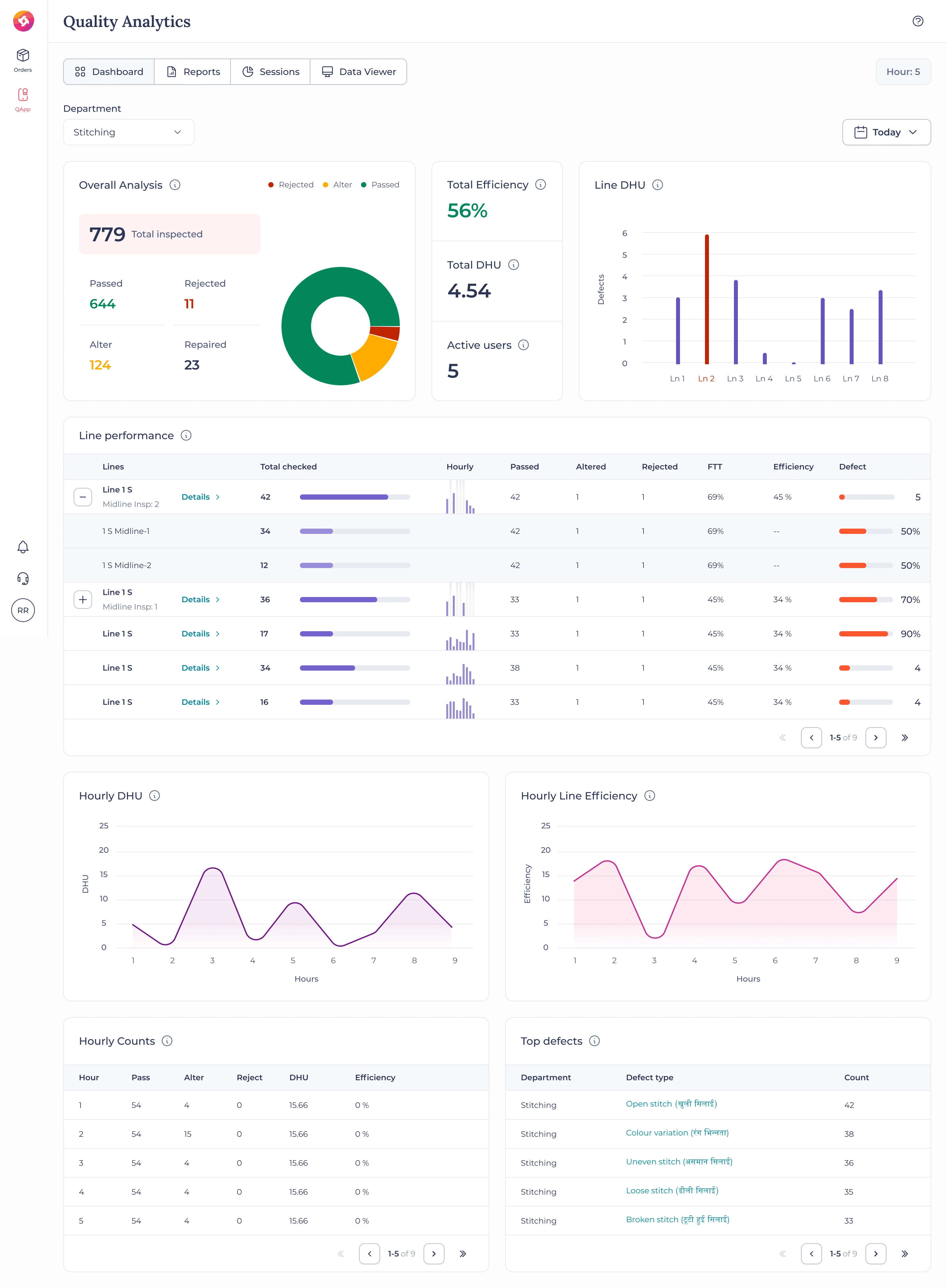
This project focuses on designing a Quality Analytics Dashboard for a garment manufacturing company, helping production teams monitor real-time quality performance, identify defects, and improve efficiency across stitching lines.
🎯 Key Features
Comprehensive Quality Overview: Displays total inspected, passed, rejected, and altered units with a clear visual breakdown.
Line Performance Tracking: Interactive tables showing hourly inspections, efficiency, and defect rates for each production line.
Defect Analytics: Highlights top recurring defects with detailed classification to aid quality improvement decisions.
Hourly Trends: Line charts for DHU (Defects per Hundred Units) and efficiency visualization across work hours.
Real-time Data Visualization: Clean and dynamic layout enabling quick insights for on-ground teams.
🧠 Design Approach
The dashboard was designed with clarity, precision, and usability at its core. Visual hierarchy, color coding, and modular card layouts make complex data easy to digest. The clean and consistent UI ensures seamless readability, even in high-pressure factory environments.
💼 Tools Used
Figma
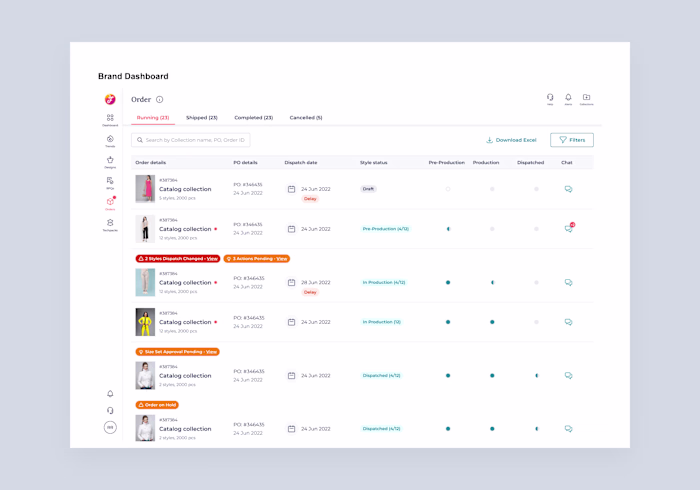
🧩 Quality Line Detail Dashboard – UX/UI Design
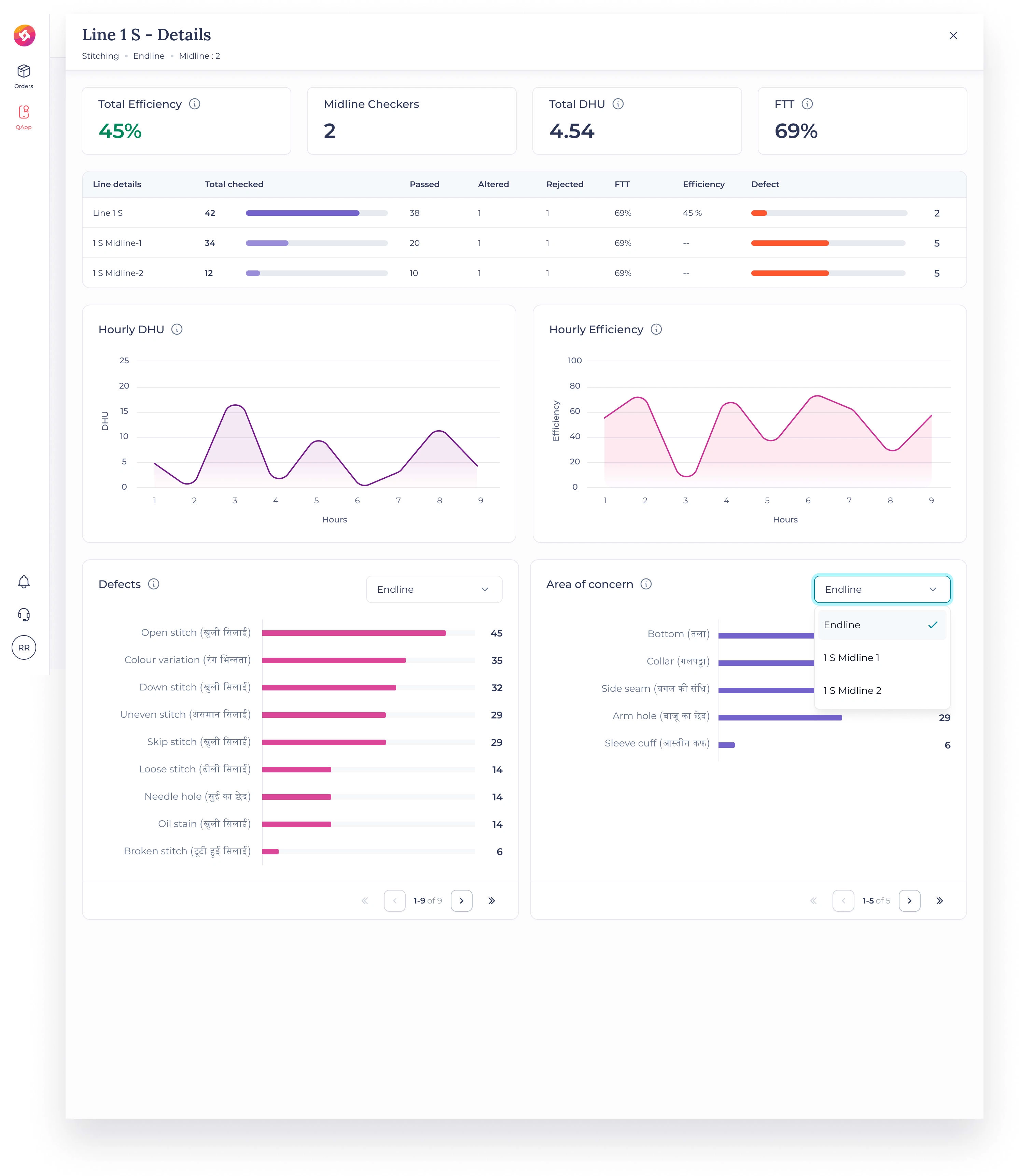
Line efficiency details
This project presents a Quality Line Detail Dashboard designed to provide an in-depth view of stitching line performance in a garment manufacturing environment. The interface empowers supervisors and quality managers to analyze efficiency, detect recurring issues, and make faster corrective decisions on the production floor.
🎯 Key Features
Real-time Efficiency Tracking: Displays key KPIs like Total Efficiency, DHU (Defects per Hundred Units), and FTT (First Time Through).
Granular Line Data: Breaks down inspection performance across midlines and endlines with hourly comparisons.
Defect Insights: Highlights top defects such as open stitches, color variation, or skipped stitches, helping teams pinpoint recurring problems.
Visual Trend Analysis: Hourly DHU and Efficiency graphs provide an at-a-glance understanding of production consistency.
Interactive Filters: Easily toggle between defect types, areas of concern, and stitching lines for focused analysis.
🧠 Design Approach
The design focuses on clarity, usability, and fast decision-making. Clean typography, soft color contrast, and modular layouts ensure the dashboard remains visually lightweight yet information-rich. Each graph and table was optimized for a balanced visual rhythm and quick interpretation.
💼 Tools Used
Figma
🧵 Advanced Quality Analytics Dashboard – UX/UI Design
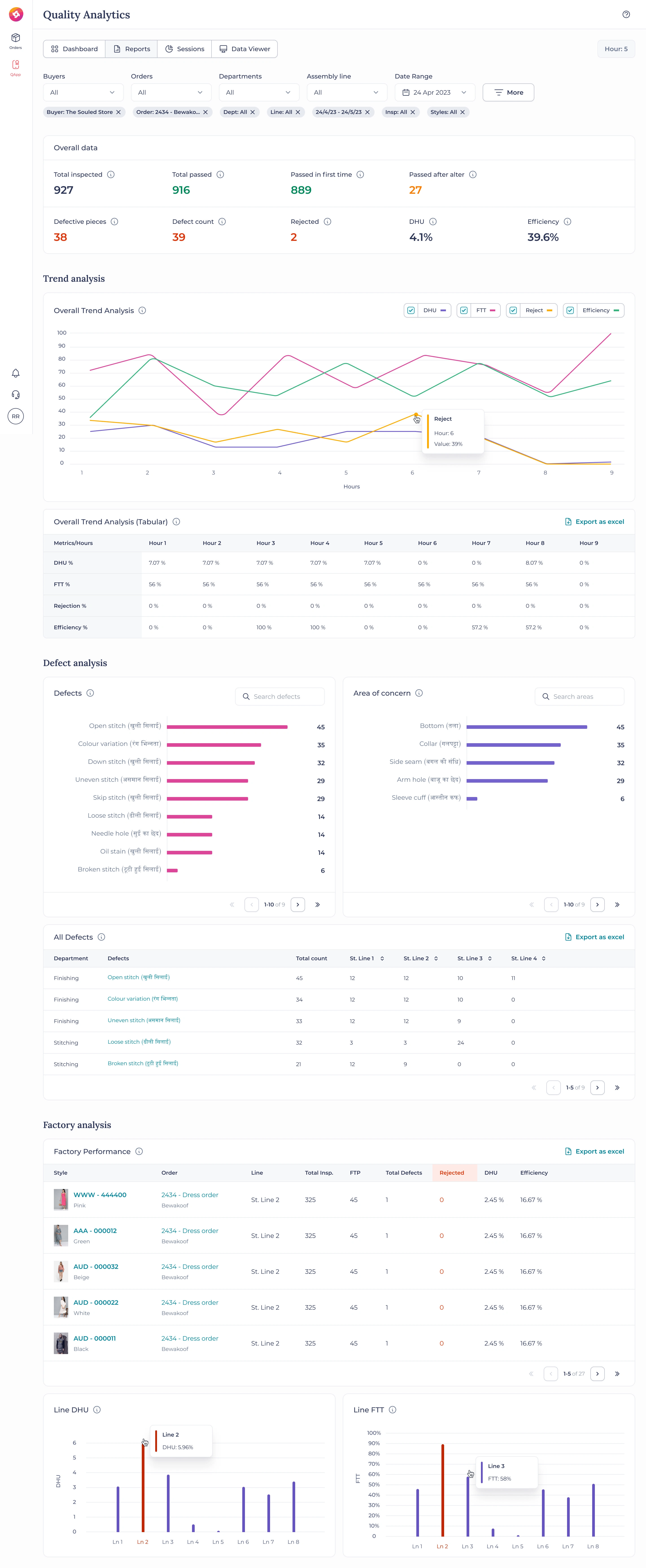
This project highlights the design of an Advanced Quality Analytics Dashboard for a garment manufacturing intelligence platform. The dashboard enables production teams, supervisors, and quality control departments to monitor end-to-end performance — from inspection metrics to defect trends — all in real time.
🎯 Key Features
Comprehensive Overview: Displays total inspected, passed, and rejected items with key KPIs like DHU (Defects per Hundred Units) and Efficiency.
Trend Analysis: Multi-line performance visualization showing patterns for DHU, FTT, Rejections, and Efficiency over time.
Defect Deep-Dive: Breaks down top defects (e.g., open stitch, color variation, uneven stitch) and areas of concern (collar, sleeve, side seam).
Factory-Level Performance: Summarizes efficiency and rejection data across styles, orders, and production lines with export options.
Interactive Data Visualization: Clean and flexible structure allows users to filter by buyer, order, department, or date range seamlessly.
🧠 Design Approach
The goal was to create a visually calm yet data-dense interface where insights surface effortlessly. A neutral color palette, subtle charts, and modular layout ensure that complex factory data feels simple and actionable. Each component was designed to maintain balance between quantitative precision and visual clarity.
💼 Tools Used
Figma
🧩 Quality Sessions Dashboard – UX/UI Design
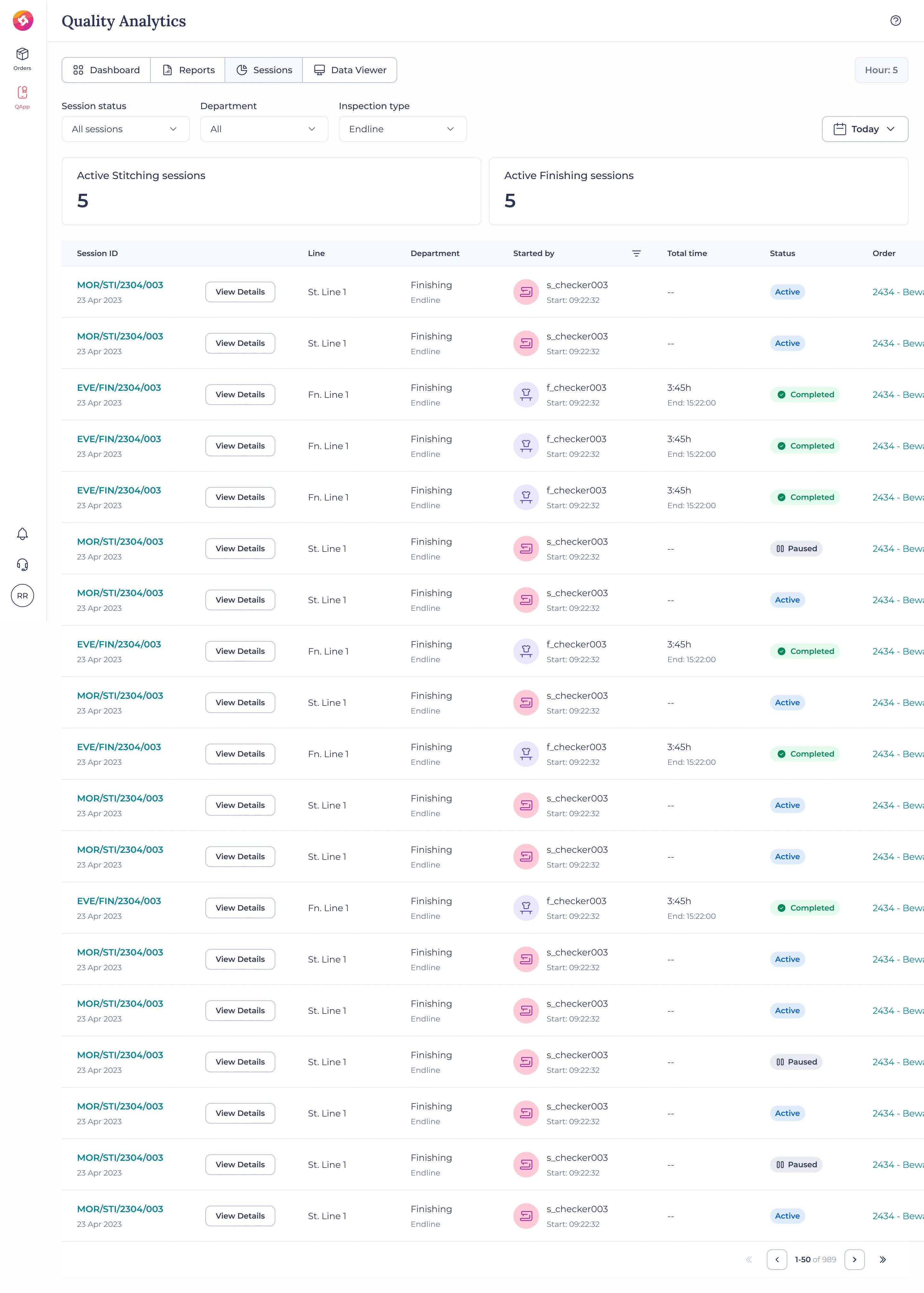
Sessions page
This project showcases the Quality Sessions Dashboard, a critical part of a garment manufacturing analytics system designed to monitor live inspection sessions across stitching and finishing departments. The goal was to create a clear, organized interface that allows supervisors and quality heads to oversee operations in real time with complete transparency.
🎯 Key Features
Live Session Tracking: Displays all active, completed, and paused quality inspection sessions in real time.
Department-Wise Segmentation: Separate metrics for stitching and finishing sessions for better process clarity.
Quick Access Controls: “View Details” functionality for diving deeper into specific line sessions and performance.
User & Status Insights: Each row highlights the assigned checker, department, start/end times, and session duration.
Status Indicators: Color-coded labels (Active, Completed, Paused) provide instant visual recognition of progress.
🧠 Design Approach
The design prioritizes clarity, traceability, and consistency. Every element — from typography to spacing — supports effortless data scanning. The structured table layout maintains a balance between density and readability, ensuring supervisors can monitor dozens of ongoing sessions without visual fatigue.
💼 Tools Used
Figma
Like this project
Posted Aug 18, 2023
A quality dashboard is available for the manufacturing unit to track daily quality and enhance factory efficiency.