Luna Health AI — Six Health Domains, One Dashboard

Mykola Popov

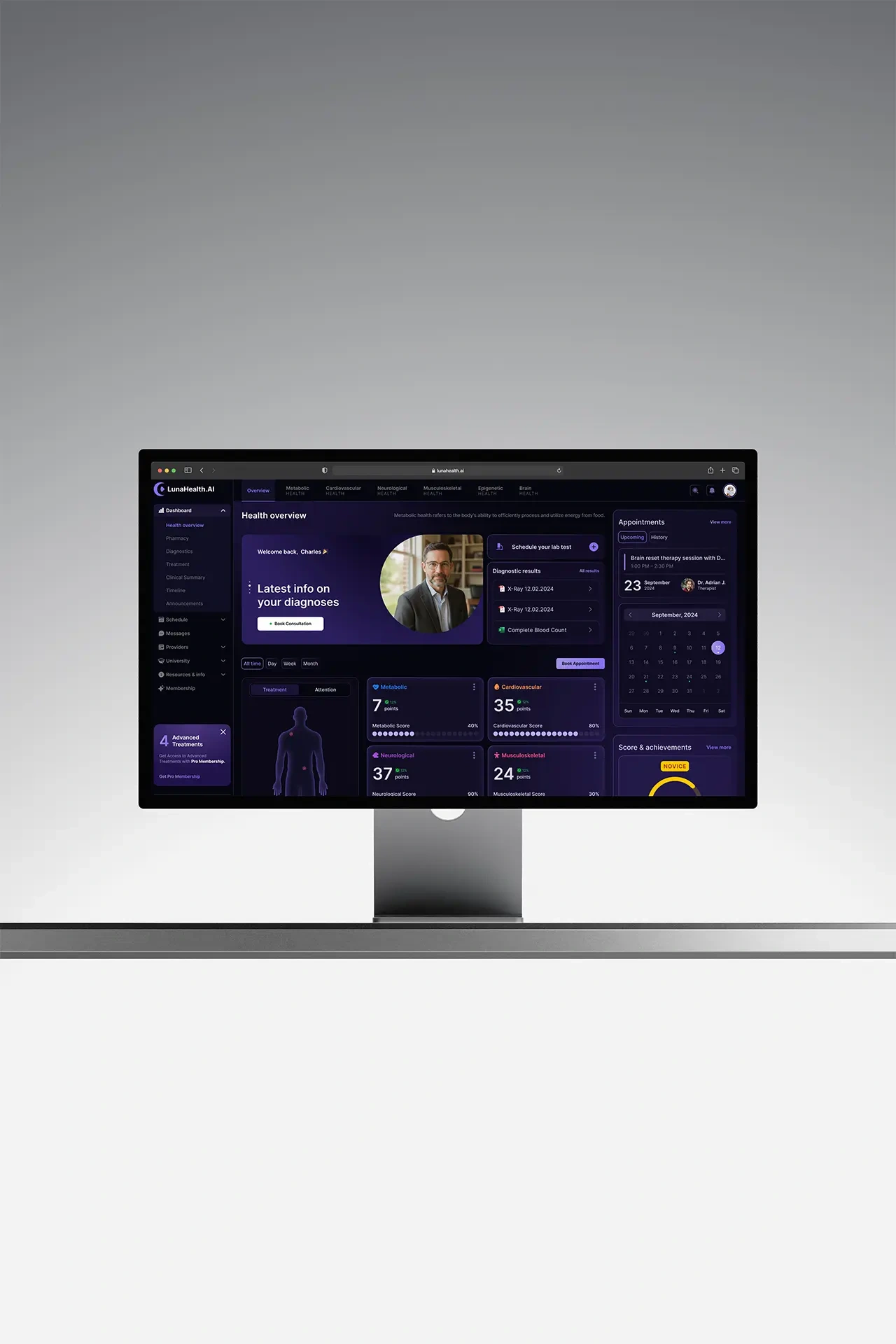
Role: Product Designer · System, data-viz, scoring, overview
Timeline: ~10 months · Industry: HealthTech · consumer AI
Scope: Design system, data visualization, mobile, scoring loop
The problem
Luna Health AI covers six domains — metabolic, cardiovascular, neurological, musculoskeletal, epigenetic and brain health. Every module is data-rich and clinically grounded. The audience is not medical.
Unreadable. Clinically correct, illegible to a layperson — completeness without comprehension.
Overload. Six domains in one place: impressive to a clinician, paralyzing to a patient.
No reason to return. One-time diagnostics don't change behavior.
Research
Usability sessions and comprehension tests with non-medical users across all six modules.
Users didn't want more numbers. They wanted "am I okay, what does this mean, and what do I do?" The surprise: engagement depended less on data depth than on a sense of progress — people returned for their score and goals, not the biomarkers.
The bet
For a non-medical audience the product isn't the data — it's the meaning and the momentum.
Clinical data → plain-language meaning → a reason to return.
Design principles
Translate before you visualize. Every number gets a plain-language "what this means for you."
Overview first, depth on demand. One readable health picture; each domain a level deeper for those who want it.
Reward progress. Make health a loop worth returning to, not a one-time report.
Three strategic decisions
Meaning over raw data. Led with plain-language meaning and clear scores, full clinical detail one tap deeper.
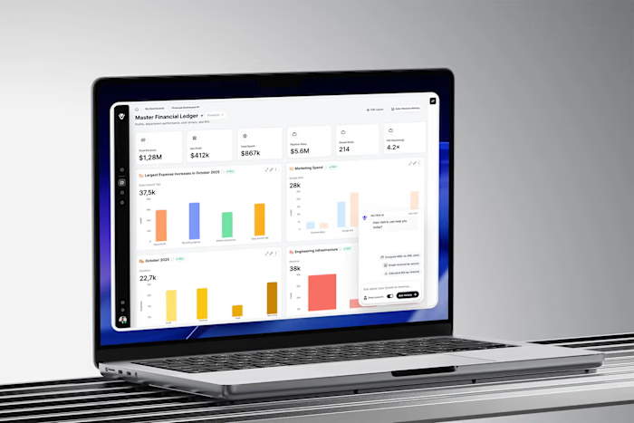
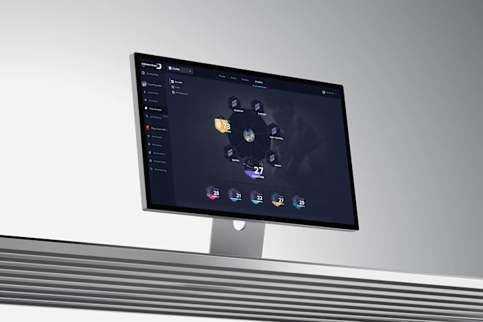
One dark-mode system across six domains. A shared component library and data-viz language — charts, gauges, progress indicators consistent everywhere — so six clinically distinct domains shipped as one product.
Engagement loop, not a static report. A scoring system with weekly progress, goals and challenges, grounded in real metrics rather than vanity badges.
Results
45% → 82% of users correctly reading their own results
~2.1× weekly return after the scoring loop
6 domains unified into one readable picture
1 dark-mode design system across all modules
North-star: users who understood and acted on their health — not users who saw their data.
What I'd carry forward
Test the plain-language translations directly with patients sooner. Comprehension, not visual polish, is the whole product here.
Like this project
Posted Aug 8, 2026
Made clinically dense health data readable for non-medical users. Correct self-reading of results went from 45% to 82%; weekly return roughly doubled.