OMV EV Charging App — Concept Redesign

Mykola Popov

This is a self-initiated concept project, not client work. It was not commissioned by or delivered to OMV. All figures below are design targets from the concept, not measured production results.
Role: Product Designer · concept
Timeline: ~6 weeks · Industry: Mobility · EV charging
Scope: UX audit, personas, information architecture, user flows, session screen, interaction design
The premise
OMV's EV charging app, like most in the category, treats charging as a find-a-station task. But a driver's real stress starts after the cable is plugged in — wondering whether it's actually charging, how fast, and what it'll cost.
Discovery
A UX audit of the existing app to locate friction, plus research-based personas mapping EV-driver tasks, pain points and opportunities across the journey.
Discovery was rarely the blocker. Friction clustered around the active session and the handoffs between charging, payment and invoicing. Drivers wanted less on screen, not more — certainty about the current charge beat any extra data or feature.
The bet
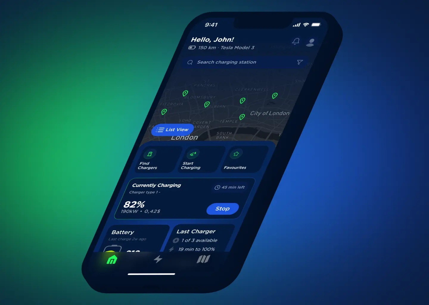
EV charging anxiety isn't about finding a station. It's about trusting what's happening while you charge. The active session, not the map, is the heart of the product.
Plug in → see status and cost live → charge with confidence.
Design principles
Lead with the live session. Status, speed and cost are home base, not a buried screen.
One thing at a time. Match the interface to where the driver is in the journey.
Make cost and progress legible. Real-time charge and cost, removing the guesswork that creates the stress.
Three decisions
Session-first over map-first. Breaks the category convention, but the map serves discovery rather than dominating.
Rebuilt IA over feature-complete visibility. Registration, charging, navigation, payment, invoicing and integrations each surface in context, with a clear primary action per screen.
Calm interaction over data density. Restrained micro-interactions and state transitions that confirm what's happening without clutter — legible one-handed in a parking lot.
Concept targets
7 → 3 steps from arrival to a confirmed charge
1 tap to live status and cost, from the home screen
~40% less time to confidence (intended, from consolidating the charging / payment / invoicing flows)
Honest limitations
As a concept it leaned on an audit and personas. I'd test the session-first model with real EV drivers in a live parking-lot context to confirm the hierarchy under genuine stress, and pressure-test the payment and invoicing handoffs with edge cases — failed charges, partial sessions — where trust is most fragile.
Like this project
Posted Aug 8, 2026
Self-initiated concept redesign of an EV charging app, built around the live charging session instead of the map. Audit, personas, IA, flows.