Built with Framer
DealDesk: Figma to Framer Site on a Two-Week Deadline

Artyum Grebenyuk (AGR Studio)
Verified



No room to negotiate.
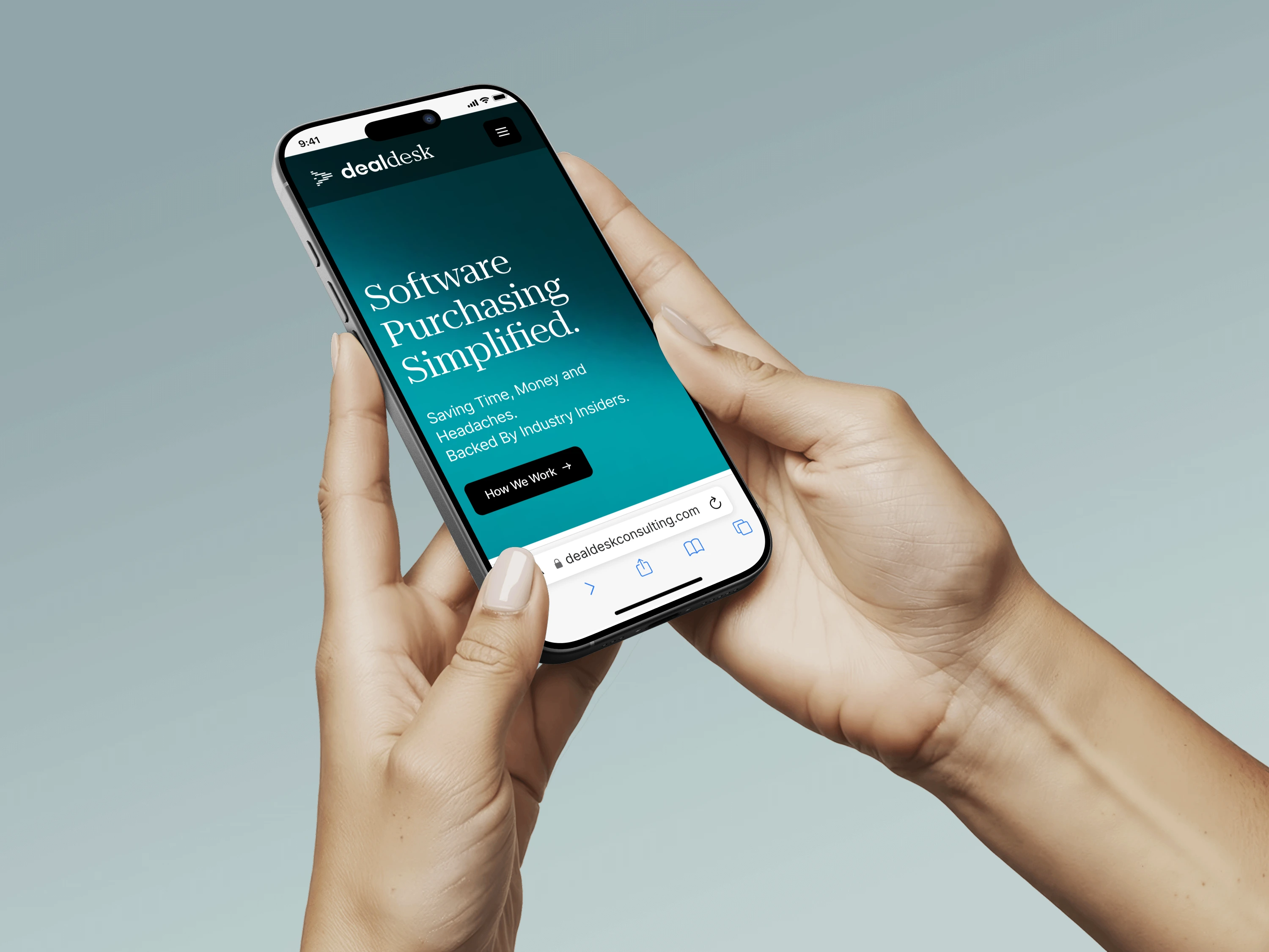
DealDesk is a procurement consultancy negotiating software and SaaS deals for enterprises. We took its Figma design to a live, responsive Framer website in two weeks.
The insight
A Figma file isn't a website yet
DealDesk runs point on software procurement, negotiations and vendor management, so its clients get more out of every purchase and renewal. The team had invested in a detailed, multi-page Figma design for the new website. But a design file shows a page at rest. It doesn't scroll, adapt to a phone or answer a cursor, and those decisions were still open.
The challenge
Two weeks, and the date wouldn't move
The site had to be live in two weeks, in time for a major industry event, and DealDesk's team had no Framer experience. The bar stayed high: every hover state, animation and breakpoint had to match the original vision, with SEO in place from day one.
The solution
Faithful to the file, finished in the browser
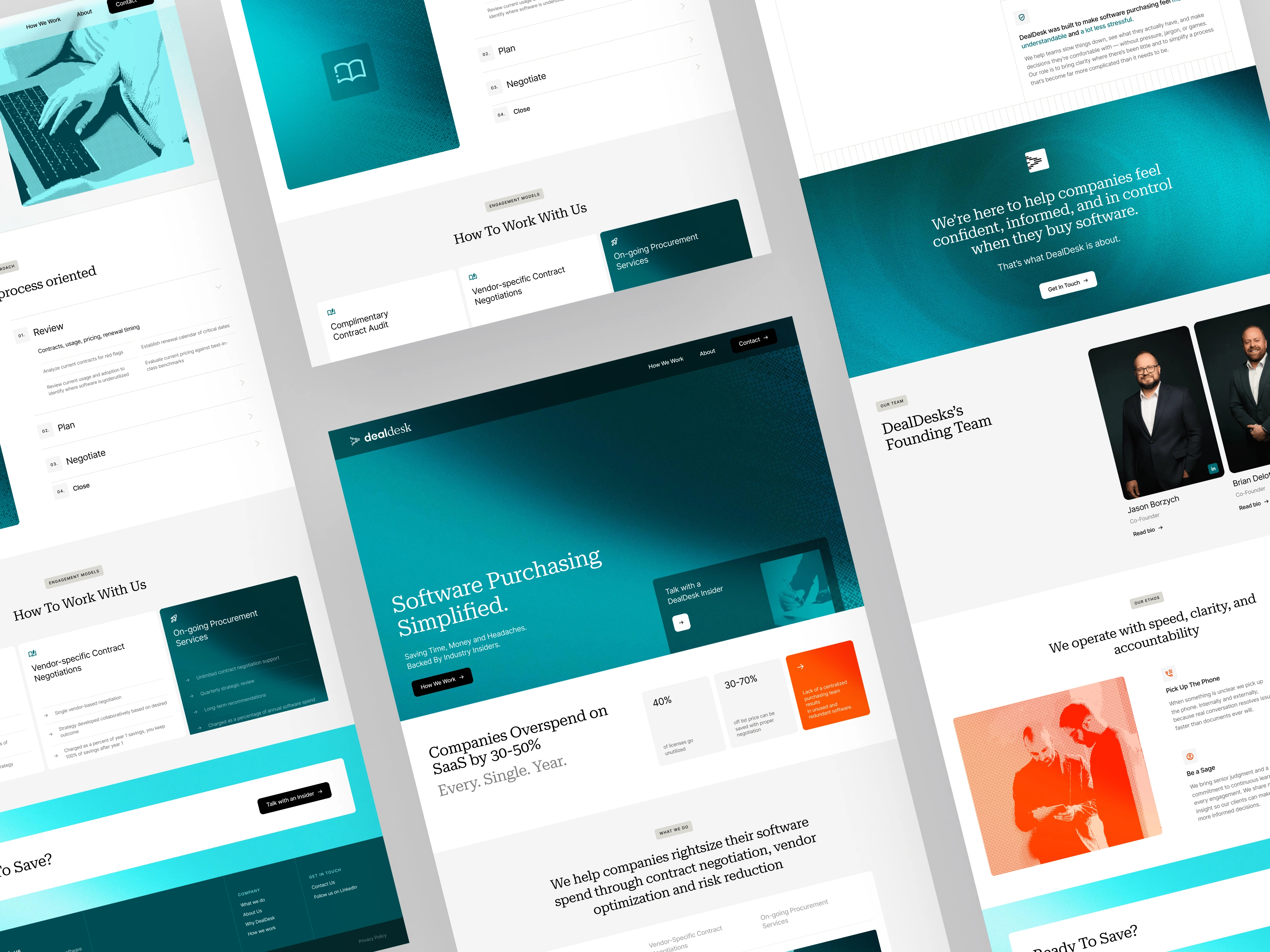
Before building, we audited the Figma files and came back with recommendations to enhance the design, not change it: spacing turned into a system, smooth transitions where the file showed static hovers, and mobile layouts where none were defined. Then we matched every color, font size and spacing value of the navy and cream design, and added what only shows up in a real browser: scroll-triggered reveals, subtle parallax on the hero and custom interactions on buttons and cards.
The Figma to Framer conversion ran on daily milestones across the homepage and the How We Work, About and Contact pages, with responsive development and testing built into the plan and feedback batched into two review rounds. SEO went in alongside: semantic HTML, meta tags on every page, image alt text, Open Graph tags and a clean sitemap.
The shift
From Figma file to live site in two weeks
The site went live on day 14, exactly as planned. DealDesk took it to the industry event, where several prospects remarked on how professional its web presence looked, and it became a key sales tool for the team. After launch it needed zero bug fixes and zero design changes: what went live was exactly what was approved.
Live site: dealdeskconsulting.com
Full case study: agr.studio/projects/dealdesk-from-figma-to-live-in-two-weeks
Like this project
Posted Mar 23, 2026
DealDesk is a procurement consultancy negotiating software and SaaS deals for enterprises. We took its Figma design to a live, responsive Framer website in two weeks.