SUCCESSION BRAND STRATEGY, EVOLUTION, & PIVOT
BRAND IMAGE AND NEW LOGO + MARKETING ROLLOUT
SUCCESSION: BRAND STRATEGY, PIVOT & EVOLUTION PROJECT:
This was a succession brand refresh that grew into more of a rebrand. The son taking over had a strong vision for the brand appeal he wanted to express. I worked very closely with him to bring that vision into form.
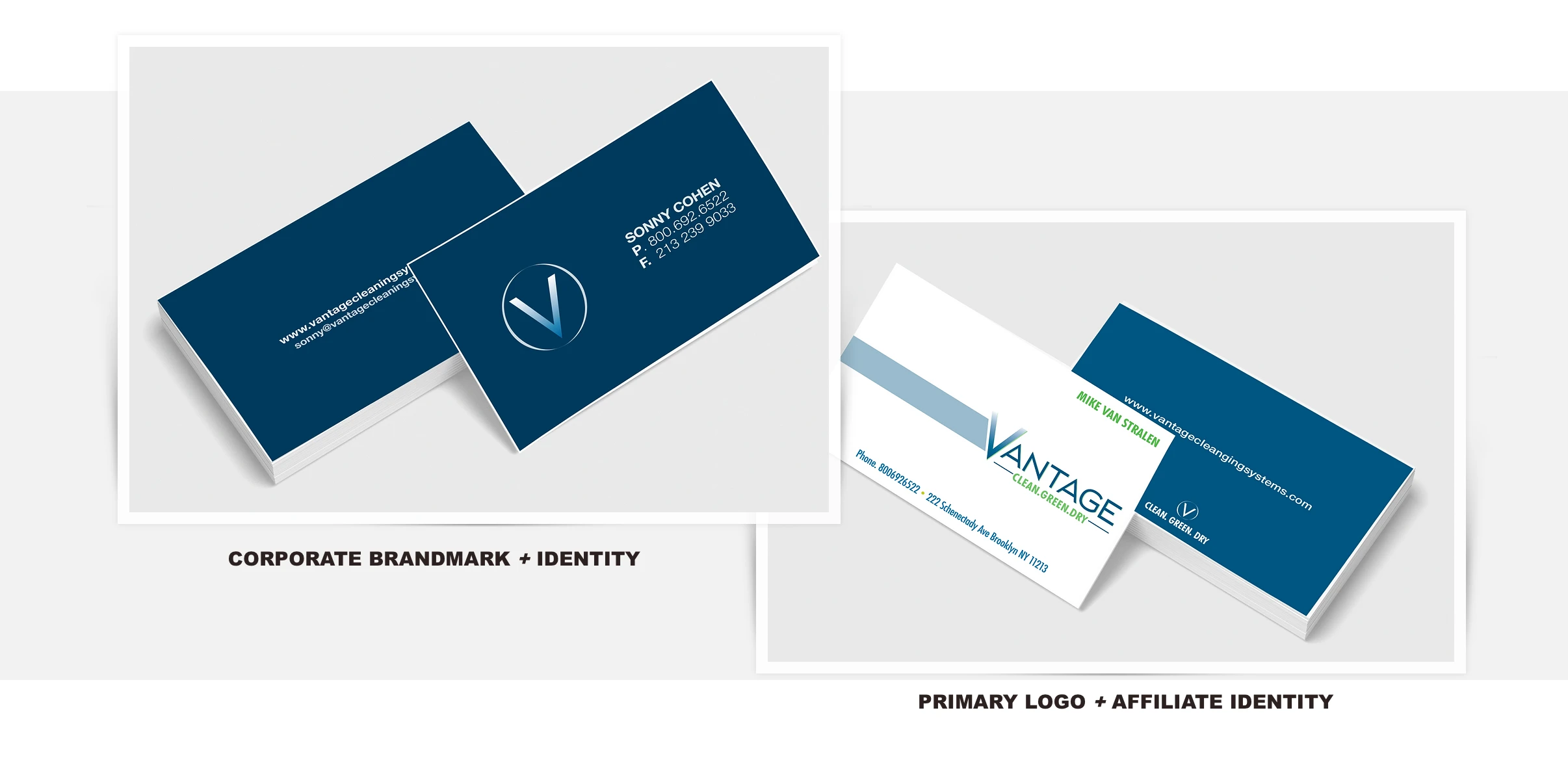
We created a secondary overall look and brandmark to support and represent corporate efforts. This allowed us to be more creative with the primary look and feel for the affiliates and marketing efforts.
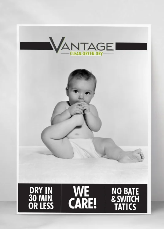
After "1000 hours" of image searching and mood boarding, a few fun directions emerged. This was the one he chose to build on.
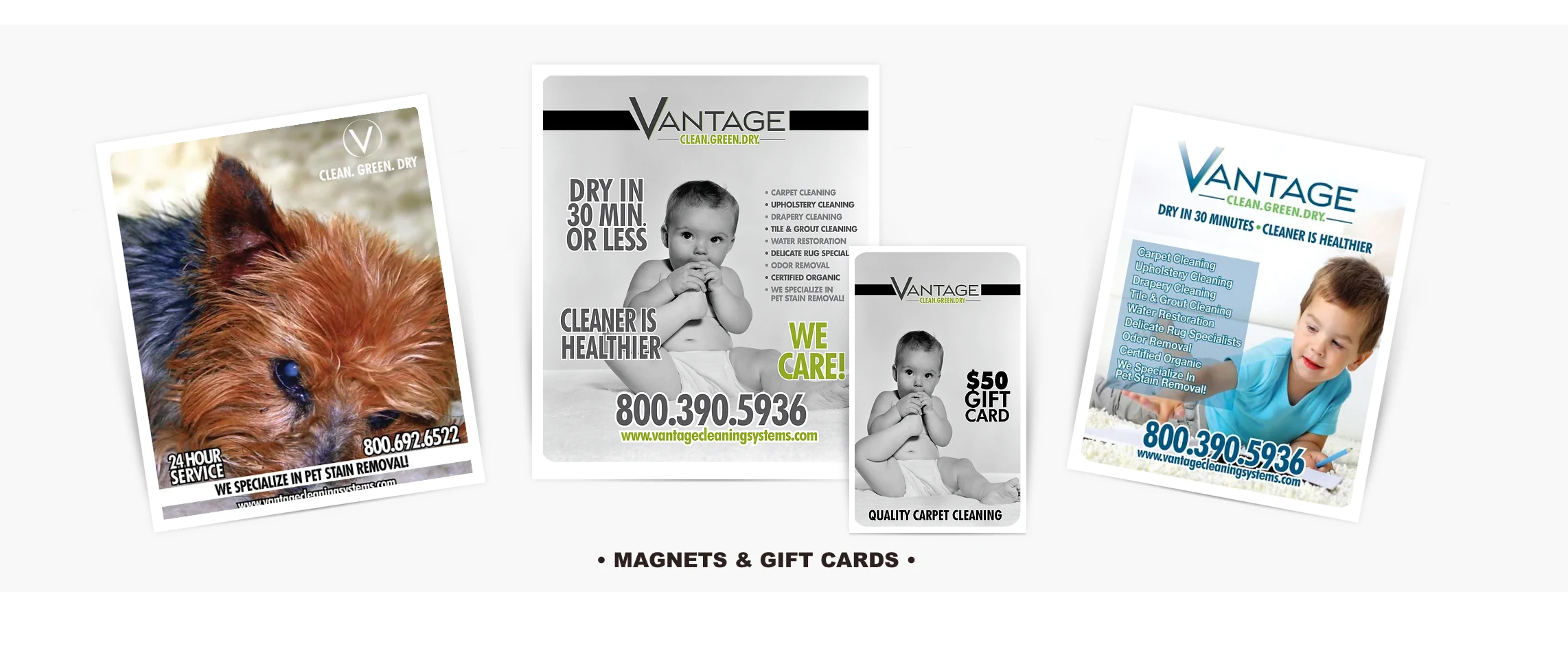
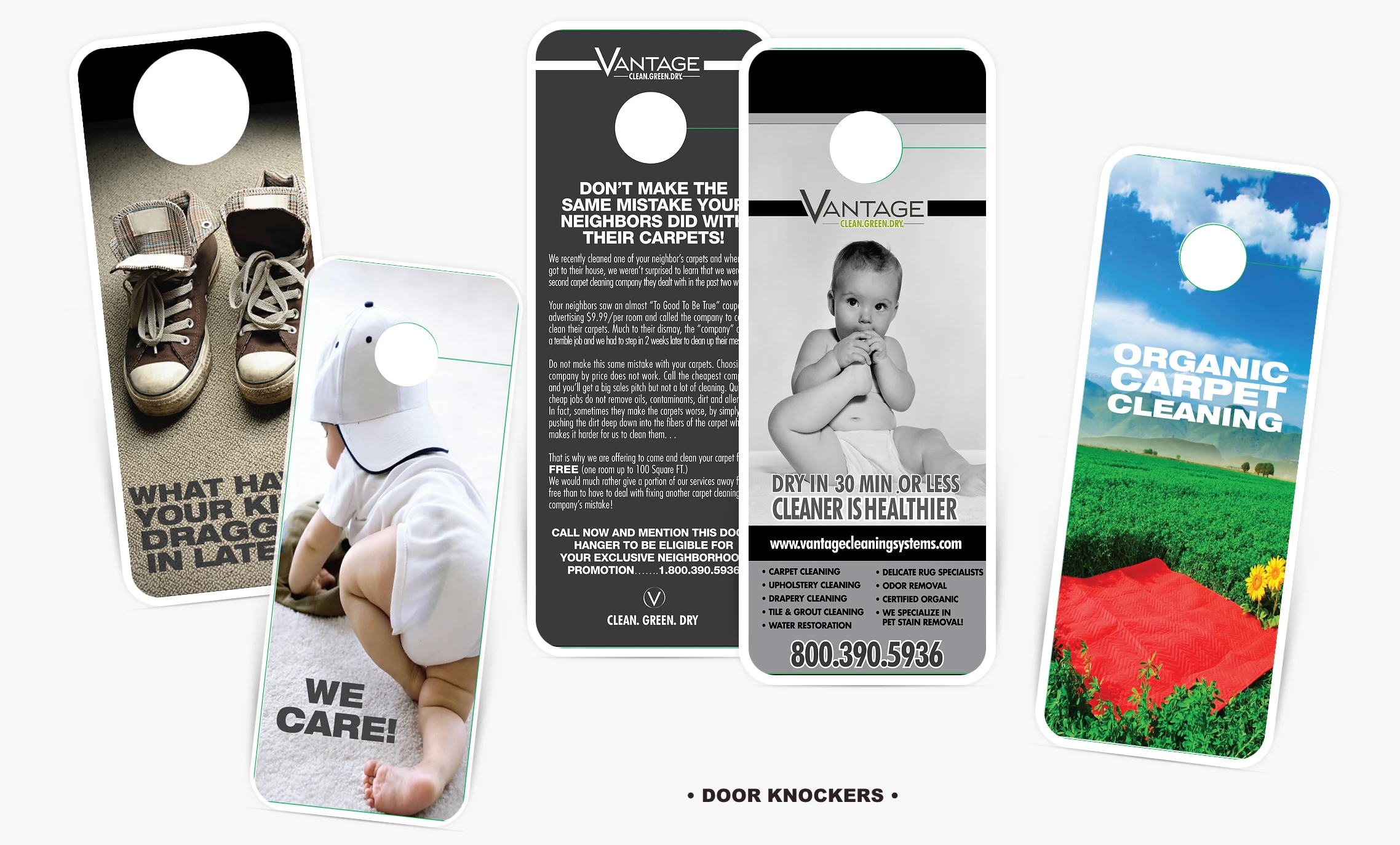
The black and white baby photo serves as the main branding image. We wanted a vintage look that echoes back to a simpler time when service felt more personal and caring.
The scope was significantly more than what is shown here, but this offers a good overview.

PRIMARY LOGO + AFFILIATE IDENTITY
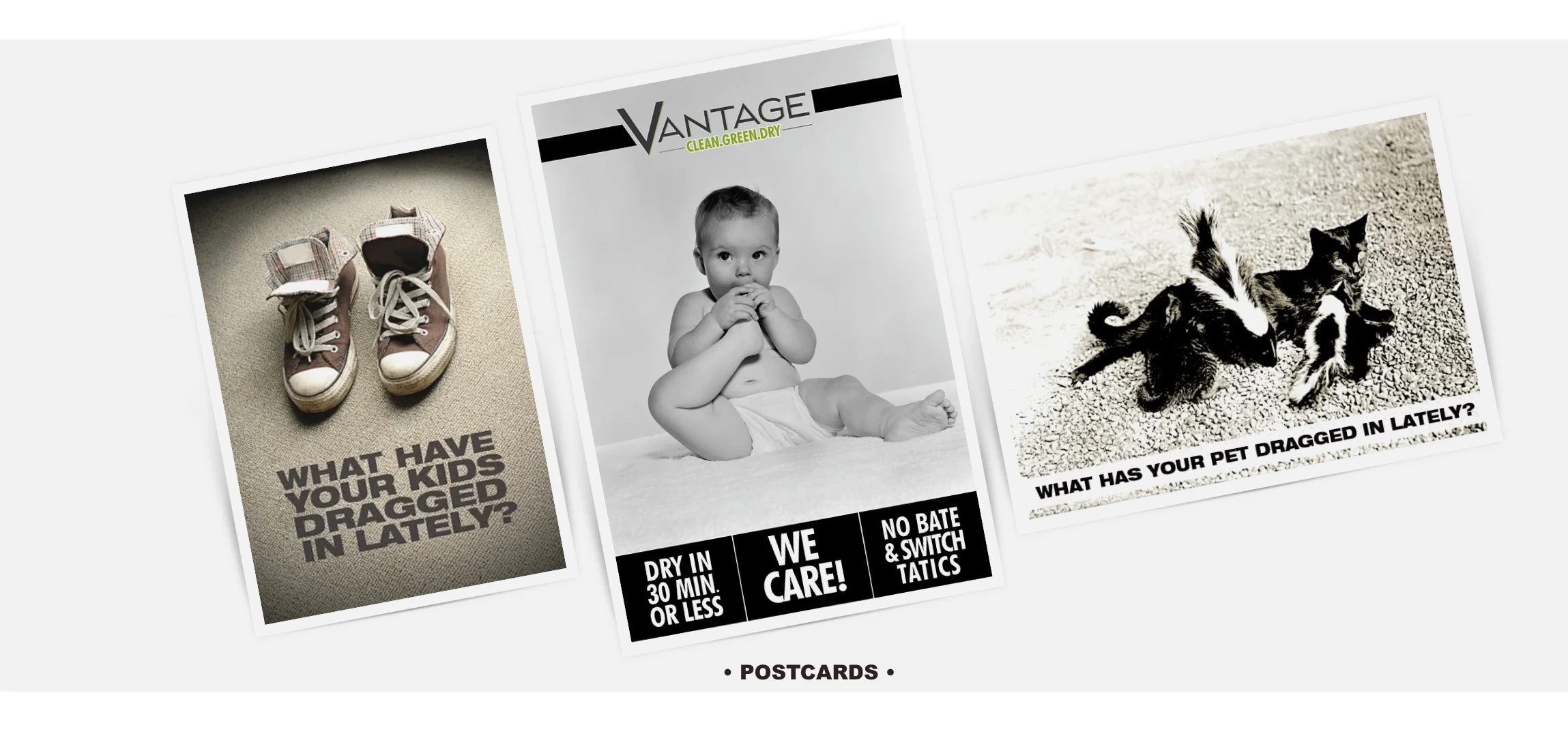
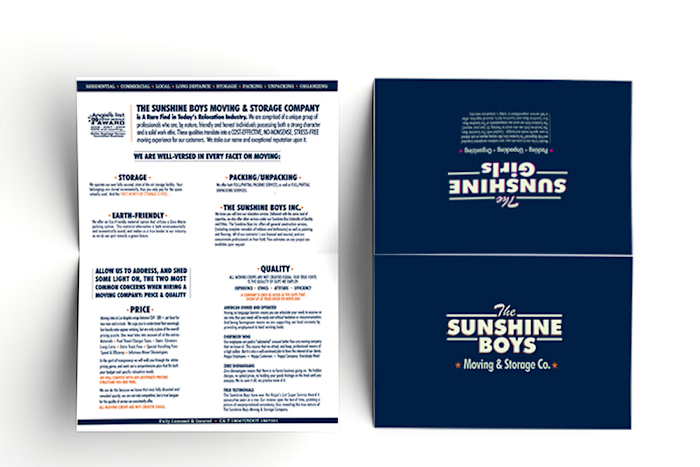
MARKETING ROLLOUT
Like this project
Posted Jul 19, 2023
Graphic Design,Advertising,Art Direction
