Moon Child Streetwear Brand Launch
Grazie Guevara
BRAND STORY
Moon Child was built from the ground up to redefine streetwearm blending urban edge with soulful storytelling. Beyond designing the brand identity and textile illustrations, I spearheaded the entire process: strategic planning, supplier sourcing, fabric testing, and seamless execution. Every detail, from the nostalgic-yet-modern logo to the wearable-art aesthetic, was meticulously crafted to stand apart in a saturated market. This wasn’t just design; it was a full-scale launch of a vision, where comfort meets character, and streetwear feels like second skin.
Teaser video
Drop #1
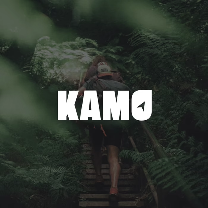
BRANDING & VISUAL IDENTITY
Every detail was intentional. We studied streetwear logos but chose minimalism as our compass, crafting a bold yet adaptable mark designed to stay legible across all products, from tags to tees. The palette hinges on contrast: indigo for depth, black-and-white for versatility, letting textile illustrations and graphic elements (stickers, cards, etc.) carry the brand’s soul. Photography and video became extensions of the identity, raw but refined, urban but timeless. No filler, just focus.
Logo
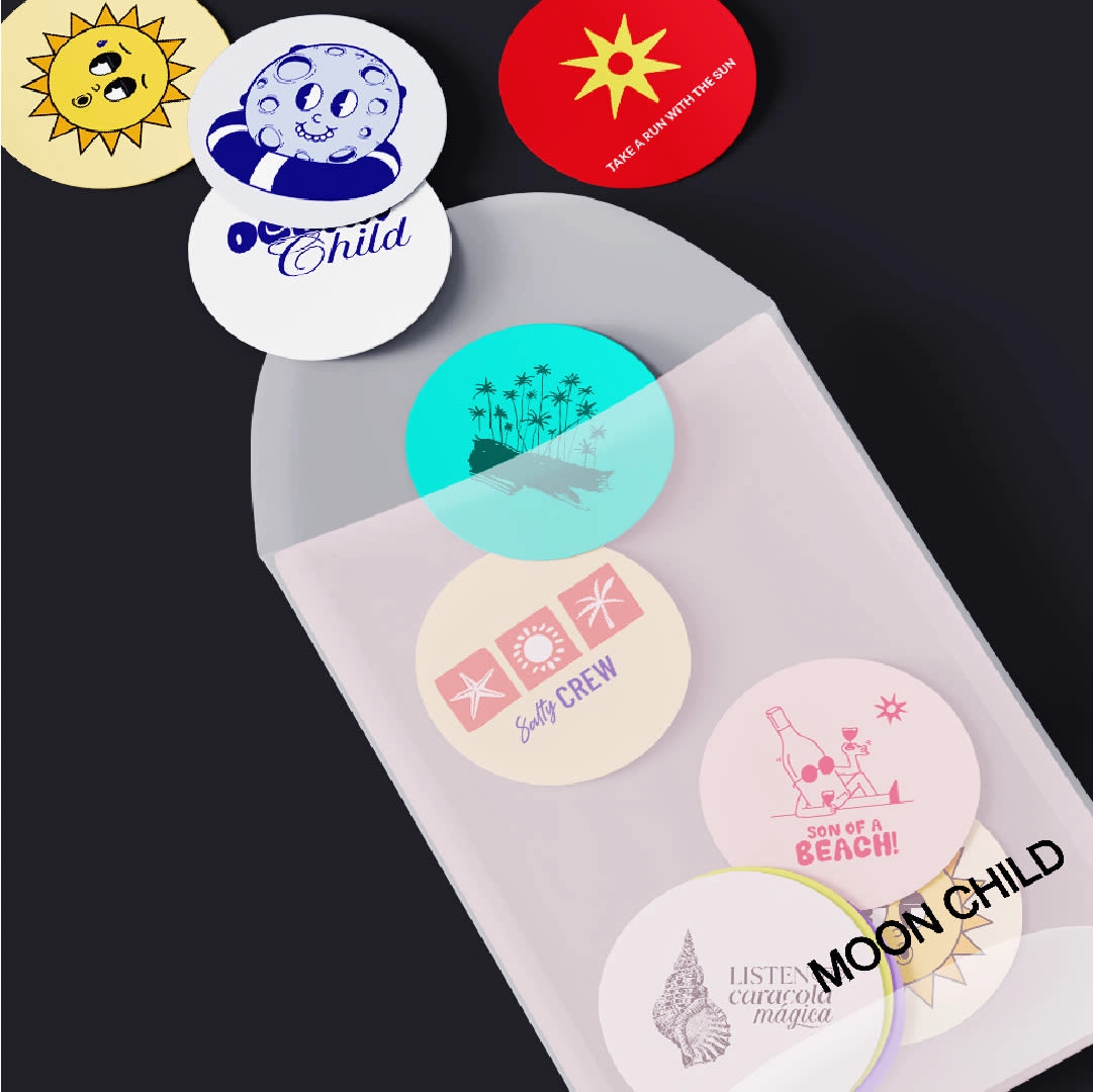
Stickers
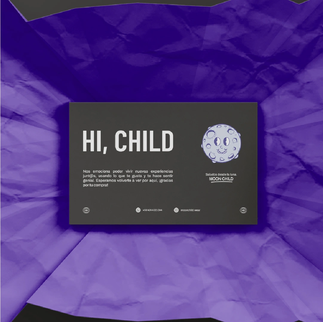
Business cards
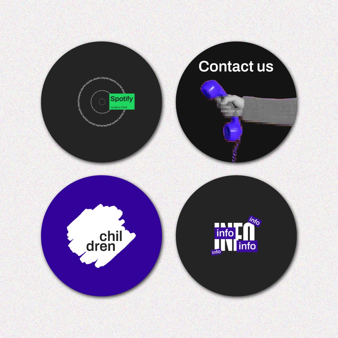
Highlights
MERCH WITH MEANING
Every piece in our first drop is a wearable statement, fusing art with environmental activism. From vinyl sublimation prints on tees to embroidered caps and eco-friendly textile-dyed bandanas, each design is a protest in physical form. Limited runs, bold visuals, zero compromise. This isn’t just streetwear; it’s a call to action stitched into fabric.
Drop #1: Lunar Glow
Drop #1: Lunar Glow
Teaser
Creative process
:)
Let’s craft a brand with depth, one that feels authentic, compelling, and unmistakably yours. If you’re looking for thoughtful design that balances creativity and strategy, I’d love to collaborate. Reach out through this platform, and let’s create something truly memorable together.
Like this project
Posted Aug 13, 2025
treetwear with soul. Limited drops fusing bold art + eco-conscious design. Wear the movement