Built with Framer
Brand Direction & Landing Page for Recurva
Anky C.
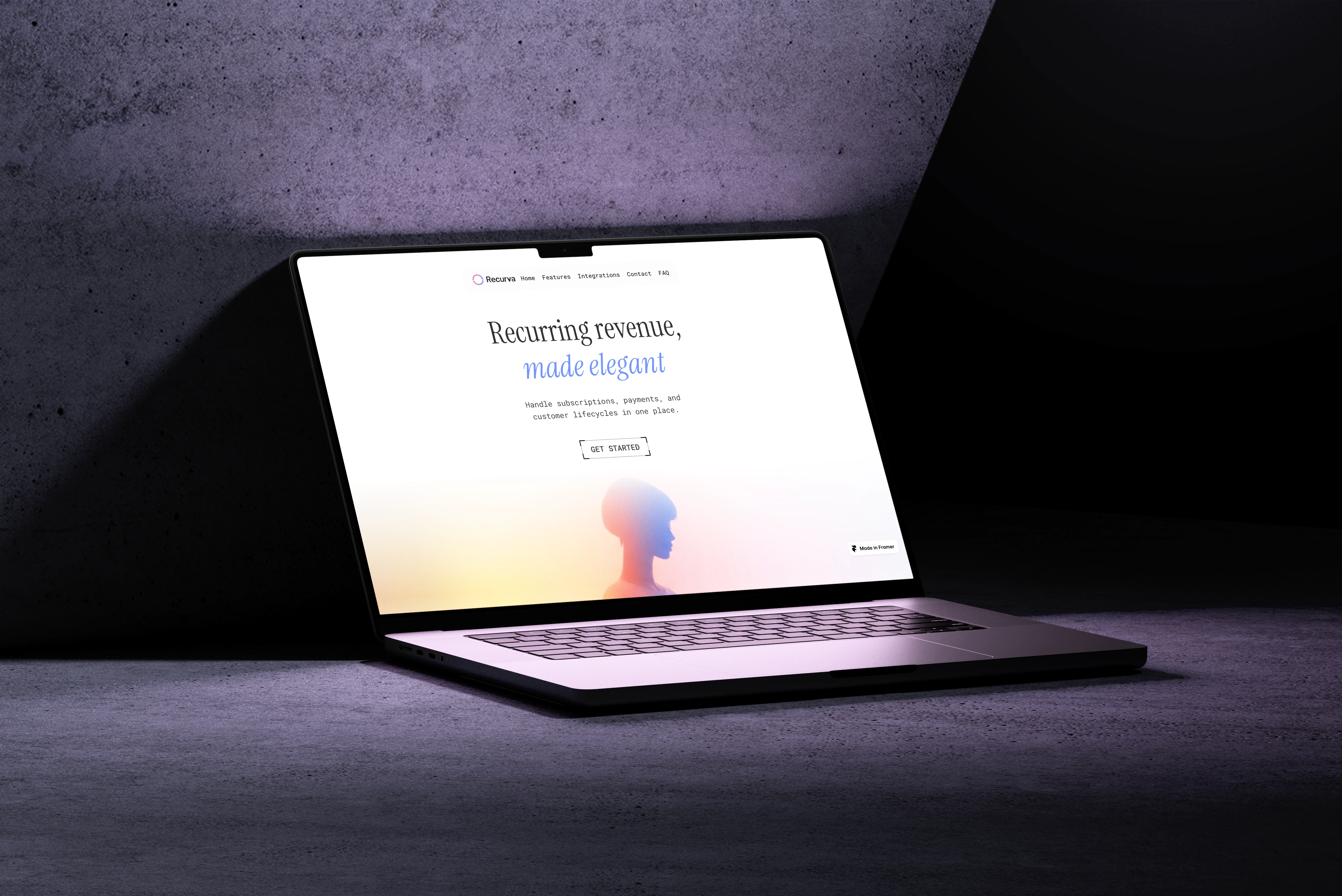
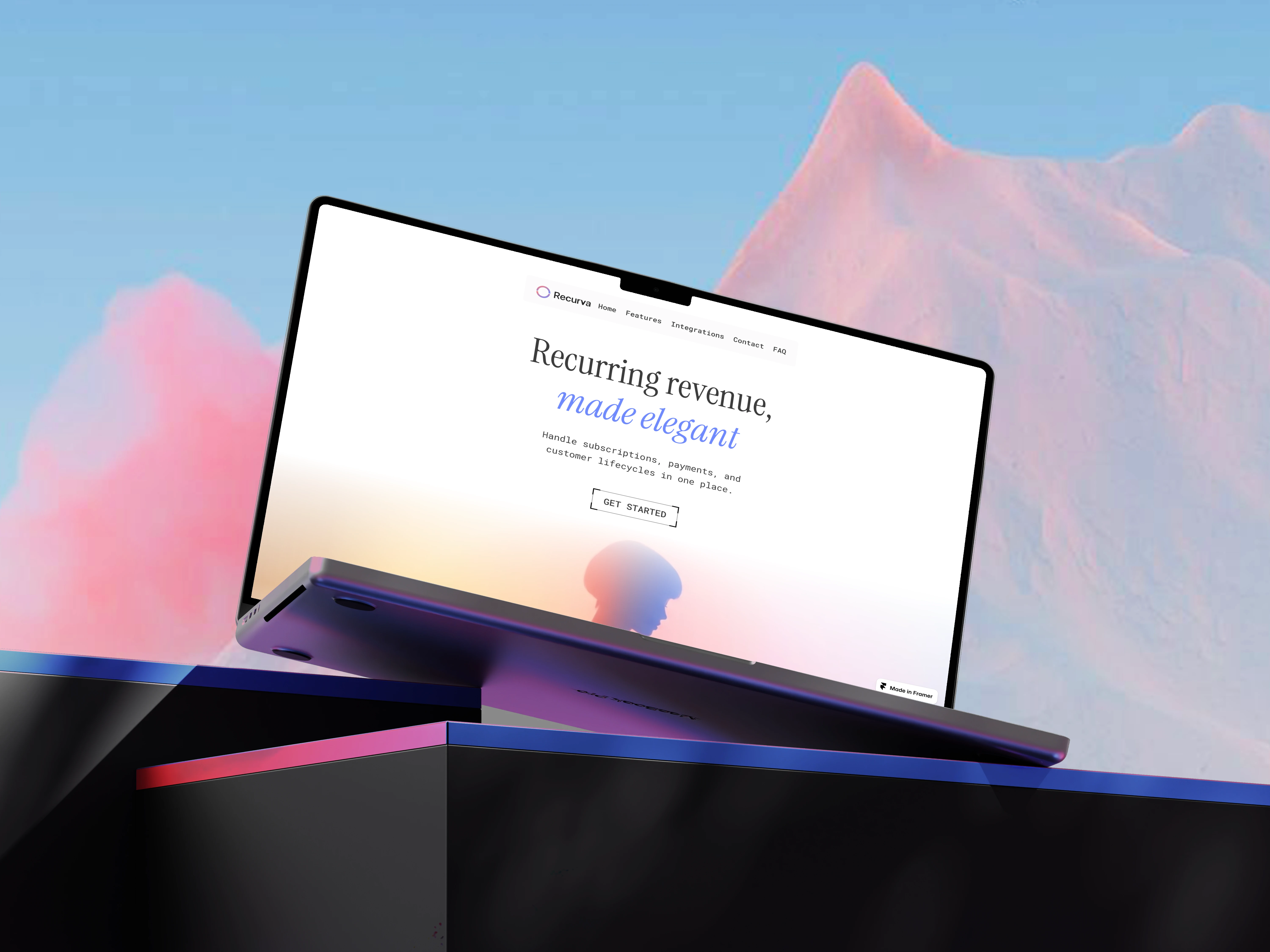
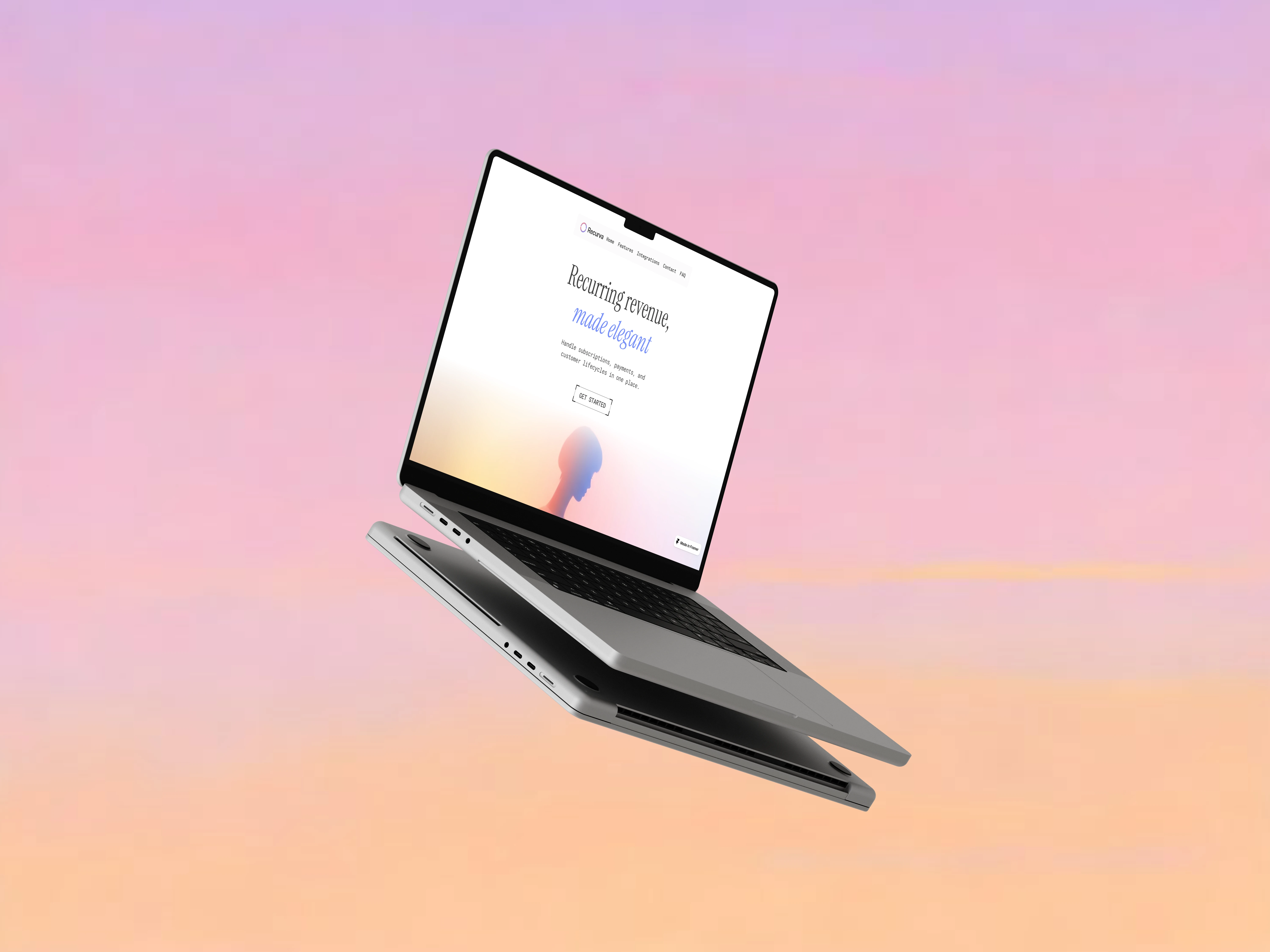
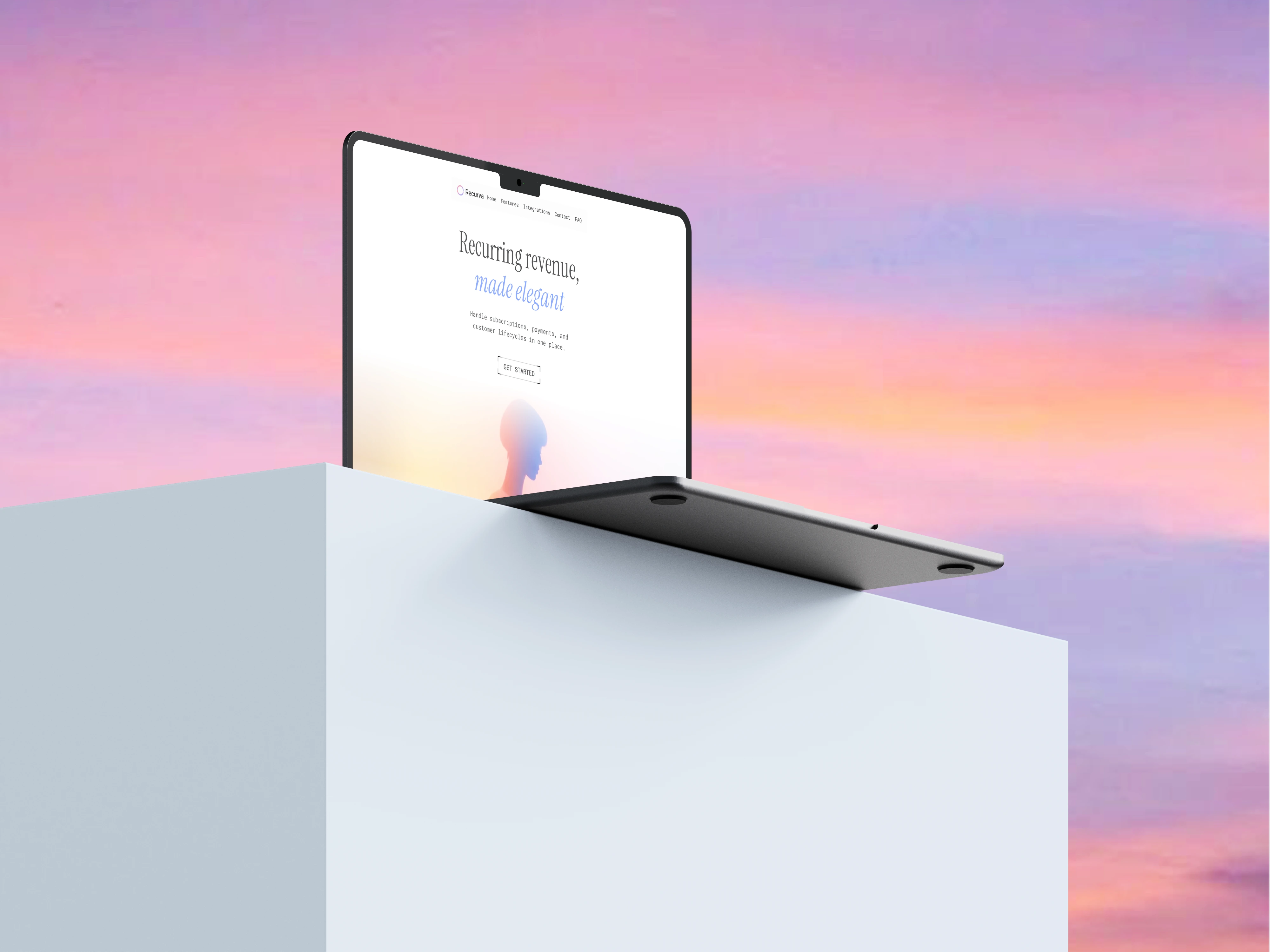
Recurva: Recurring revenue, made simple
Overview
Recurva is a platform designed to help businesses set up, manage, and scale recurring revenue without complexity. From subscriptions to repeat payments, it transforms what is usually fragmented and technical into a seamless, approachable experience.
The goal of this project was to design a landing page that doesn’t just explain the product, but makes recurring revenue feel simple, trustworthy, and achievable from the first scroll.
The Problem
Recurring revenue is powerful in theory, but intimidating in practice.
Businesses struggle with:
setting up subscription systems
managing billing cycles
handling failed payments
trusting tools that feel overly technical
Most platforms solve the backend.. but fail at the first impression.
The Goal
The intention was to design a landing page that reduces hesitation within seconds. Instead of overwhelming users with information, the experience needed to guide them gently, build trust early, and maintain a sense of momentum throughout the scroll.
Approach
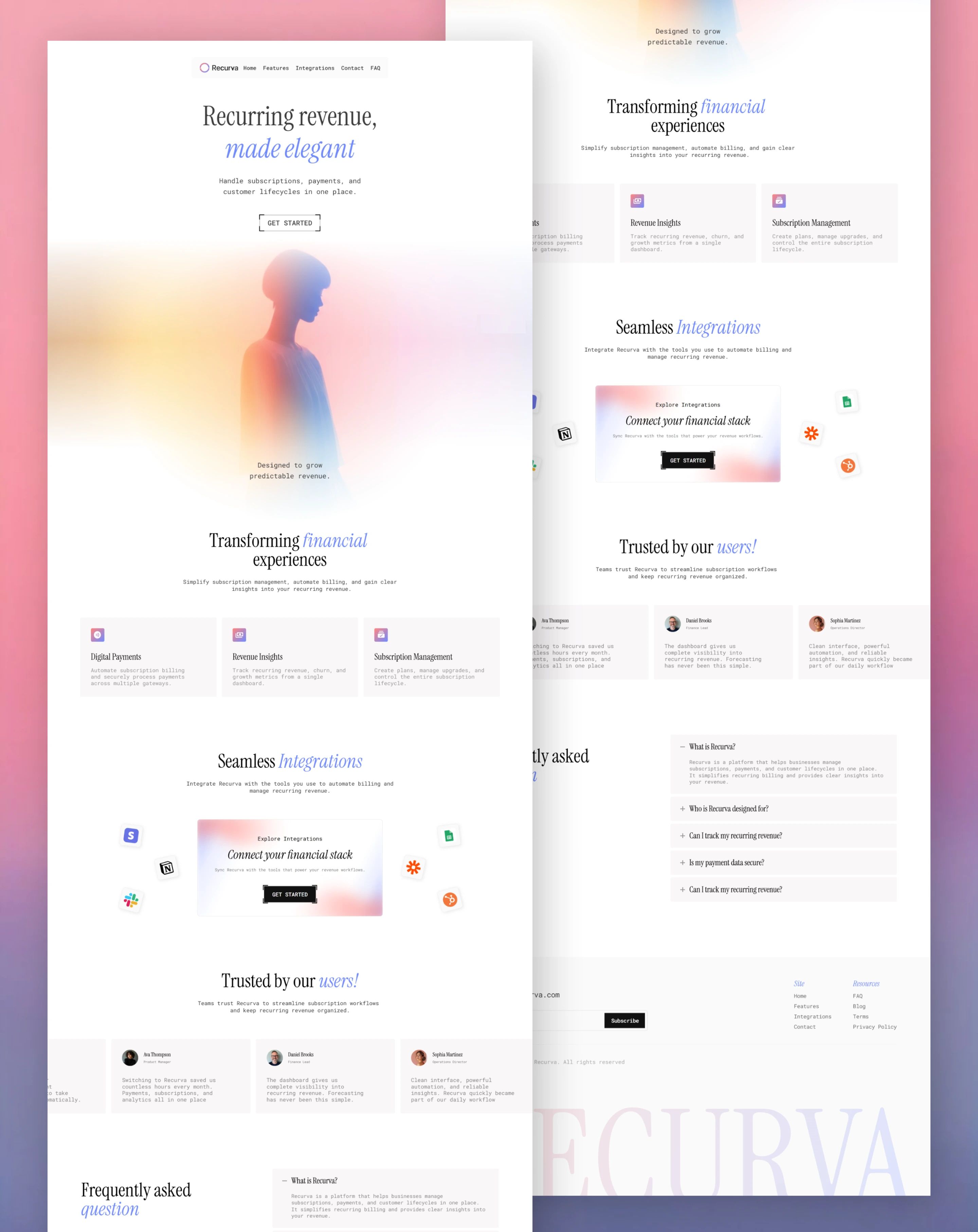
The entire page was structured as a narrative rather than a collection of sections. Each moment leads naturally into the next, creating a sense of forward motion that mirrors the idea of recurring systems.
Clarity became the foundation. Instead of relying on technical language, the messaging focuses on outcomes, predictable income, reduced manual effort, and smoother operations. The interface supports this by staying visually calm, allowing users to process information without distraction.
Information is revealed progressively. Users are first introduced to the value, and only then invited to explore deeper layers if they choose. This keeps the experience light while still being informative.
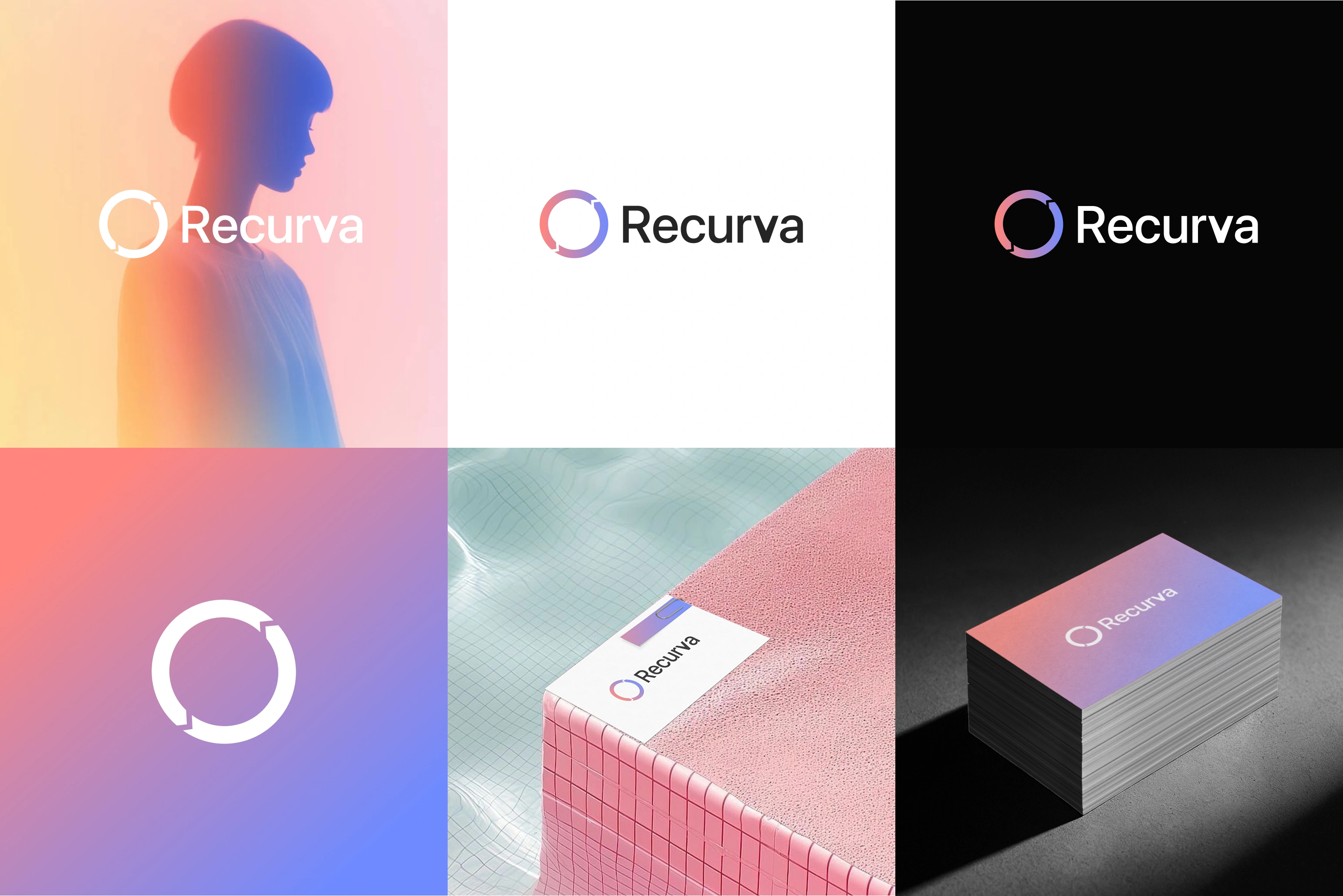
Brand Direction - Inspired by the Sky
The visual identity draws from a gradient inspired by the sky, blending pink, yellow, and blue. This choice reflects the core idea behind Recurva.
The sky is continuous, always present, constantly shifting yet never chaotic. It carries a sense of calm predictability.
That same feeling is what recurring revenue aims to provide, a system that runs in the background, steady and dependable.
The gradient becomes more than a visual element. Pink introduces a sense of growth and optimism, yellow brings clarity and energy, while blue grounds the experience in trust and stability. As these colors transition smoothly into one another, they create a subtle sense of movement, reinforcing the idea of continuity.
Rather than using harsh contrasts, the interface leans into this softness. The gradient guides attention, adds depth, and creates a rhythm that makes the experience feel effortless.
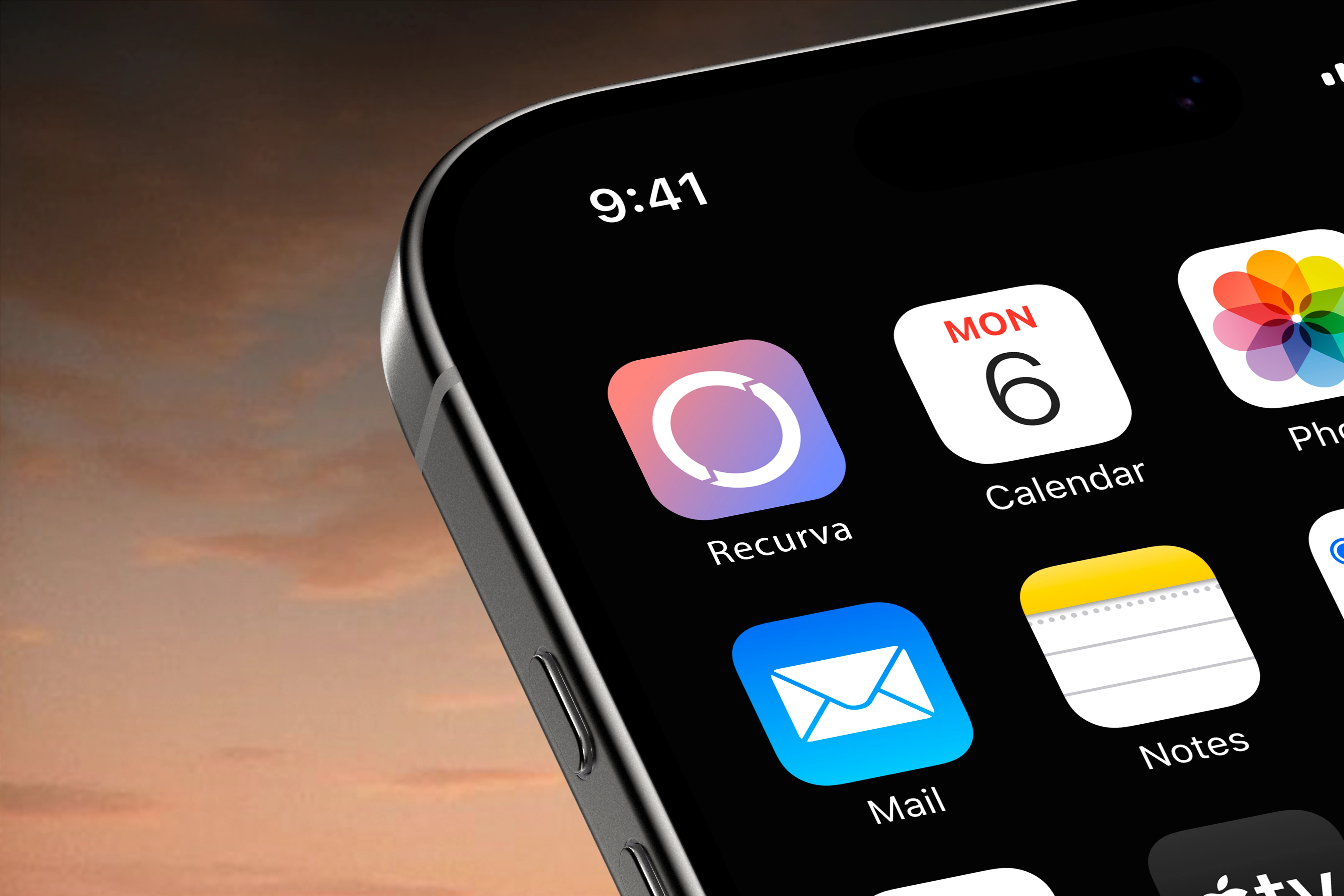
App Icon
Execution
The entire experience was designed and built in Framer, allowing layout, interaction, and responsiveness to be developed together. This made it easier to refine details directly in the environment where the final experience lives.
Careful attention was given to how the design adapts across screen sizes, particularly larger and ultra-wide displays where layouts often lose balance. Spacing and alignment were adjusted to maintain consistency without disrupting the overall flow.
Interactions were kept subtle and purposeful. Motion is used to support continuity, helping each section transition naturally into the next so the experience feels connected from start to finish.
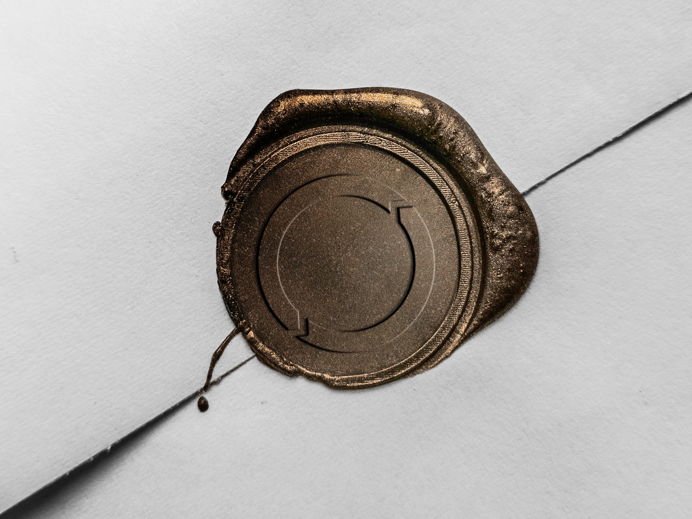
Metal Stamp
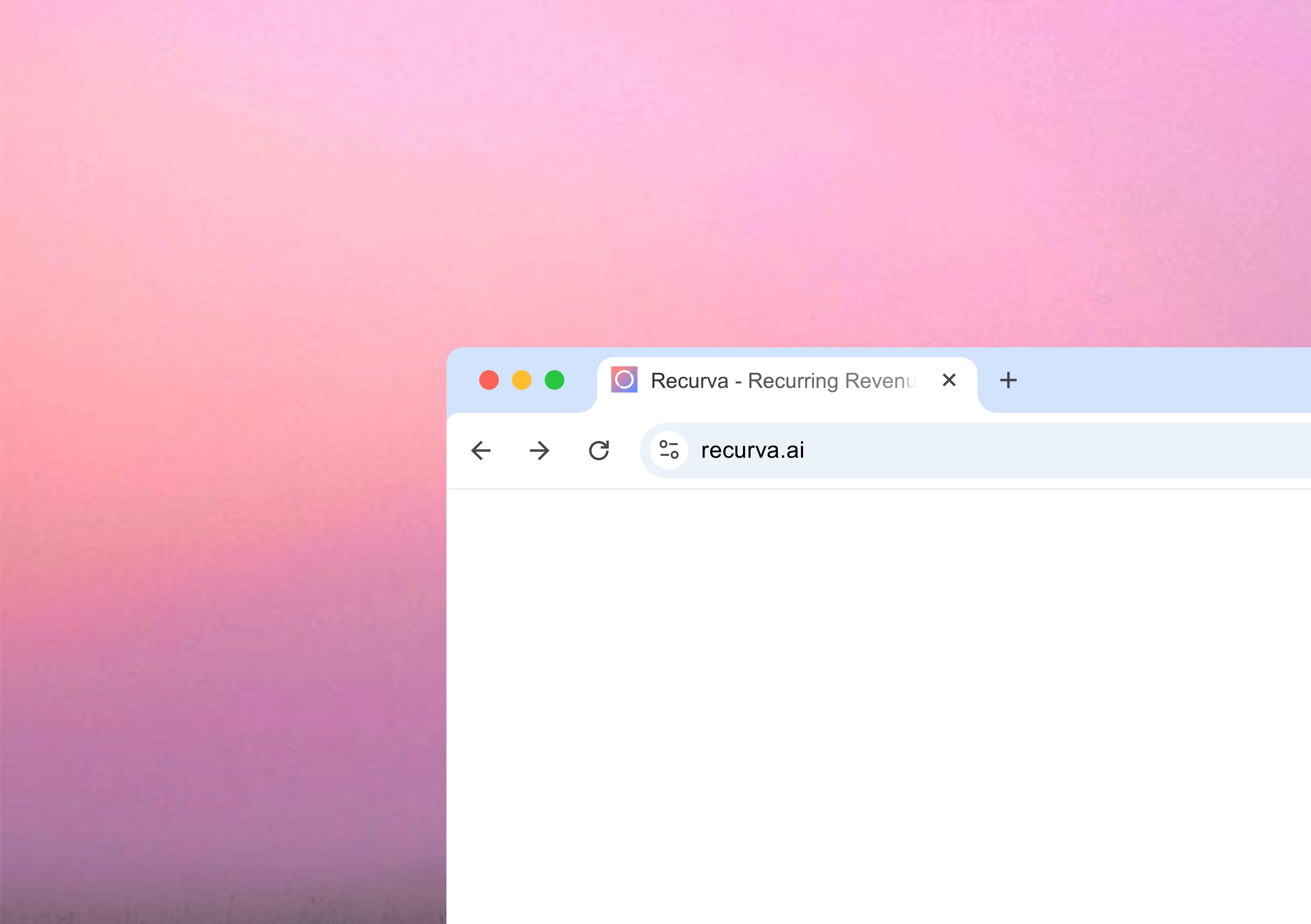
Recurva Favicon
Outcome
The final experience communicates value more clearly and reduces hesitation early in the journey. Users are able to grasp the core idea quickly, while the continuous flow of the page keeps them engaged.
Instead of pushing for action, the design builds confidence gradually, making the next step feel natural.
Book a call ❇️
If you’re building products where clarity, conversion, and flow matter, I’d be glad to help shape that experience.

Like this project
Posted May 6, 2026
Crafting a brand identity and landing page that transforms a technical concept into a seamless, intuitive experience.