Amapola Brand Identity Design
Alexandra Pérez
Project overview
Amapola is a Nicaraguan clothing brand rooted in women’s empowerment and self-expression. The goal was to evolve a striking but isolated logo into a full visual identity that honors local heritage while feeling ready for a global audience.
What I did: Expanded the brand into a unified system inspired by the amapola flower, anchored in a signature orange palette, refined typography, and cohesive touchpoints across digital, print, and produc
The challenge
A strong logo is not enough to build a consistent fashion brand experience, so the challenge was to expand Amapola’s existing mark into a complete, flexible identity system that could scale across product, packaging, and digital while staying premium and cohesive. At the same time, the brand needed to honor its Nicaraguan roots without leaning on clichés, balancing simplicity and refinement with enough distinctiveness to feel recognizable and ready for a global audience.
Strategy
The strategy was to translate the essence of the amapola flower into a modern brand system that feels confident, feminine, and elevated.
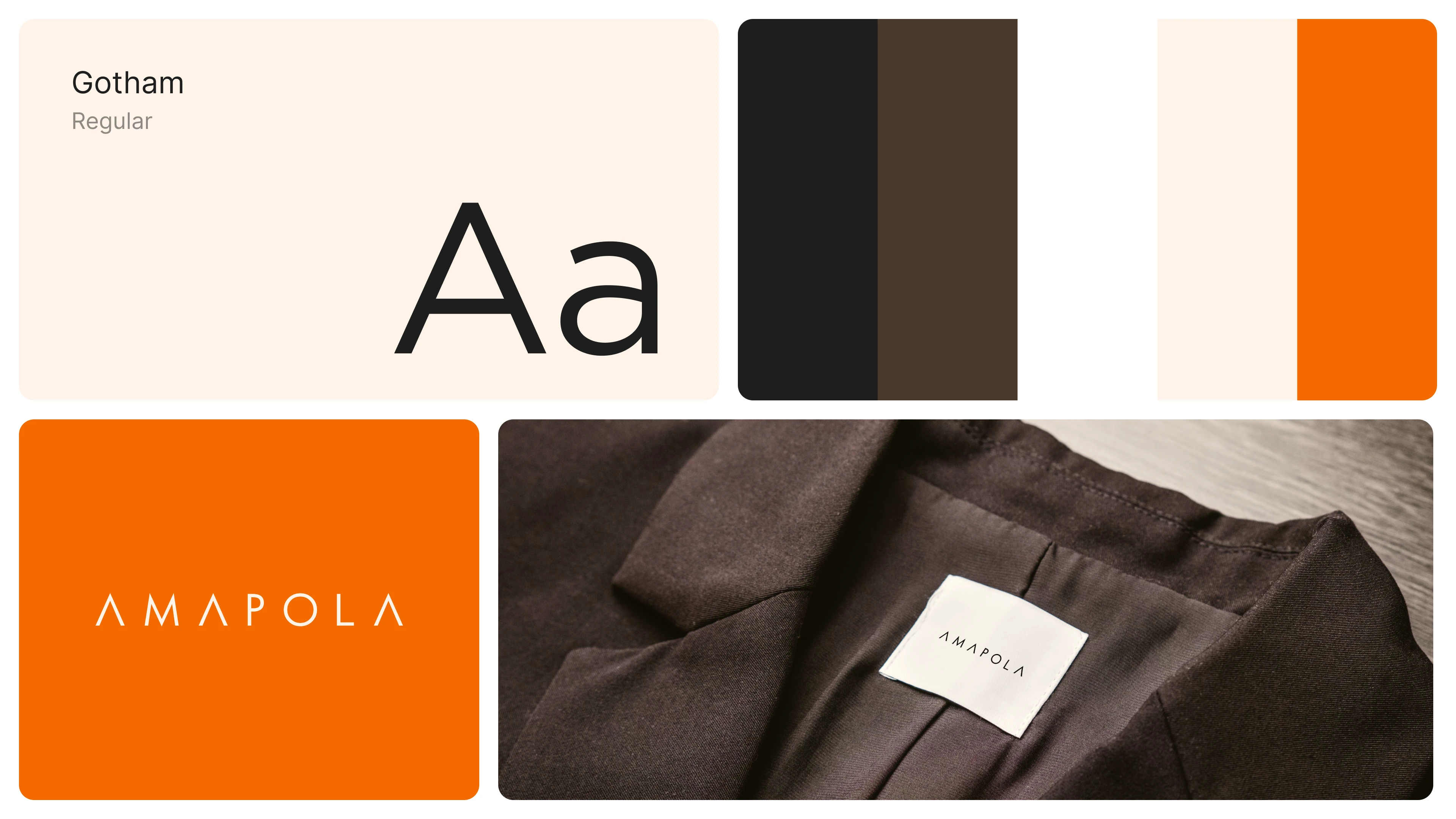
Own a recognizable color signature: the orange palette becomes an immediate brand cue, balancing warmth and boldness.
Refine the brand voice through typography: clean, modern type creates a premium feel and improves legibility across product and print.
Build cohesion through repeatable rules: consistent spacing, hierarchy, and layout decisions help the brand scale across many touchpoints.
Bridge local and global: keep the identity rooted in Nicaraguan origin through tone and inspiration, while presenting it in a contemporary, internationally readable system.
Touchpoints delivered
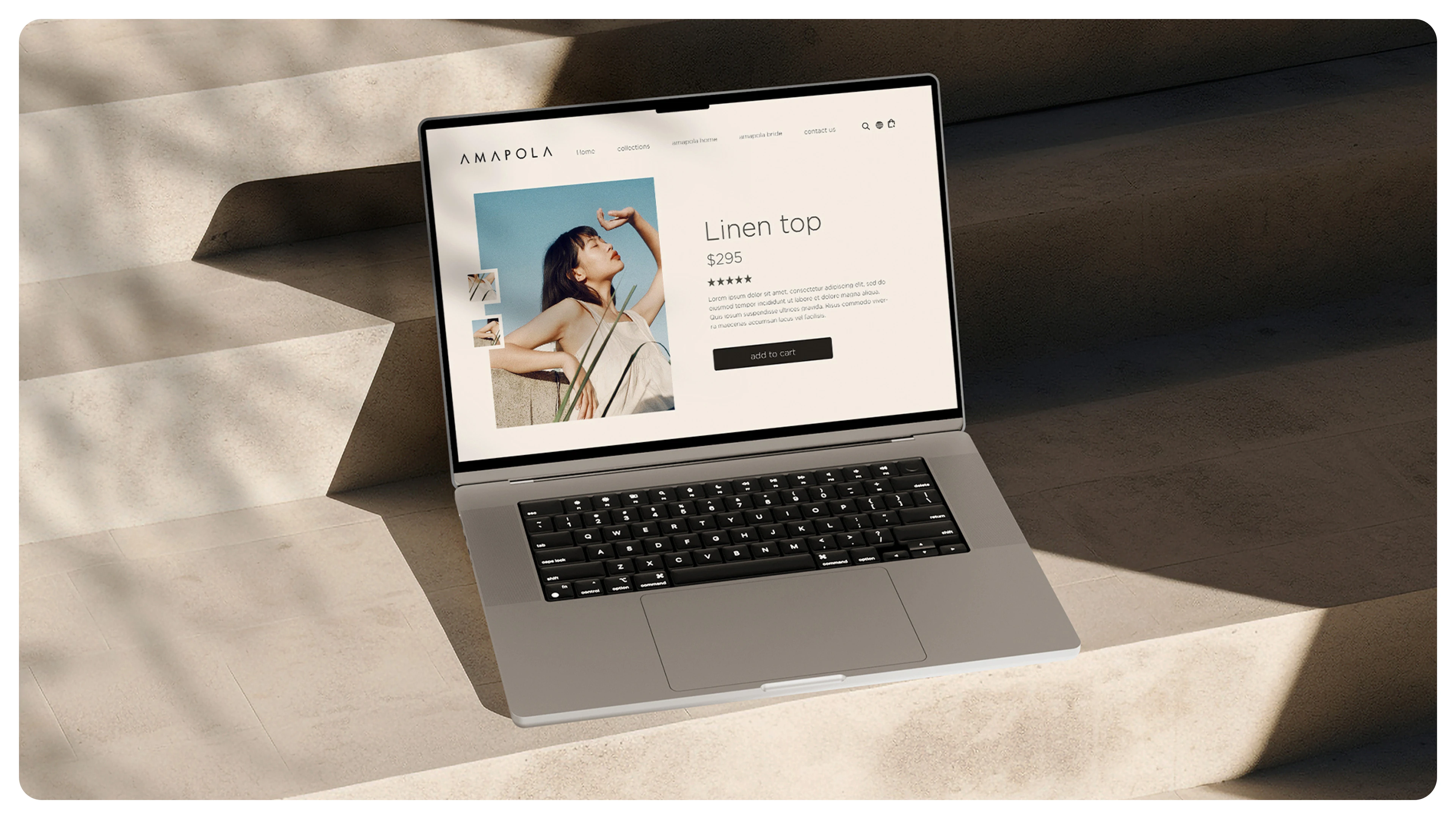
Visual identity system (logo usage and brand guidelines direction)
Color and typography system (signature orange palette and refined type)
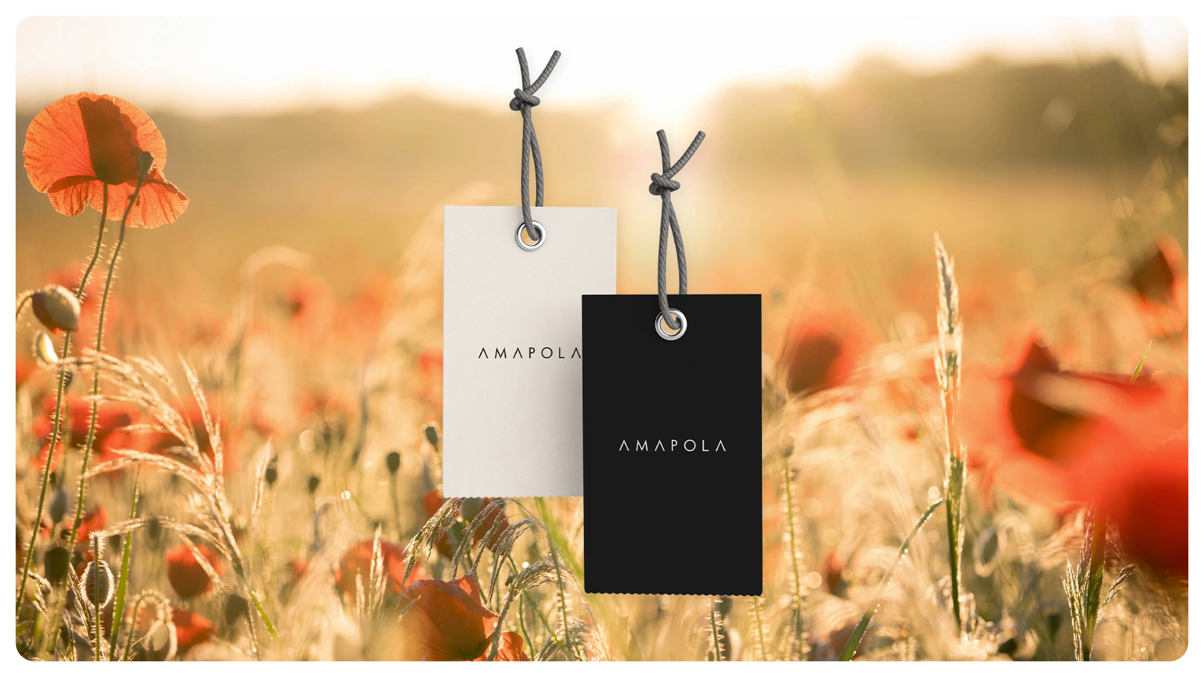
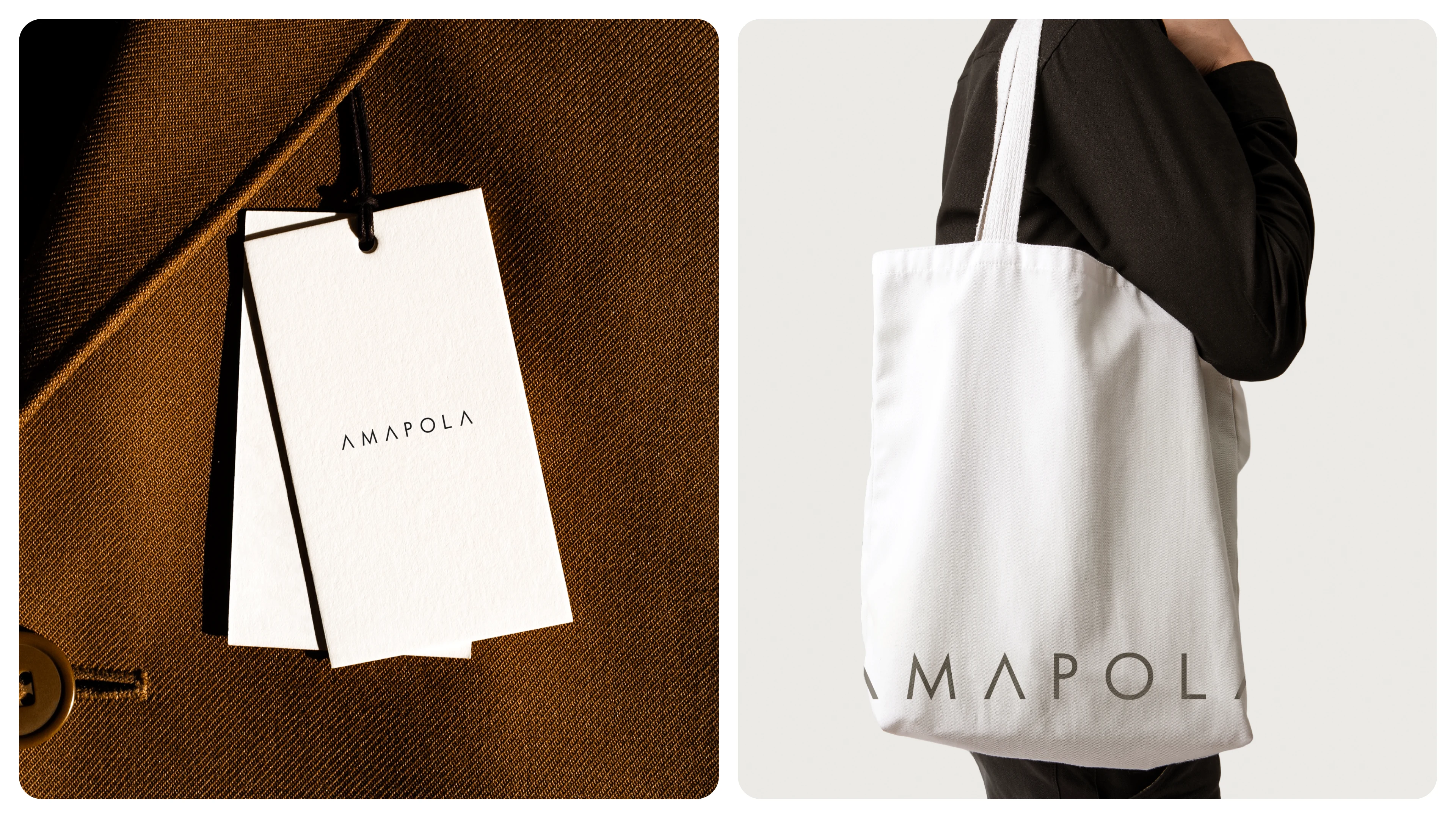
Print collateral (brand cards and tags)
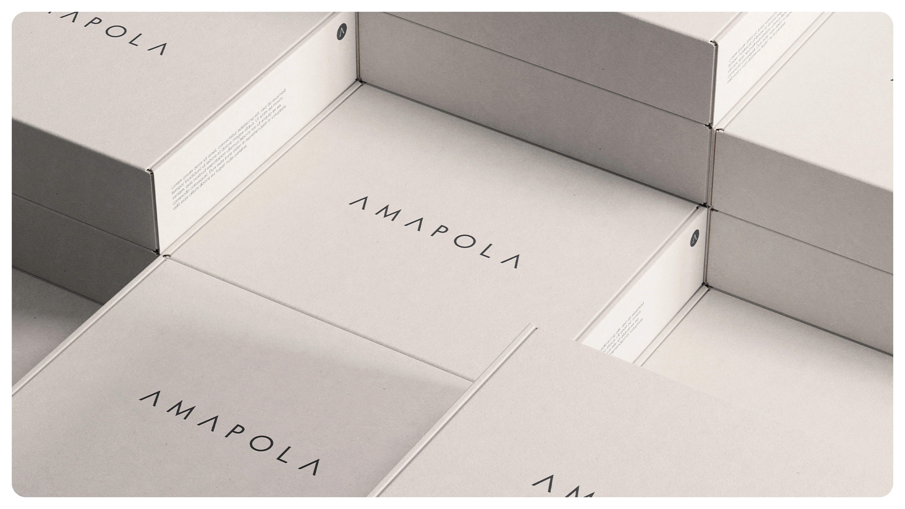
Product and packaging applications (hang tags, labels, box concepts)
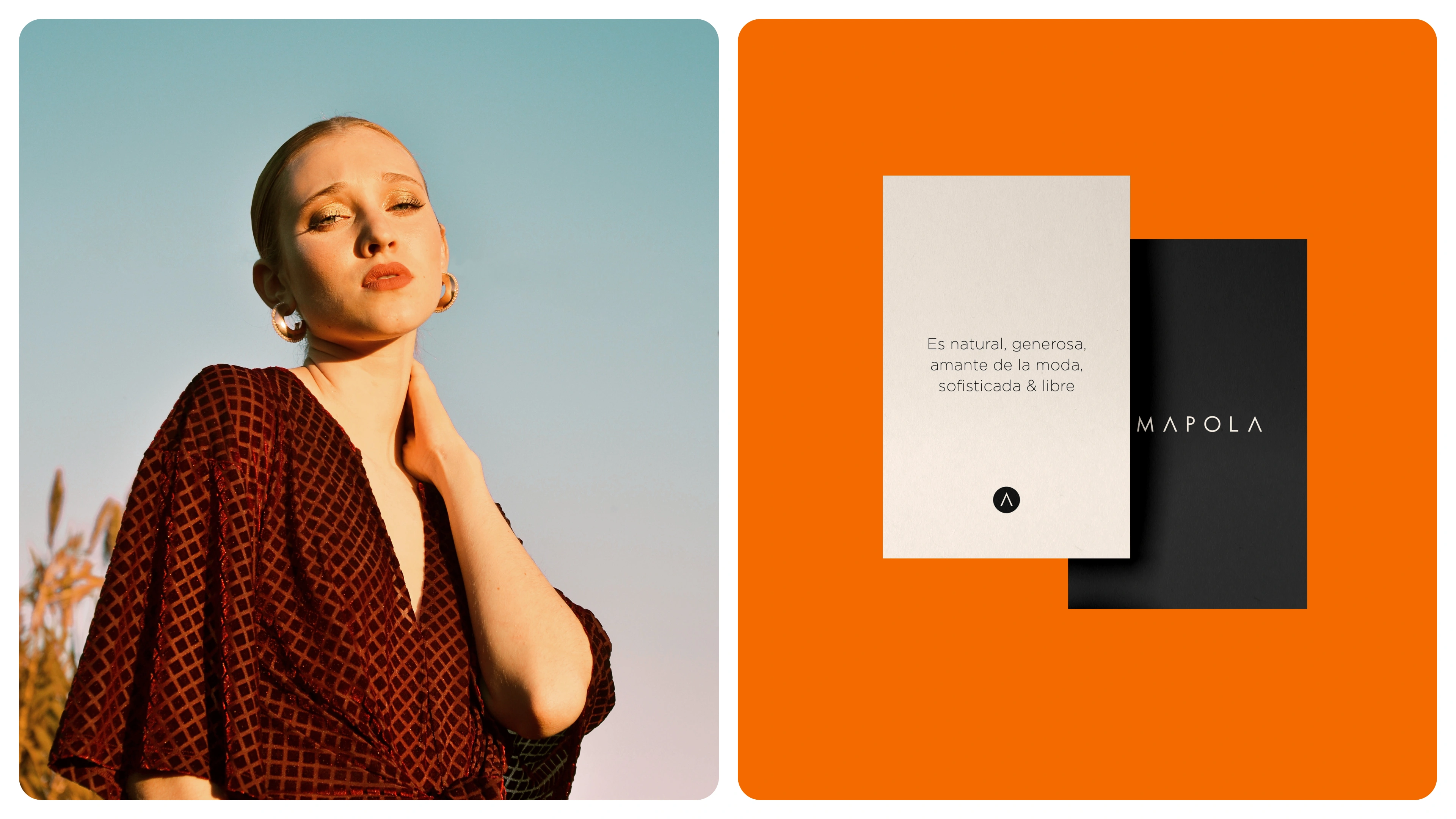
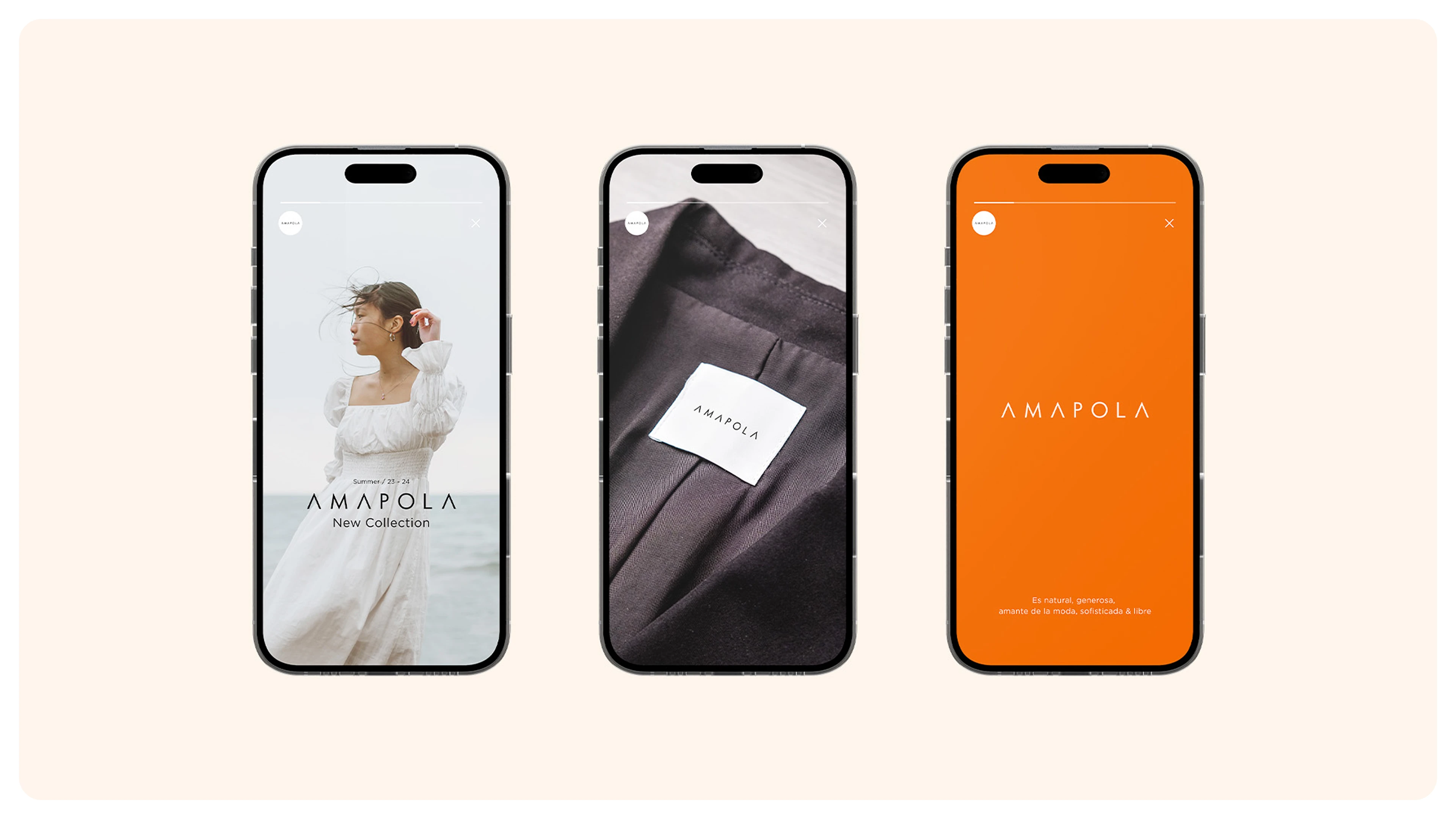
Digital brand presence (social-ready assets and layouts)
Branded merchandise (tote concept and extensions)
What the client and audience experiences
This identity helps Amapola show up as:
empowering (bold, self-assured tone)
elevated (clean typography and restraint)
distinct (a strong orange signature and cohesive system)
consistent (touchpoints that feel like one brand across product and digital)
The result is a fashion identity that feels rooted and modern, with a bold signature that carries from tags to packaging to social.
Like this project
Posted Feb 13, 2026
Evolved Amapola’s logo into a complete identity system, anchored in a signature orange palette, refined typography, and cohesive touchpoints.