Inspira Brand Identity Design
Alexandra Pérez
Project overview
Inspira grew from a personal healing practice rooted in touch, movement, and human connection. The goal was to translate that intimacy into a brand that still reads as credible, professional, and trustworthy, without losing softness.
What I did: Built a light, modern identity system where flowing lines and a luminous palette bridge both worlds: clinical clarity and human warmth.
The challenge
Healing/wellness brands can swing to extremes:
Too “medical” → feels cold, distant, overly clinical
Too “spiritual” → can feel vague, less credible
Inspira needed both: professional care + deeply human presence.
Strategy
The strategy was to create trust through clarity while preserving emotional softness, so the experience feels grounded, intentional, and human.
Credibility without feeling clinical: clean typography, generous spacing, and minimal composition signal professionalism and care.
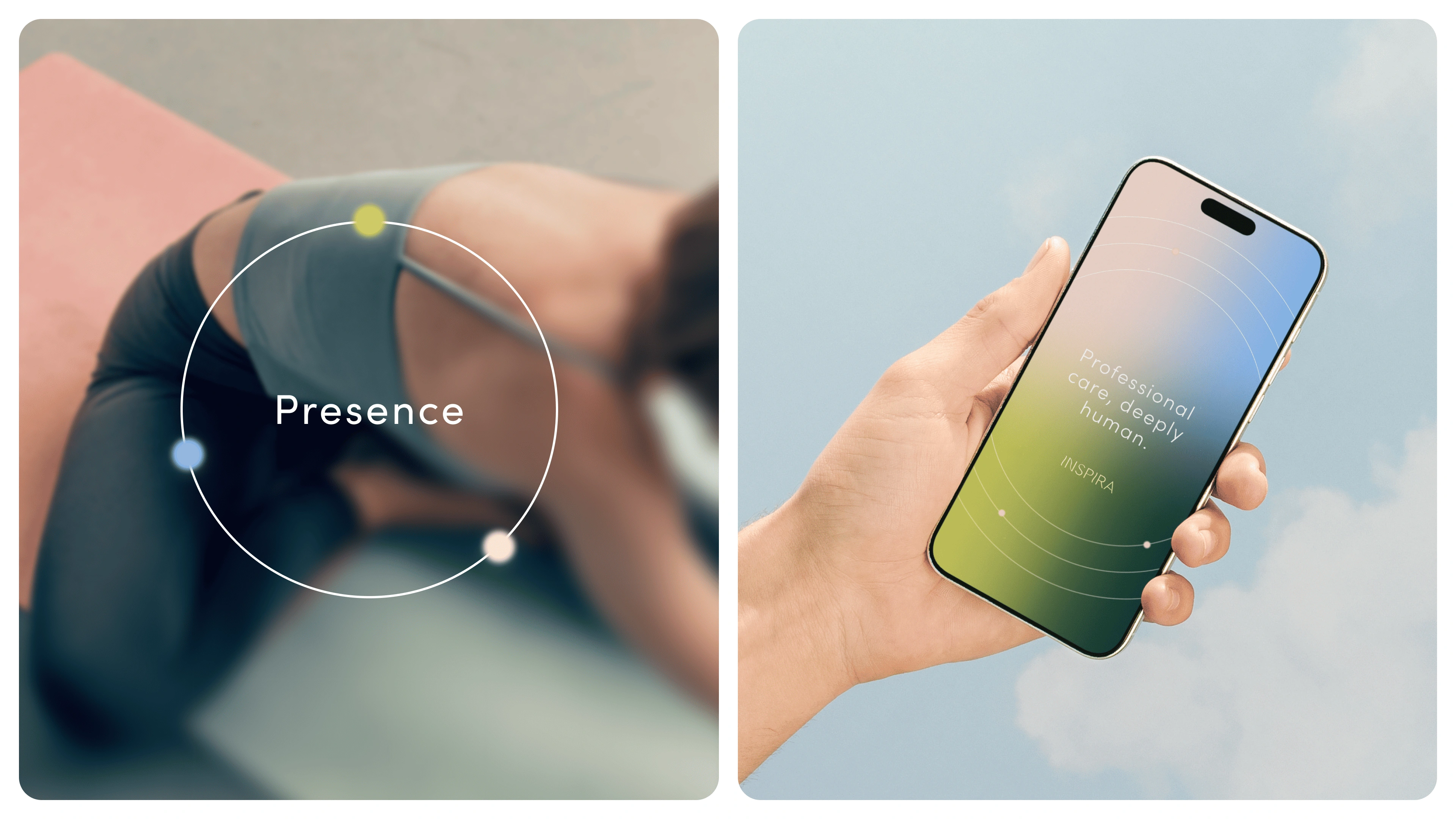
Human presence through motion cues: flowing lines and gentle gradients, inspired by touch and movement, keep the identity embodied rather than sterile.
Consistency across touchpoints: the system stays cohesive from digital applications to print, balancing calm structure with warmth.
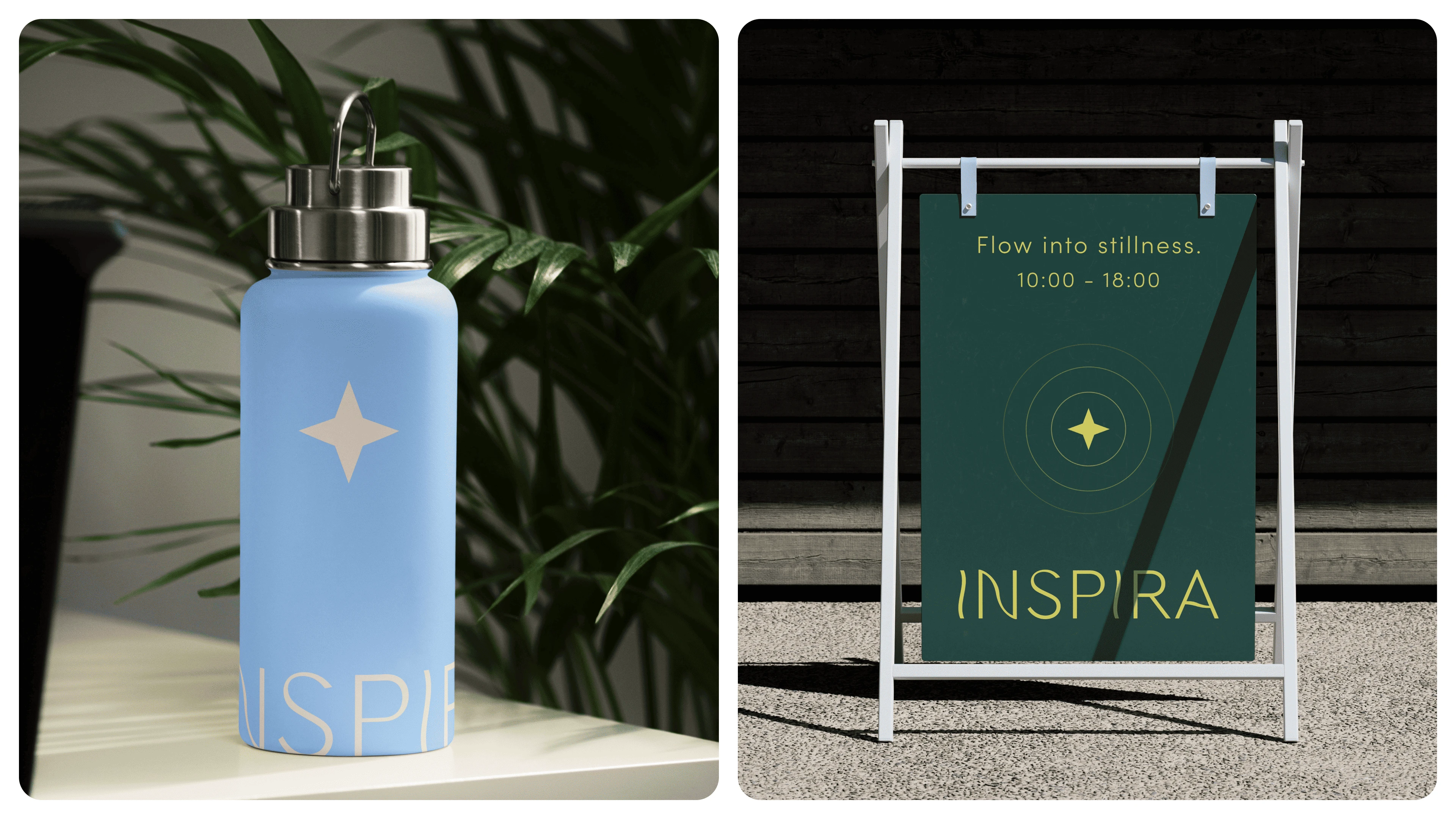
Touchpoints delivered
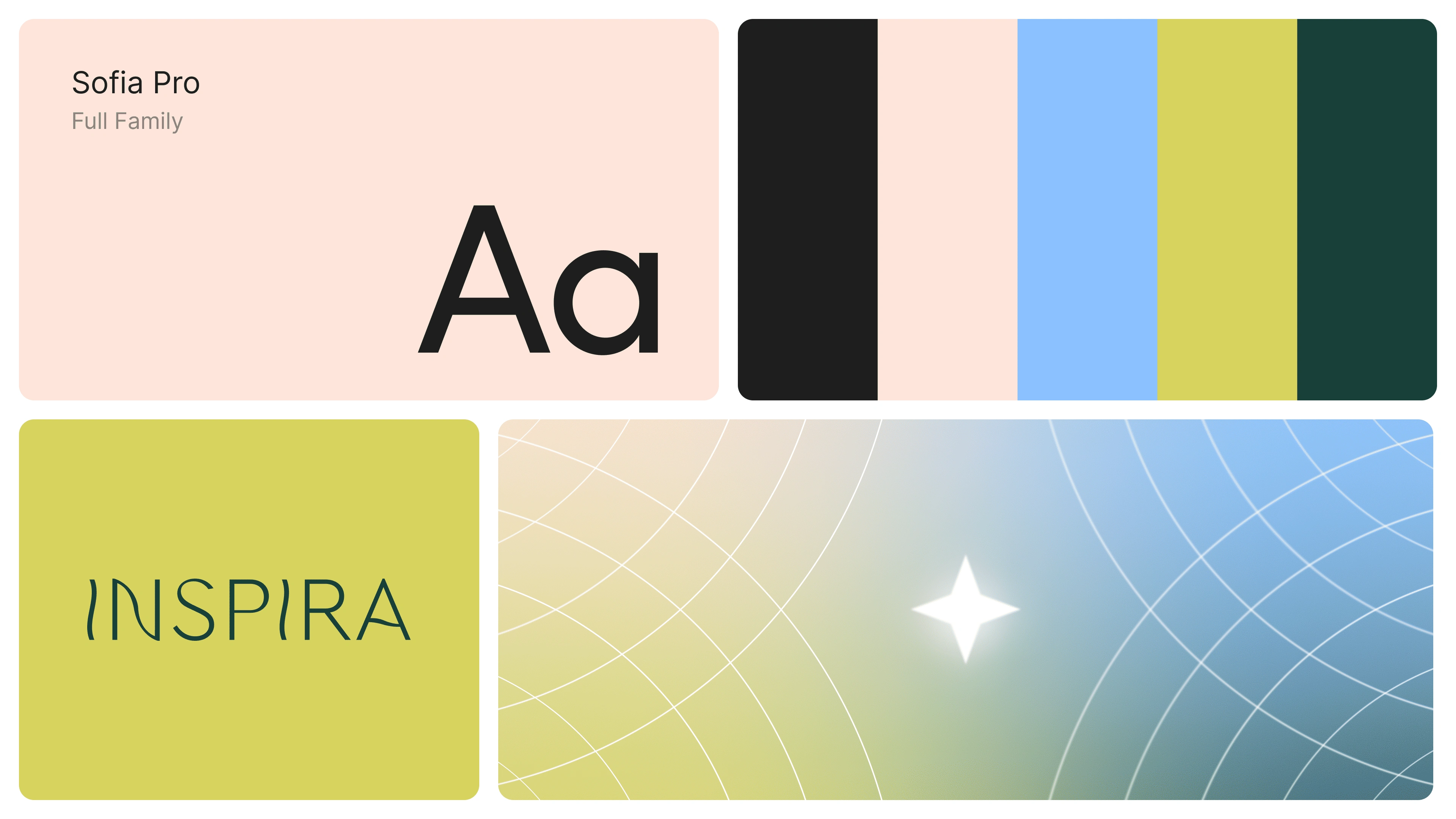
Brand identity design (logo lockup and system)
Color palette and typography system
Graphic motifs (flow lines and light-field elements)
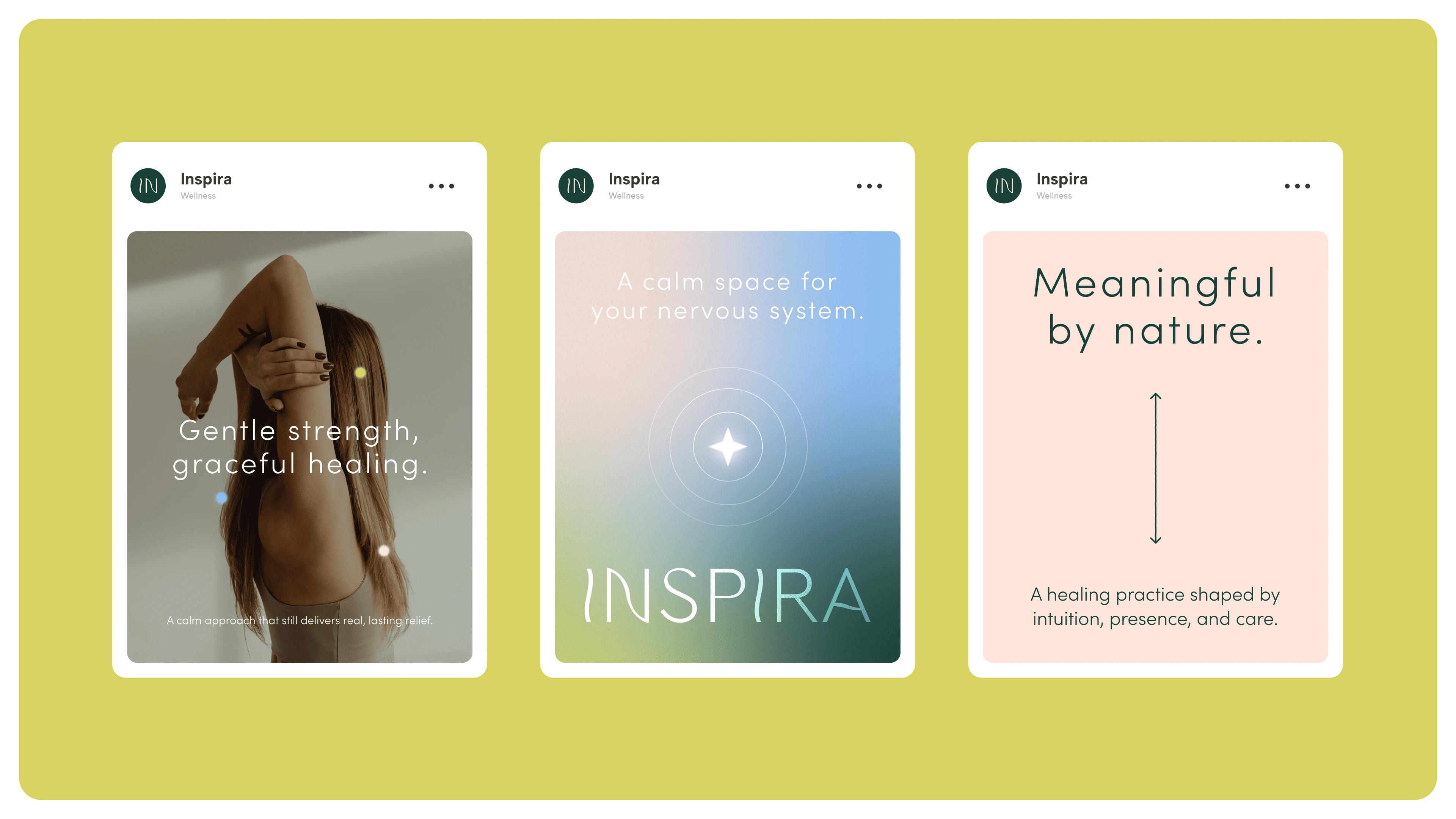
Social media templates (feed-ready layouts)
Brand presence key visual (campaign-style hero imagery)
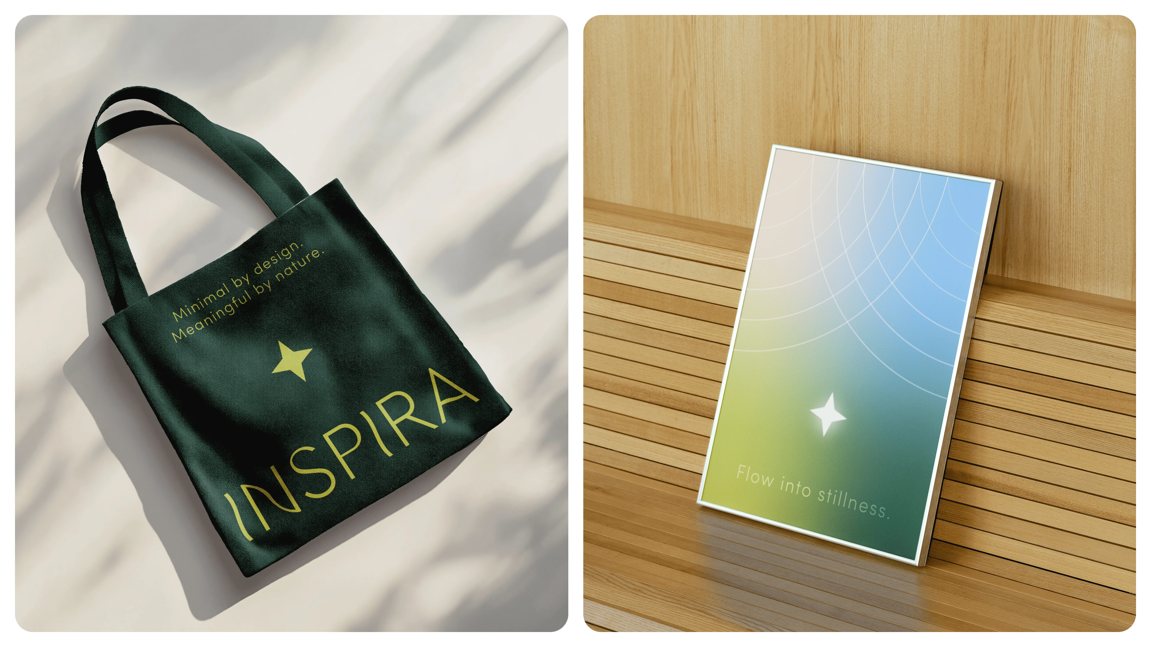
Print collateral concept (for example, card or tag application)

What the client and audience experience
This identity helps Inspira show up as:
trustworthy (professional, clean, intentional)
gentle (soft gradients, organic movement)
present (calm and embodied)
cohesive (consistent across touchpoints)

The result is a brand that feels like a calm exhale: modern, credible, and deeply human.
Like this project
Posted Apr 23, 2026
Designed a light, modern brand identity for Inspira that bridges clinical clarity and human warmth.