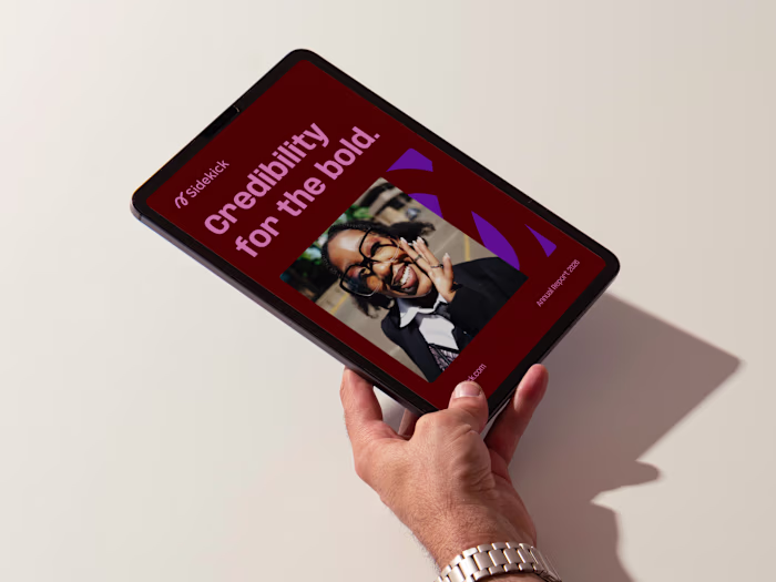
Clarity Presentation Template Design
Alexandra Pérez
Project overview
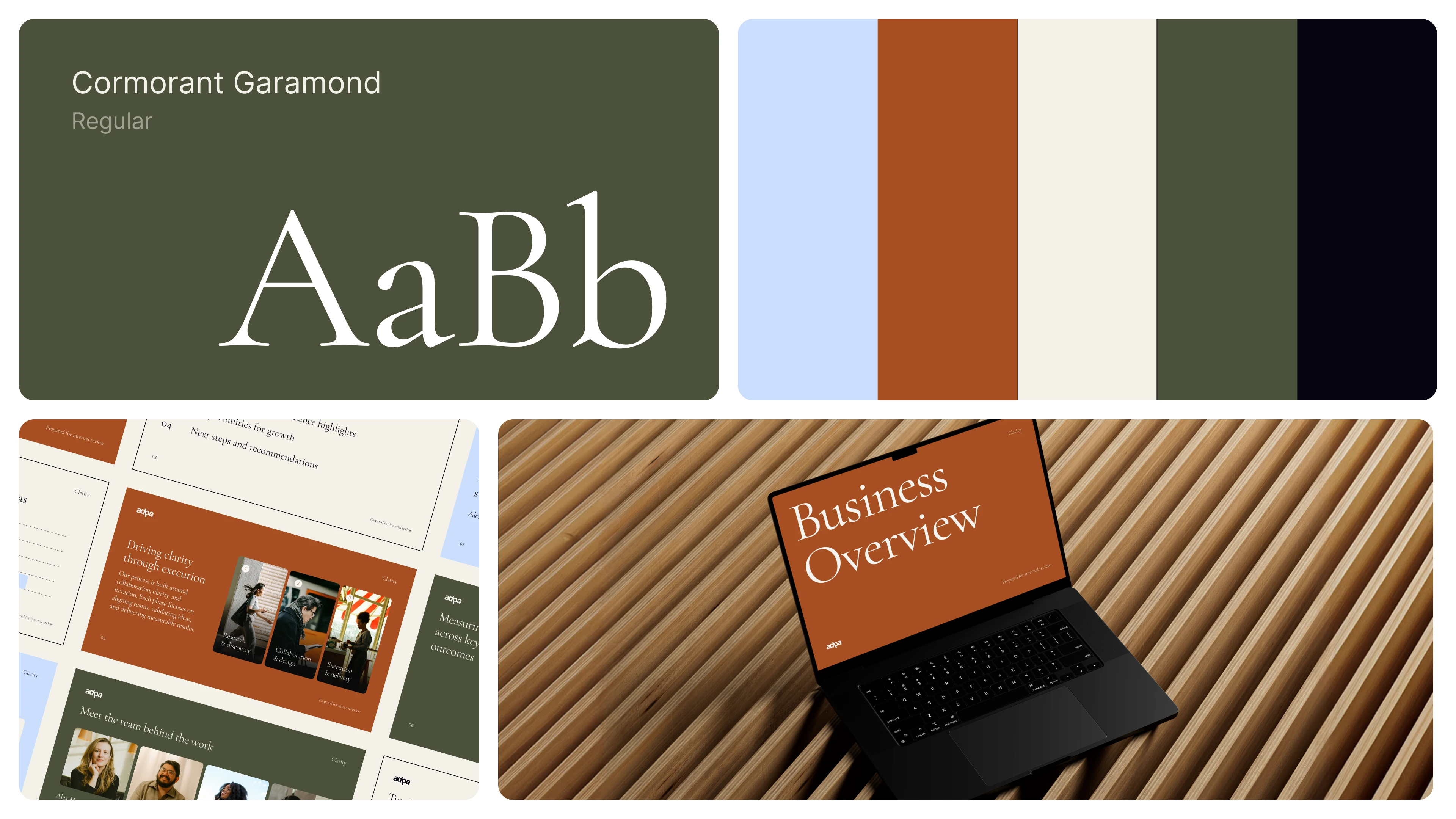
Clarity is a presentation template designed to move business decks away from the typical sales pitch and toward something more grounded and thoughtful. Rooted in editorial design and a warm, earthy palette, it uses clear hierarchy, generous white space, and elegant typography to help teams communicate with confidence.
What I did: Designed an editorial-inspired deck system with repeatable layouts, data slides, and content modules that make business storytelling feel calm, credible, and polished.
The challenge
Most business decks default to loud, sales-driven design patterns that can make even strong content feel generic. The challenge was to create a template that feels refined and grounded, while still being practical for real teams to use across many scenarios, including strategy updates, internal reviews, and performance reporting.
Strategy
The strategy was to borrow from editorial design to create a calmer, more trustworthy deck experience, then translate that into flexible slide building blocks.
Make hierarchy do the work: strong typographic scale, consistent grid decisions, and clear spacing guide the reader without relying on heavy decoration.
Warm, grounded tone: an earthy palette and restrained accents shift the deck away from pitch energy and toward clarity and confidence.
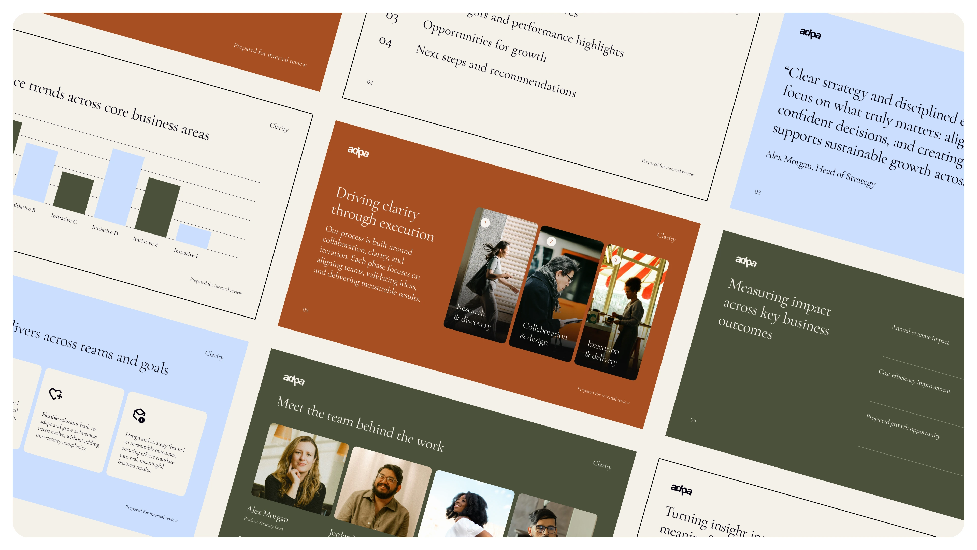
Design for repeatable use: modular slide types for agendas, section dividers, data visualization, team pages, and recommendations keep output consistent.
Support both narrative and data: slides balance whitespace with structure so storytelling, metrics, and insights all feel equally considered.
Touchpoints delivered
Presentation template system (master layouts and style rules)
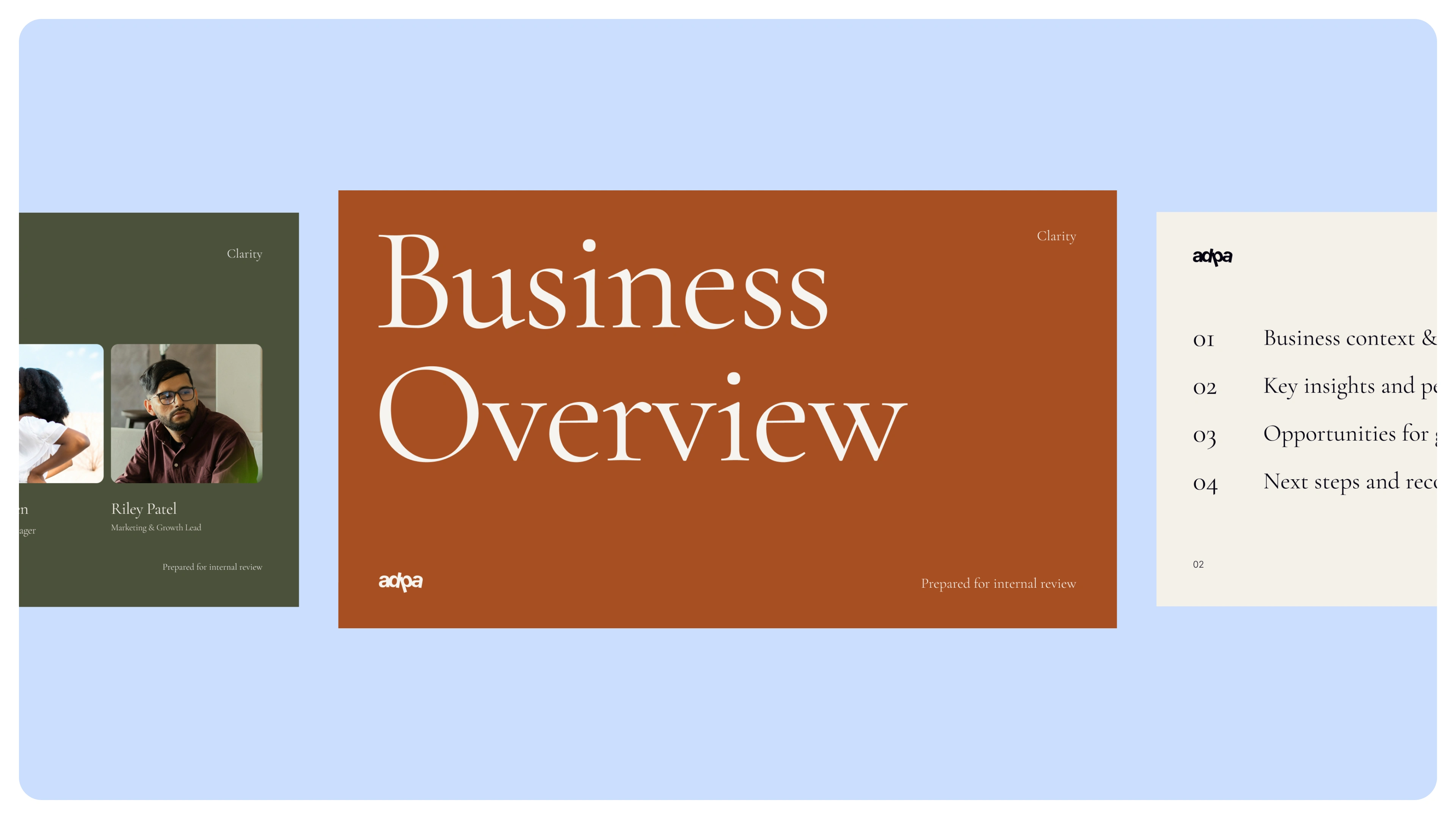
Core slide library (cover, agenda, dividers, content, team, quote, data slides)
Chart and data styles (clear, consistent visual language for metrics)
Editorial layout components (grids, spacing rules, type hierarchy)
Color and typography direction (earthy palette and elegant type pairing)
What the client and audience experiences
This template helps teams present as:
grounded (calm tone, warm palette, thoughtful spacing)
credible (editorial structure and strong hierarchy)
clear (easy-to-follow narrative and data slides)
consistent (repeatable system across many decks)
The result is a deck system that makes business communication feel composed, modern, and confident.
Like this project
Posted Feb 13, 2026
Designed Clarity, an editorial-inspired presentation template with warm earthy colors, elegant typography, and modular layouts for business storytelling.
Likes
0
Views
7