Mini Visual Identity for Coastal Sage Bread
Rachel Cohen
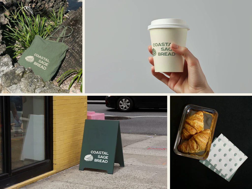
Coastal Sage Logo Mockups
Overview
Lindsay came to me looking for a visual identity for her new micro bakery, Coastal Sage Bread. Her passion has evolved into a small business, baking anything and everything sourdough from her home kitchen. As her business grows to pop ups and farmers markets, she found herself in need of a visual identity.
The Result
A minimalist and rustic mini brand featuring an abstract hand-drawn logo and serene color palette.
Constraints
Coastal Sage is new business, so she had a limited budget, but wanted to invest in the visual identity early on.
Lindsay had two main requests for her brand:
She envisioned the logo as a loaf of bread that could look like a variety of bakes.
The color palette should be based around sage, after the business name.
Brand Mood
Lindsay described her business as:
grounded | warm | natural | rustic | minimalist
She wanted to balance a modern and rustic, Scandinavian feel with a coastal California aesthetic.
The Final Mini-Brand
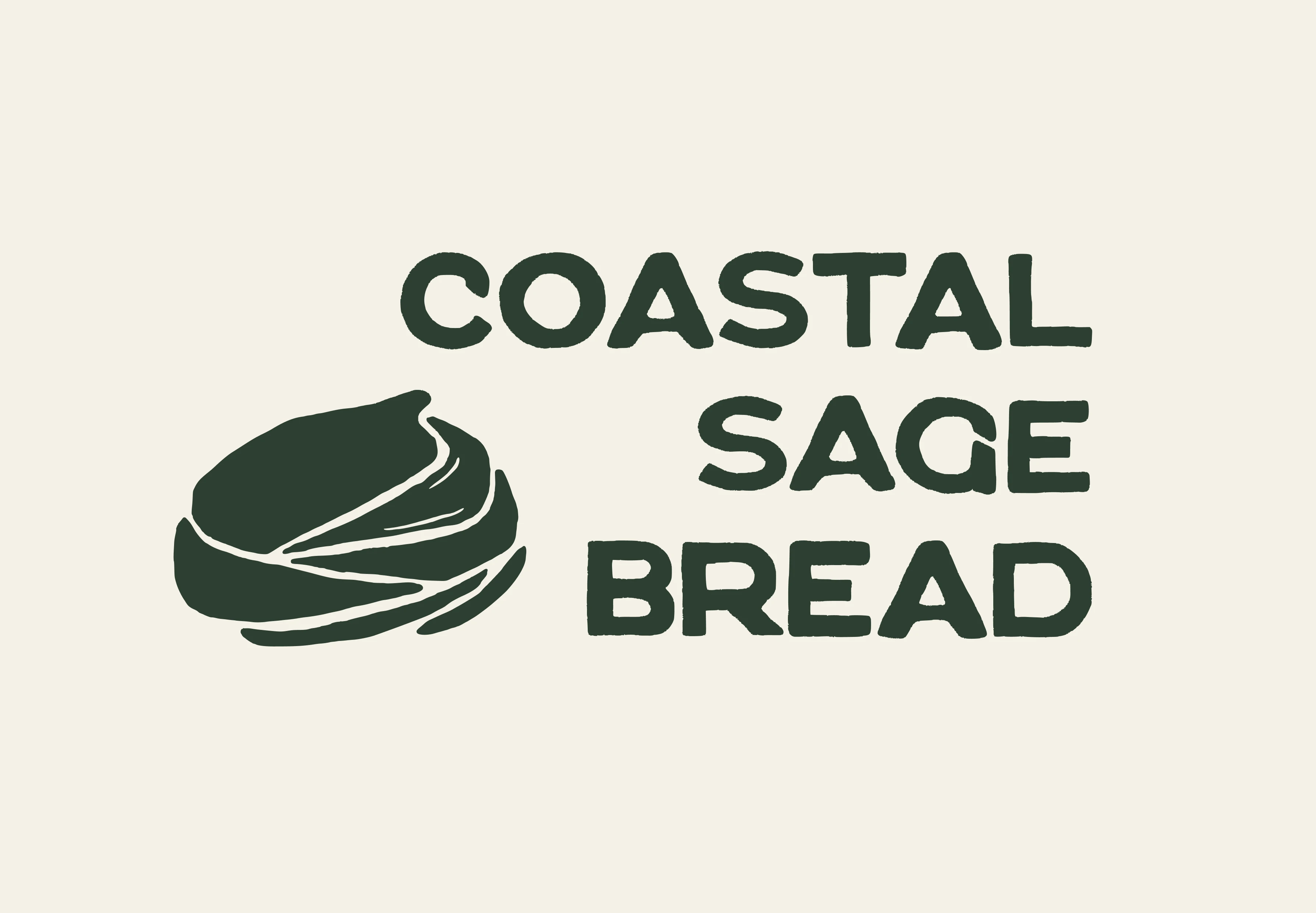
Coastal Sage Logomark

Coastal Sage Boule Brandmark
The coastal sage boule brandmark was designed to look like a stretched and folded ball of dough, a crusty loaf of sourdough, and a cinnamon roll all in one. I drew the logo by hand to amplify the homemade feeling.

Horizontal Wordmark
The wordmark was also hand-drawn, inspired by three or four typefaces that were close to the look we were aspiring to, but didn't quite hit the mark. Given that they're hand-drawn, each character is slightly different and a bit rough around the edges, adding to the rustic feel.
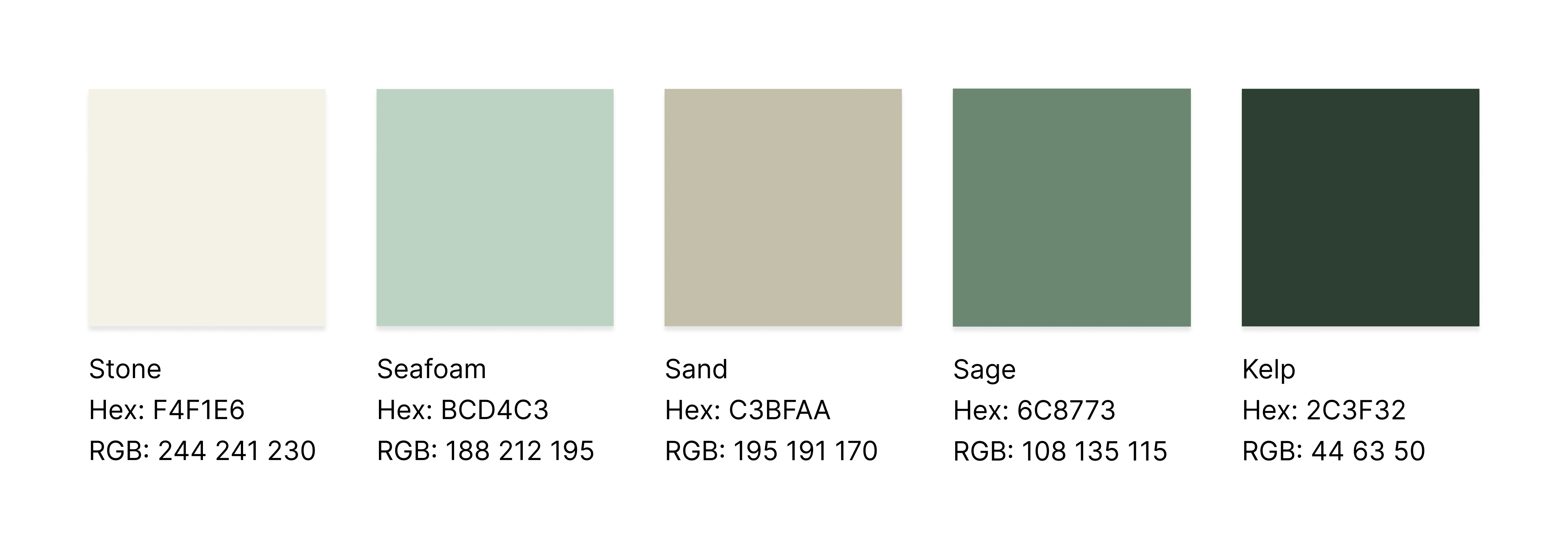
Coastal Sage Color Palette
The color palette centers around sage and balances it with sandy tones, reflecting the natural and serene aesthetics of modern Scandinavian interior design and coastal California, where Lindsay is based.
Take a Look
Like this project
Posted May 29, 2025
Developed a mini visual identity for Coastal Sage Bread, a San Diego-based micro-bakery, featuring a hand-drawn logo and serene, natural sage color palette.
Likes
1
Views
29
Timeline
May 15, 2025 - May 23, 2025