CRO focused UX Audit for Small Business Lender
Rachel Cohen
Overview
The team at NBC, a small business lender, recently redesigned their website and is looking for additional opportunities for improvement via a comprehensive audit of the new website, application form, and competitive analysis.
This audit, which I completed as part of my work with CRO Metrics, focused primarily on user experience design, accessibility, and copy to create a conversion rate optimization testing plan.
View the full audit:
Audit Goals
Increase the number of users who start the Loan Application Form
Increase the number of users who complete the Loan Application Form
Increase leads gathered on the Partners page
Increase Loan Application Starts from the Loan Pages
Relevant Data
According to Google Analytics, 91% of users abandon the application form at step 1.
Visitor Breakdown: 50% mobile / 48% desktop / 2% tablet
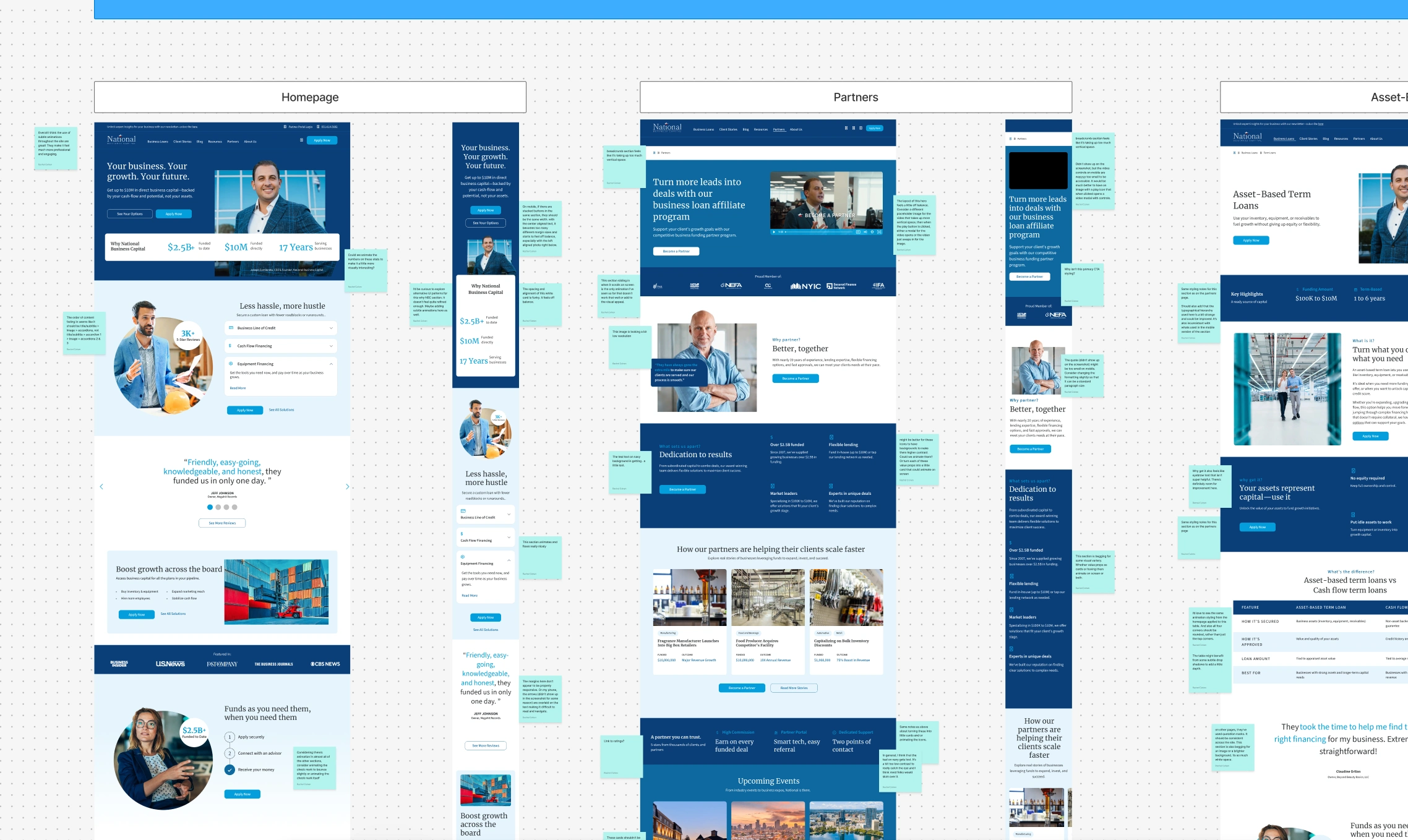
Website Improvements
More consistent use of micro-interactions and subtle animation across the website, rather than solely on the homepage.
Consider refining the NBC brand to create a more unique and memorable color palette and typography choices.
Create a design system to define spacing, color, CTA/interaction, and typography rules that ensure consistency across the brand and website.
a. The current site is very off balance. Some sections are totally crowded, and others have arguably too much negative space.
b. There is much room for improvement in typographical hierarchy and clarifying information architecture.
Double-checking that sections have the correct margins and are truly responsive across devices, as some mobile sections are getting cut off or not resizing.
Use eyebrow text to give more context to section headers. The current version has somewhat vague copy like "What is it?" and "Why get it?" without defining 'it'.
Application Improvements
Use clearer applications of color to ensure CTAs follow conventional UI patterns for active, inactive, disabled states, etc.
a. The CTA on question 1 of the form doesn't update from the inactive CTA color even when Q1 has been answered. This is likely why the application is abandoned by 91% of users.
There are a ton of steps to the application, but no clear indicator of how long it usually takes to complete. The progress indicator also appears to be broken, given that it updates inconsistently as a user progresses through the form.
Add copy at the beginning of the form or next to application CTAs on the website indicating how long the application takes to complete.
Competitive Analysis
Consider adding a calculator to show visitors how pricing works or a mini eligibility quiz.
Consider highlighting industries and client types
NBC's clients are busy, placing more emphasis on how quick the application process is and how quickly they can get funded may lead to higher conversion rates.
Funding Circle and Lendio are great examples of best-in-class universal navigation (layout, information architecture, and interaction) and color application.
Like this project
Posted May 26, 2025
Conducted a conversion-rate-optimization-focused UX audit for a small business lender's recently redesigned website and lending application.
Likes
0
Views
14