Trackstack — The inbox for demos

Ville Oké


Trackstack — The Invoice for demos
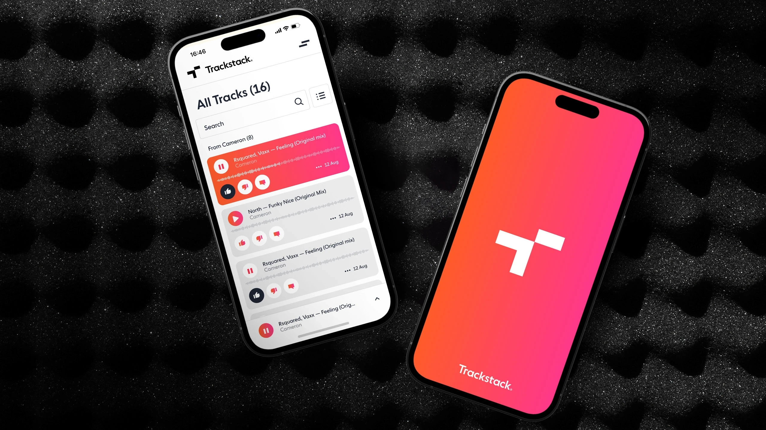
Trackstack streamlines the workflow for finding up-and-coming artists by collecting and sorting all demo-tracks sent to DJ:s and labels in one place.
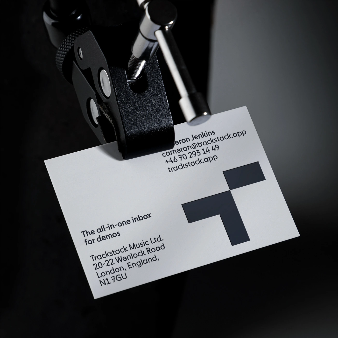
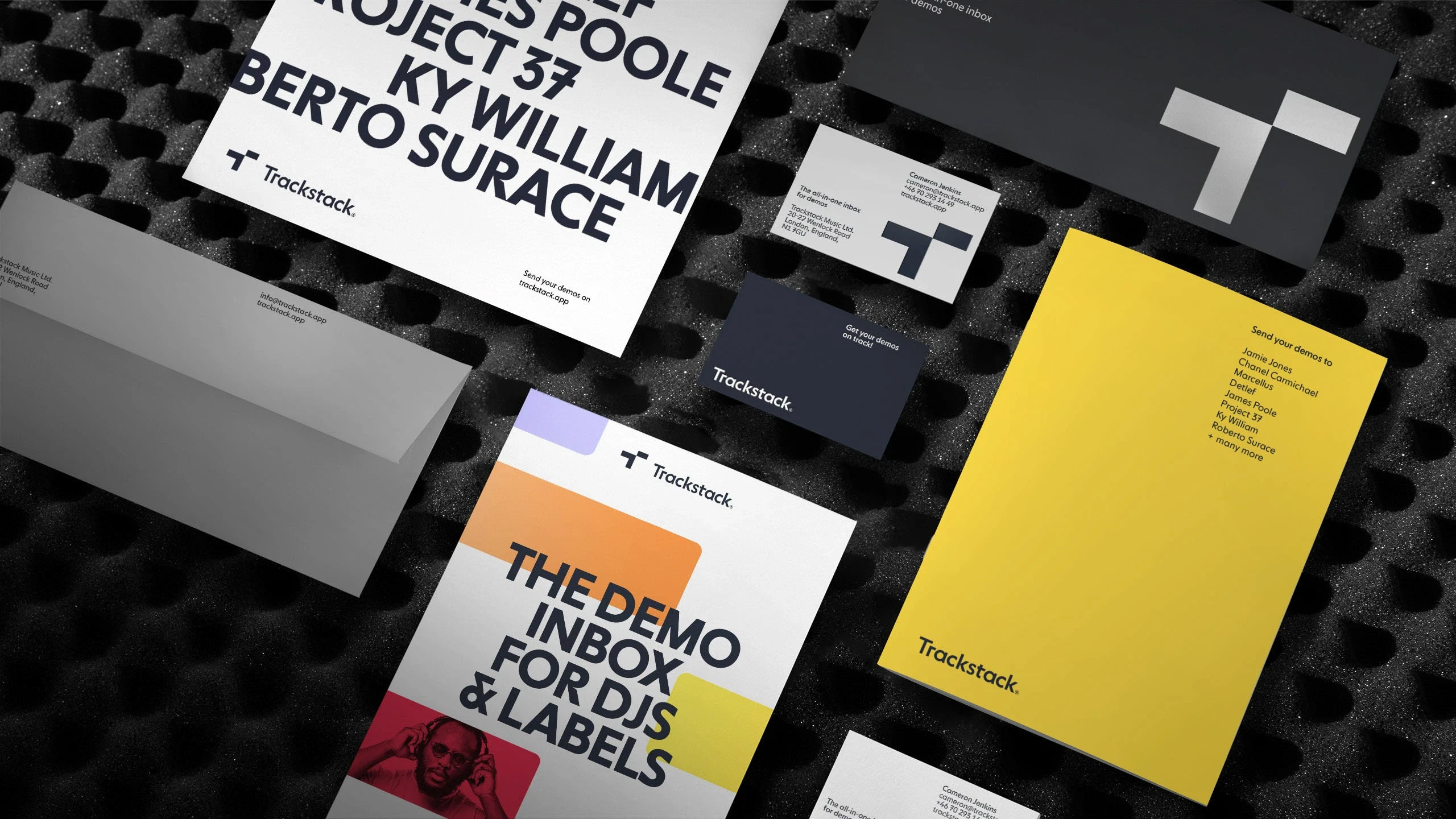
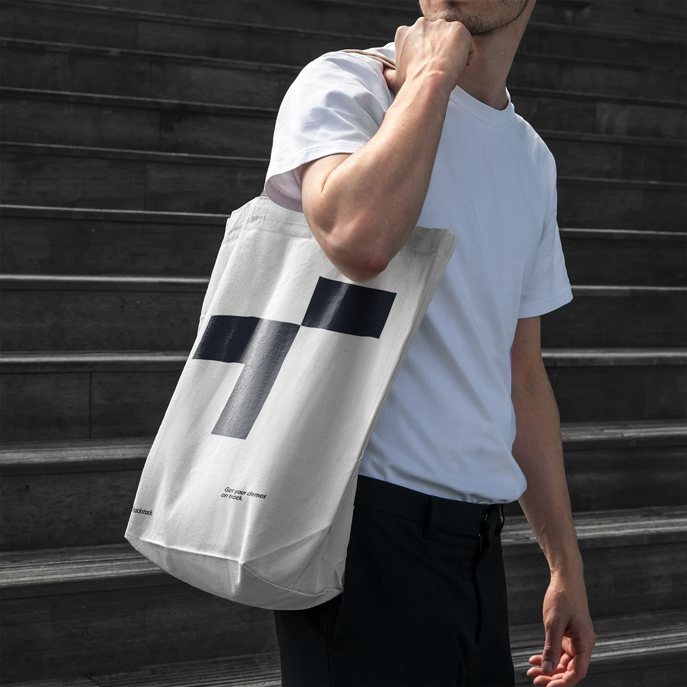
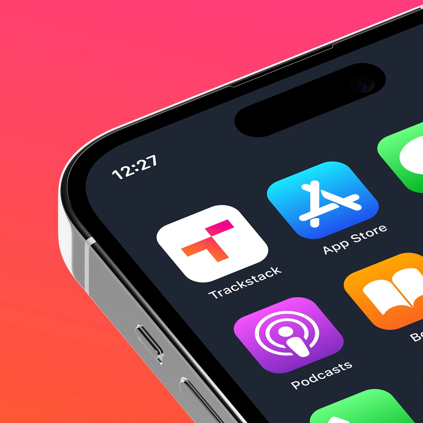
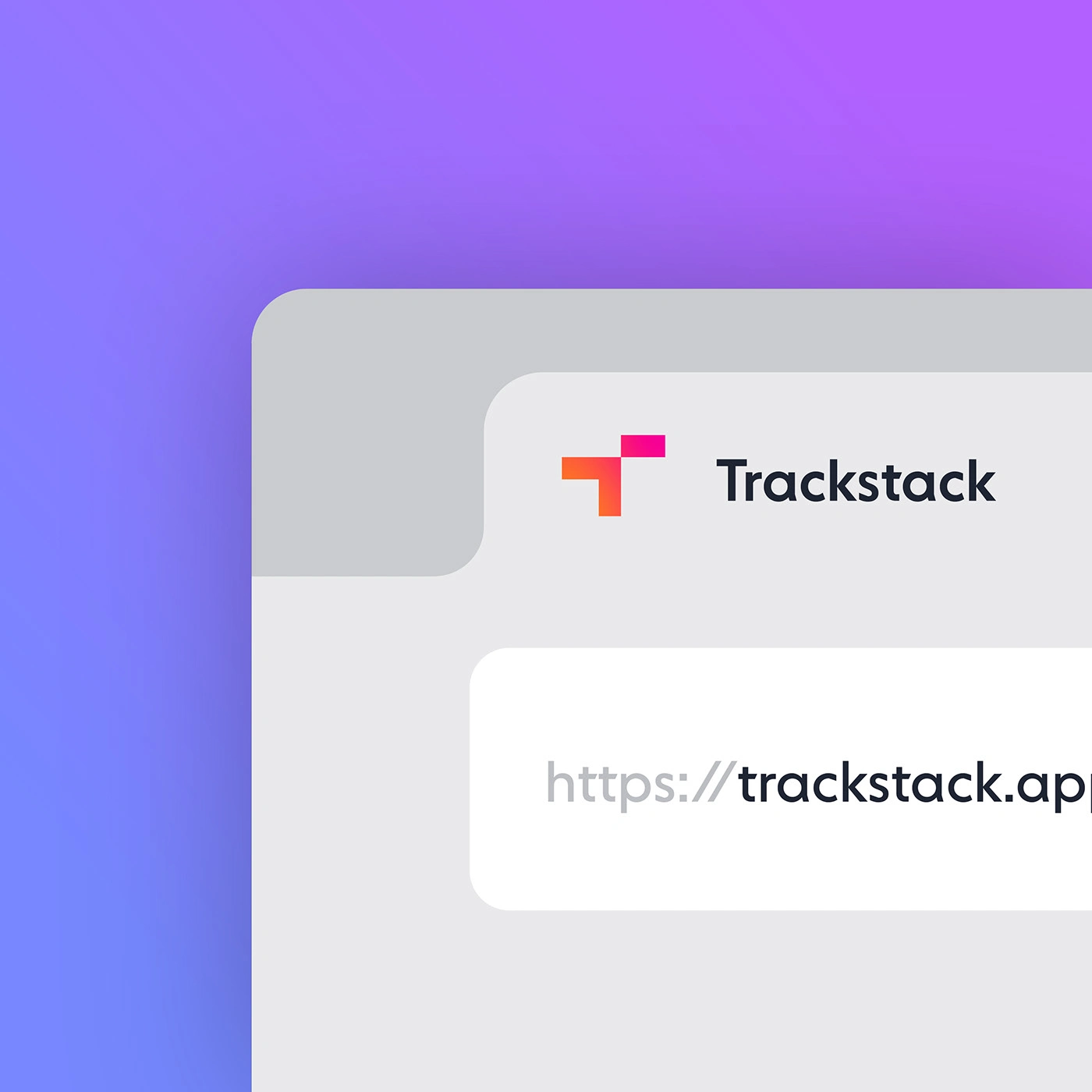
Oké Design created the visual identity and some initial implementations of the brand, including website, app, printed matter and ads, before handing over to the in-house design team.
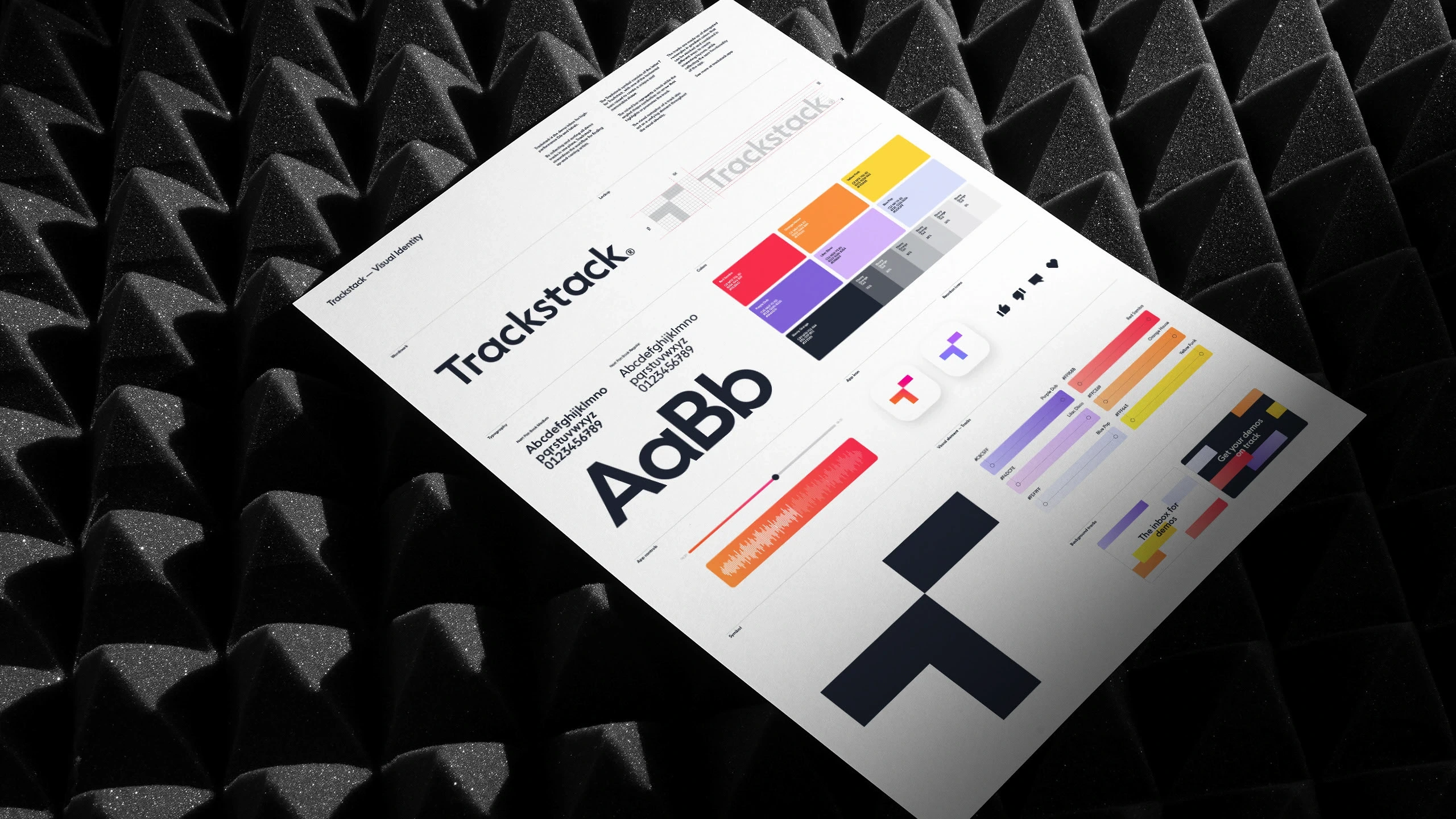
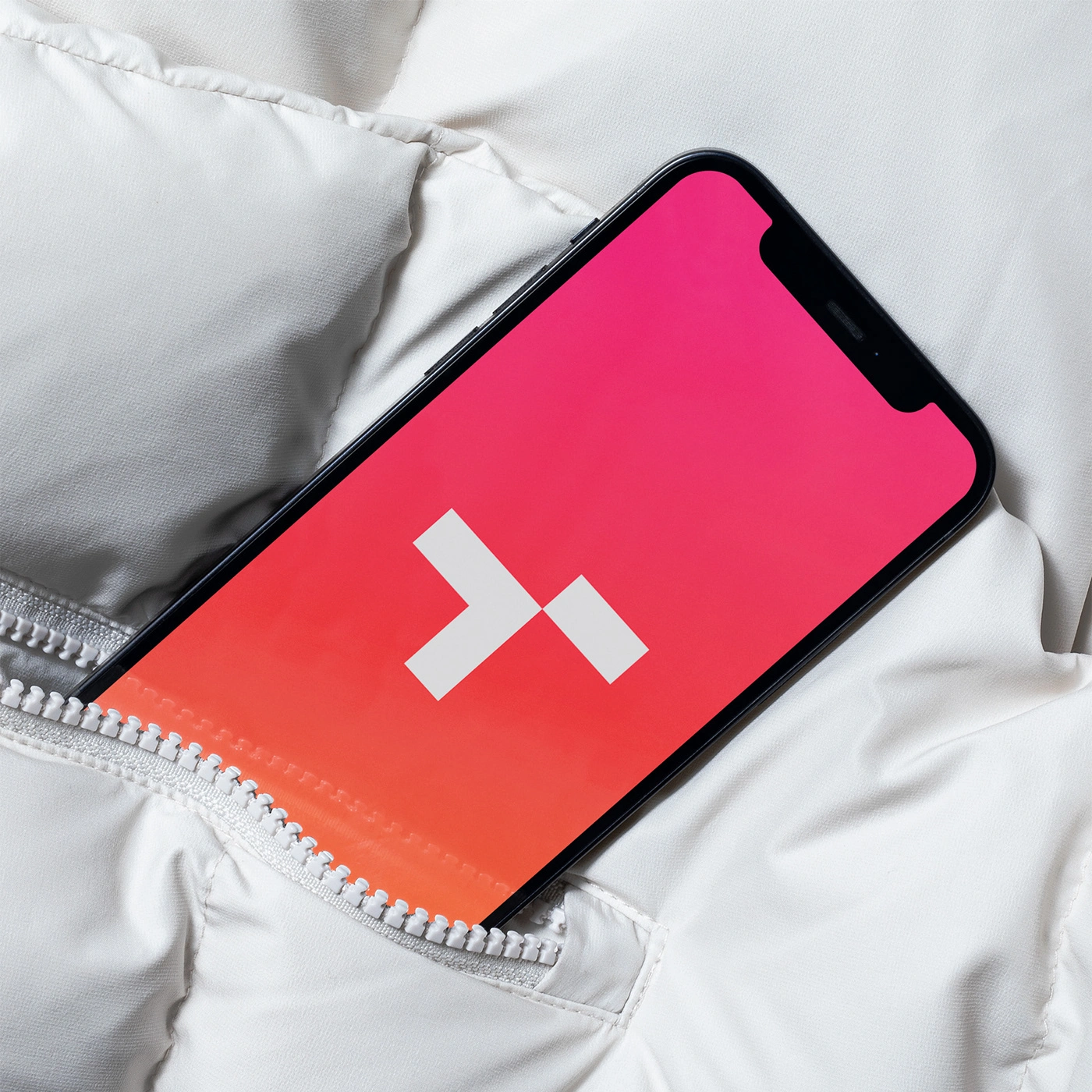
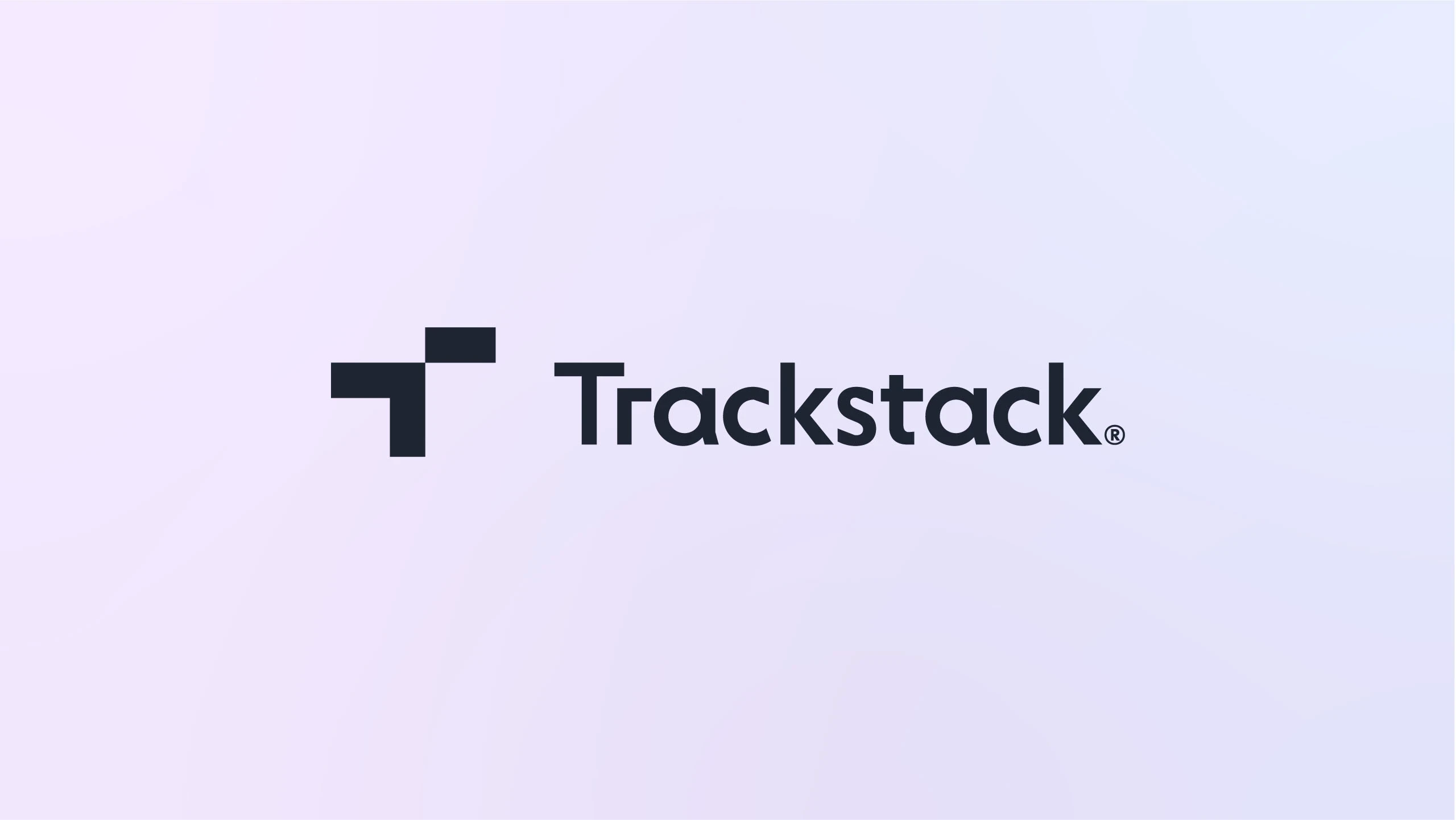
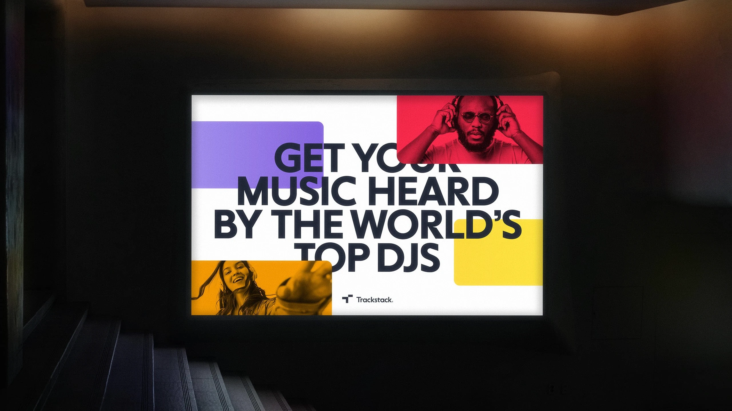
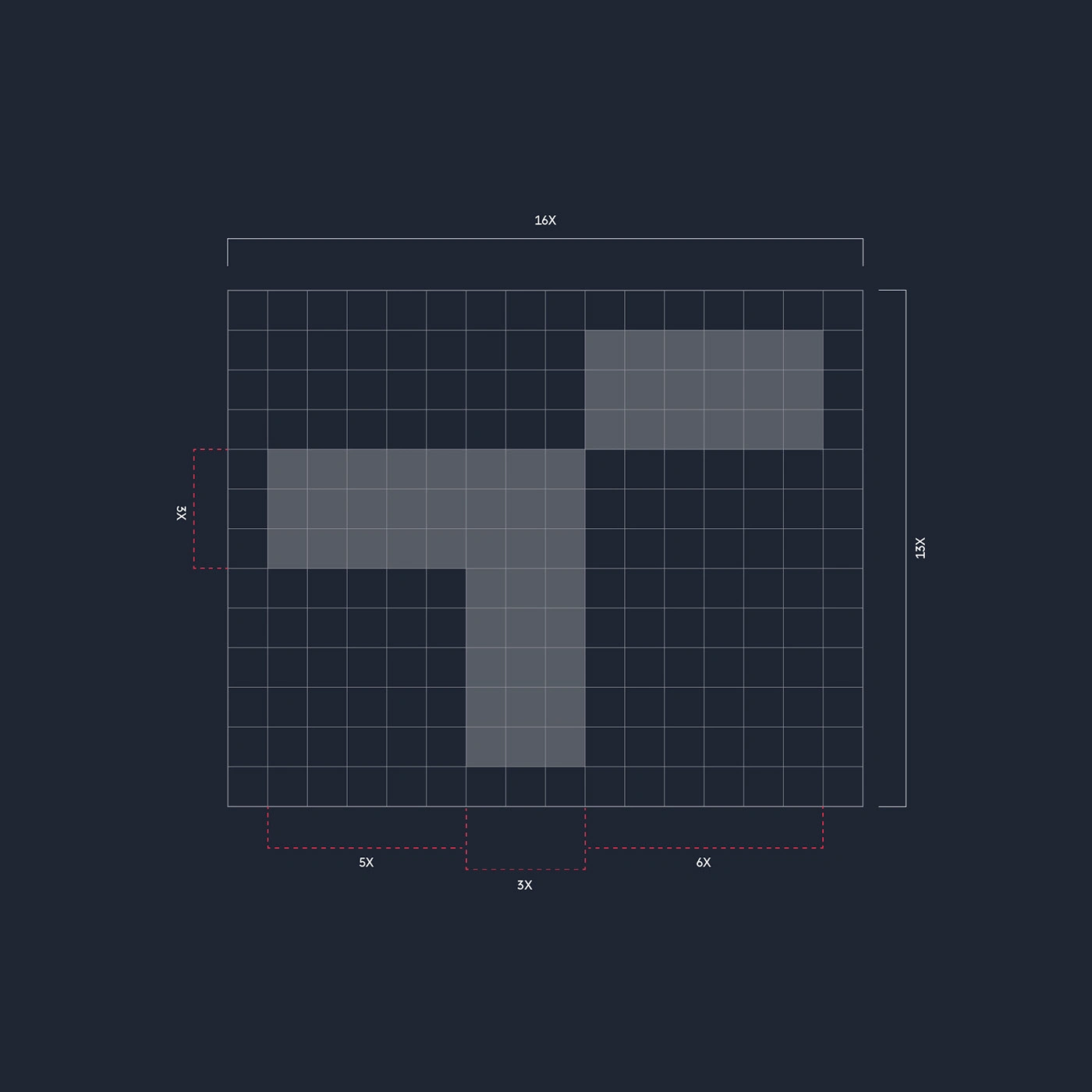
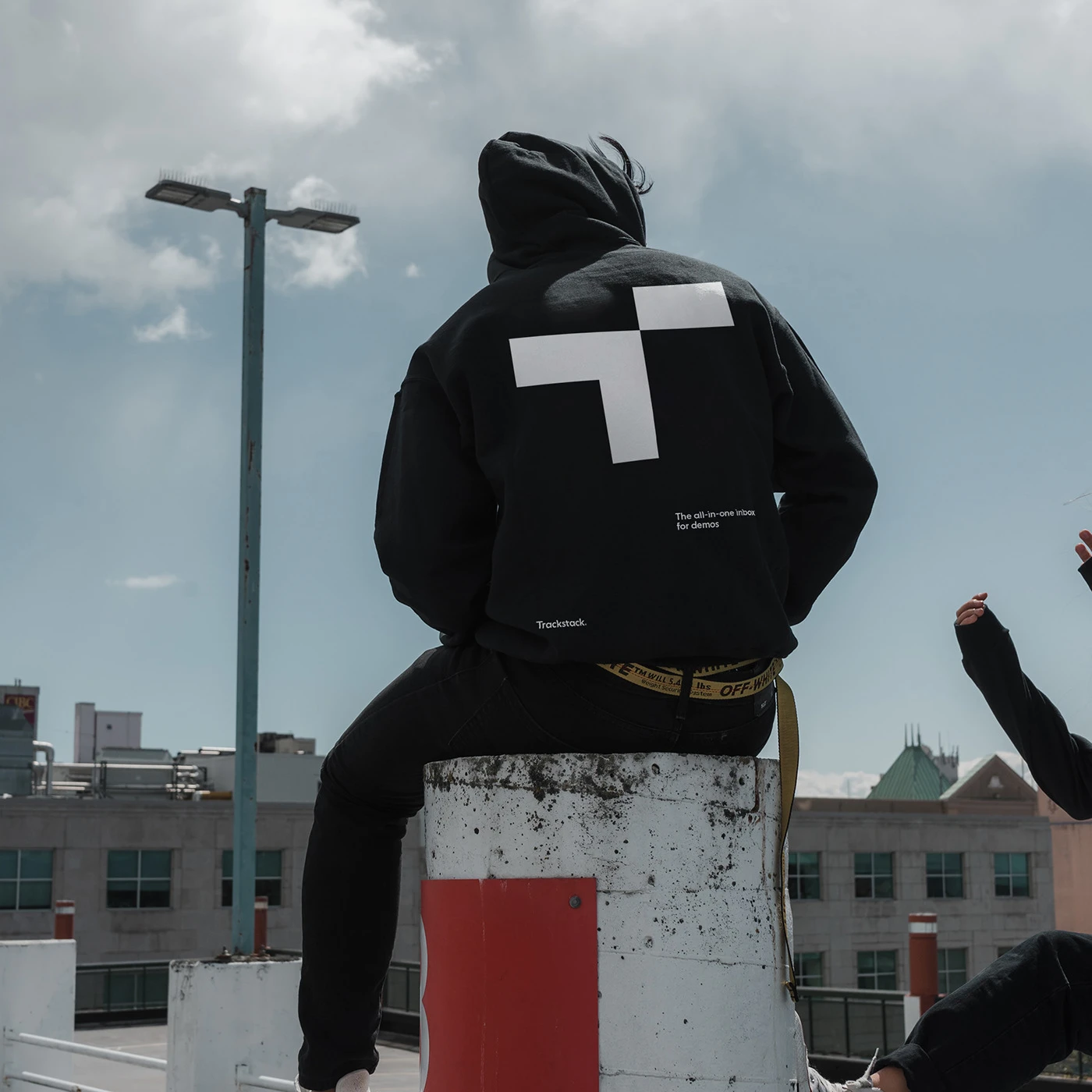
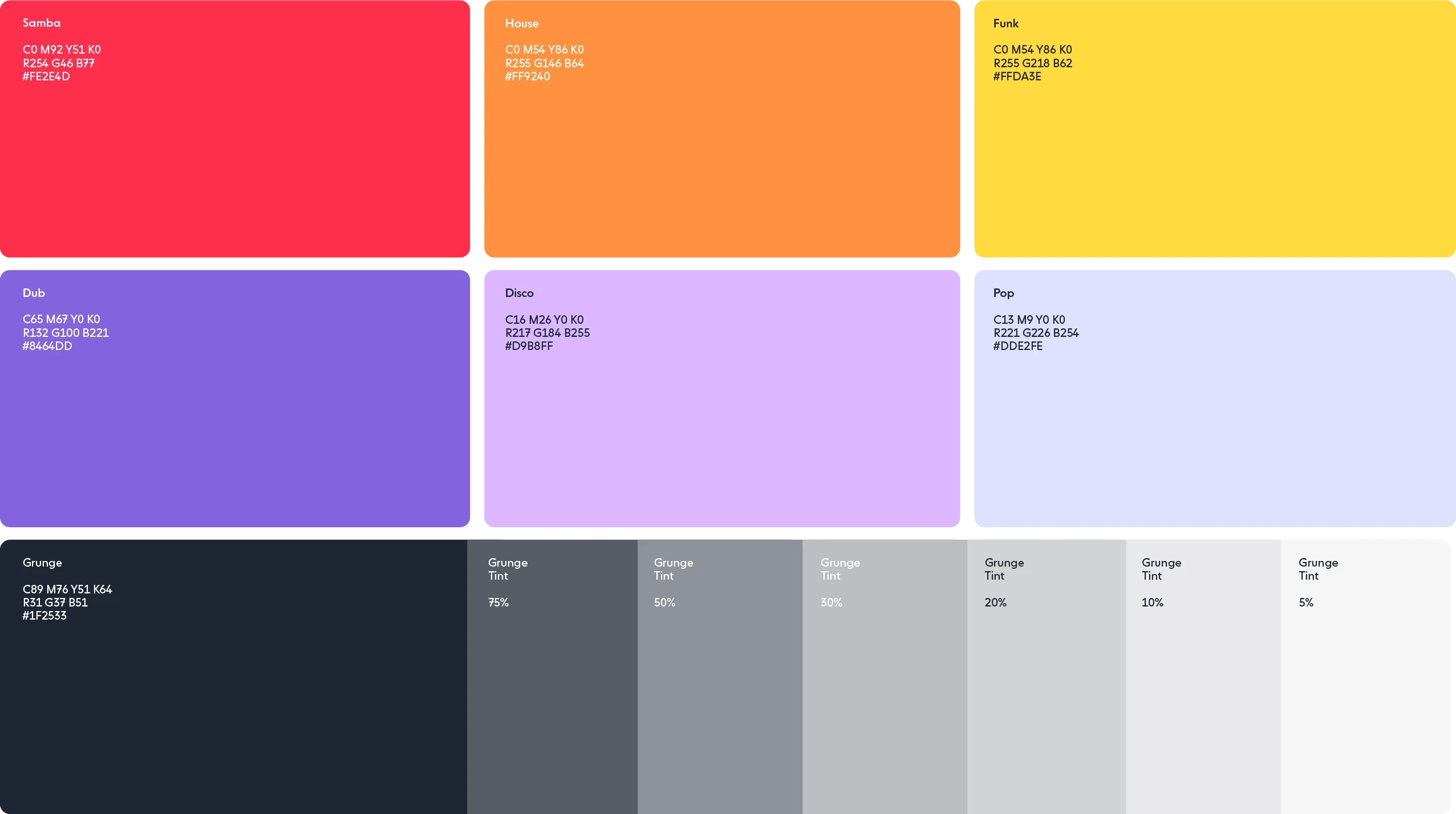
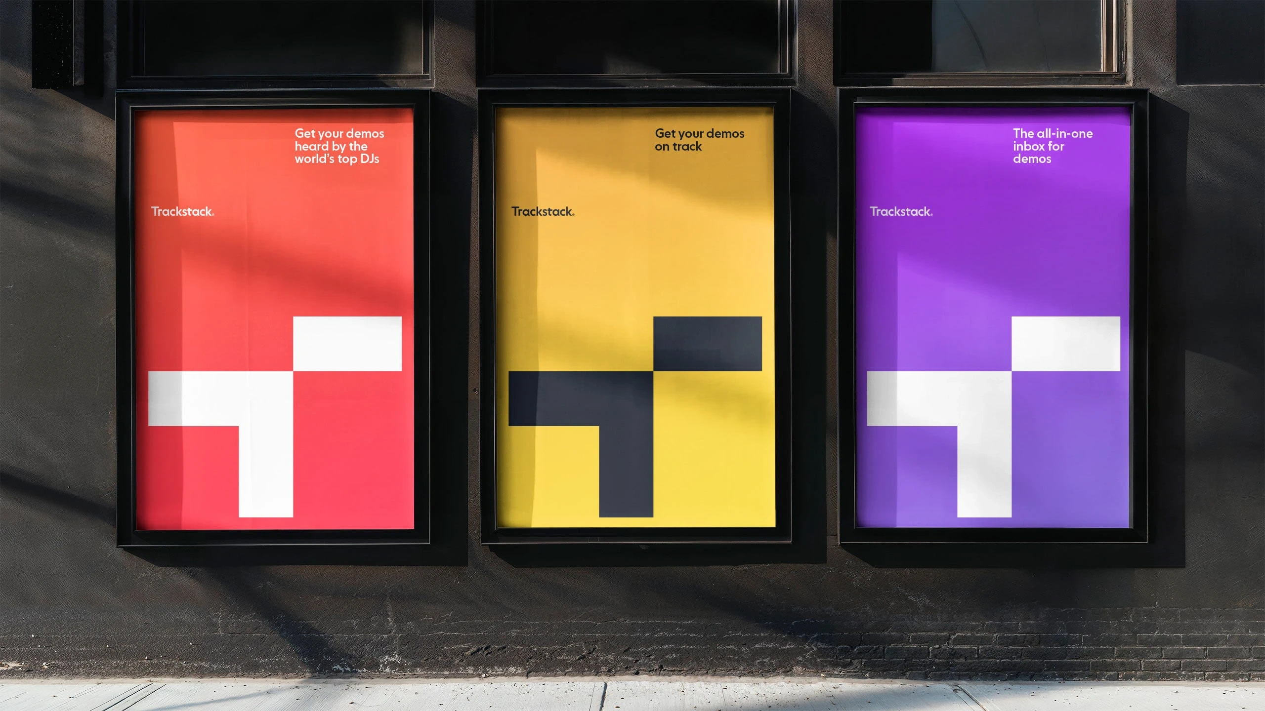
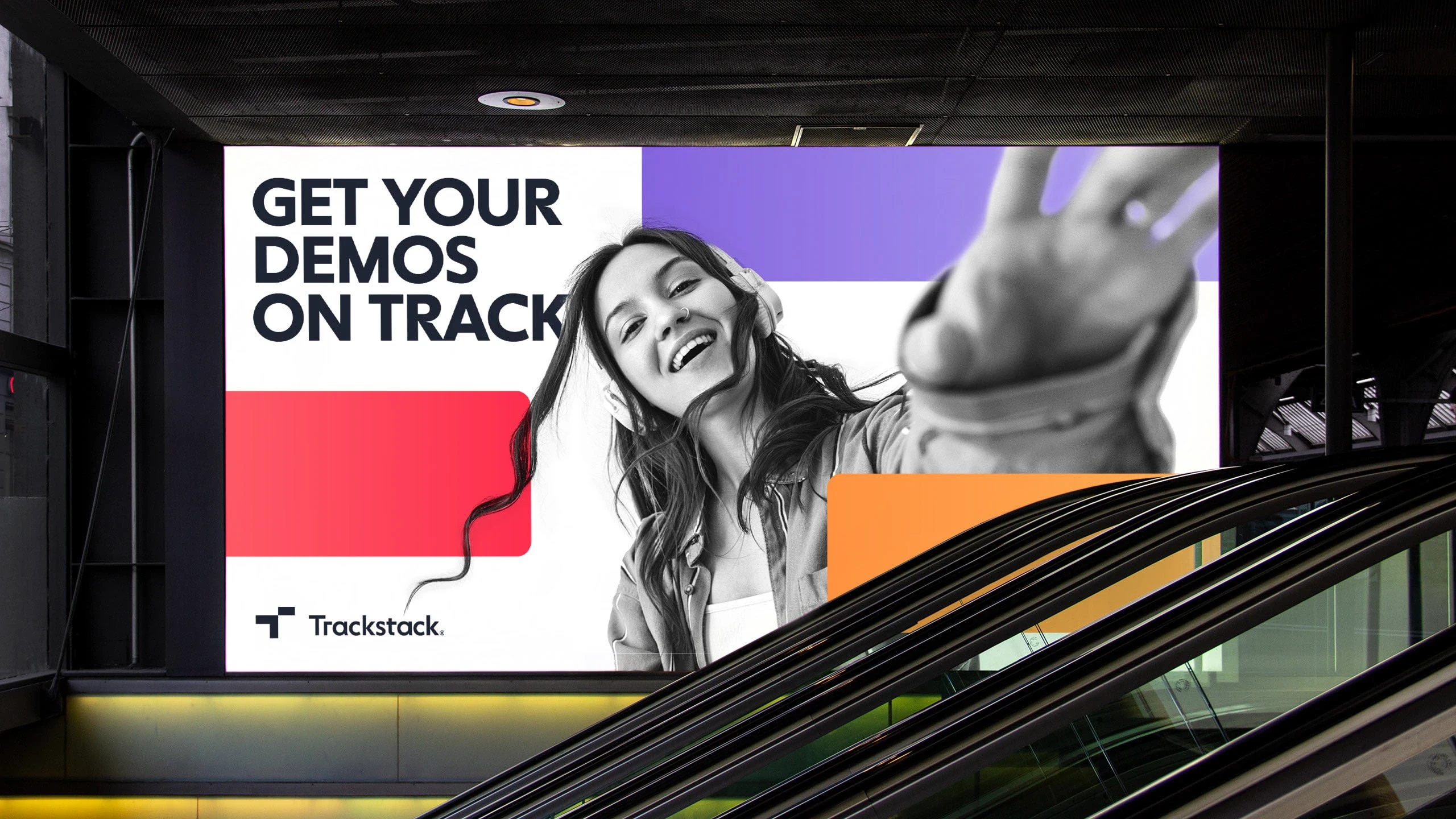
The symbol consists of the letter T for Trackstack, with one of the horisontal bars raised to create a unique and memorable shape. The raised bar represents a track while the angled shape symbolises an arrow that highlights or promotes the track. The visual metaphor of a track also act as a unifying element throughout the visual identity. The tracks are made up of elongated rectangles in gradient colors that can be stacked and combined in different ways to create interesting layouts, while reflecting the core functionality of the app.

Like this project
Posted May 22, 2025
Trackstack is an app that collects music demos from up-and-coming artists. The new visual identity centers around the simplified shape of a music track.
Likes
0
Views
14
Timeline
Jan 1, 2022 - Ongoing