PRODIGI Studios Mobile App

Zain Malik
1 collaborator


Redefining Print-on-Demand for Mobile
A seamless mobile experience designed to simplify product management, order tracking, and fulfillment workflows while empowering users to manage their print business anytime, anywhere.
The Prodigi Mobile App was crafted to bring the power of print-on-demand directly into the hands of users through an intuitive and streamlined mobile experience. From browsing products and managing orders to tracking fulfillment and monitoring business activity, every interaction was designed to reduce complexity and improve efficiency. The application combines a clean visual language, thoughtful user flows, and scalable design systems to create a reliable platform that supports both productivity and growth. This case study showcases the design process, key user experiences, and the strategic decisions behind building a mobile-first solution that aligns with Prodigi's innovative brand vision.
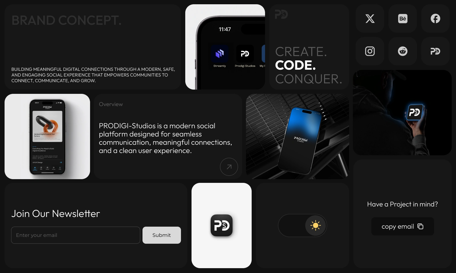
From Concept to Experience
A comprehensive exploration of the strategy, design decisions, and user experience behind the Prodigi Mobile App.
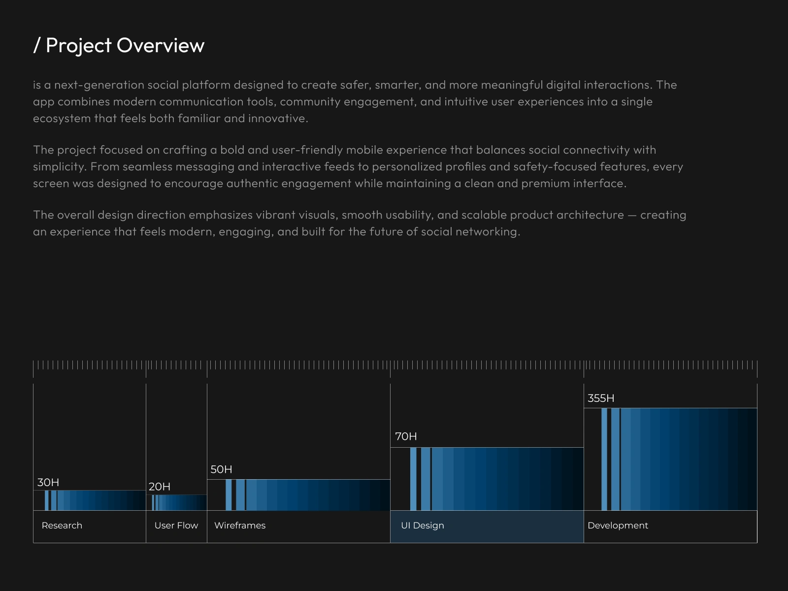
Project Overview
The Prodigi Mobile App was designed to bring the power of print-on-demand management into a seamless, mobile-first experience. The goal was to simplify complex workflows and provide users with an intuitive platform for managing products, orders, fulfillment, and business operations from anywhere. By transforming traditionally fragmented processes into a unified mobile solution, the app enables users to stay connected to their business with greater efficiency and control.
The design process focused on creating a clear information architecture, streamlined user flows, and a modern interface that balances functionality with simplicity. Every interaction was carefully crafted to reduce friction, improve accessibility, and help users complete tasks quickly and confidently. From order tracking and product management to real-time updates and operational insights, the experience was built around the needs of modern print businesses.
Through a scalable design system, consistent visual language, and user-centered approach, the Prodigi Mobile App delivers a reliable and engaging experience that supports productivity, growth, and long-term business success. The result is a polished mobile platform that reflects Prodigi's commitment to innovation while making print-on-demand management more accessible, efficient, and user-friendly.
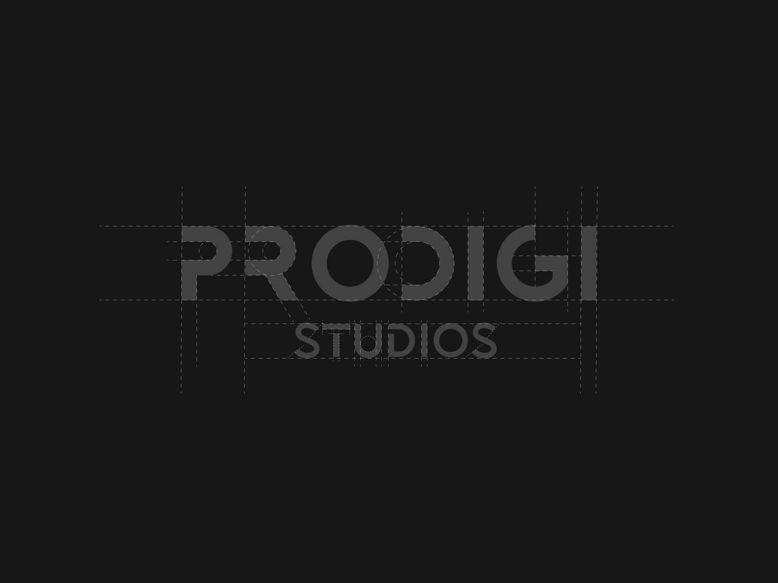
Wordmark Logo
The Prodigi logo is designed as a clean and modern wordmark, emphasizing clarity, professionalism, and brand recognition. Its minimalist approach creates a strong visual identity while maintaining flexibility across digital and mobile platforms.
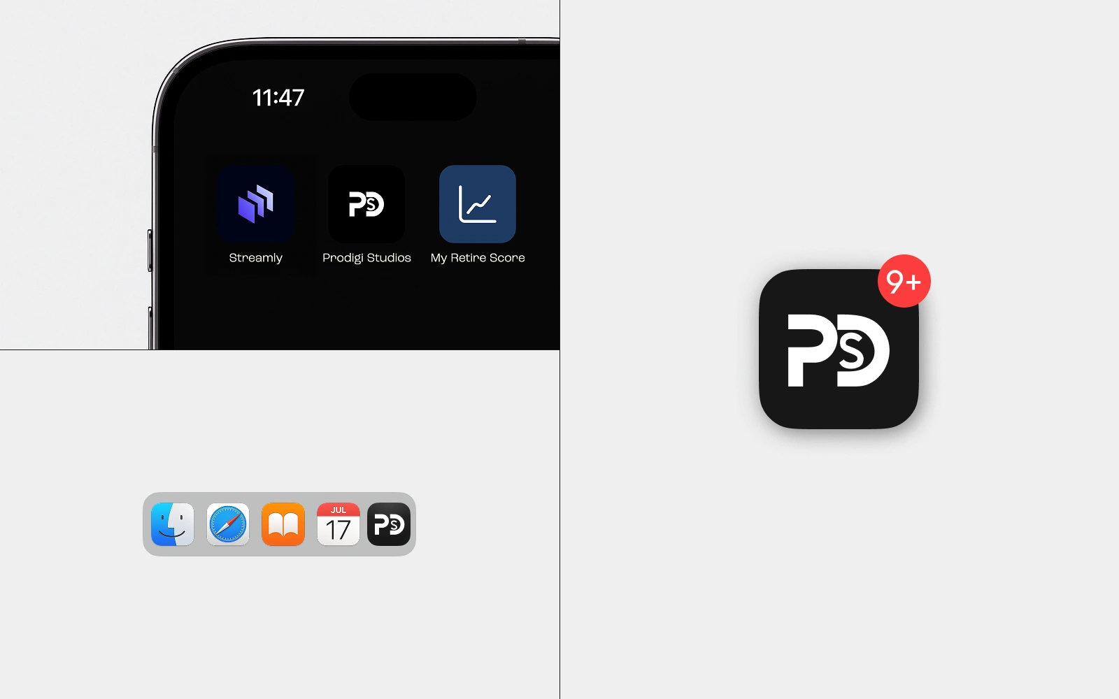
Optimized for Every Device
Designed with a responsive and scalable approach, the Prodigi Mobile App delivers a consistent and seamless experience across a wide range of devices and screen sizes. Whether accessed on smartphones or tablets, the interface adapts effortlessly to ensure optimal usability, performance, and accessibility. Every screen is carefully structured to maintain clarity, functionality, and visual consistency, allowing users to stay productive wherever they are.
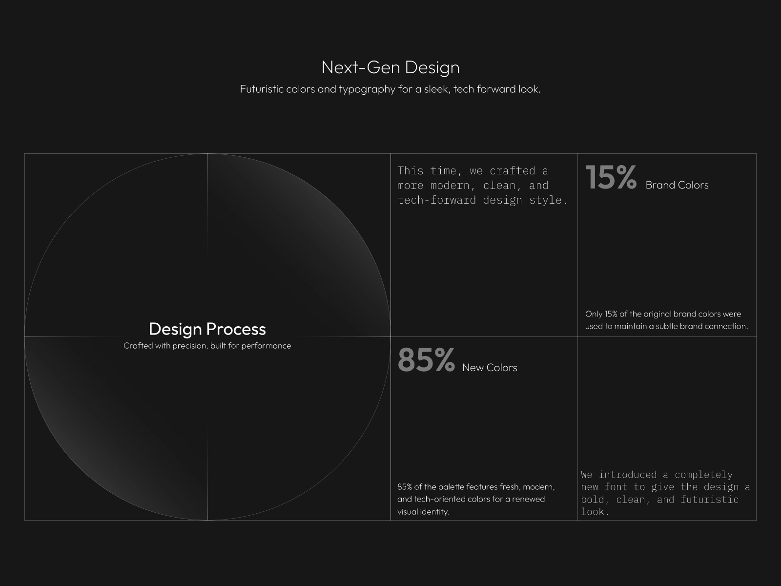
Design Process
The design process began with understanding user needs, business objectives, and workflow challenges to establish a strong foundation for the product experience. Through research, wireframing, user flow mapping, and iterative design exploration, each screen was carefully crafted to balance usability, functionality, and visual appeal. The result is a refined mobile experience built on strategic thinking, user-centered design principles, and a scalable design system that ensures consistency across the entire application.
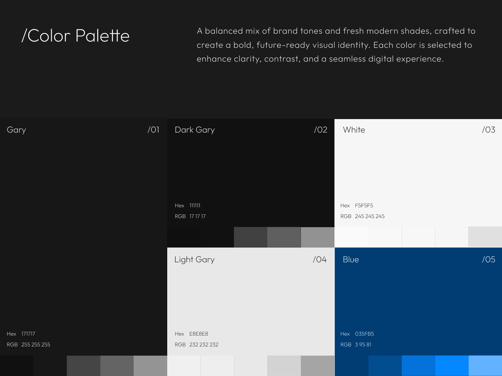
Color Palette
The color palette was carefully selected to create a modern, trustworthy, and visually balanced experience. A combination of bold primary colors and subtle supporting tones establishes a strong brand presence while maintaining clarity and usability across the interface. Each color serves a purposeful role in guiding user attention, enhancing visual hierarchy, and ensuring a consistent experience throughout the application.
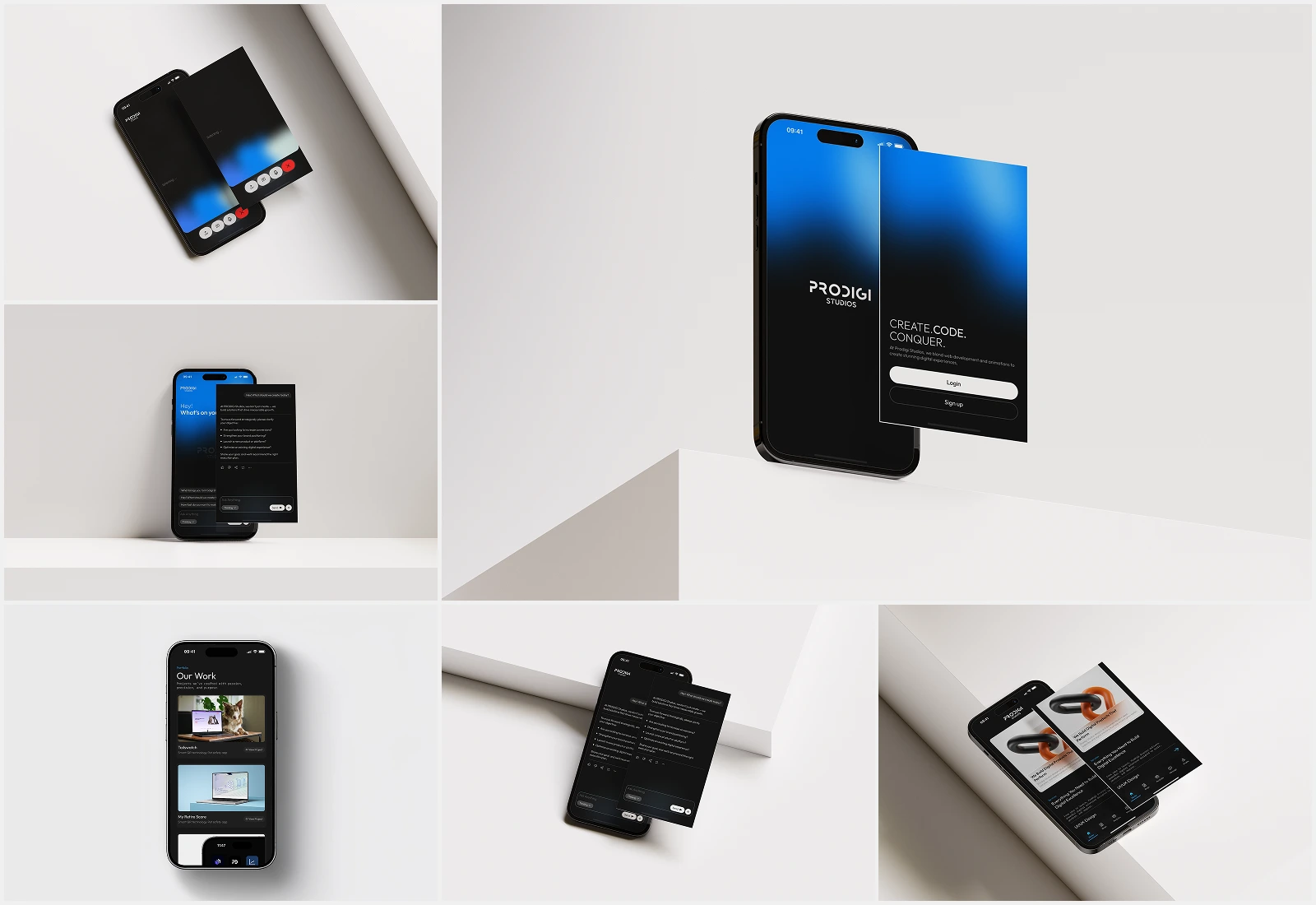
Final Screens
The final screens showcase a cohesive and thoughtfully crafted mobile experience designed to simplify every stage of the user journey. Each interface was built with a focus on clarity, usability, and consistency, ensuring users can seamlessly navigate through products, orders, tracking, and account management. By combining intuitive interactions with a modern visual language, the final design delivers a polished experience that aligns with both user needs and business goals.
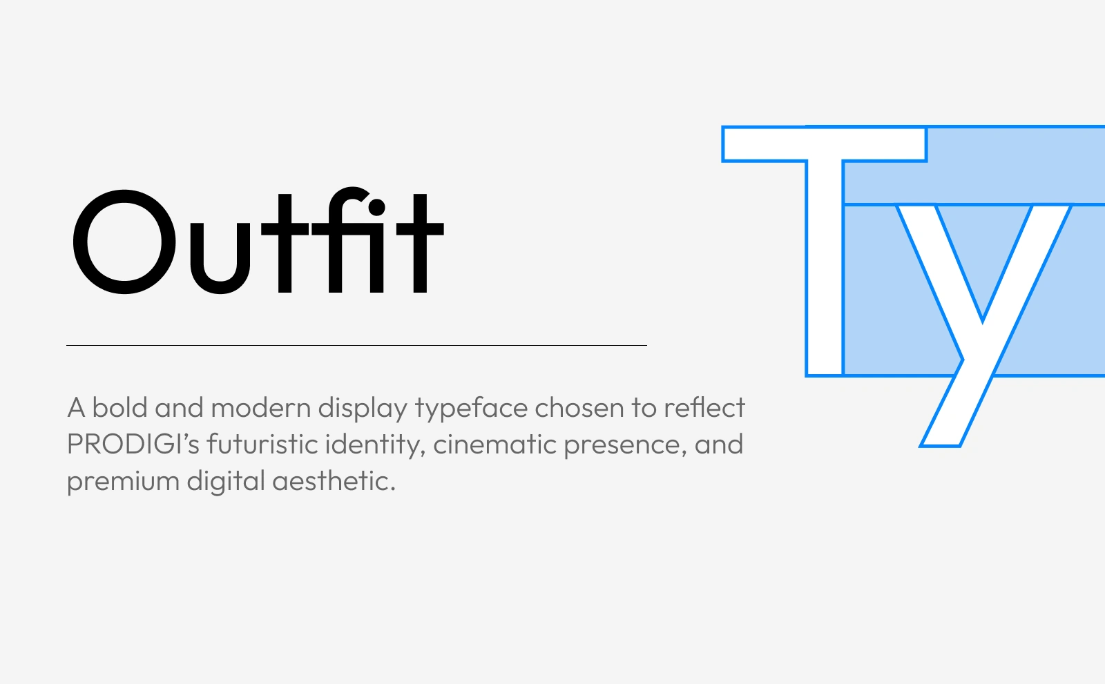
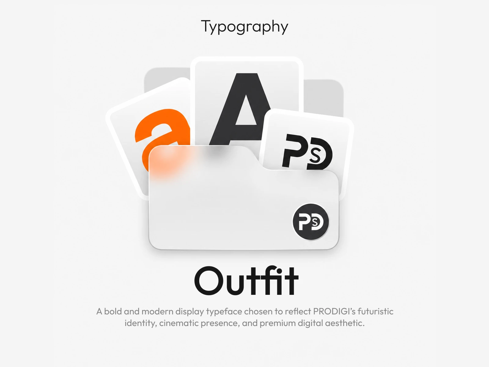
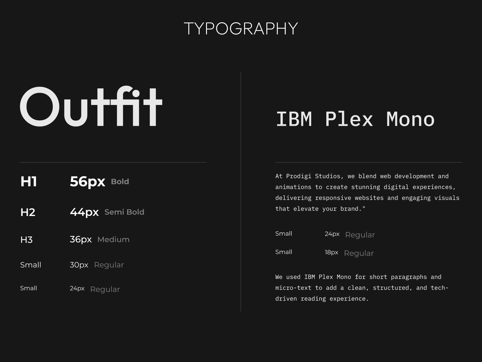
Typography That Speaks with Clarity
Typography plays a fundamental role in shaping the user experience and establishing a strong visual identity. Carefully selected to balance readability, consistency, and modern aesthetics, the type system creates a clear hierarchy that guides users effortlessly through the interface. From prominent headings to supporting content, every text element was designed to enhance communication, improve accessibility, and deliver a polished, professional experience across the application.
Designed to Make an Impact
A seamless blend of strategy, usability, and visual design crafted to deliver meaningful experiences and lasting impressions.
Like this project
Posted May 30, 2026
Worked on UI/UX research of PRODIGI Studios mobile app. Featuring easy to navigate user experience. Having User Auth flows and AI based features for clients.
Likes
2
Views
18
Collaborators