DivineShot Brand Identity and Web Design

Zain Malik
1 collaborator


Brand Overview
DivineShot is a modern creative platform built to transform visual storytelling into a premium digital experience. Designed with a strong focus on aesthetics, performance, and user interaction, the brand combines cinematic visuals with a sleek and minimal interface to create an immersive creative ecosystem. From photography showcases to content presentation, every detail is crafted to feel refined, bold, and visually impactful.
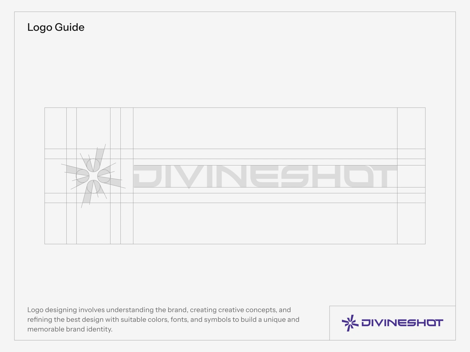
Logo Development Process
Crafting a Bold Visual Identity
From early concepts to the final refined mark, every step of the DivineShot logo was designed to represent creativity, precision, and cinematic excellence.
The logo development process focused on building a clean and memorable identity that reflects the premium visual experience of DivineShot. Through multiple iterations, balanced geometry, and modern styling, the final logo achieves a timeless and professional appearance suitable for digital platforms, branding assets, and creative storytelling.
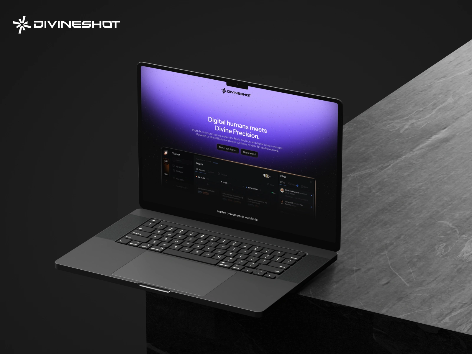
Desktop Experience
Designed for a Cinematic Web Experience
A refined desktop interface crafted to showcase visuals with clarity, depth, and premium interaction across every screen.
The DivineShot web experience blends modern layouts, smooth visual hierarchy, and immersive content presentation to create a seamless creative journey. Every section is carefully structured to enhance storytelling while maintaining a clean and minimal aesthetic.
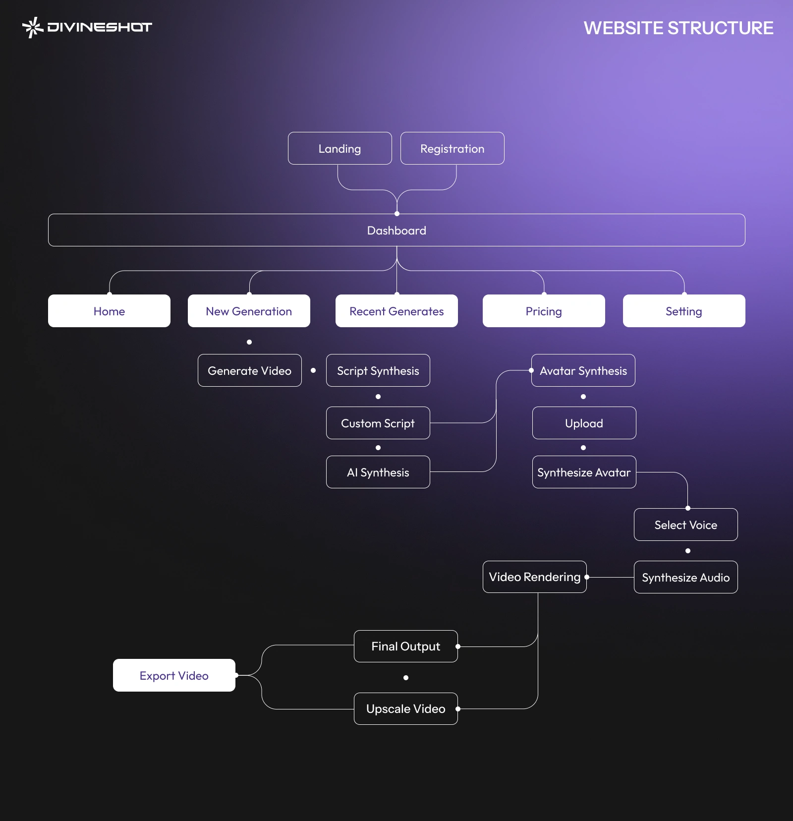
Website Workflow
A Seamless Creative Journey
Structured to deliver a smooth, intuitive, and visually engaging experience from start to finish.
The DivineShot workflow was designed to simplify user interaction while maintaining a premium visual experience. From discovering content to exploring galleries and engaging with creative work, every transition and interaction feels fluid, organized, and effortless.
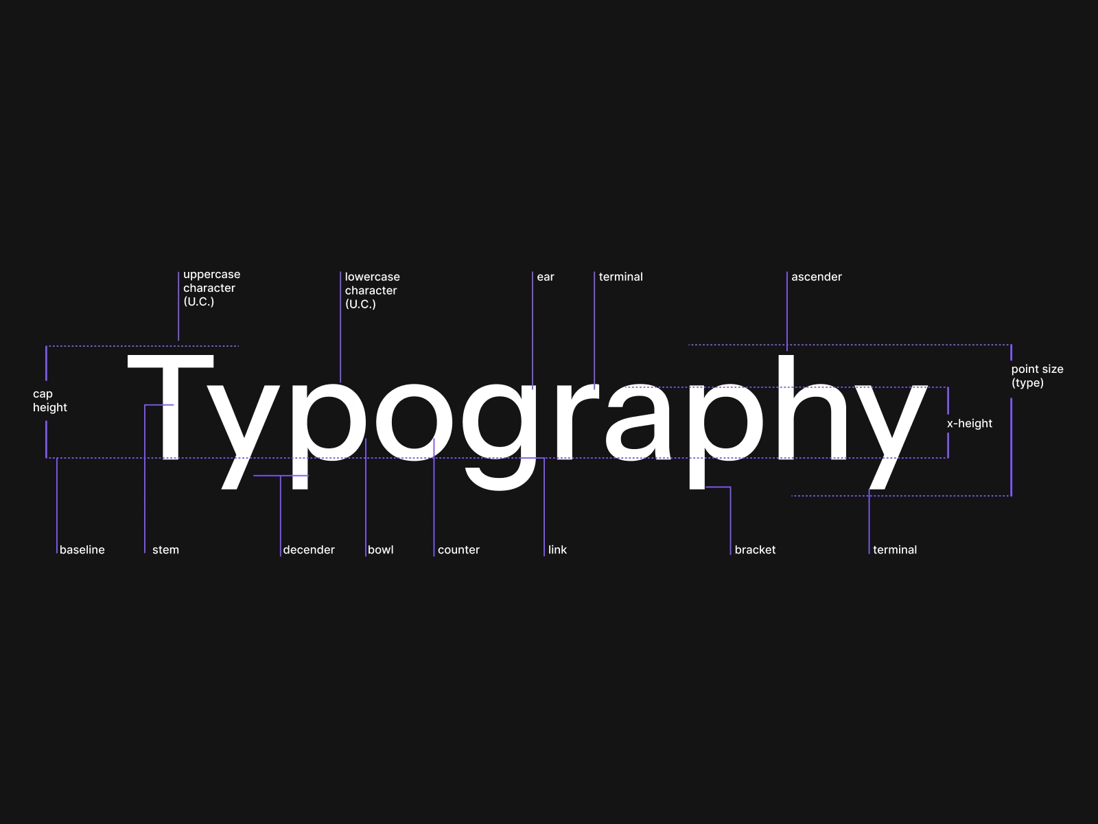
Sans Serif
Modern Sans Serif Typography
A clean and contemporary type system designed to enhance readability, clarity, and premium visual balance across the DivineShot experience.
The DivineShot typography system is built around a modern sans serif font that delivers a sleek and professional appearance. Its minimal structure and balanced spacing create a strong visual hierarchy while maintaining excellent readability across both desktop and mobile interfaces. The typeface reflects the brand’s modern identity, supporting a refined and cinematic digital experience.
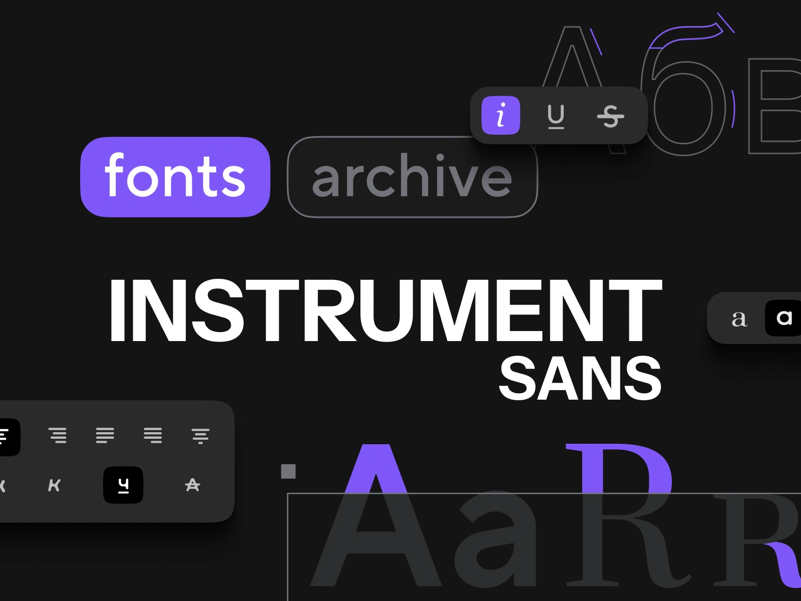
Design Principles
Built with Structure, Balance & Visual Clarity
The DivineShot website follows a modern minimal design approach focused on alignment, spacing, hierarchy, and cinematic presentation.
The interface is designed using a clean grid-based layout with balanced alignment and consistent spacing to maintain visual harmony across every section. A left-to-center content flow, modern typography hierarchy, and structured composition help users navigate the experience effortlessly. Minimal UI elements, bold imagery, and refined whitespace create a premium and immersive visual identity while keeping the overall experience elegant, responsive, and highly user-focused.
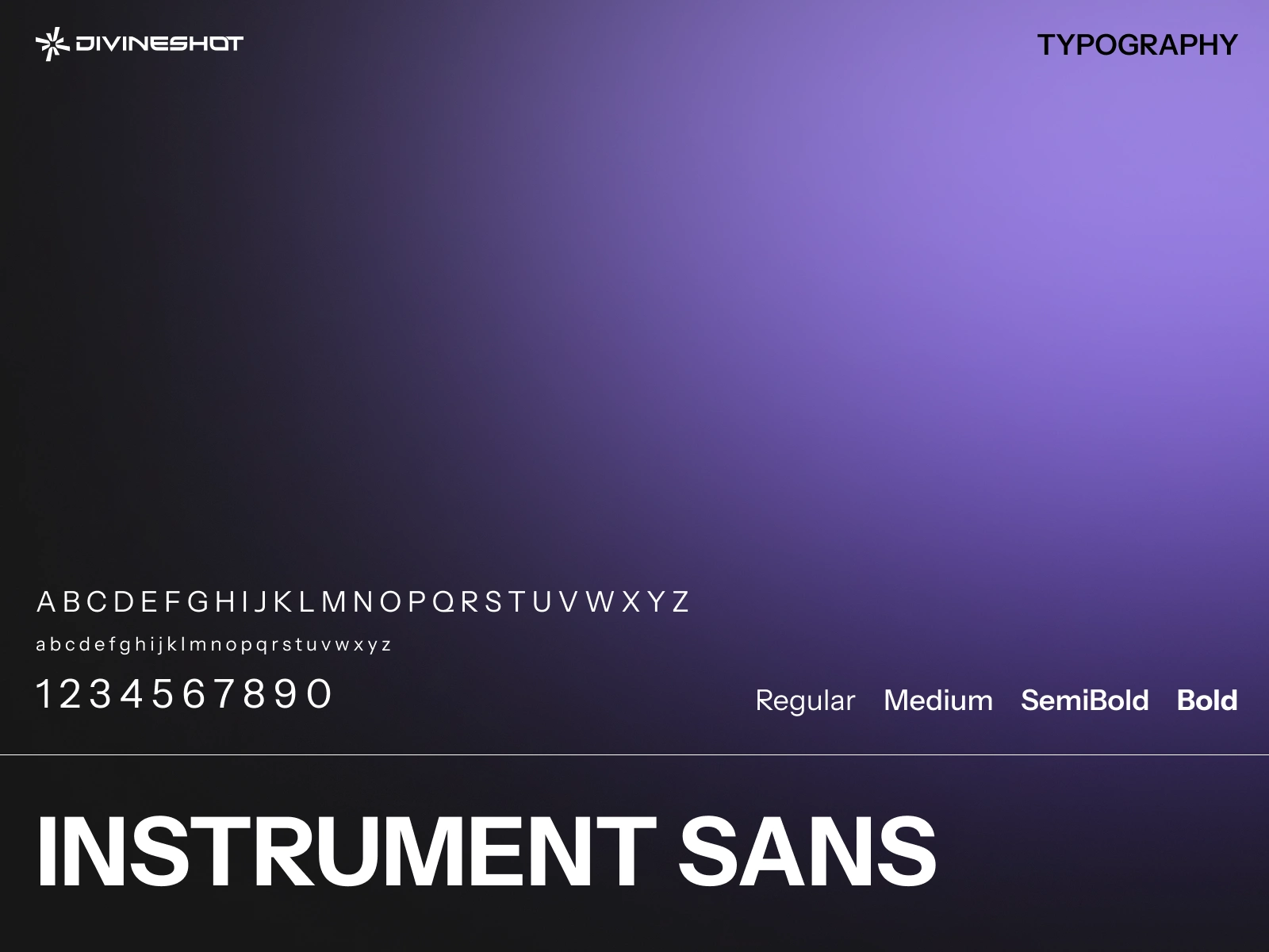
Typography Choice
Powered by Instrument Sans
A modern sans serif typeface selected to create a clean, refined, and visually balanced digital experience.
Instrument Sans was chosen to establish a contemporary visual identity with strong readability and minimal aesthetics. Its clean geometric structure, balanced spacing, and modern appearance enhance the overall user experience while maintaining a premium and cinematic feel across the DivineShot website.
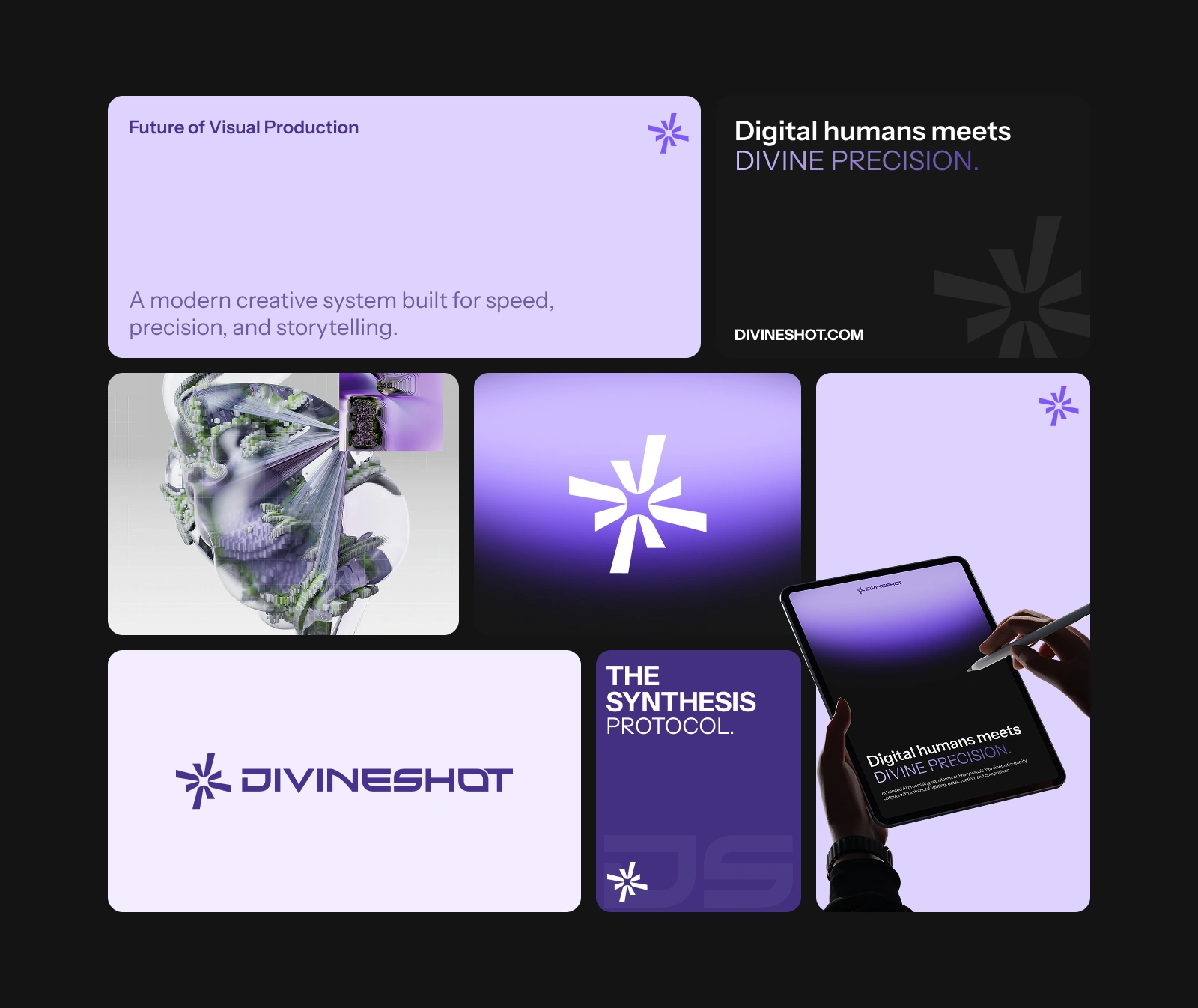
Brand Bento Grid
A Structured Visual Identity System
A modular layout that presents DivineShot’s brand elements in a clean, organized, and visually engaging composition.
The brand bento grid is designed to showcase all key identity elements of DivineShot in a balanced and structured way. From typography and color palette to logo variations and UI components, each block highlights a different part of the brand system. The modular layout improves clarity, enhances storytelling, and reflects a modern design approach that feels both minimal and premium.
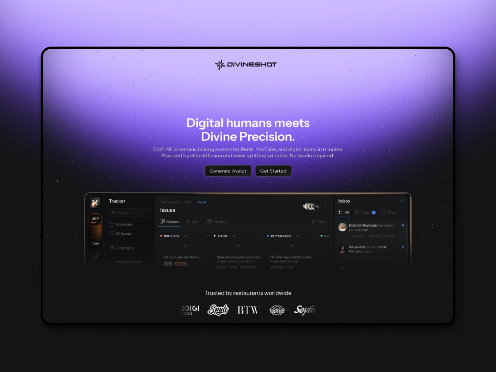
Hero Section
A Bold First Impression
Designed to instantly capture attention with a strong visual hierarchy and cinematic presence.
The hero section of DivineShot is crafted to create a powerful first impression through minimal layout, bold typography, and impactful visuals. It introduces the brand identity in a clean and focused way, guiding users smoothly into the experience. With carefully balanced spacing, strong contrast, and modern composition, the hero section sets the tone for a premium and immersive digital journey.
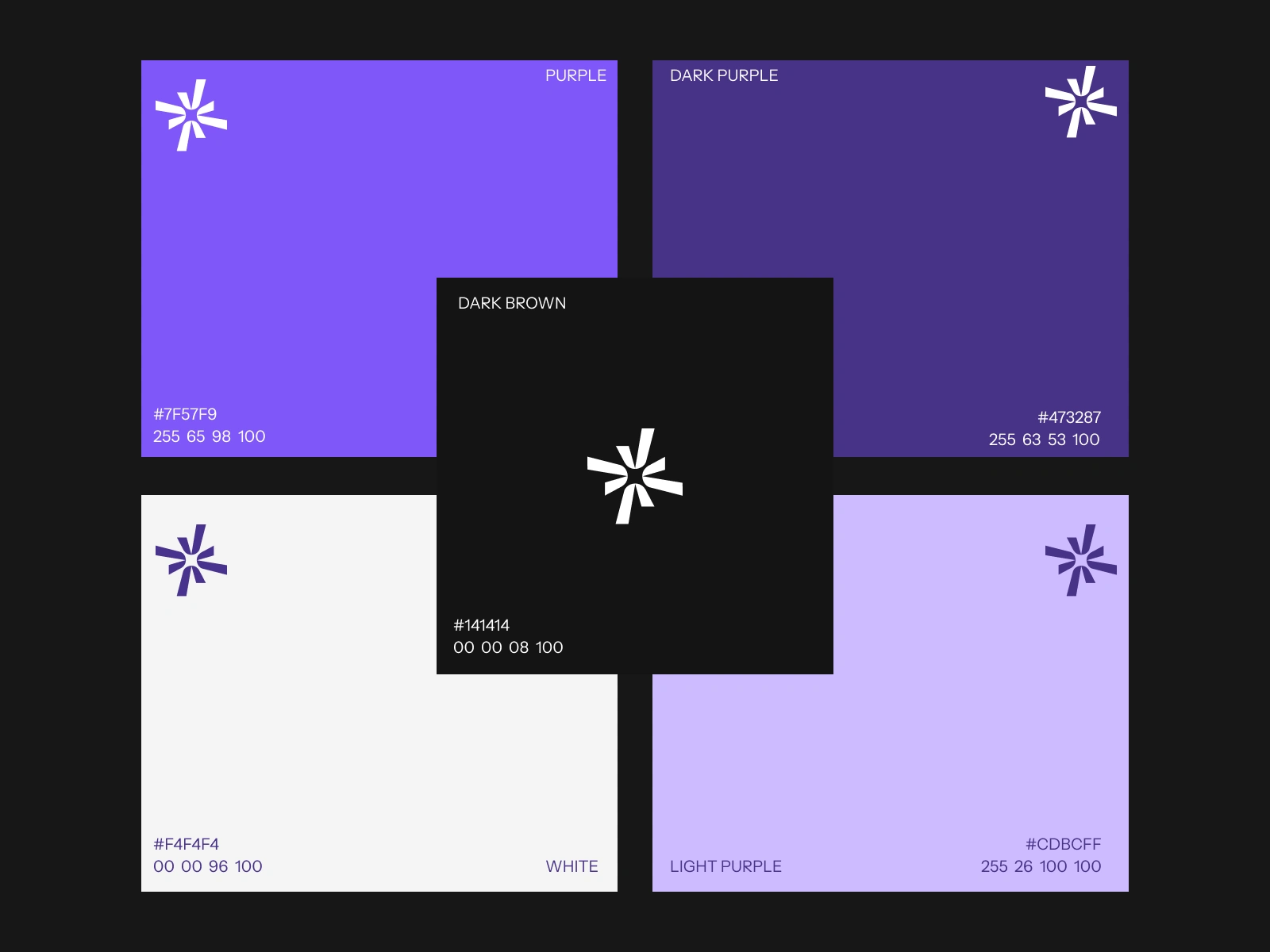
Color Palette
A Refined Visual Tone System
Carefully selected colors that define the mood, depth, and premium identity of DivineShot.
The DivineShot color palette is built around a minimal and balanced approach, focusing on modern contrast and visual harmony. Each color is chosen to enhance readability, highlight key elements, and maintain a cinematic feel across the interface. The palette supports a consistent brand identity, ensuring every section feels cohesive, elegant, and visually impactful while reinforcing a premium digital experience.
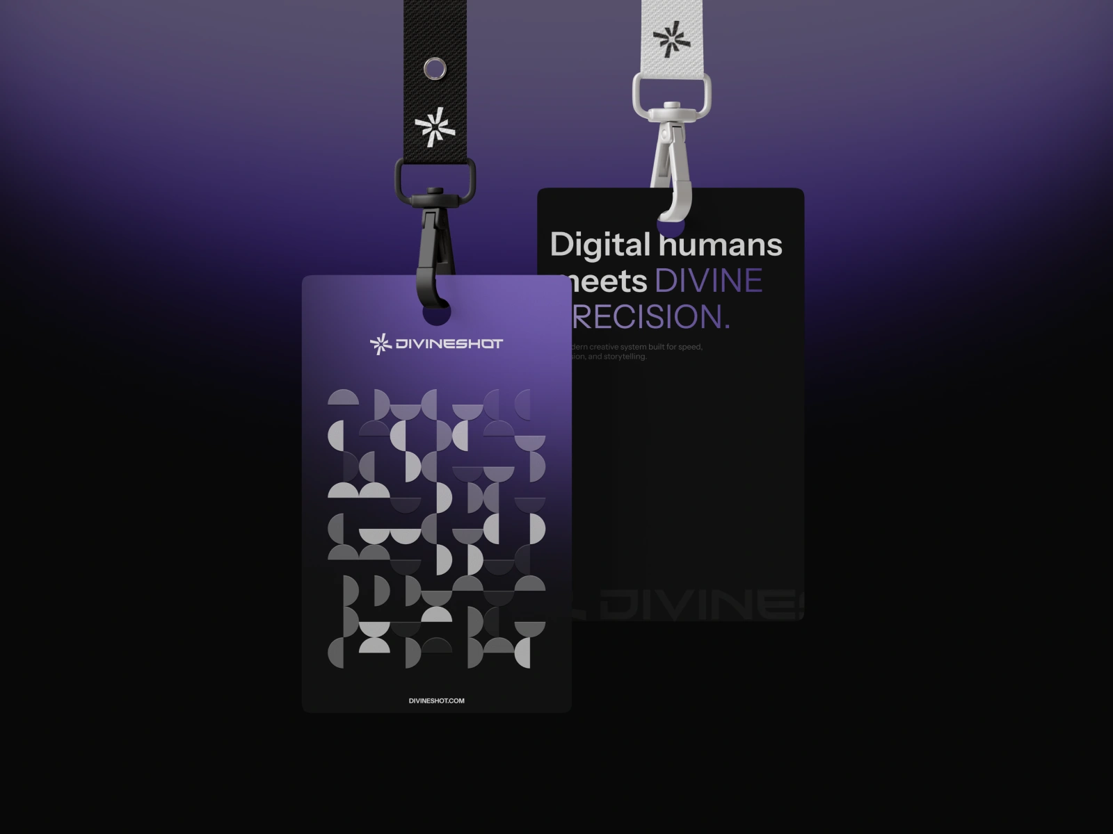
Brand Cards
Showcasing Identity in Modular Form
A clean card-based system designed to present brand elements with clarity, structure, and visual balance.
The brand cards in DivineShot are crafted to highlight key identity components in a simple yet impactful way. Each card focuses on a specific element such as typography, color system, UI components, or brand values. With consistent spacing, soft contrast, and minimal styling, the cards create a structured visual flow that enhances readability and makes the brand system easy to explore while maintaining a premium and modern aesthetic.
Like this project
Posted May 26, 2026
DivineShot is a modern creative platform built to transform visual storytelling into a premium digital experience. Long form AI content generation SaaS platform
Likes
4
Views
36
Clients
DivineShot
Collaborators