Millie’s: Branding for a contemporary neighborhood bakery

Urvisha Joshi


The Brief
Millie’s Bakehaus is a contemporary neighborhood bakery inspired by European café culture, slow mornings, and the comfort of everyday rituals.
The challenge was to create a brand that felt warm and familiar without falling into rustic farmhouse cues or overly polished luxury.
The Idea
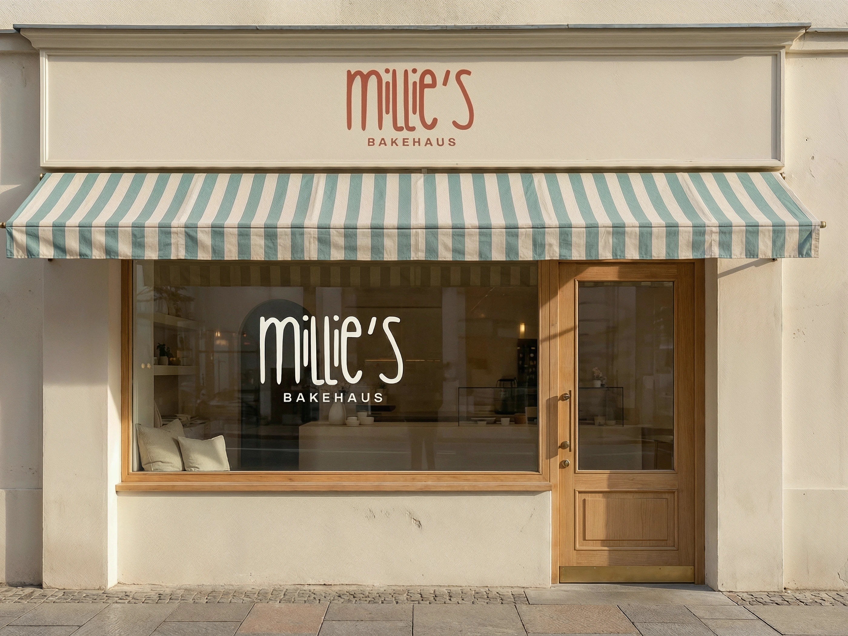
The identity sits comfortably between those two worlds.
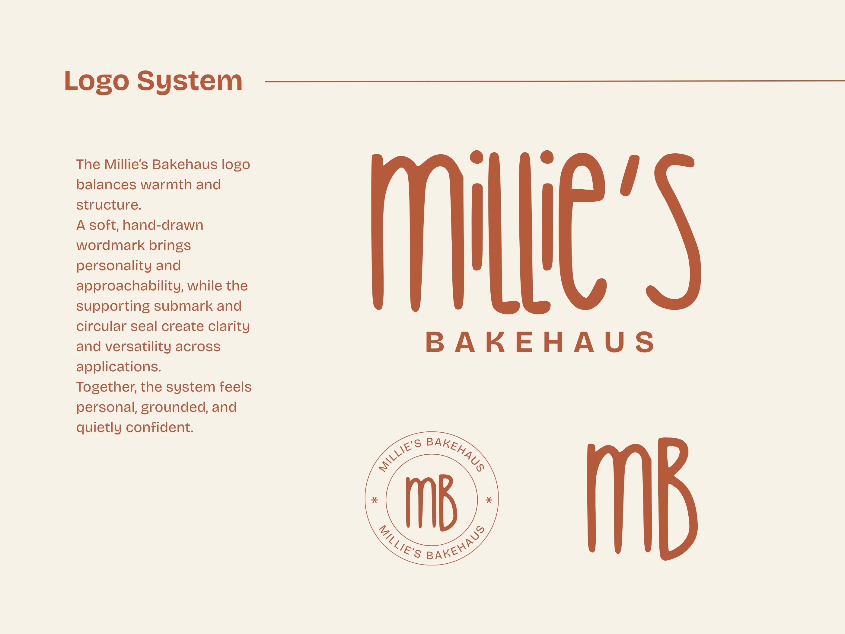
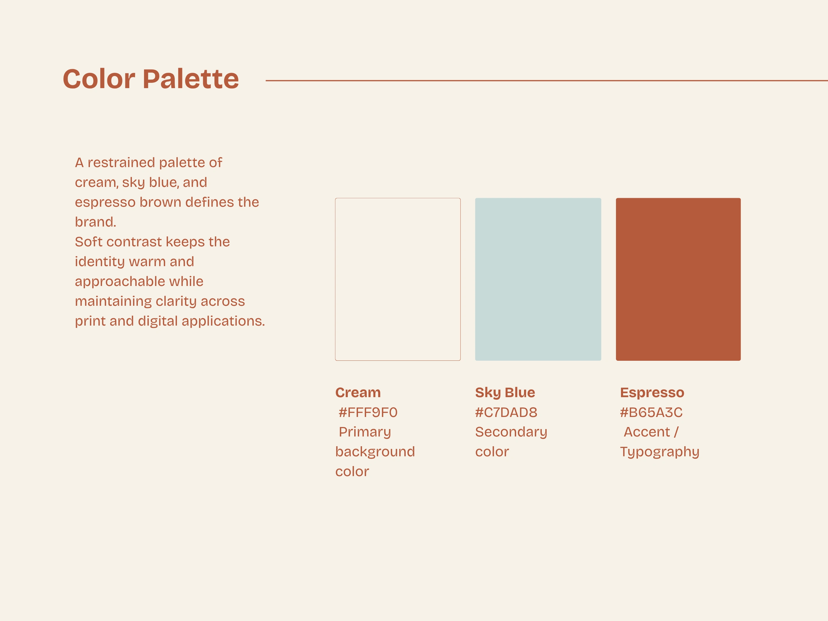
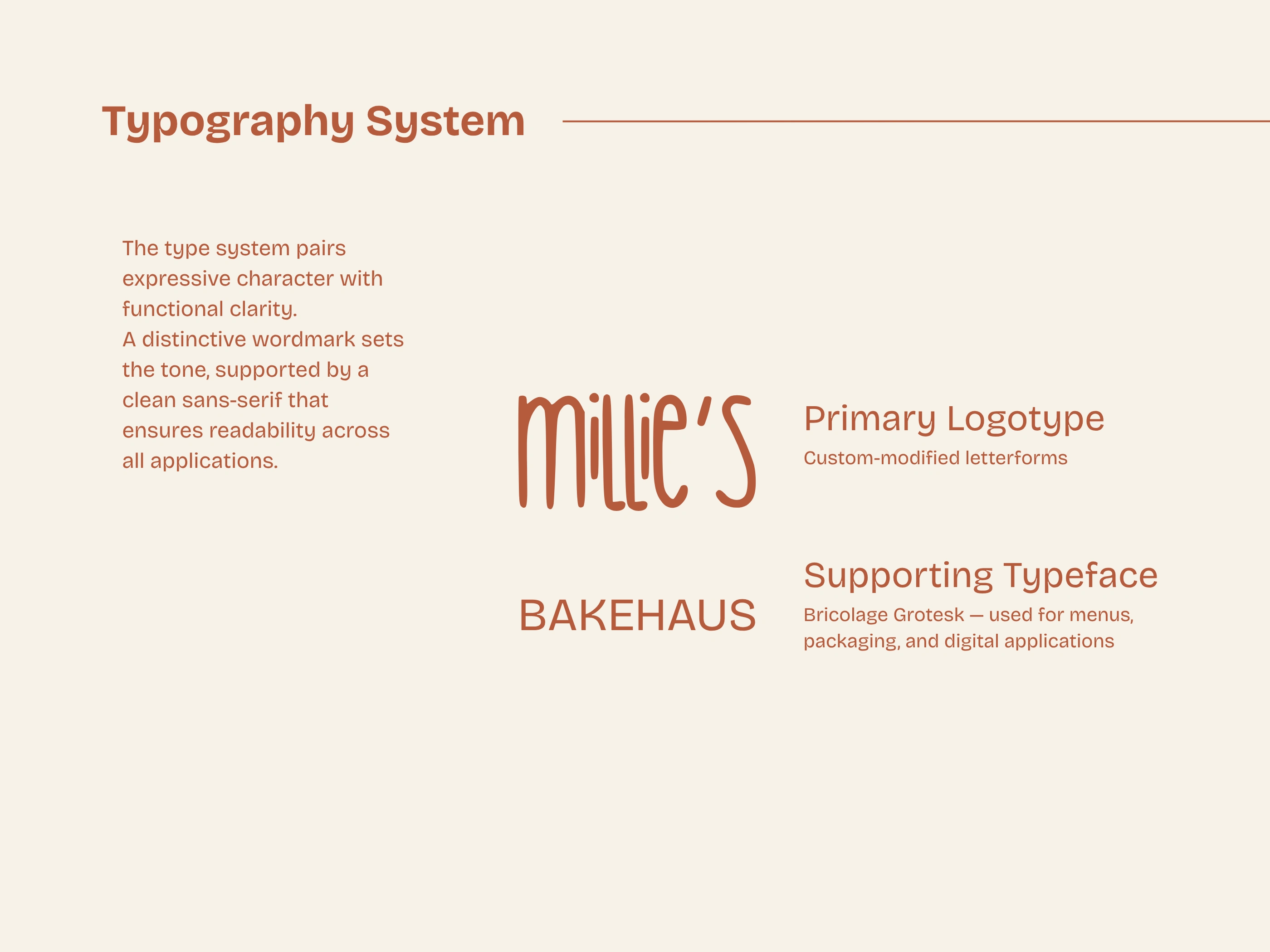
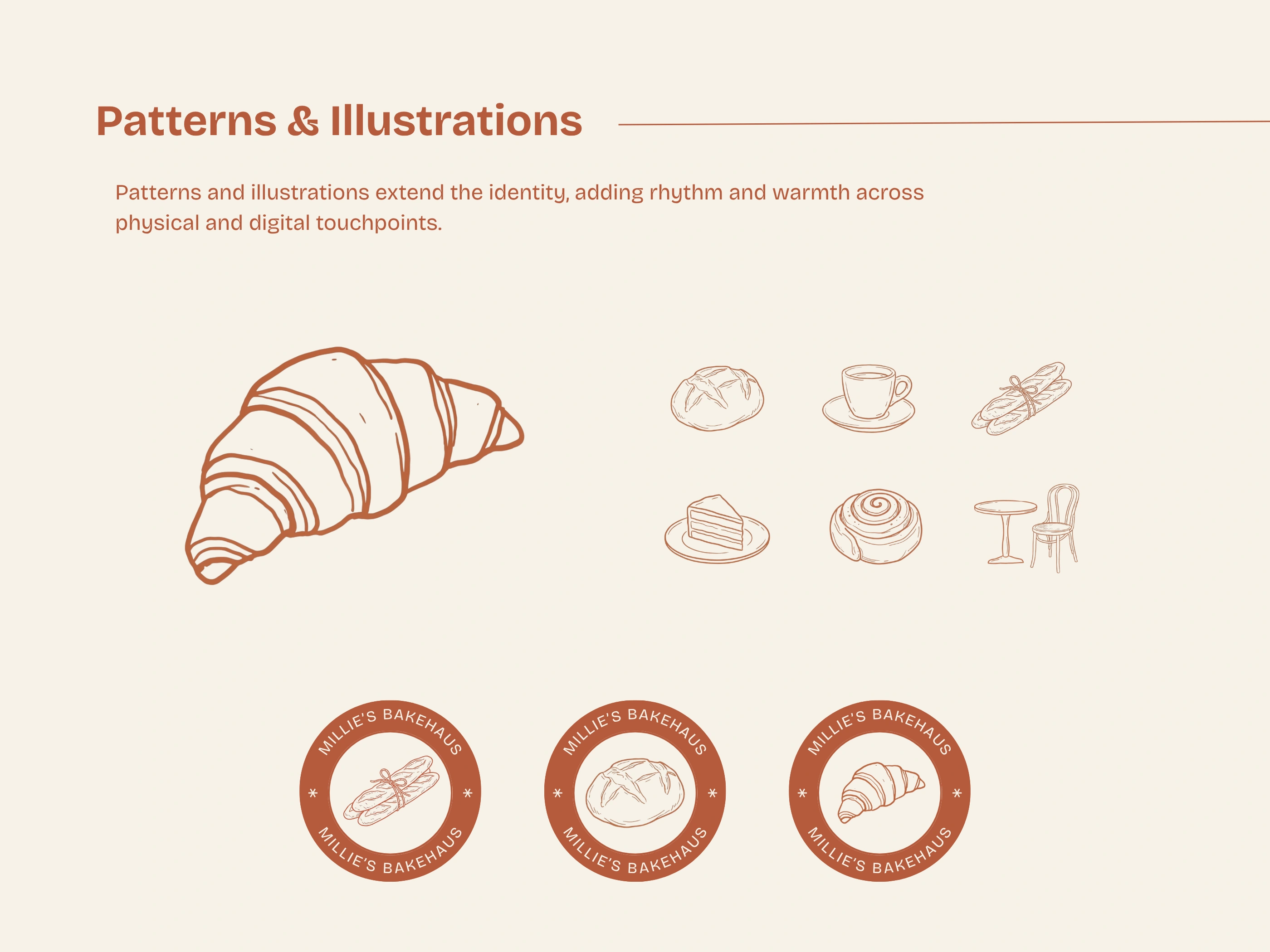
A custom wordmark brings personality and warmth, while a restrained palette and minimal layouts create a calm visual rhythm. Soft illustrations and subtle patterns add a sense of character without competing with the products themselves.
The system is designed to feel timeless, with enough flexibility to stay inviting across seasons, menus, packaging, and daily interactions.
The System
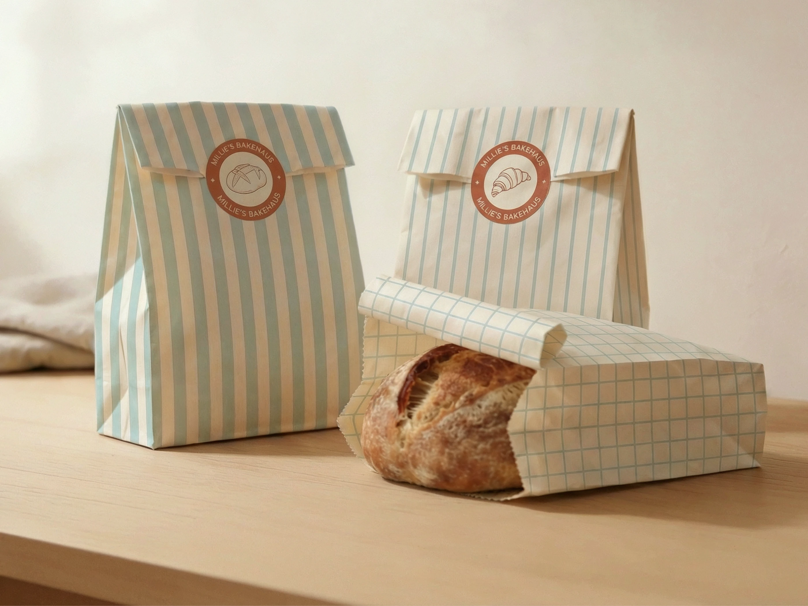
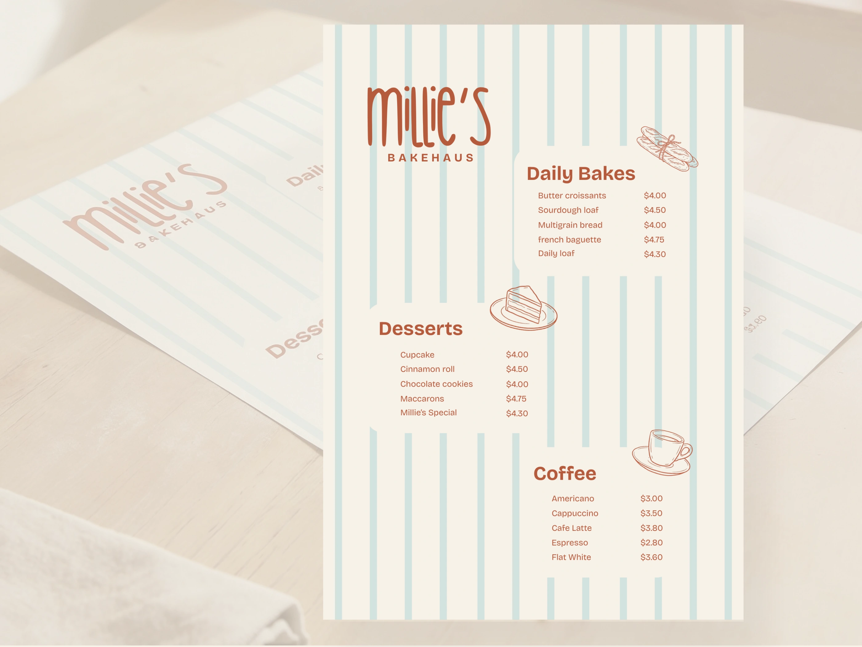
A bakery is experienced through small, repeated moments: the takeaway bag carried home, the menu read at the counter, the pastry box opened at breakfast, and the cup sitting beside a morning newspaper.
Millie’s was built as a connected set of those moments. Packaging, collateral, illustration, and social direction all carry the same relaxed, thoughtful tone.
Scope
Brand strategy
Visual identity
Packaging design
Illustration system
Brand collateral
Social direction
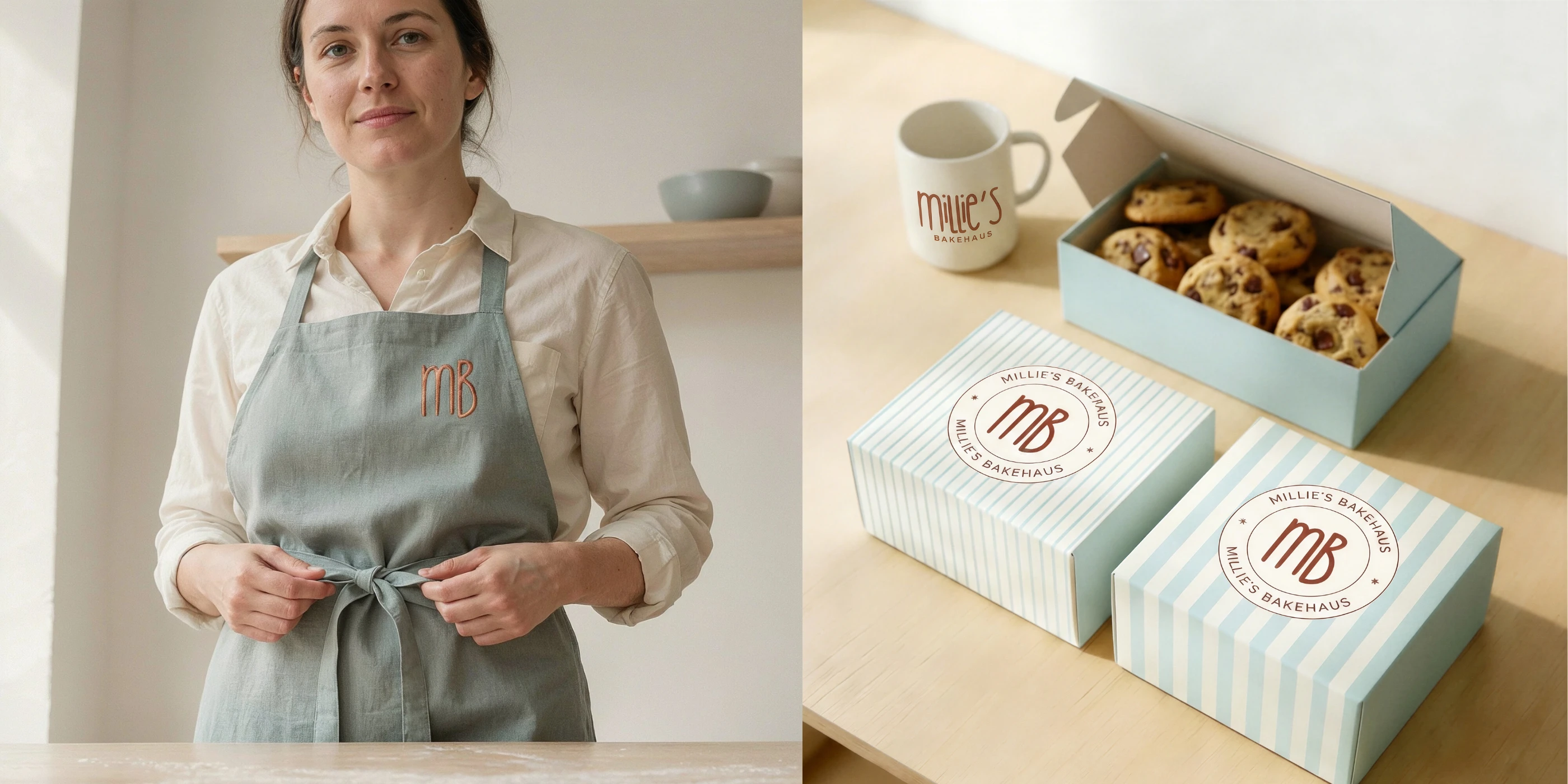
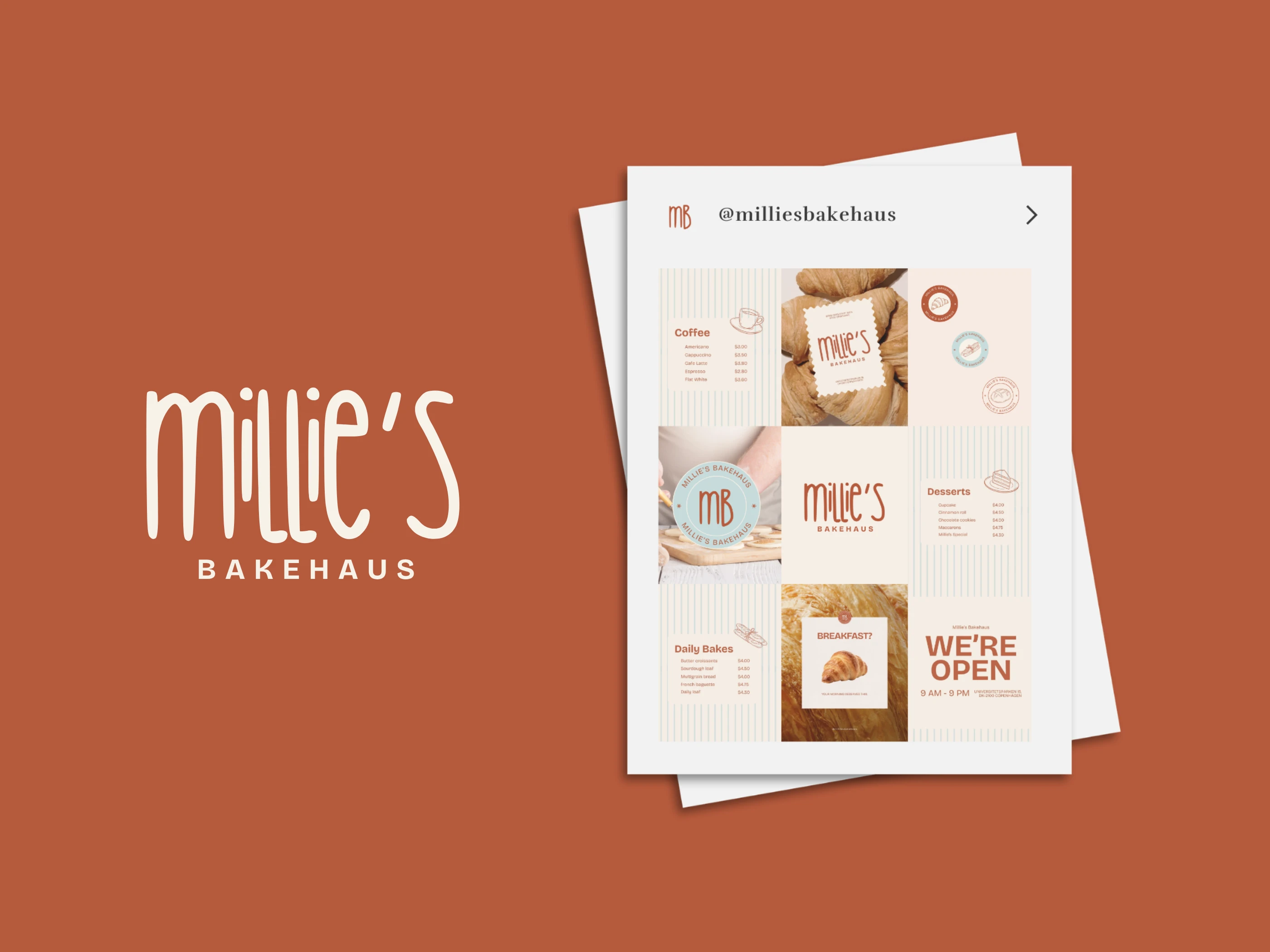
Designed for Everyday Touchpoints
The identity gives Millie’s Bakehaus a warm and refined presence without demanding attention.
It creates a flexible brand world where the small details, from a pastry box to a menu, feel part of the same familiar place.
Like this project
Posted Jul 17, 2026
Branding for a contemporary neighborhood bakery, blending warm identity design, packaging, illustration, and everyday brand touchpoints.