Cravly: Indulgence-first branding for functional snacks

Urvisha Joshi


The Brief
Cravly is a protein brownie brand built for people who want a convenient, protein-rich snack without giving up the pleasure of a proper treat.
The category often leans on muted palettes, clinical claims, and performance-led messaging. Cravly takes the opposite route. The brand leads with flavour, texture, and the anticipation of dessert, with functional nutrition sitting naturally in the background.
The Idea
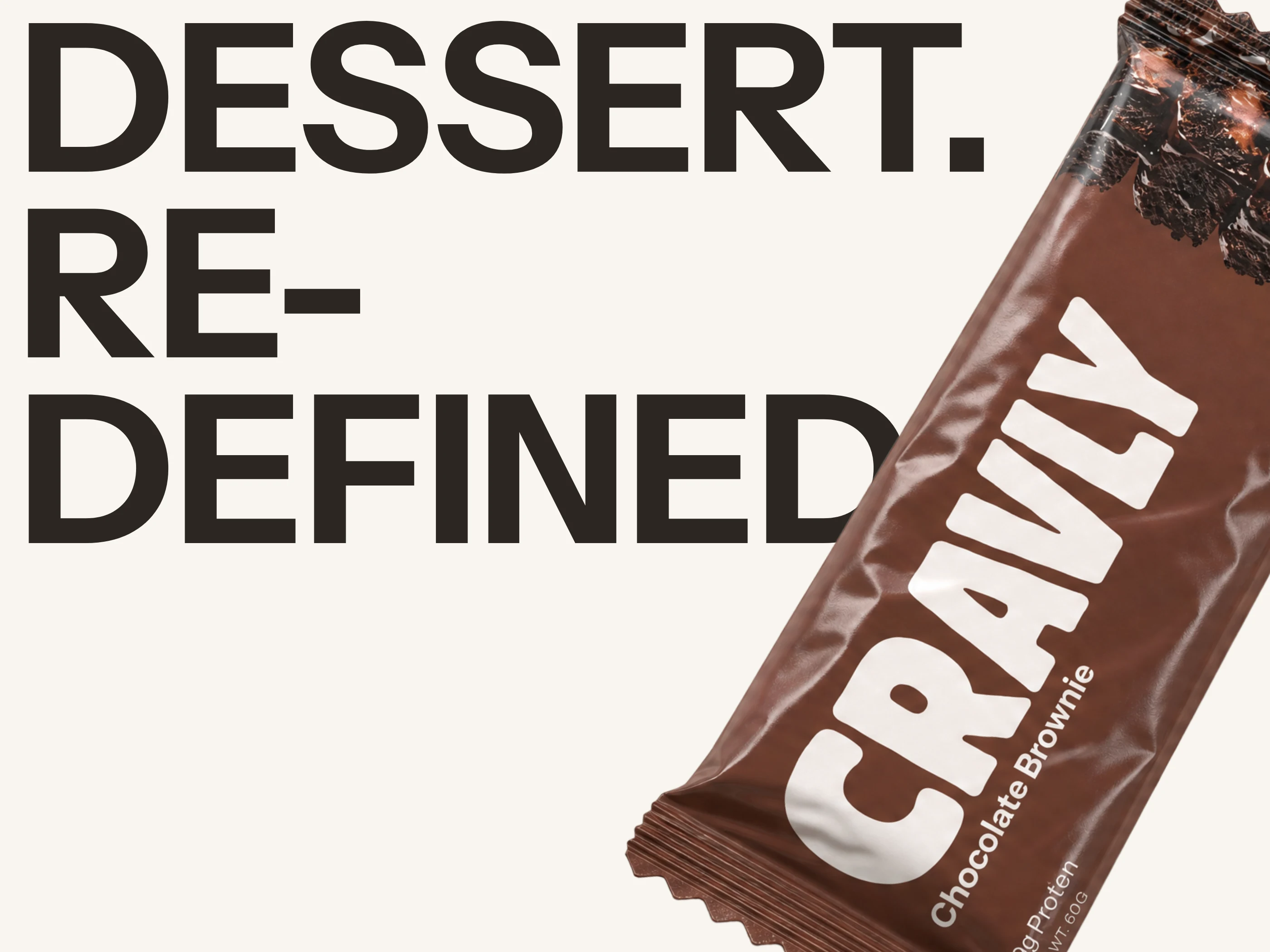
The identity is designed to make the product feel instantly craveable.
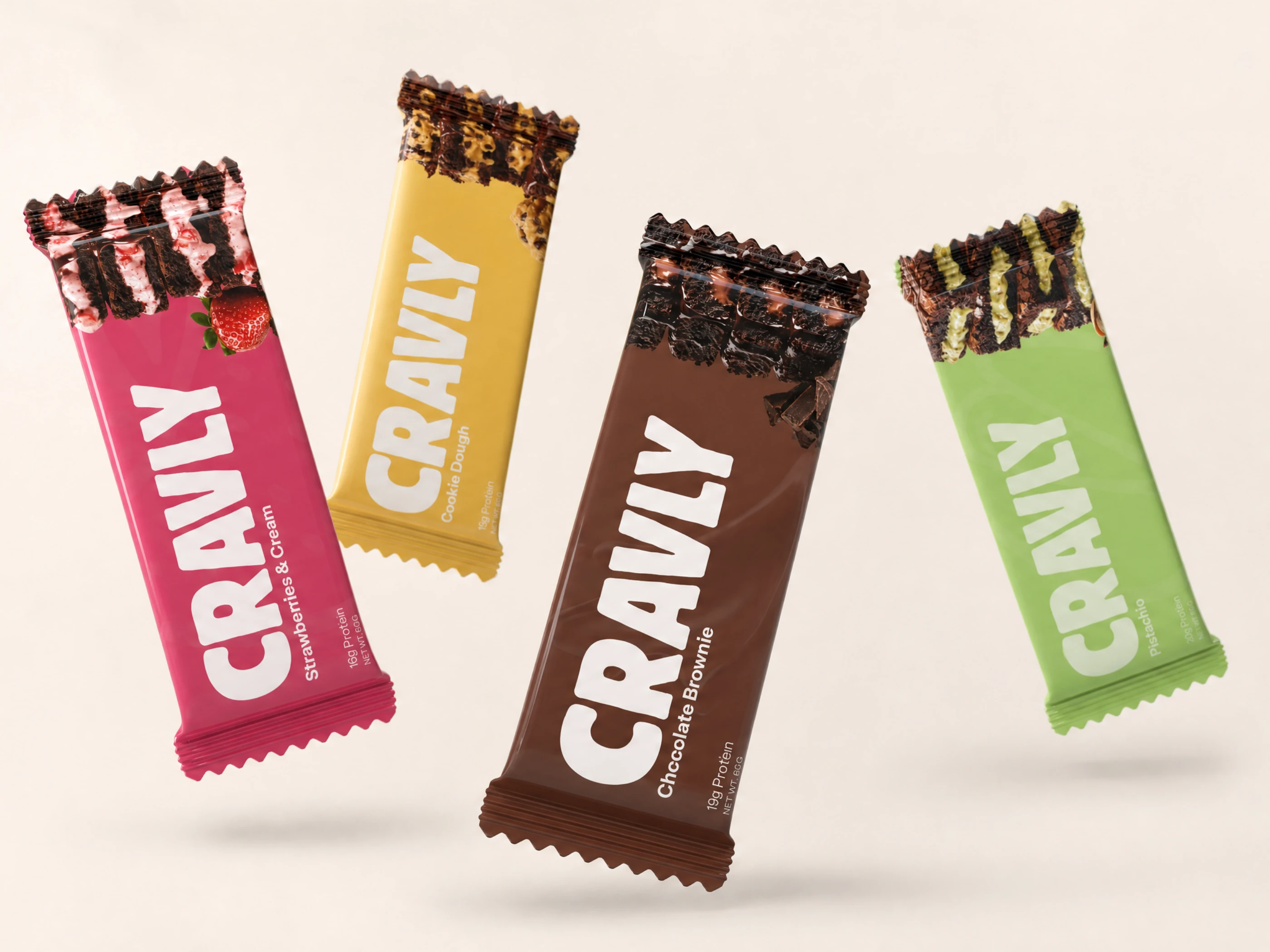
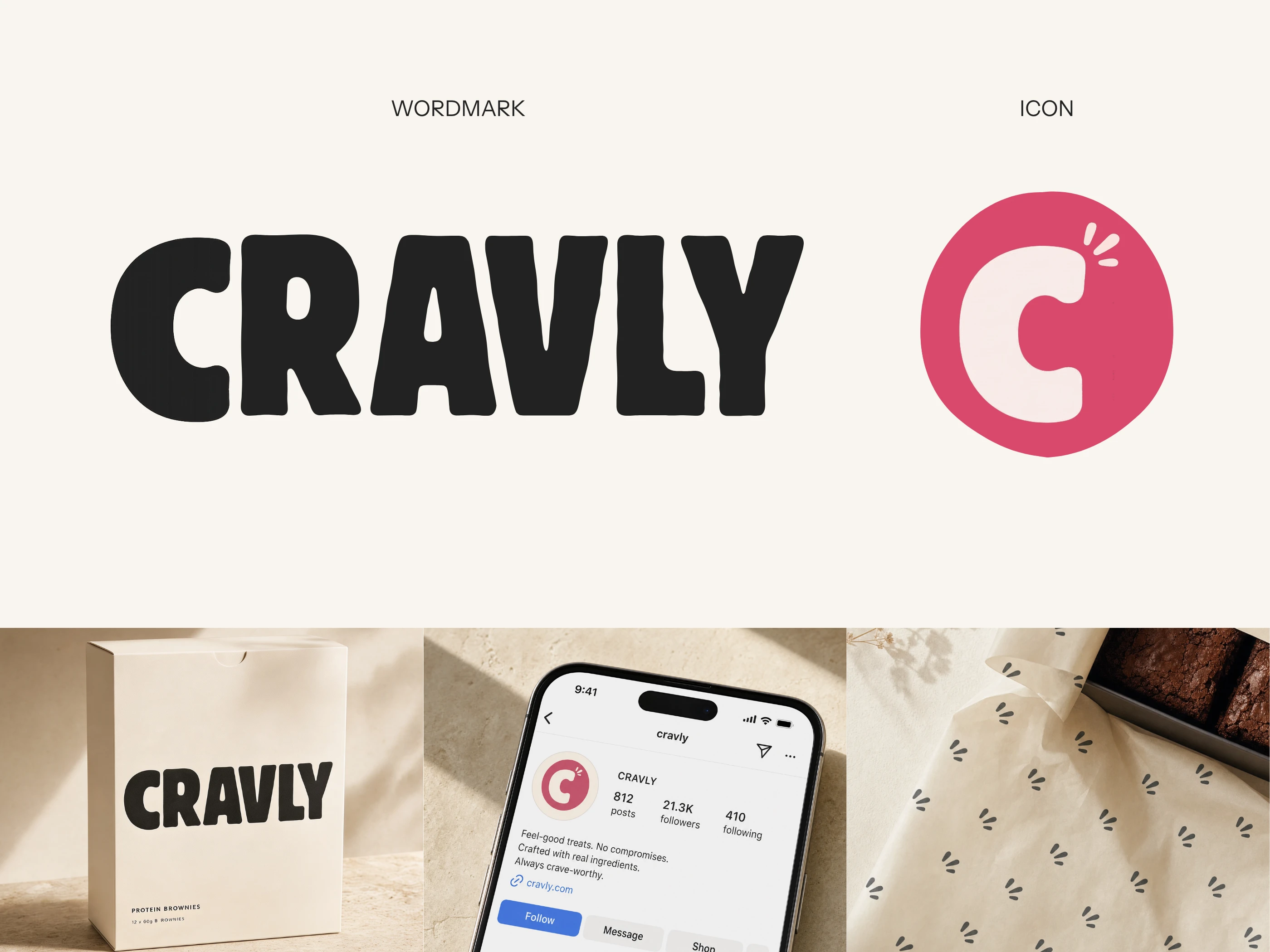
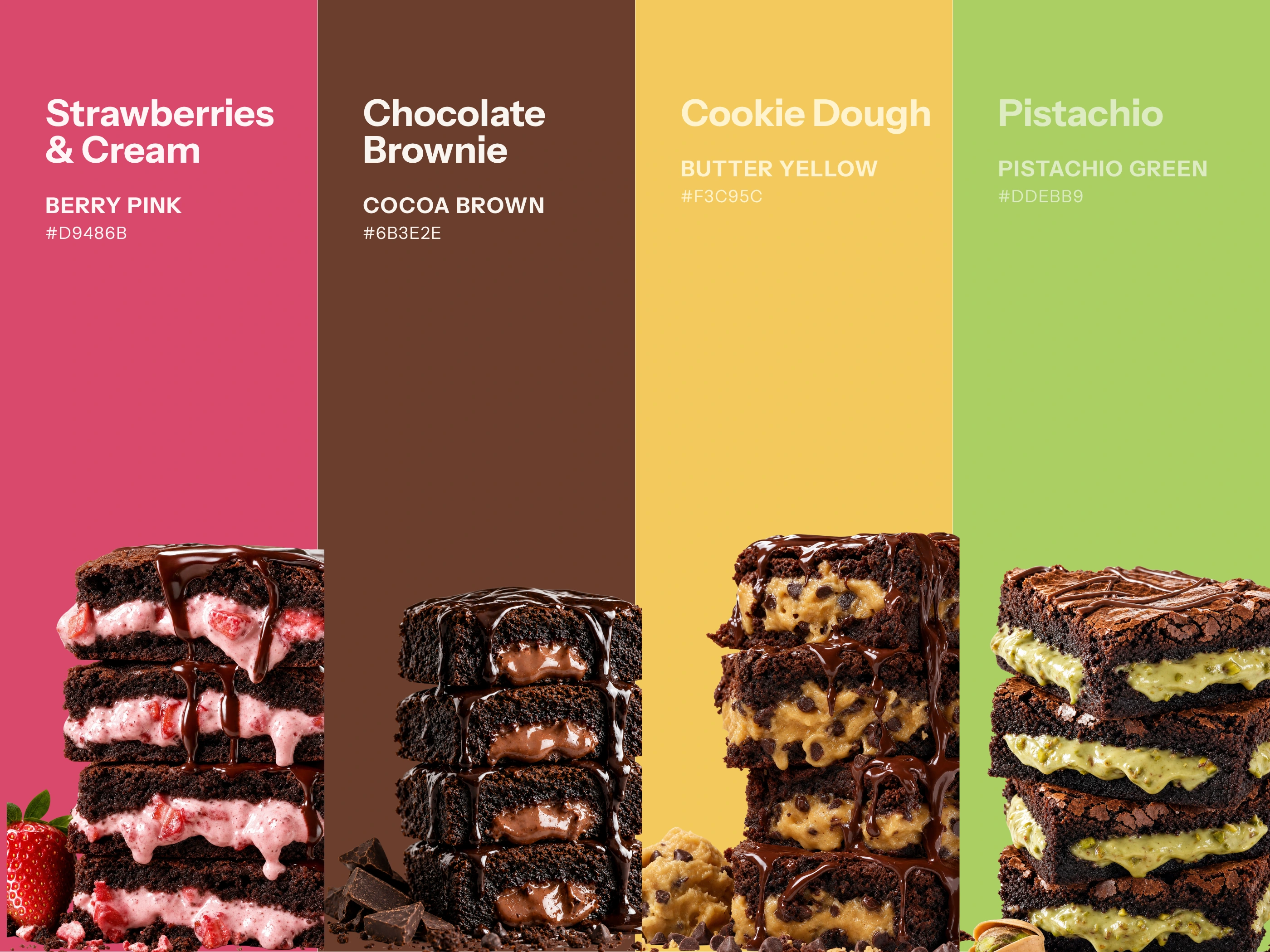
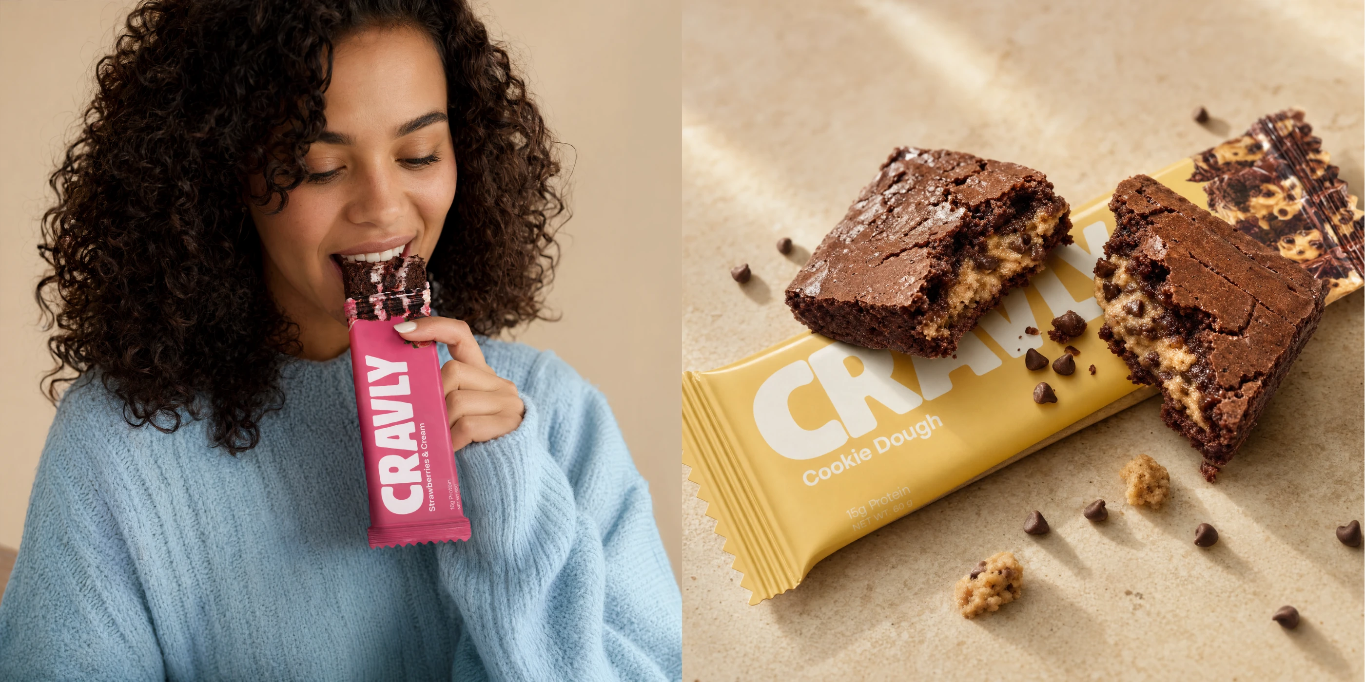
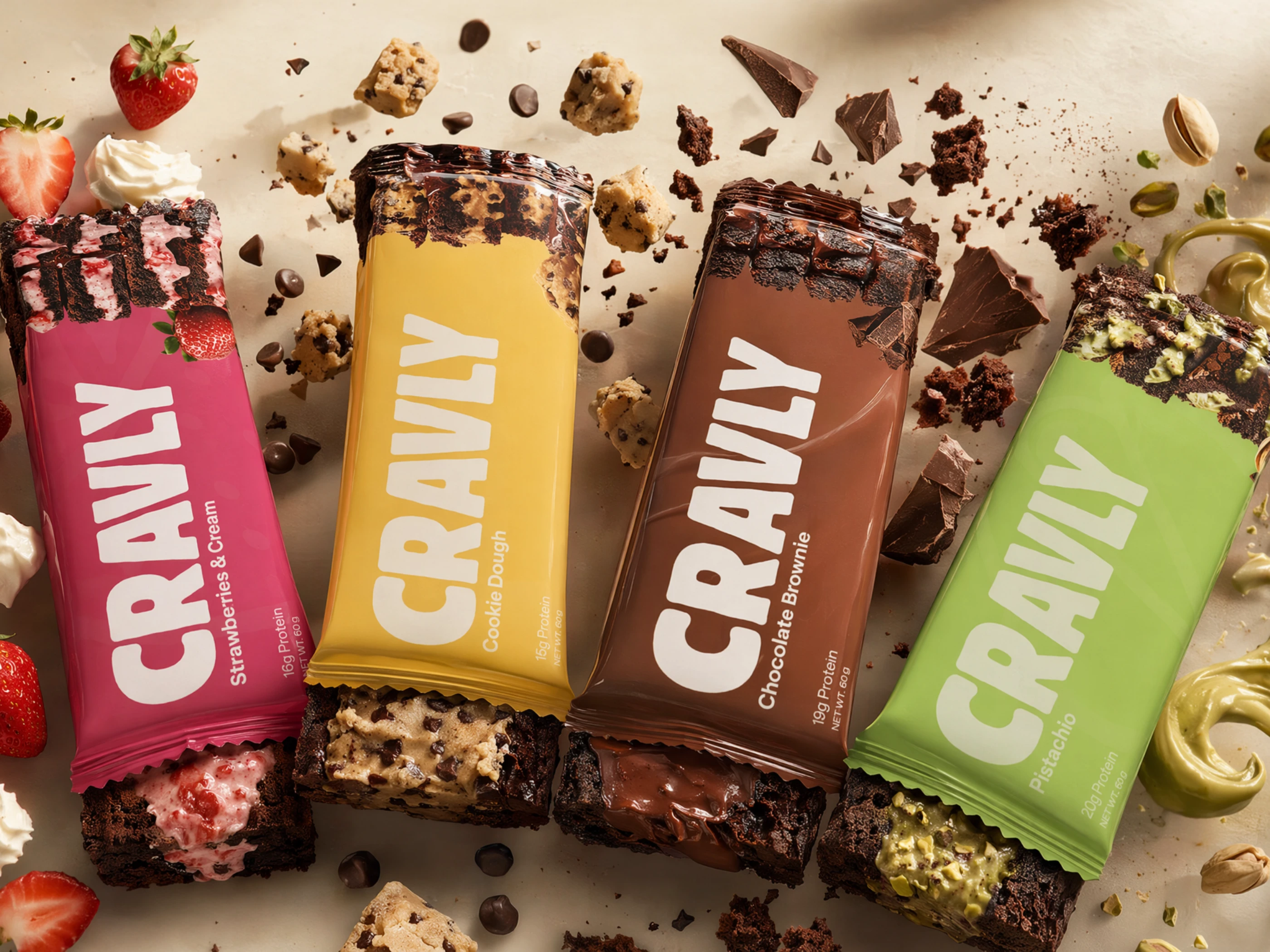
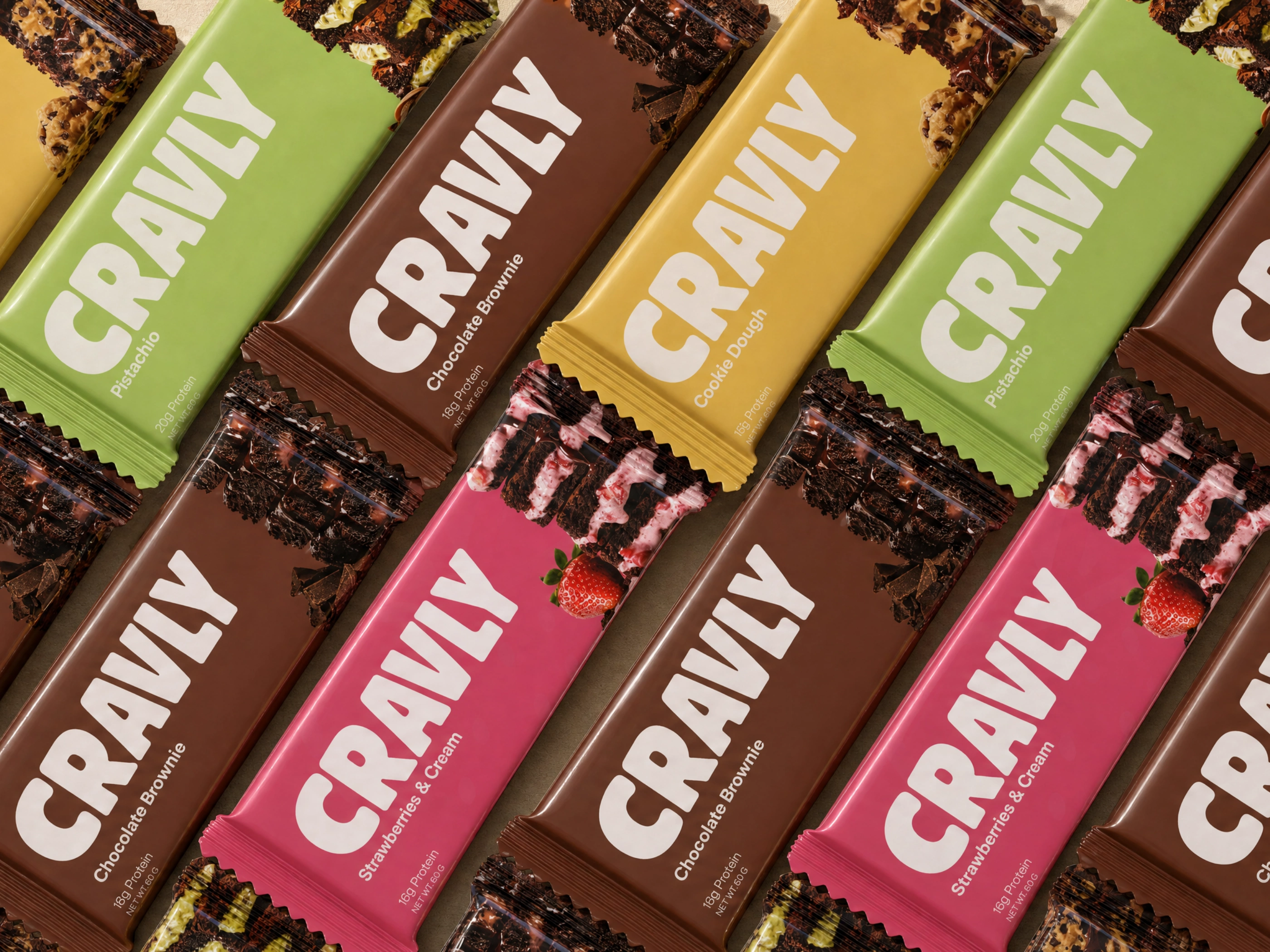
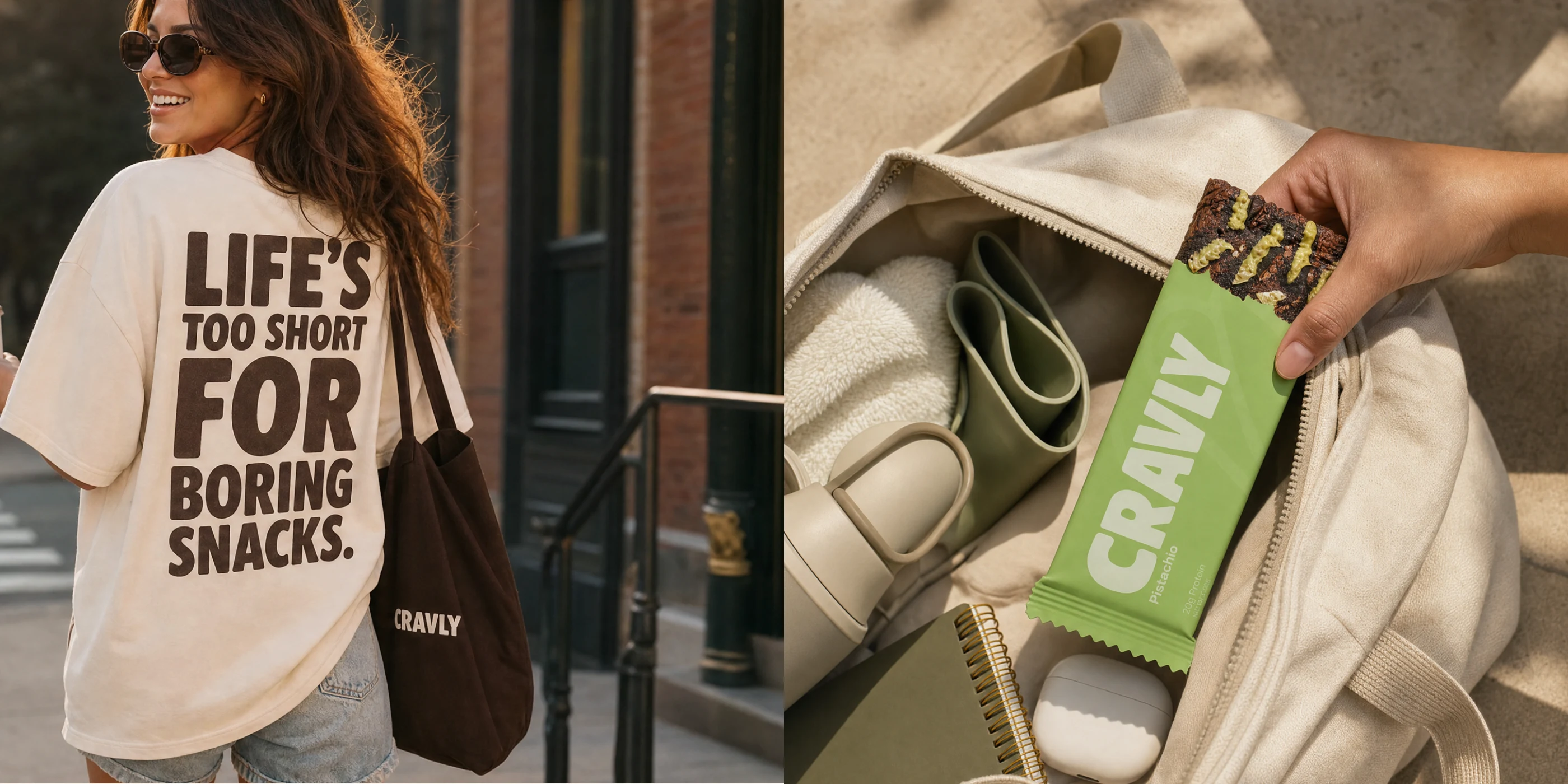
A confident wordmark, expressive type, and flavour-led colour create a brand world with the energy of a dessert counter rather than a traditional health-food aisle. The visual language gives each brownie its own personality while keeping the overall range connected.
The System
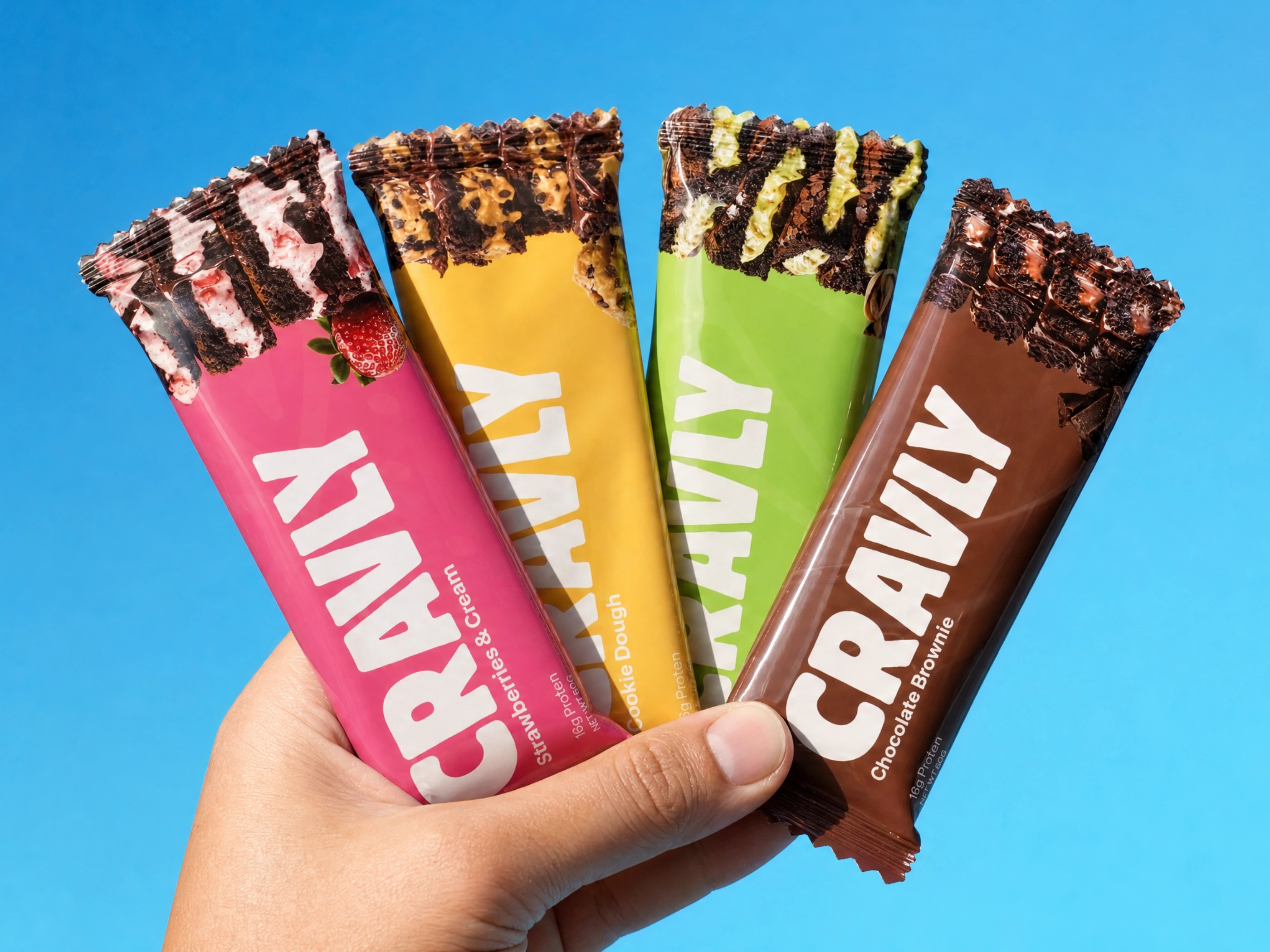
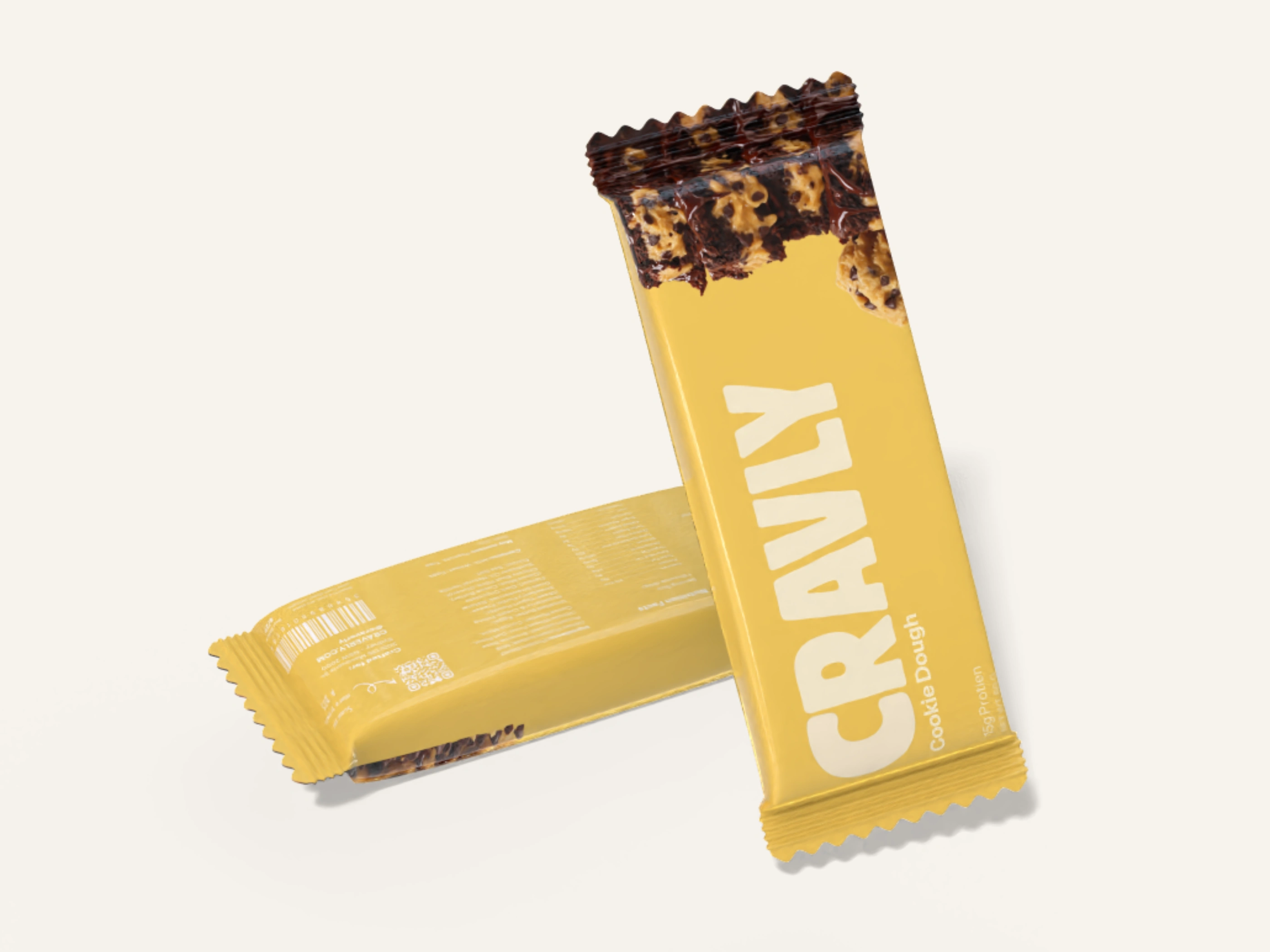
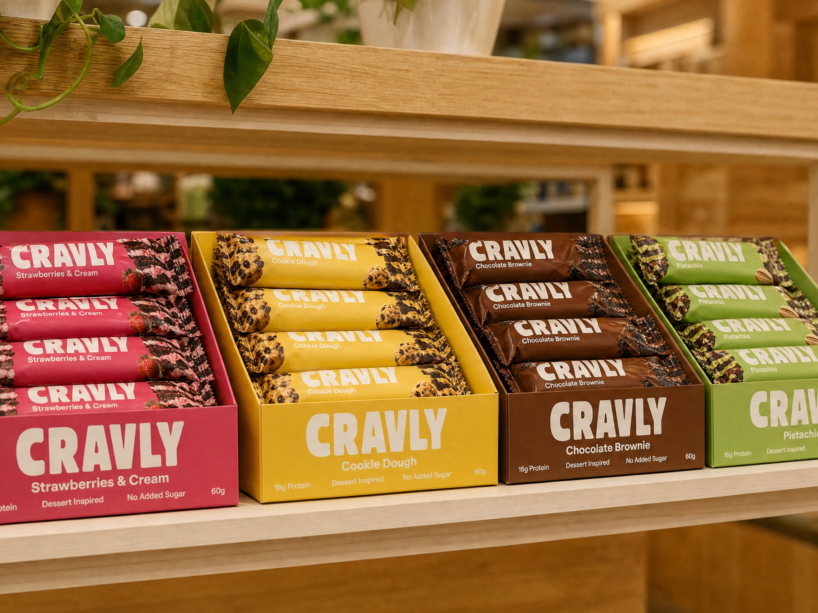
Packaging needed to balance indulgence with clarity. Large product imagery brings the brownie forward, while colour and information hierarchy make each flavour easy to spot and understand.
The result is a flexible system that can grow across wrappers, multipacks, retail displays, digital content, and campaign assets without losing its appetite-first point of view.
Scope
Brand strategy
Visual identity
Packaging design
Creative direction
Product-range architecture
Designed to Be Picked Up
Every touchpoint is built around a simple idea: functional snacks can look as tempting as the treats people already reach for.
The identity gives Cravly a bold, energetic presence that makes healthy choices feel like a choice people actually want to make.

Like this project
Posted Jul 17, 2026
Designed brand identity for a protein brownie brand that puts flavour, indulgence, and personality first, supported by a bold identity and packaging system.