Everkynd: Skincare brand for sensitive skin

Urvisha Joshi


The Brief
Everkynd is a skincare brand for sensitive and overstimulated skin, created around the idea that daily care can feel slower, gentler, and more intentional.
Rather than competing through loud claims or crowded packaging, the brand creates a quieter experience from the first moment someone encounters it.

The Idea
The visual identity is built around softness, restraint, and reassurance.
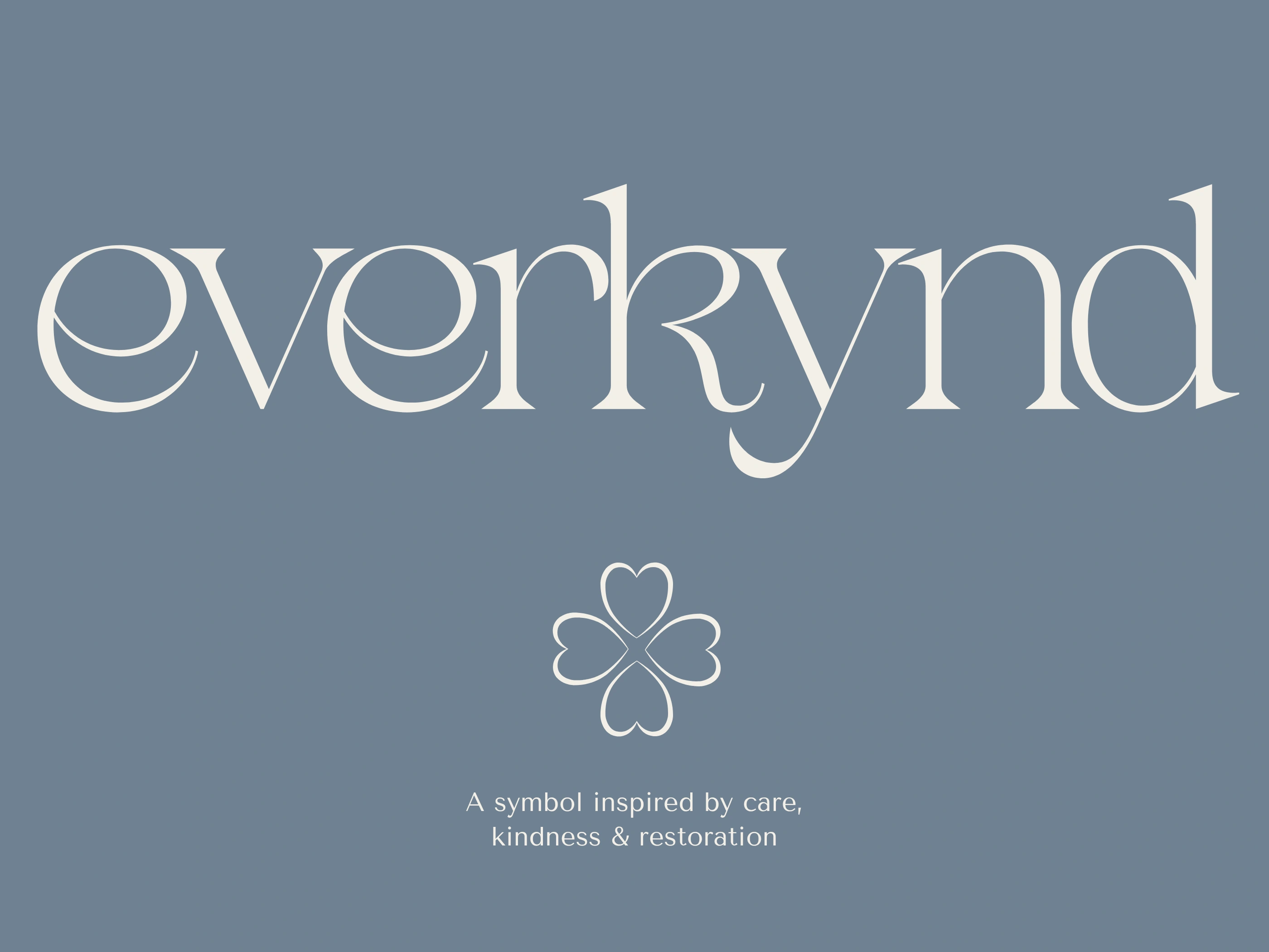
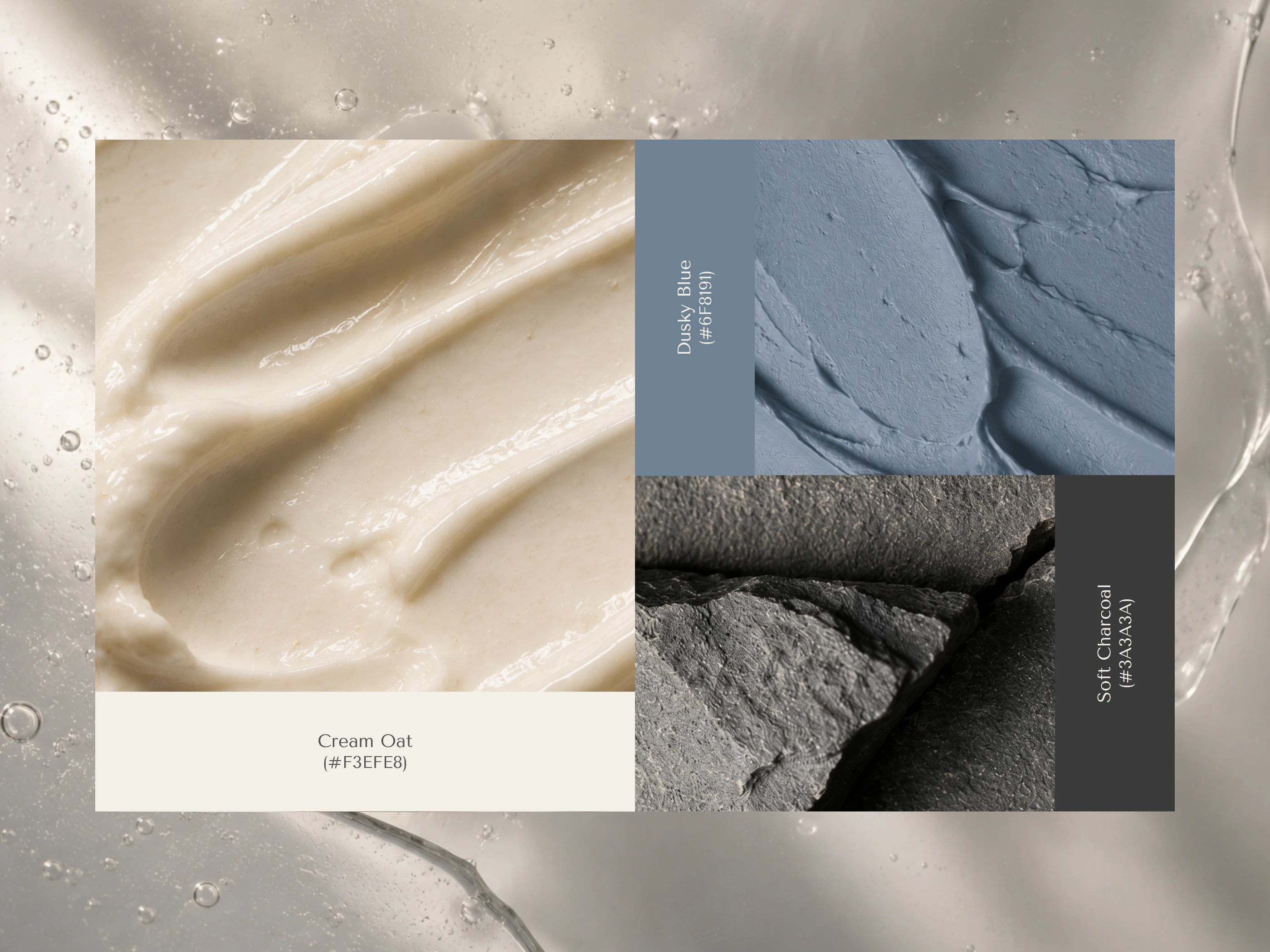
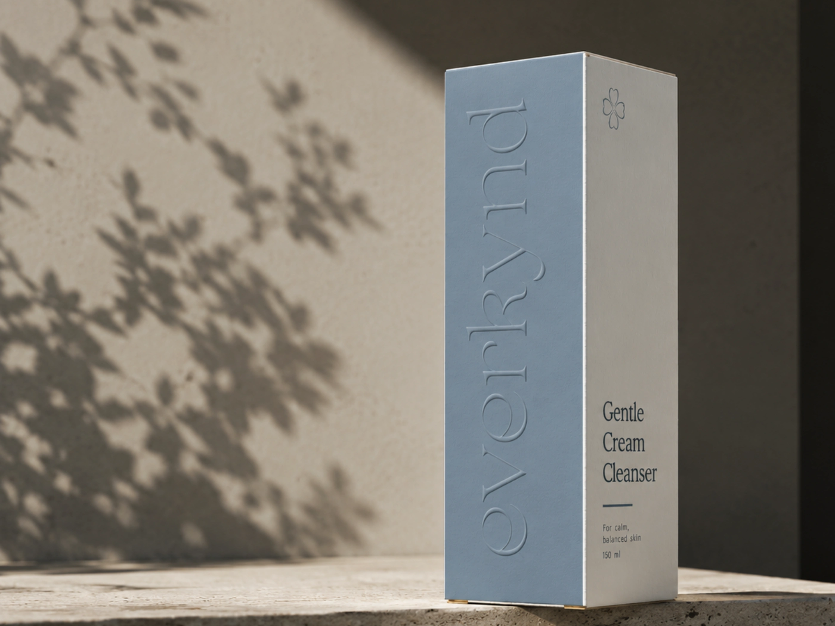
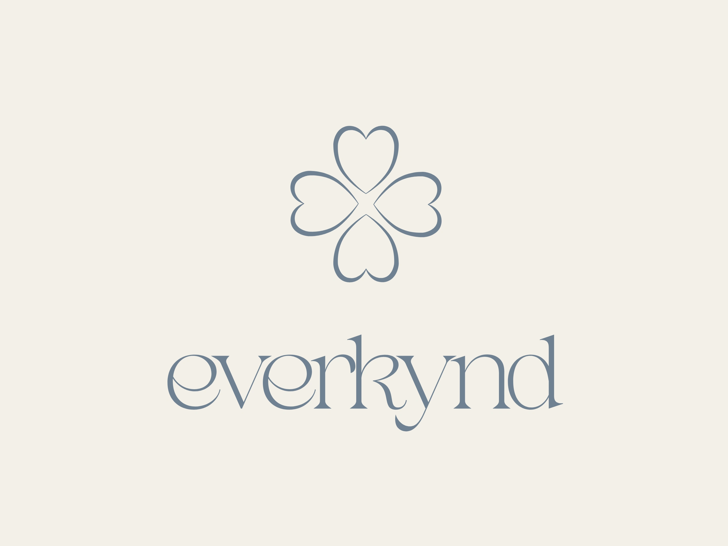
An elegant serif wordmark brings warmth and refinement, while clear supporting typography keeps product information calm and approachable. A muted palette of cream, dusky blue, and charcoal creates an atmosphere that feels considered without becoming cold or overly clinical.
A subtle floral symbol adds a sense of care and restoration, giving the brand a recognizable signature across packaging and communications.

The System
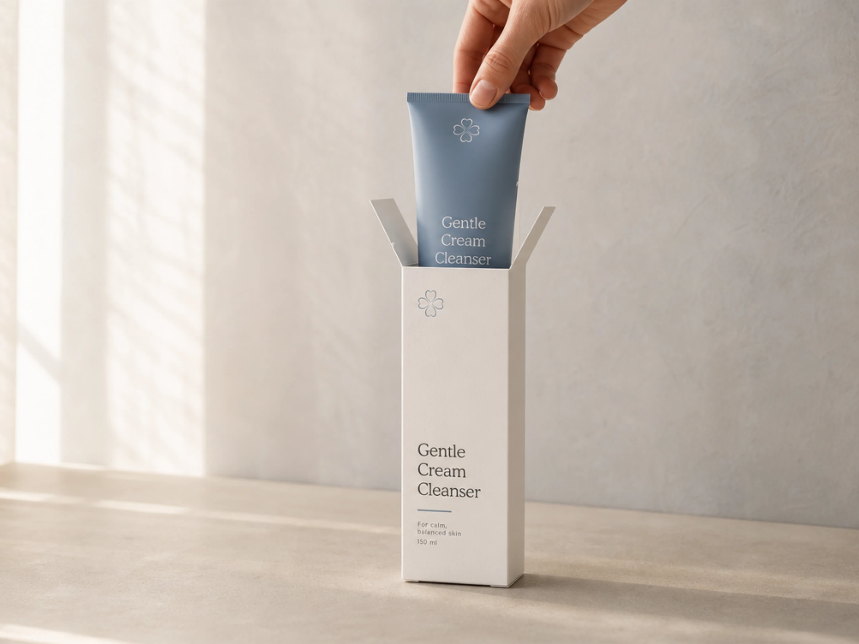
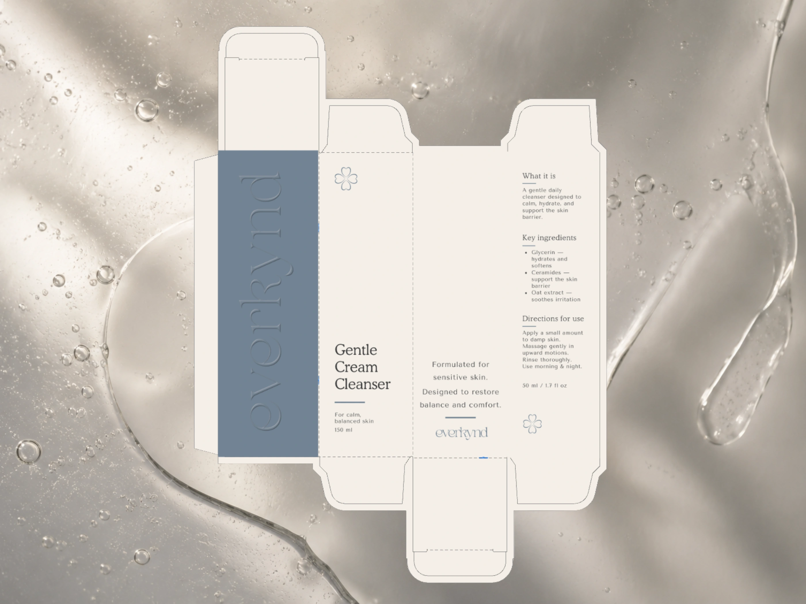
The packaging uses generous white space and careful hierarchy to let the products breathe. Each element has room to do its job, from product names and skincare benefits to ingredient information and routine cues.
Photography and art direction extend the same feeling through soft light, natural texture, and quiet ritual-led scenes.


Scope
Brand strategy
Visual identity
Packaging design
Art direction
Product system design



Designed for Moments of Care
Everkynd imagines skincare as a restorative pause rather than another task on the list.
The resulting system creates a consistent, calm experience across packaging, digital content, and future brand applications.
Like this project
Posted Jul 17, 2026
Branding for a sensitive-skin skincare brand, pairing a calm visual identity with packaging and art direction built around slower self-care rituals.