Extending a Personal Identity Into a Visual System

Justin Donnell


Extending a Personal Identity Into a Visual System
After redesigning my personal website, I began carrying the same visual language into other parts of my professional presence.
What started as a website identity gradually expanded into social graphics, service marketing, business cards, and portfolio materials.
The goal was not to make every piece look identical. It was to create a recognizable visual system that could adapt to different formats, messages, and constraints while still feeling like part of the same identity.
The starting point
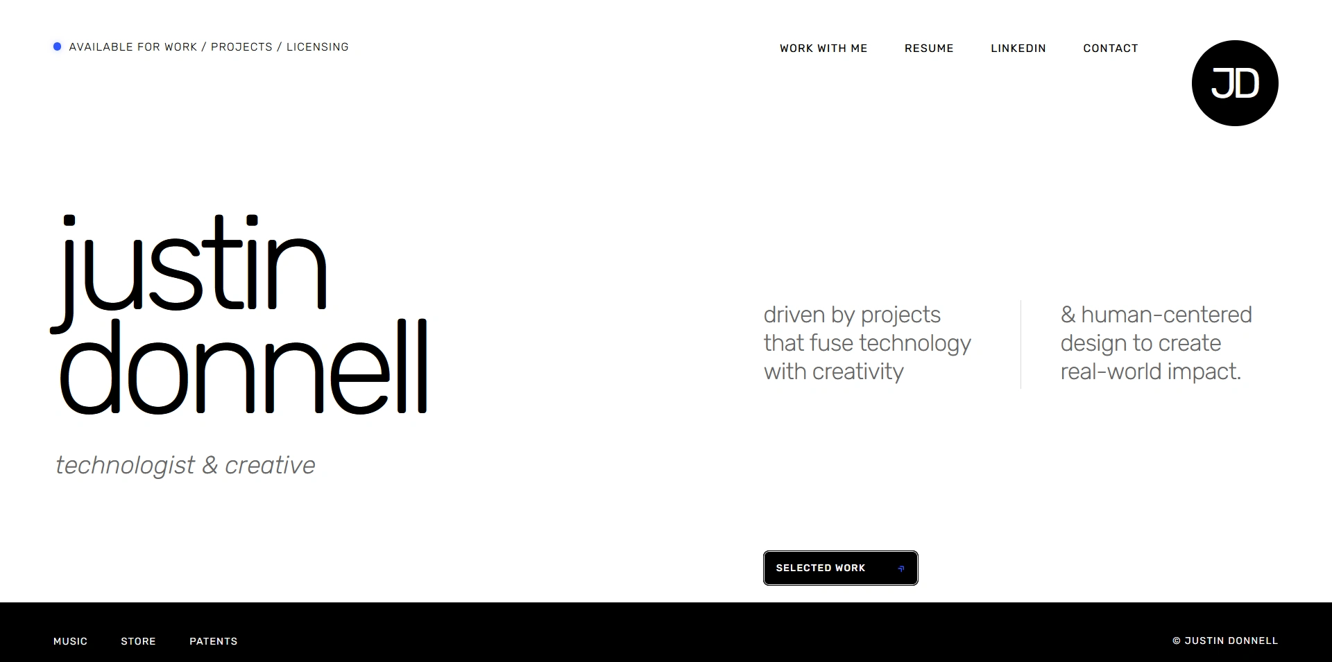
The website established the core visual language:
oversized lowercase typography
a restrained black, white, and gray palette
electric blue as the primary accent
generous negative space
asymmetrical editorial layouts
the circular JD monogram
simple rules, dividers, and typographic details
a mix of large identity statements and quieter supporting information
Those elements became the foundation for everything that followed.
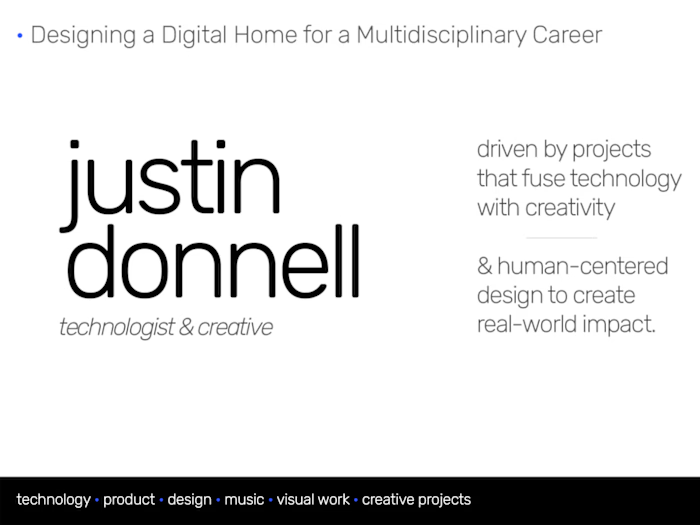
The original challenge was creating a digital home for work that spans technology, product, software, design, and independent creative projects.
This case study picks up where the original website project left off.
View the website case study: Designing a Digital Home for a Multidisciplinary Career
Once the site was complete, the question became:
Could that identity work just as well outside the website?
Home Page
Taking the identity beyond the site
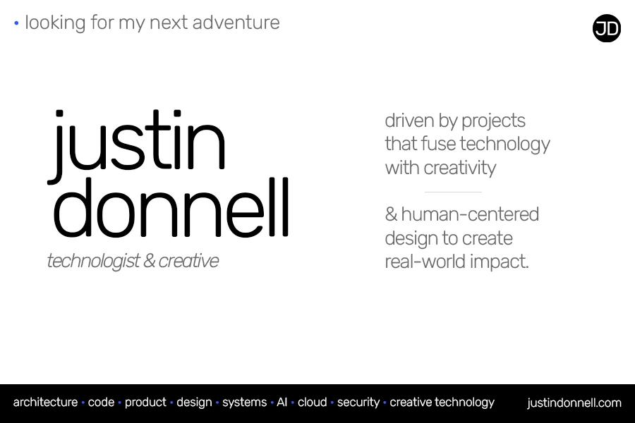
One of the first extensions was a graphic created to accompany posts about looking for my next professional opportunity.
Rather than create a standalone promotional piece with a different look, I treated it as another surface for the same identity.
The typography, blue accent, JD mark, spacing, and editorial structure all carried over, but the composition changed to suit a static social image rather than a webpage.
That became an early test of whether the system could stand on its own.
Social Graphic
Creating a repeatable system for services
As I expanded my freelance offerings, I needed a set of graphics for several different service areas.
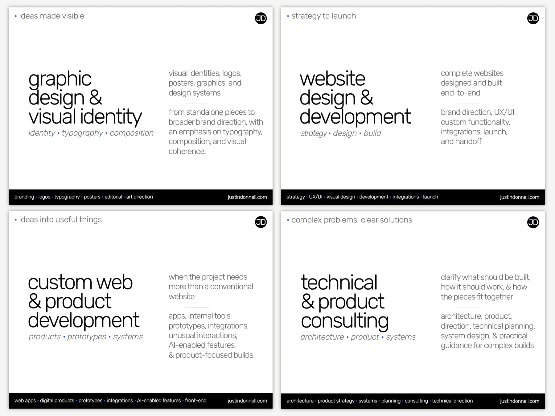
Instead of designing each independently, I created a shared visual framework that could handle different titles, descriptions, and levels of information while remaining clearly related.
Each graphic uses the same basic structure:
short conceptual phrase in the upper left
oversized service title
italic secondary descriptor
supporting copy on the right
JD monogram
black footer containing related capabilities
blue punctuation and accents throughout
The structure stays recognizable from piece to piece, but the typography and composition flex depending on the content.
The result is a family of graphics that belong together without feeling like the same template repeated multiple times.
Service Graphics
Consistency without repetition
One of the more useful outcomes of the process was realizing that consistency does not require sameness.
Some elements remain stable throughout the system:
typography
color palette
JD monogram
blue accent
spacing philosophy
editorial tone
strong typographic hierarchy
Other elements are allowed to change:
title length
line breaks
content density
composition
relative scale
balance between primary and secondary information
That flexibility makes the identity more useful.
Rather than defining one rigid layout, the system establishes a visual grammar that can be interpreted differently depending on the communication problem.
Another intentional part of the system was reversibility. The predominantly black-and-white palette allows the identity to invert naturally, while the blue accent becomes its complementary yellow. This created a built-in dark variation without requiring a separate visual system.
Exploring a broader color system
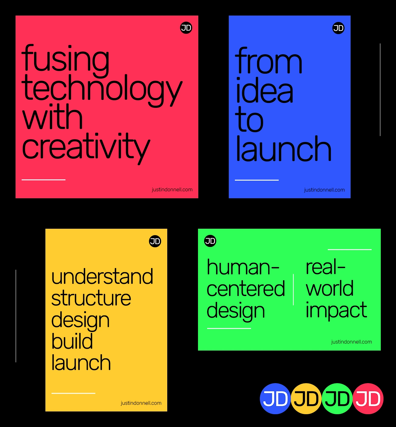
As the identity developed, I began testing how far the visual language could stretch beyond its original black, white, gray, and blue palette.
Rather than changing the underlying structure, these experiments kept the same typography, spacing, JD mark, and minimal composition while allowing color to become the dominant field.
The original blue remained part of the system, but I also explored a four-color palette built from evenly spaced hues on the color wheel. The resulting blue, yellow, red, and green created a broader but still balanced color system.
The goal was not to replace the core visual identity, but to see how much variation it could support without losing its character.
Color Experiments
The experiments reinforced that the identity was being carried less by one specific color combination and more by its typography, proportion, spacing, and overall visual grammar.
Moving the identity into print
The next step was translating the system into a physical business card.
The smaller format introduced different constraints.
The cards needed to communicate professional positioning, capabilities, contact information, and a QR code while still retaining the same visual character as the website and digital graphics.
Typography, spacing, the JD monogram, and blue accents carried over directly, but the information hierarchy had to become more compact.
Print production also affected the palette.
Some of the lighter gray typography that worked well on screen needed to be darkened substantially to reproduce reliably in print. The final cards therefore use more solid black than the digital materials.
That reduced some of the tonal contrast between black and gray, but the hierarchy still holds through scale, spacing, alignment, grouping, and typographic weight.
The system was adjusted to work within the realities of the medium rather than treated as a fixed set of rules.
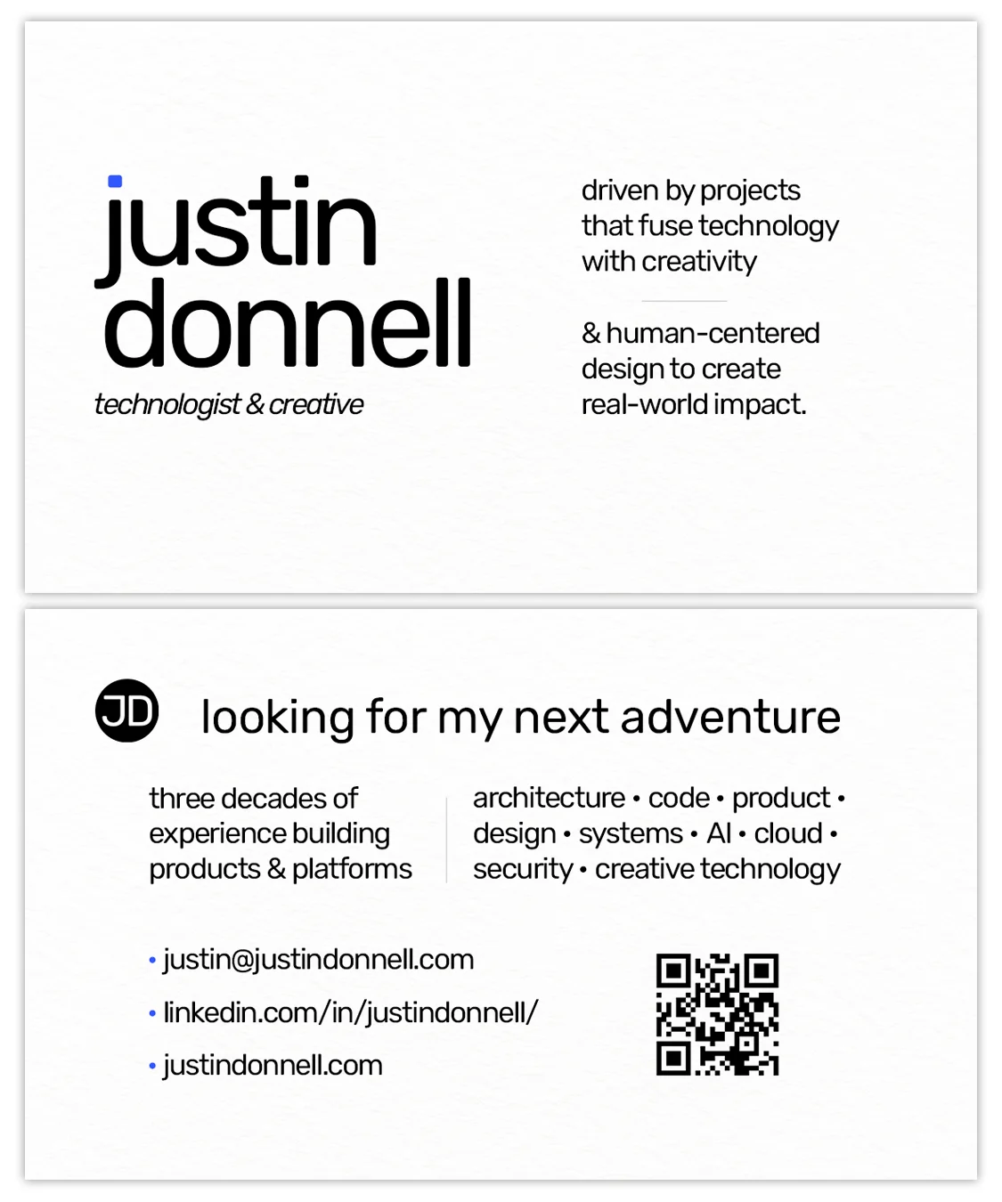
Business Card (front & back)
From identity to system
By this point, the original website identity had expanded across several different kinds of communication:
website
social graphics
service marketing
professional positioning
print
portfolio presentation
The individual pieces serve different purposes, but they share the same underlying language.
The consistency comes less from one repeated layout and more from a set of recurring decisions around:
typography, proportion, spacing, contrast, blue accents, editorial structure, and tone.
That is what turned the original website design into something broader: not just a look, but a flexible visual system.
Extending the system one step further
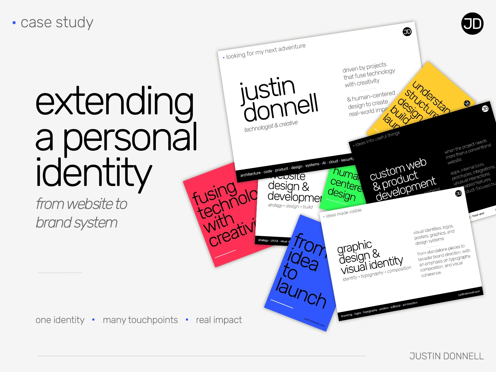
The cover image for this case study became another application of the same identity.
Rather than use a neutral portfolio thumbnail, I designed the cover using the same visual language: oversized typography, white space, the JD mark, layered examples of the work itself, and the broader color palette introduced through the later experiments.
I also introduced a very light gray background so the predominantly white source graphics would separate from the page and retain enough visual depth. It’s a small departure from the original black-and-white system, but one made in service of clarity rather than decoration.
The piece documenting the visual system became one more place where that system had to adapt and still remain recognizable.
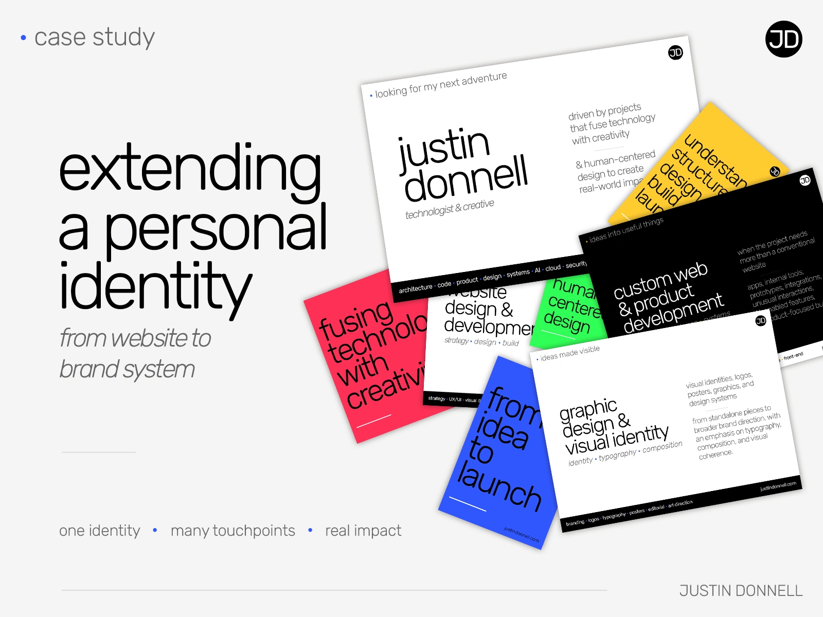
Case Study Cover Image
My role
Visual identity • graphic design • typography • layout • brand system • print design • content hierarchy • art direction
Like this project
Posted Sep 20, 2026
Extended a personal visual identity across social, services, print, and portfolio materials into one flexible, cohesive design system.