Capturing the Photographer

Justin Donnell

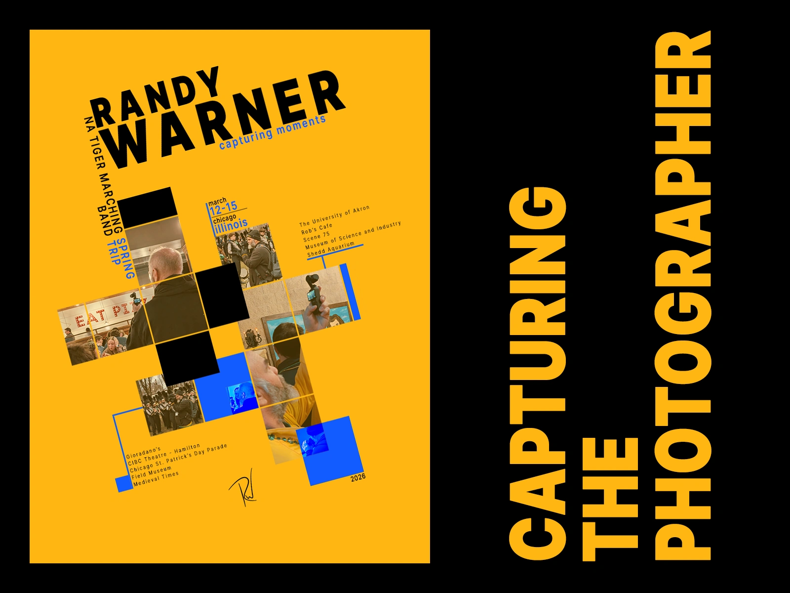
Capturing the photographer
Randy Warner has spent years volunteering his time photographing and filming our high school marching band—games, parades, trips, performances, and just about everything in between.
On a band trip to Chicago, I decided to turn the camera around.
Without telling him what I was doing, I started taking candid photographs of Randy taking photographs of everyone else.
At the time, I didn’t know exactly what I was going to make with them. I just knew I wanted to create something that acknowledged the person who was usually behind the camera.
Finding the visual direction
I had previously saved a poster by designer Chris Decker because I liked its interpretation of the International Typographic Style—particularly its angled typography, modular image grid, restricted palette, use of negative space, and relationship between photography and geometric shapes.
When I came back to the photographs from the Chicago trip, that poster became the visual starting point.
Rather than recreate it, I used it as a reference for the underlying design system and began adapting those ideas to a different subject, set of images, and purpose. This was a personal, noncommercial project created as a tribute rather than for client work or sale.
Reference: Chris Decker, Swiss Style Exhibition Poster
Building a new composition
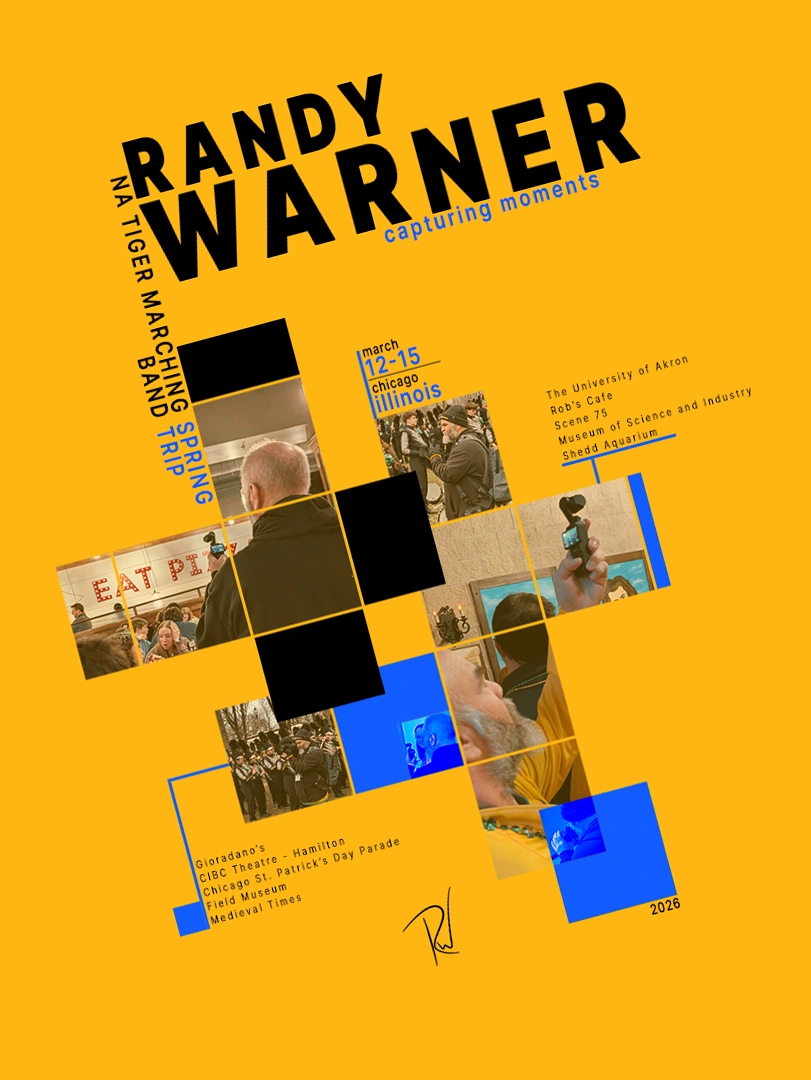
The new piece uses the school’s colors as its dominant palette, with blue as a contrasting accent.
The photographic grid became much more expansive than the original reference, creating a diagonal path through the page using candid images of Randy photographing other people.
I paid particular attention to how the viewer’s eye moves through the composition. Camera angles, sightlines, image edges, blocks of color, and typography were arranged to lead from one moment to the next rather than treating the photographs as a simple collage.
Letting the subject shape the design
The poster became less about recreating a particular visual style and more about using that style to tell a very specific story.
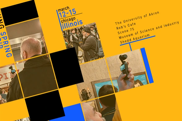
Every photograph shows Randy in the act of documenting somebody else.
The locations and events listed throughout the composition—Chicago, the marching band trip, museums, performances, and other stops—turn the poster into a record of that experience while keeping Randy himself at the center.
The title, "Capturing Moments," works in both directions: it describes what he does for everyone else, and what I was doing by photographing him.
Inspiration vs. outcome
The final piece retains some visible DNA from the poster that inspired it: asymmetry, angled typography, modular photography, strong geometry, and a restricted color system.
But the subject, photographs, visual hierarchy, grid structure, palette, typography, pacing, and overall composition were rebuilt around a completely different purpose.
For me, the exercise became less about imitation and more about understanding why a design worked, then using those principles as constraints for something personal.
My role
Concept • photography • visual design • composition • typography • image treatment • art direction
The finished poster became a small tribute to someone who had spent years documenting everyone else—this time putting the photographer inside the frame.
Interested in Randy’s work?
View more of his photography and video work here:
Like this project
Posted Sep 18, 2026
A photographic tribute to a longtime volunteer, using Swiss poster design as the framework for a new composition built from candid images of him at work.