Kids play space Branding

Bilal Haider


The idea in one sentence
Build a cheerful world children want to explore—and a clear, calm experience parents can understand at a glance.
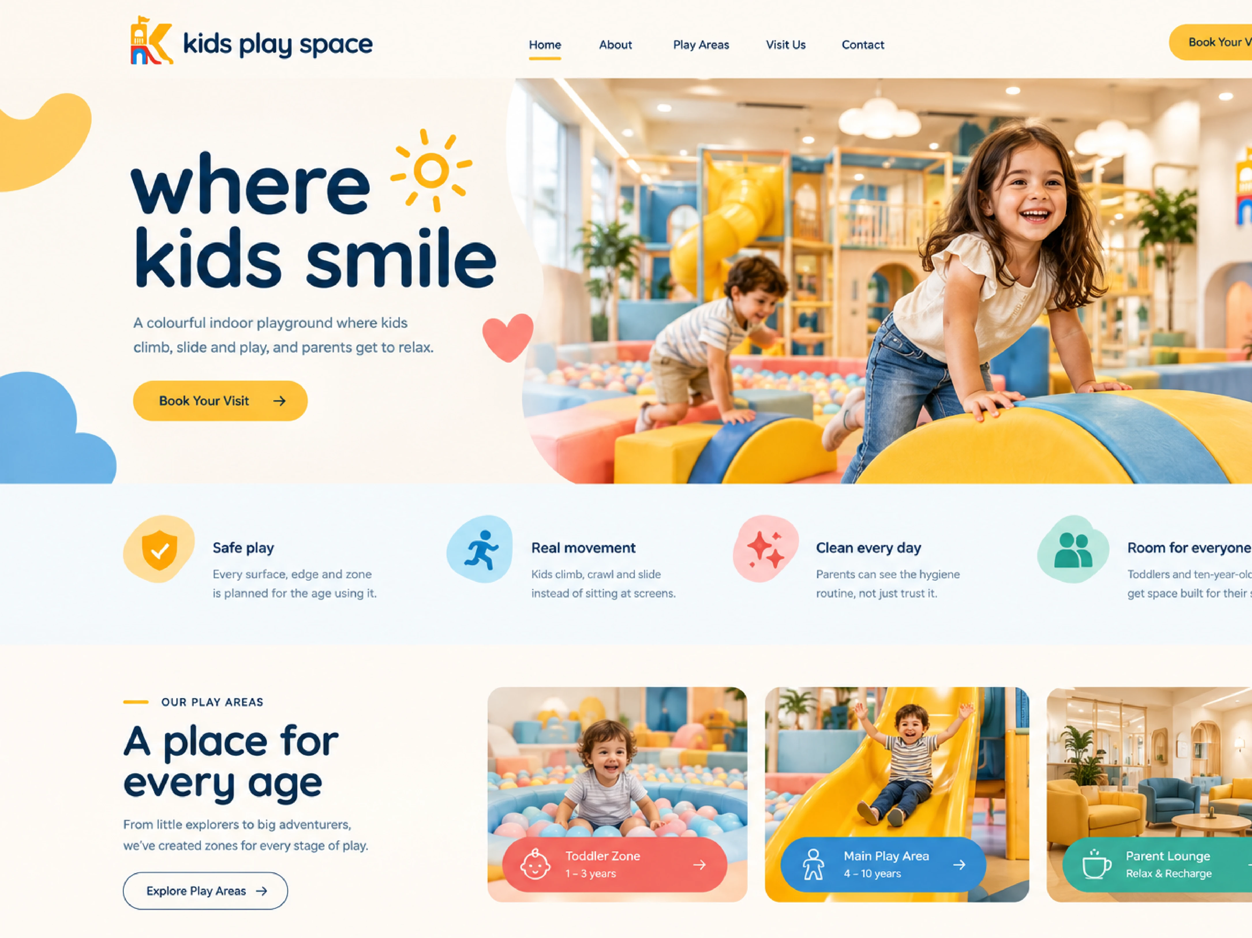
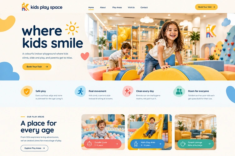
The supplied identity for kids play space brings that idea together through a playground-inspired K, rounded typography, soft backgrounds and friendly shape characters. This case study explains the documented brand strategy and demonstrates how it could extend across a complete visitor journey: discovering the venue, entering the space, finding the right play zone, planning a visit and taking a little of the experience home.

The identity system
One distinctive mark. A whole world around it.
The playground K
The symbol combines playground forms into a recognisable K. Its stacked lockup places the symbol above a fixed lowercase wordmark. The icon can also stand alone for small applications, such as avatars or merchandise details.[^1]
The wordmark is artwork—not a heading to retype. The guide specifies clear space equal to the height of the wordmark’s “k”, a primary minimum width of 30 mm / 140 px, and an icon minimum width of 8 mm / 32 px.[^1]
Built as a full brand system rather than a single logo. The mark is designed to hold together at favicon size and still work on a storefront sign, with the color, type and social templates worked out around it.
Message Me for Brand Work
Like this project