Building a Ecosystem Where Participation Becomes Value
Sourav Dhali
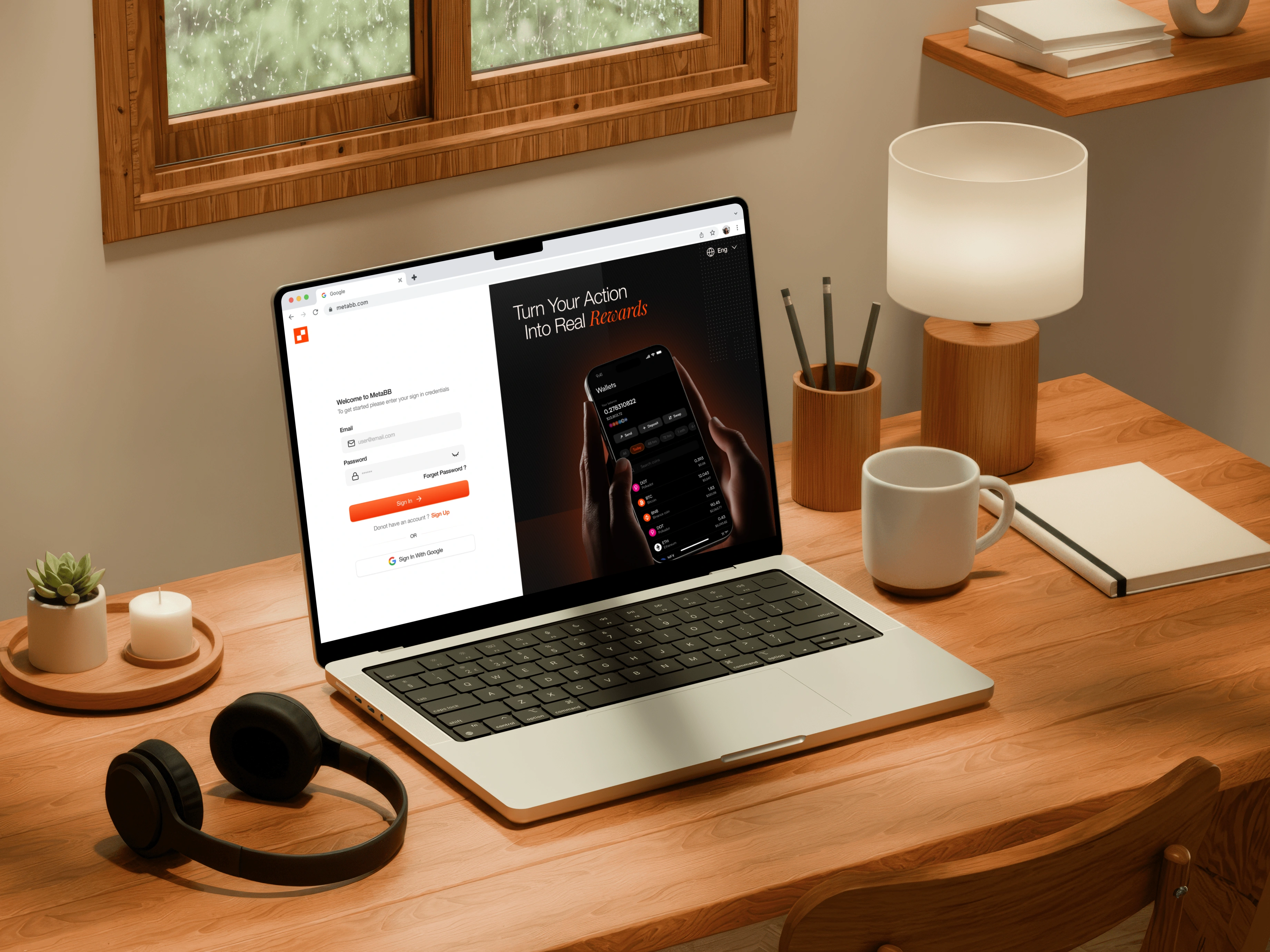
Project Name : MetaBB
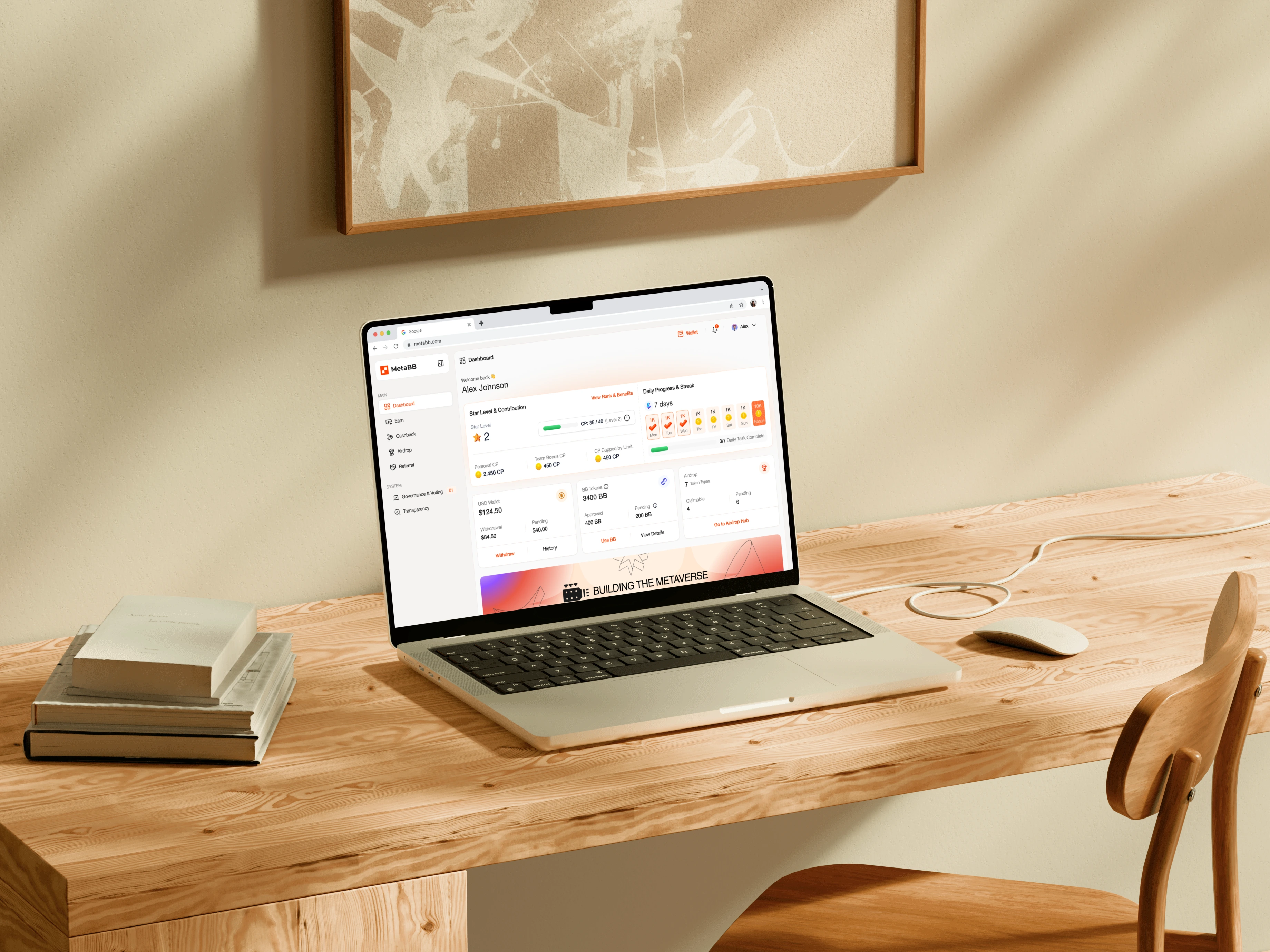
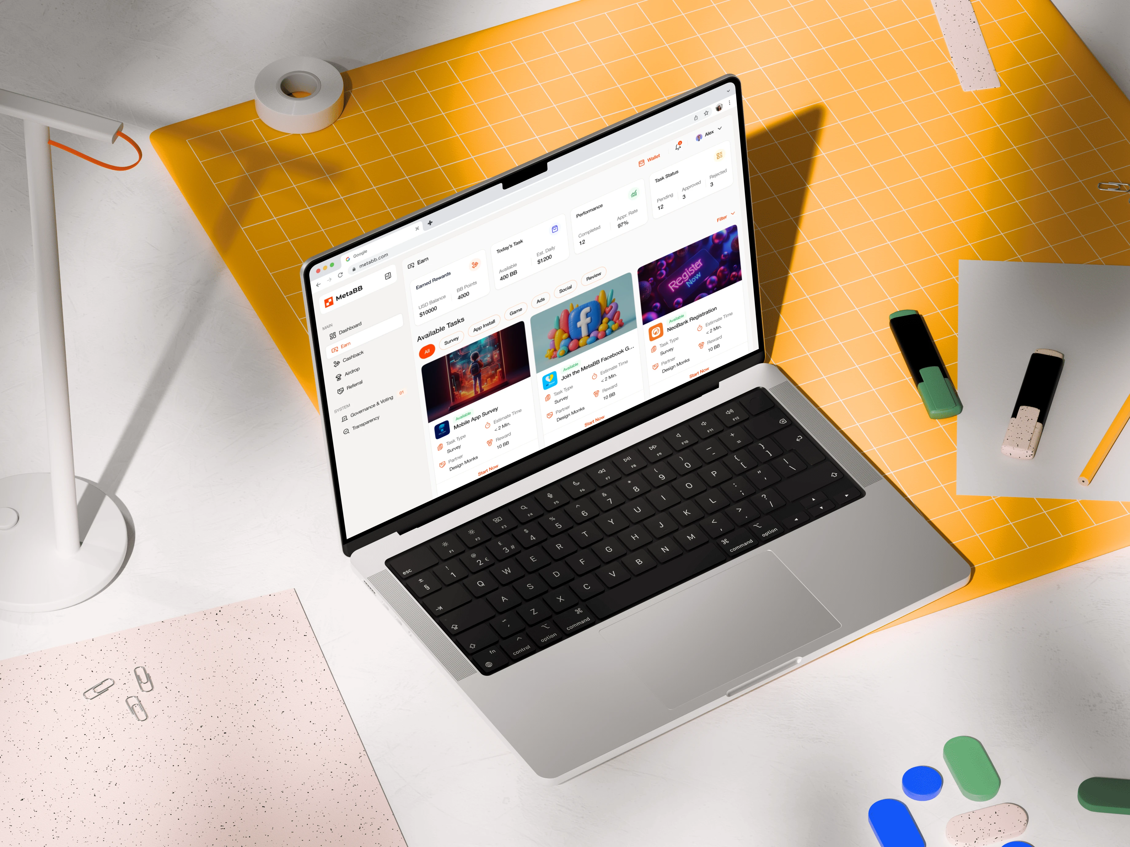
MetaBB is a platform that brings together a crypto wallet, a task-based earning system, and account management into a single unified experience. The objective was to transform a feature-heavy product into a system that feels intuitive, structured, and easy to navigate, allowing users to move seamlessly between earning rewards, managing funds, and controlling their account without friction.
The Challenges
The core challenge was not a lack of functionality, but a lack of structure. Multiple high-priority features were competing for attention without a clear hierarchy, making the experience feel fragmented and difficult to navigate. Financial interactions, which require clarity and trust, were at risk of becoming overwhelming, especially for users unfamiliar with crypto products. At the same time, stakeholder-driven UI suggestions introduced additional complexity that did not necessarily improve usability, creating a need to balance business input with strong UX principles.
My Approach
Instead of focusing on individual screens, I approached MetaBB as a system design problem. I restructured the experience around user intent rather than features, aligning the product with how users naturally think and act. This meant organizing the platform into clear mental models such as earning through tasks, managing funds through the wallet, and controlling account settings through profile and system controls. By shifting from a feature-based structure to an intent-driven one, the product became significantly easier to understand and navigate.
Process
The process began with breaking down the product into its core functional areas and identifying overlaps, friction points, and inconsistencies in navigation. From there, I mapped user intent to define a more intuitive structure, which led to a modular architecture where each section—tasks, wallet, profile, and settings—functions as a self-contained environment. I then refined interaction patterns and interface decisions to support clarity and hierarchy, such as introducing a profile control hub for identity management, restructuring settings into focused categories, and simplifying system status visibility into a lightweight header element instead of a visually heavy component. Throughout the process, I continuously balanced stakeholder requirements with usability best practices, ensuring that design decisions were grounded in logic rather than preference.
Outcomes
The final design significantly improved the overall usability and structure of the product. Users can now navigate more efficiently between earning and financial actions, with reduced cognitive load and clearer feature separation. The modular system enhances discoverability without adding complexity, while the improved information hierarchy ensures that critical elements remain visible without overwhelming the interface. Beyond immediate usability gains, the design also establishes a scalable foundation that supports future feature expansion and long-term product growth.
MetaBB
MetaBB
Like this project
Posted Apr 27, 2026
Redesigned MetaBB for enhanced usability and scalability with a focus on user intent.