Coffee Corner
Designing a landing page for Coffee Corner, the lastest high-end coffee shop in town. The primary goal? Get folks excited enough to sign up for their newsletter. Let's break down how I approached this and the fantastic results I achieved.
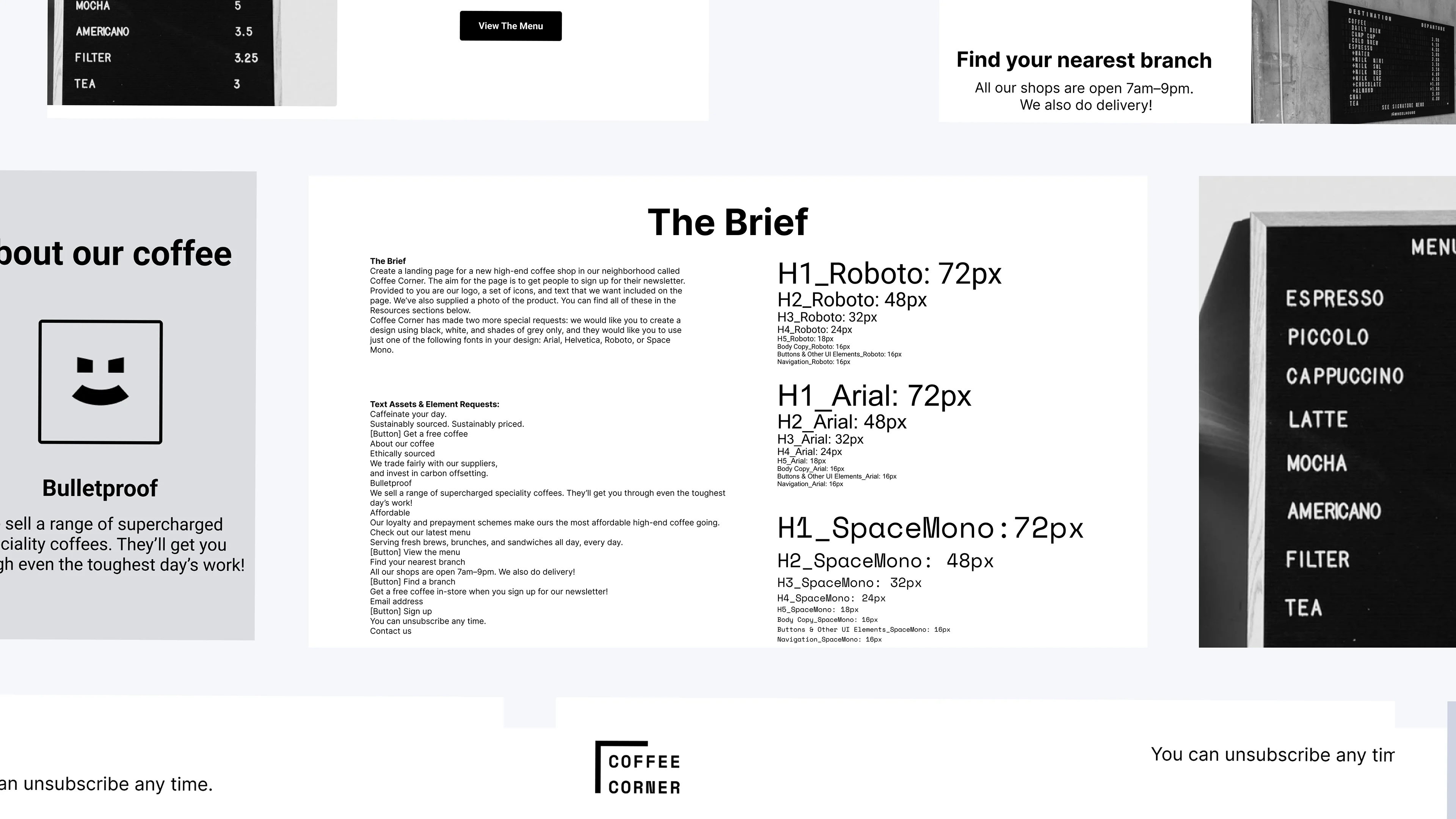
The Client Brief, Mission and Key Goals
* Captivate Visitors: Craft an eye-catching, elegant landing page that draws people in.
* Boost Sign-Ups: Make it easy and compelling for visitors to join the newsletter.
* Highlight Coffee Corner’s Unique Selling Points: Showcase their sustainably sourced, premium coffee.
* Leverage UX/UI Best Practices: Combine functionality with aesthetic excellence to create an inviting and user-friendly interface.
Inspiration
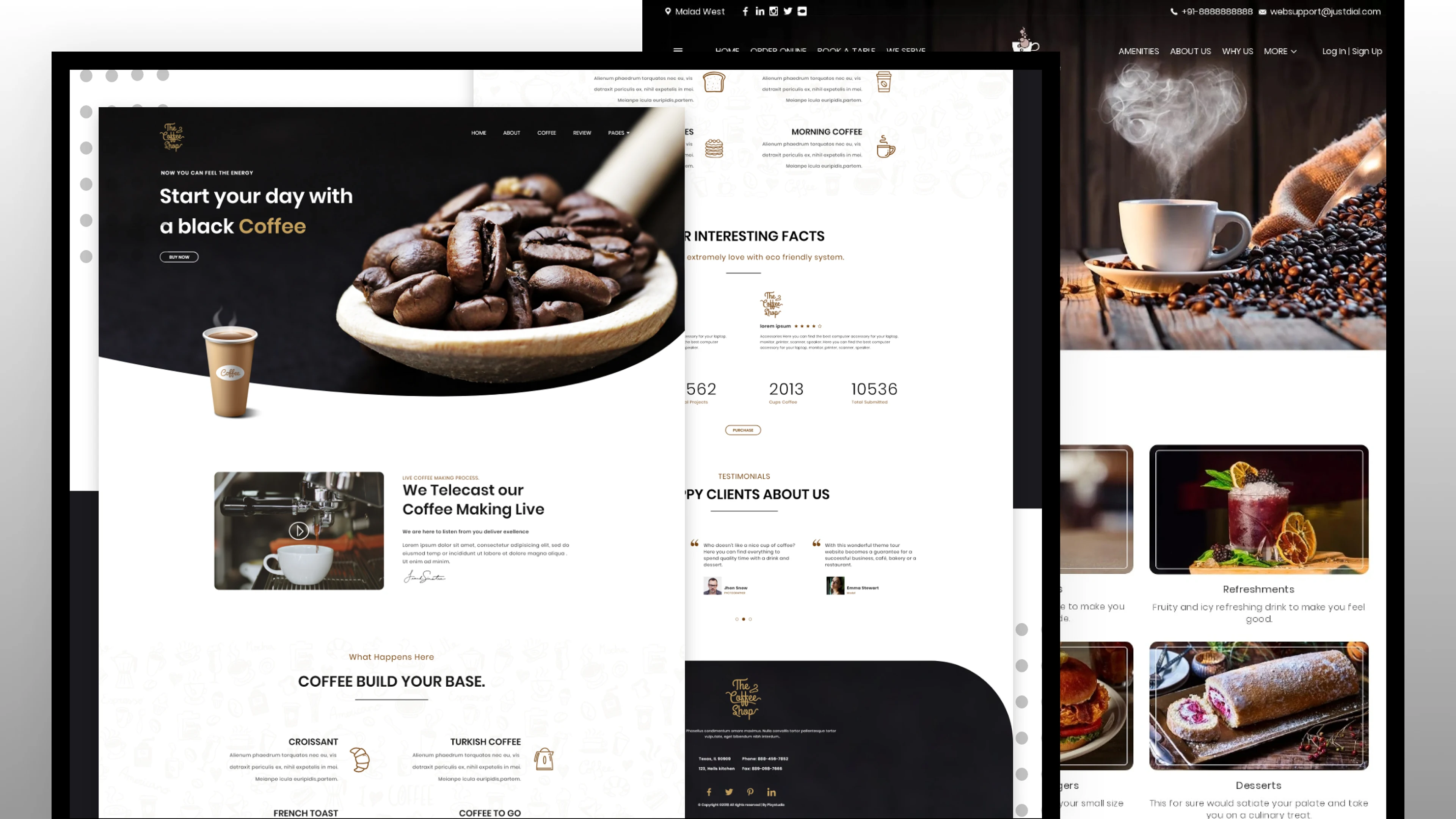
To kick off the design process, I gathered inspiration from various sources to ensure Coffee Corner's landing page stood out with a high-end aesthetic:
Modern Coffee Shop Websites: Explored contemporary designs for layout and typography trends.
Monochromatic Design Examples: Reviewed designs to maintain interest and clarity without relying on color diversity.
First Design Exploration
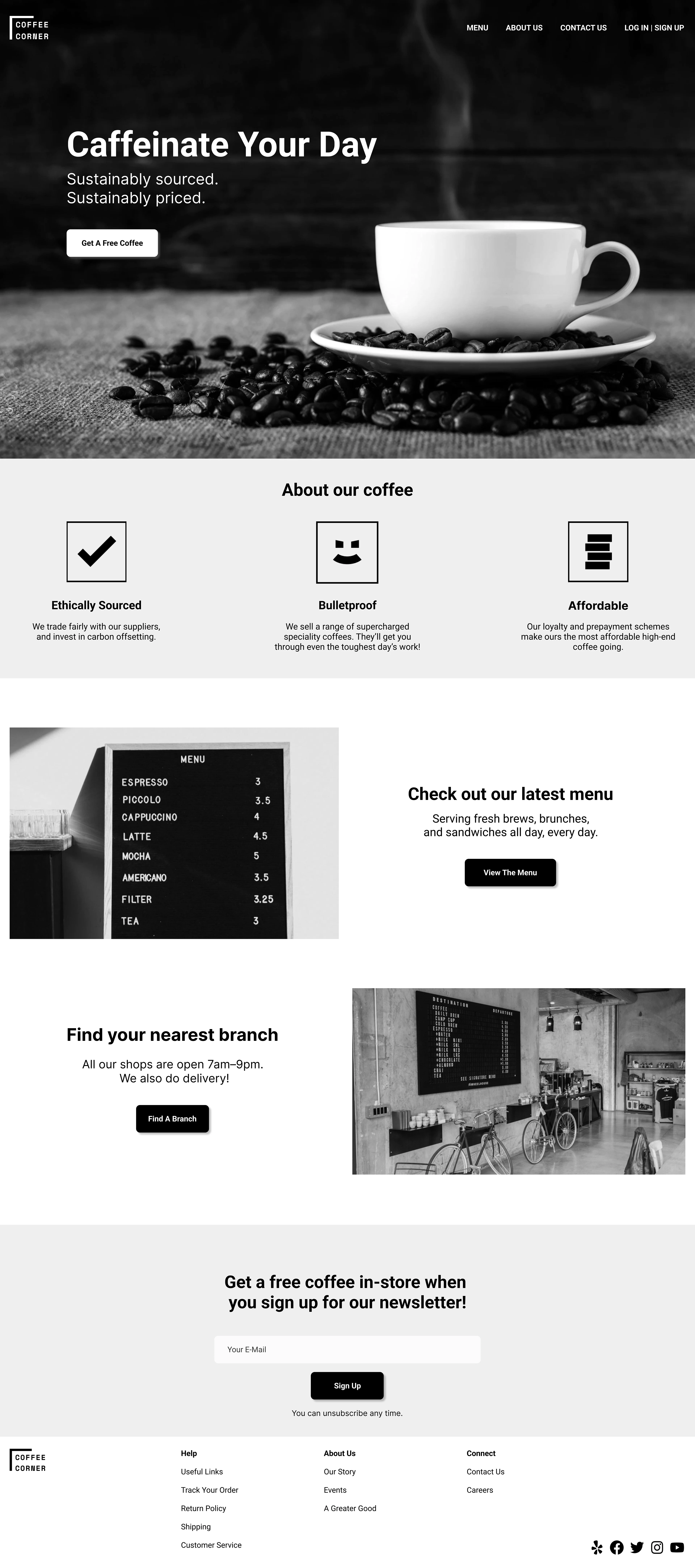
Initial Concept:
* I started with a minimalist, monochromatic theme using black, white, and shades of grey as requested by the client.
* Focused on organizing content to emphasize the key messages and call-to-actions (CTAs).
* I chose the Roboto font for its modern, clean lines.
Insights Gained:
* The minimalist approach emphasized the need for a clear visual hierarchy.
* Better text and image organization were needed for a more cohesive presentation.
Design Execution, Best Practices and Final Outcome
Changes Made:
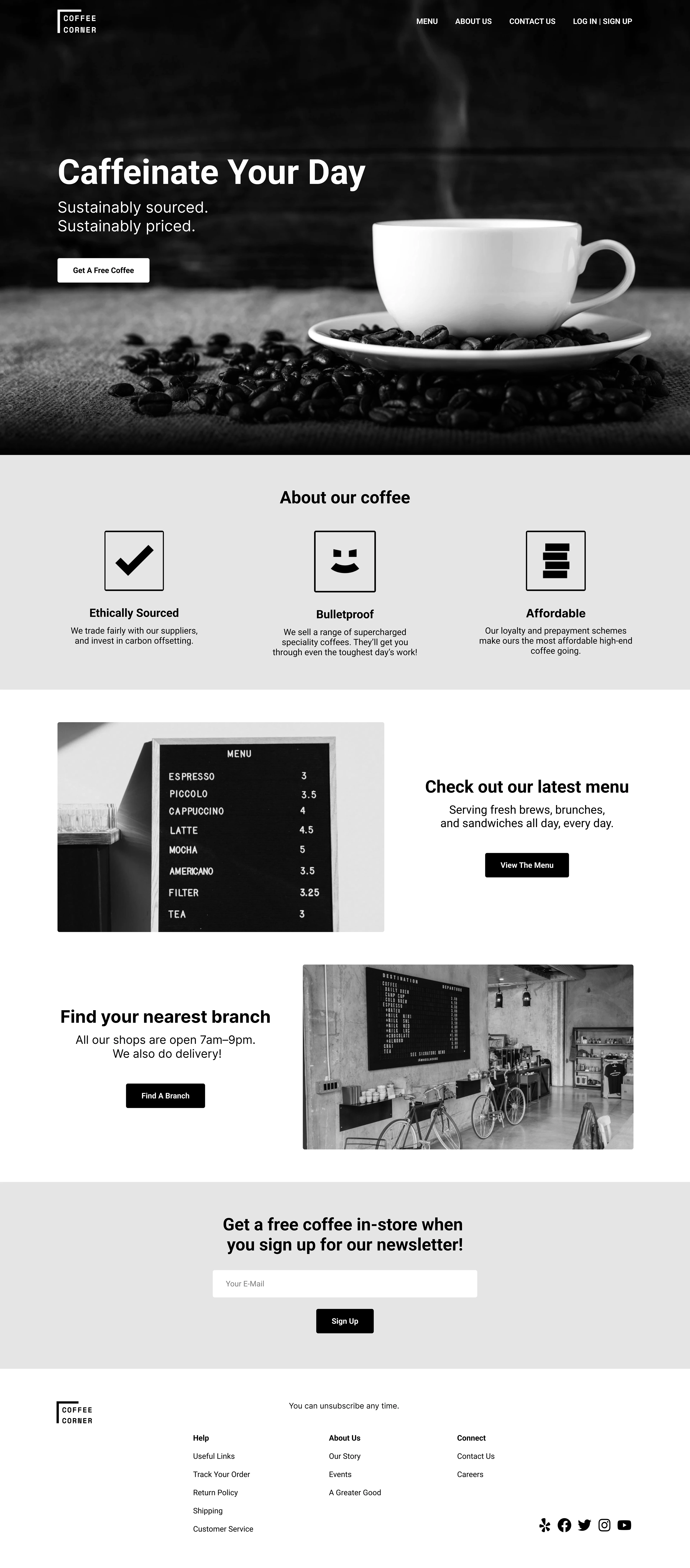
* Alignment: Improved alignment for a clean, professional look.
* Reusable Components: Created reusable components to ensure consistency and efficiency in design updates.
* Grid System: Implemented a grid system to maintain a structured and balanced layout.
* Padding: Added appropriate padding to enhance readability and create a more breathable design.
Outcome:
* The final design’s sleek, monochromatic palette perfectly matches Coffee Corner’s premium brand image.
* The streamlined layout and modern typography make the page inviting and easy to navigate, effectively driving newsletter sign-ups.
* The centralized CTA button and well-organized sections guide users naturally through the content.
Insights and Learnings
This project highlighted the importance of a well-structured visual hierarchy and the power of simplicity. We learned that implementing a grid system and reusable components not only enhances consistency but also streamlines future updates. However, next time we might experiment with subtle color injections to add a touch of liveliness to the landing page. This experience reinforced the need to balance aesthetic appeal with practical functionality to create effective UX/UI designs.
Disclaimer: This case study is a conceptual project created for illustrative purposes only.
Like this project
Posted Sep 25, 2024
Landing Page Redesign
Likes
0
Views
8
