Toshio's Ramen
Hero Redesign
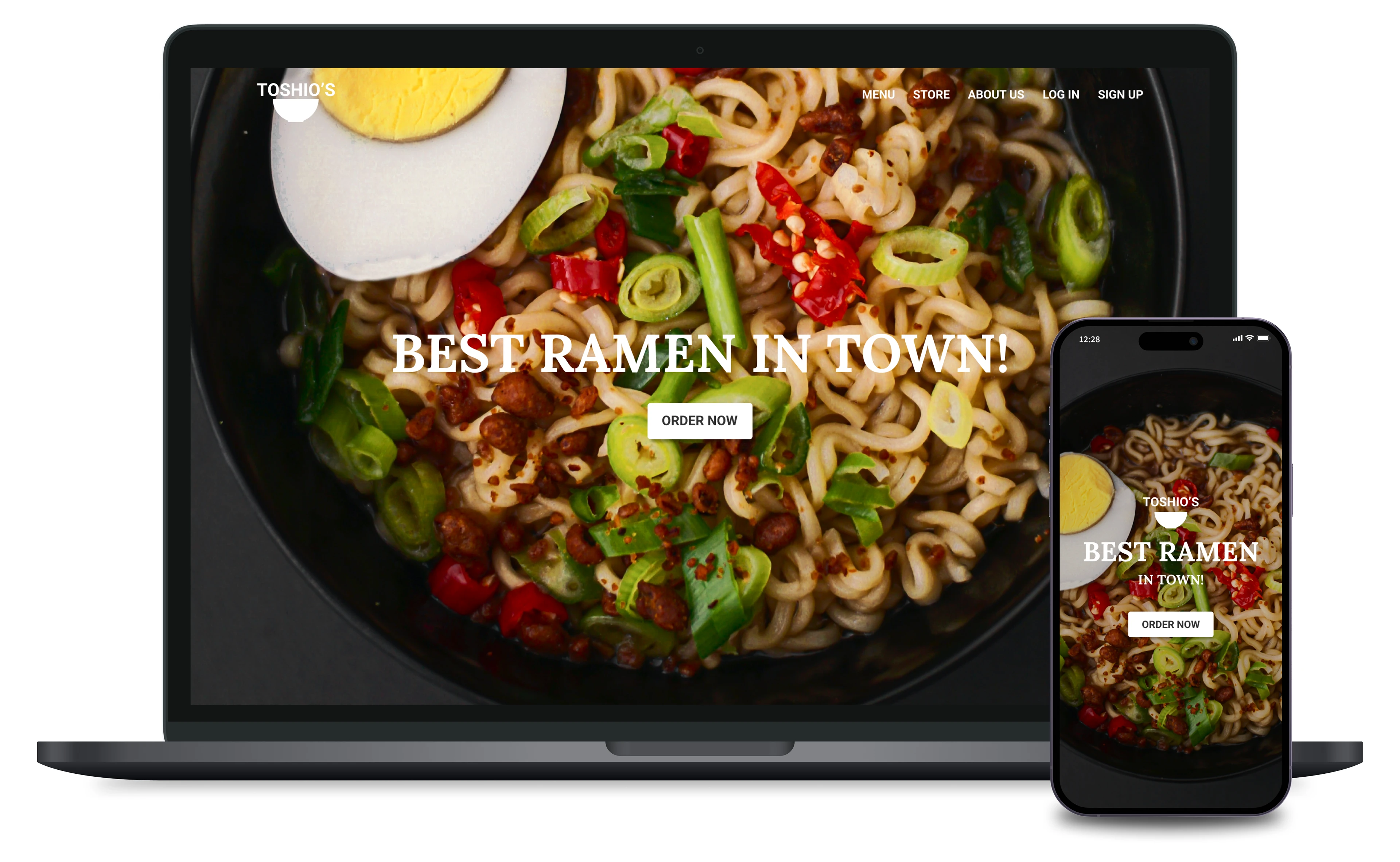
I wanted to share the exciting updates on my project to redesign the hero section of Toshio’s Ramen website. My main goal is to boost visual appeal, improve user experience, and ensure everything aligns with our modern, clean brand aesthetic.
Objectives:
Enhance Visual Appeal: I want the hero section to look stunning and grab attention.
Improve User Experience: Make it super intuitive and easy for our users to navigate.
Align with Brand Identity: Reflect Toshio’s sophisticated, modern vibe throughout the design.
Goals:
Increase Engagement and Conversions: By making the interface more visually appealing and user-friendly.
Reflect the Brand’s Identity: Ensure the design feels like a natural extension of Toshio’s brand.
Implement UX/UI Best Practices: Enhance functionality and accessibility.
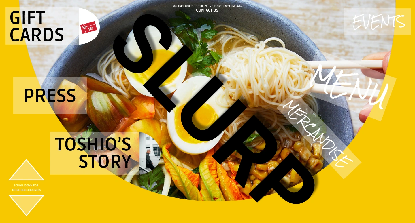
The Original Design
The Original Design:
Visual Clutter: Too many overlapping text elements made it look busy.
Color Scheme: The bright yellow was eye-catching but sometimes took attention away from the delicious food images.
Typography: A mix of fonts and sizes made things feel a bit chaotic.
Navigation: Important links like gift cards and stories were scattered around.
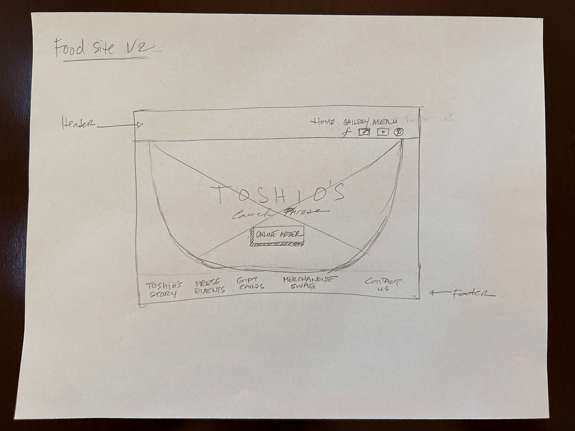
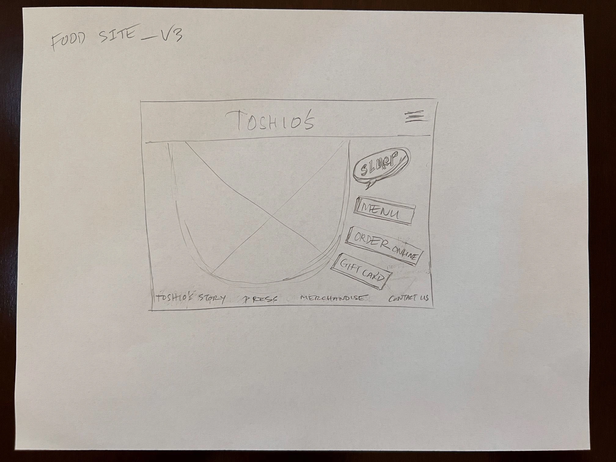
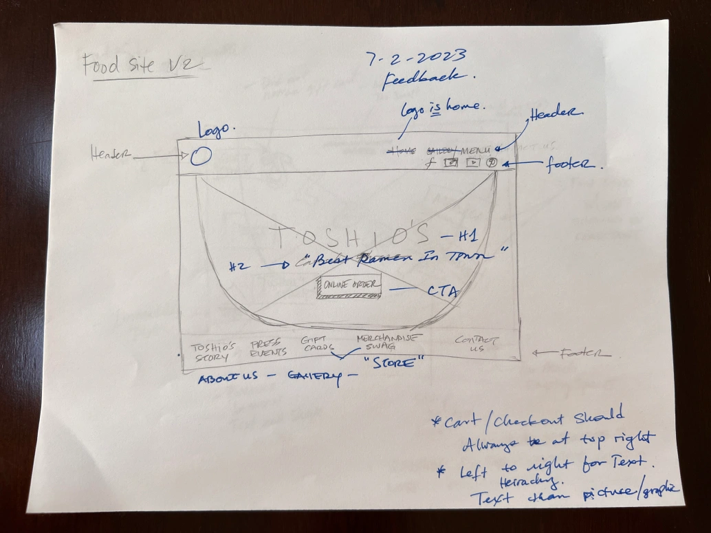
Iteration Notes: Sketch Review
Header: Simplified navigation bar with essential links.
Main Section: Focus on a central, high-quality food image with a bold headline and a prominent "Order Now" button.
Footer: Relocated additional links to the footer to reduce clutter.
Iterative Approach
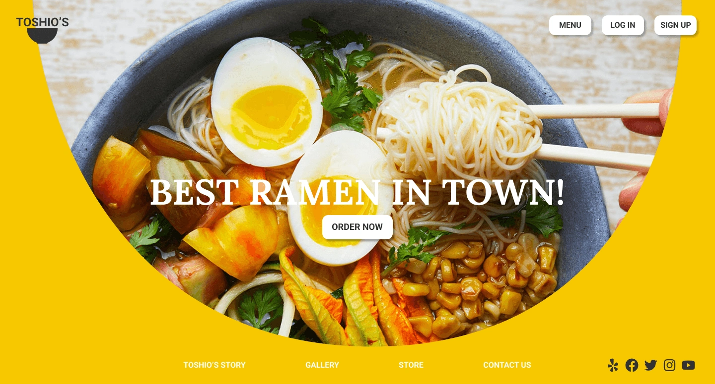
The first iteration focused on simplifying the layout, typography, and elements for visual clarity. I played with reducing clutter by minimizing overlapping text and streamlining the navigation.
Color Scheme: Kept the bright yellow background for vibrancy.
Typography: Used consistent font sizes to create a clearer visual hierarchy.
Navigation: Organized links like gift cards and Toshio’s story more effectively, but the layout still felt a bit busy.
Takeaways:
While simplifying elements improved visual clarity, the bright yellow background still detracted from the food imagery.
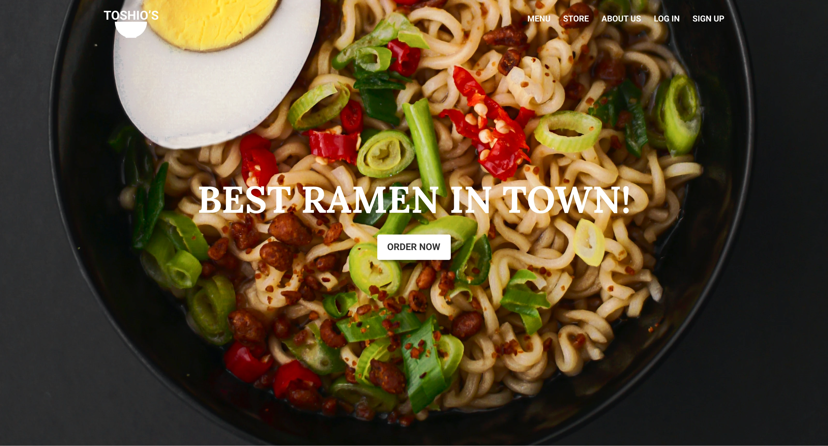
A more cohesive and sophisticated color scheme was needed to enhance the user experience further.
Final Screen
Like this project
Posted Sep 25, 2024
Hero Page Redesign
Likes
0
Views
6
