Keshia McCray's Portfolio Website
Kit Siu
Keshia McCray's Portfolio Website
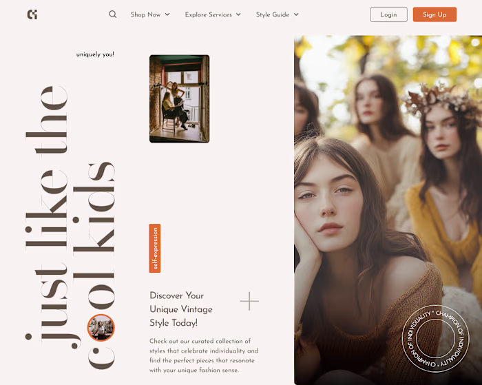
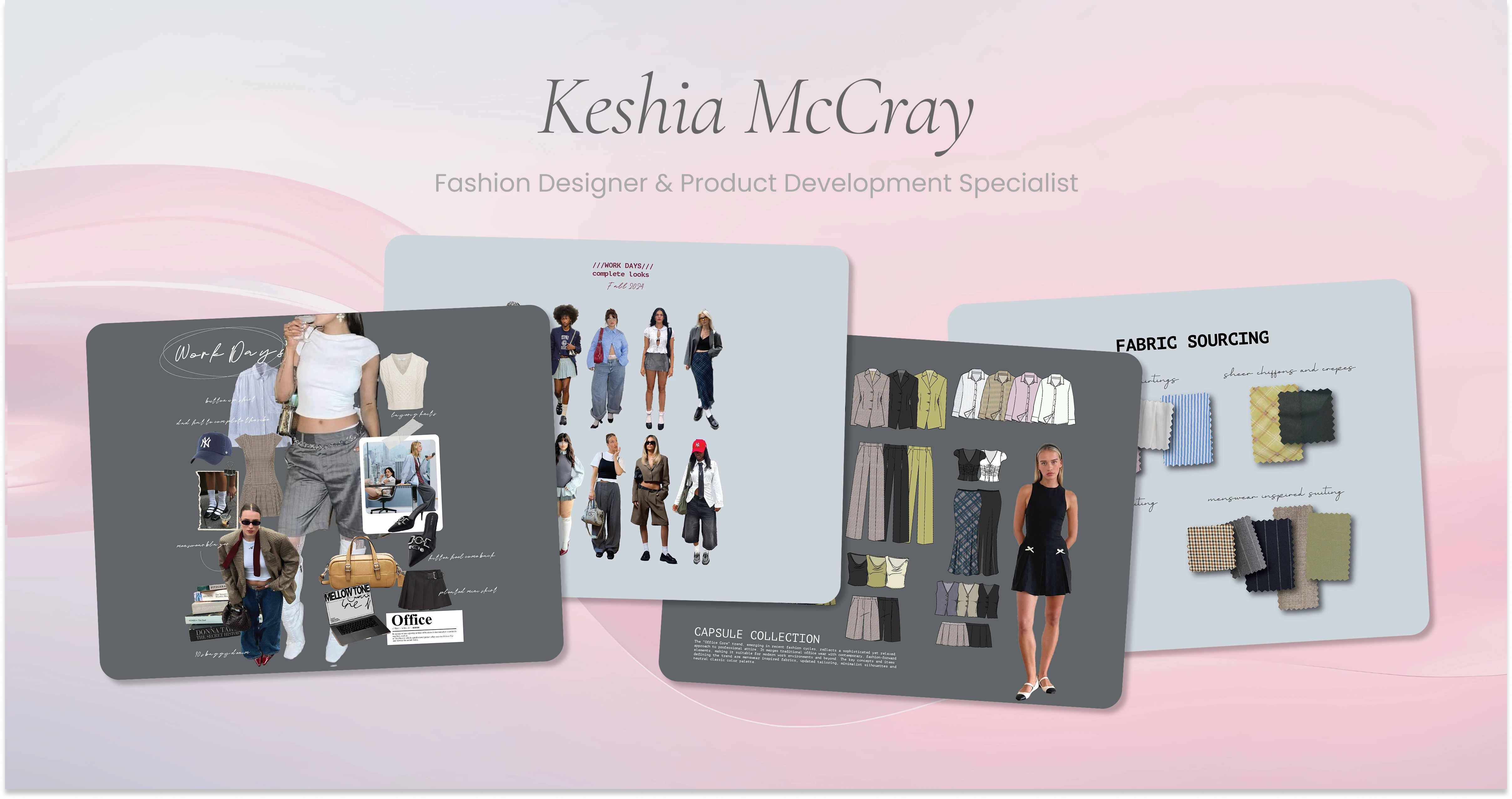
Fashion Portfolio Website
Role: Designer & Developer
Tools: Framer, Figma, Illustrator, Photoshop, Midjourney, Runway, Capcut, Jitter, LTX Studio, Pinterest, Behance, Coolors, Dribbble, Envato, Freepik, Vecteezy, Framer University
Timeline: 3 Weeks
Live Site: www.keshiamccray.com
Introduction
Like so many creatives who’ve dedicated years to big-name companies, Keshia’s portfolio had quietly fallen out of date. After relocating to a new state and stepping away from a long-term role, she found herself in need of something she hadn’t touched in a while — a portfolio.
But this time, instead of lugging around a physical briefcase filled with sketches and tear sheets, the ask was clear: she needed a modern, digital presence that reflected where she is now — experienced, creative, and still evolving.
Keshia reached out to me not just because I build websites, but because I also come from the fashion world. I understood the rhythm of design seasons, the pressure of presentations, and the balance between art and commerce. She trusted me to help translate her story into an immersive online experience that felt fresh, elevated, and true to her voice.
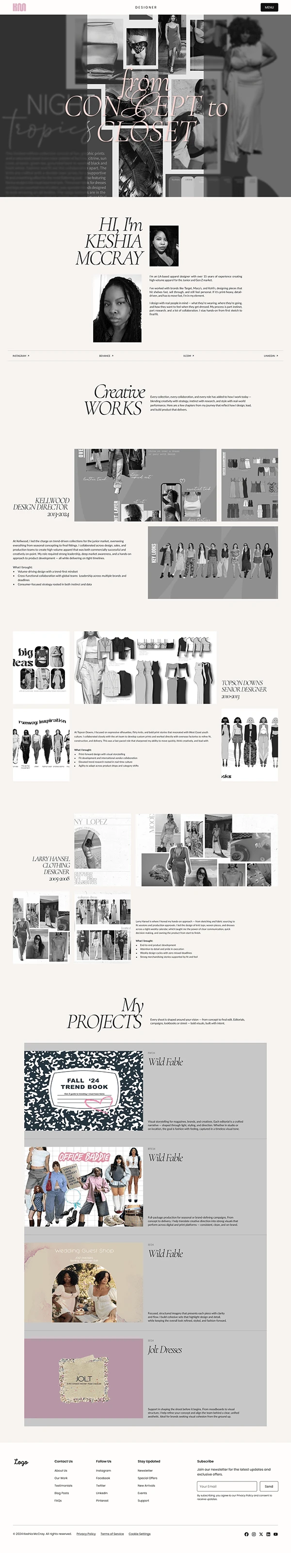
Project Overview
Our shared vision was to create a portfolio that didn’t just “show work” but felt like Keshia — youthful, intelligent, and effortlessly cool. Beyond clarity and structure, she wanted the site to move — literally — with subtle scroll animations and transitions that brought her design aesthetic to life.
We worked together closely to shape the experience. She brought references, I brought experiments. I spent time learning, testing, and sometimes failing, before getting the scroll effects, timing, and layout rhythm just right. The result is something uniquely hers: clean and professional, but never boring.
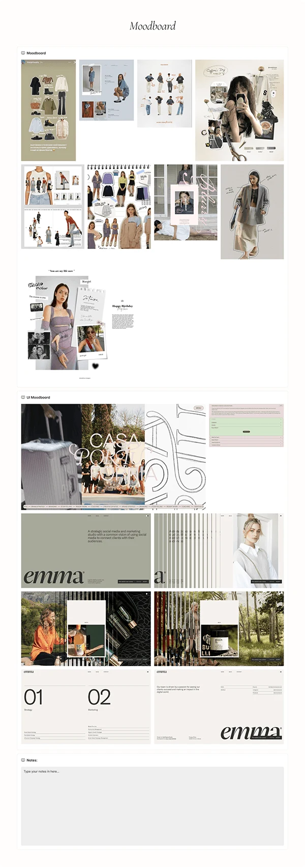
Research & Inspiration
We began by gathering visual cues from all corners of the internet — from Pinterest boards and Behance showcases to fashion portfolio standouts on Dribbble and animation goodies on Framer University.
The look and feel we landed on was clean, modern, and editorial. I leaned into tools like Coolors to define her color palette, and referenced Envato, Freepik, and Vecteezy for modular UI inspiration. Our design anchors were clarity, rhythm, and a little sense of magic.

Design & Iteration
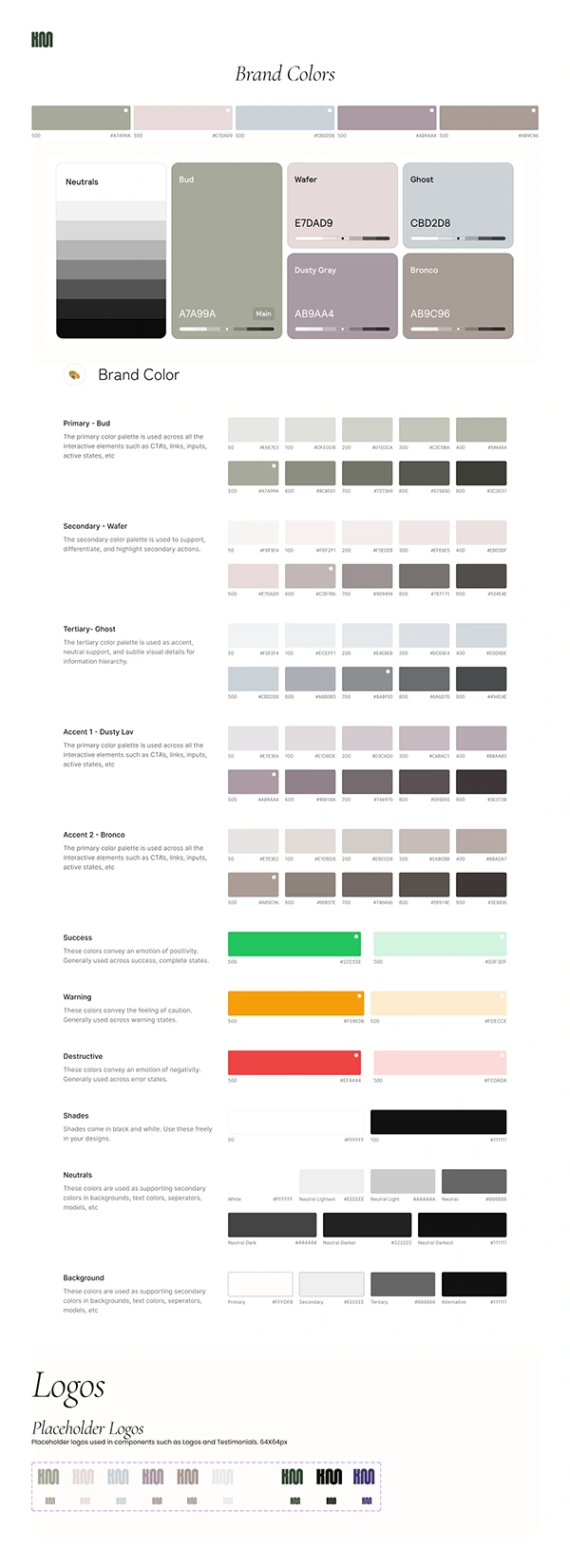
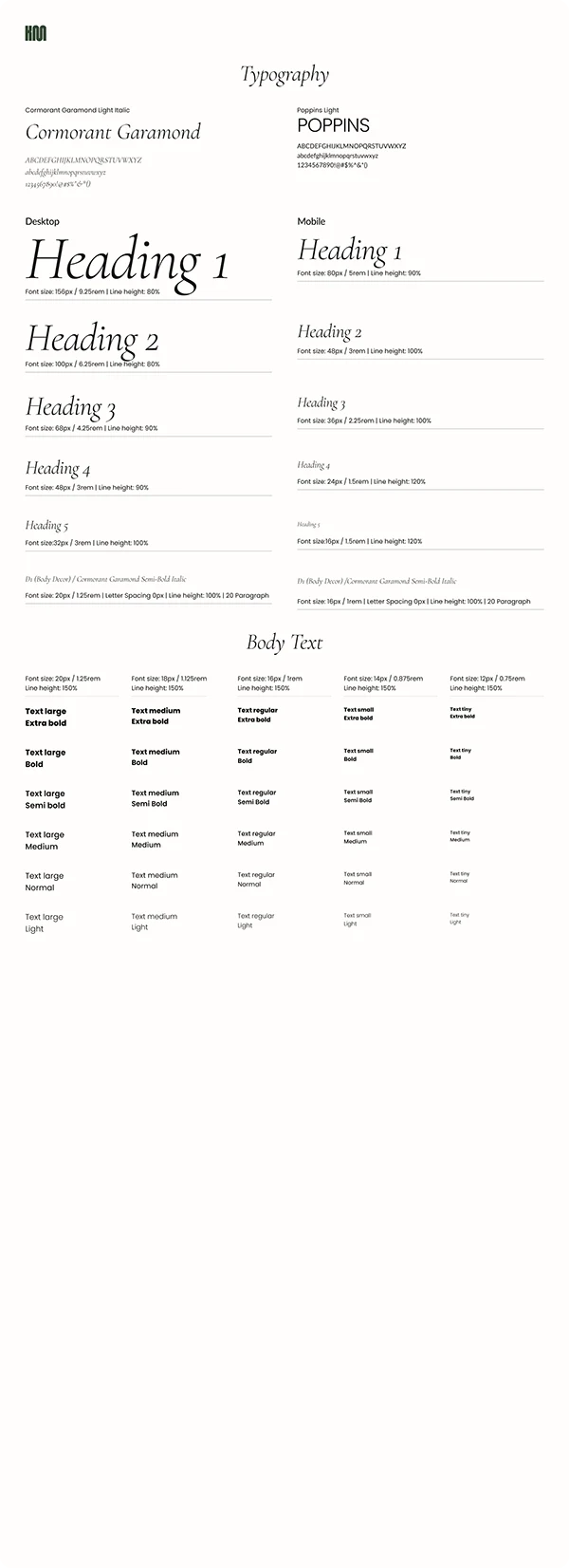
This wasn’t just a website — it was a personal rebrand. I started by creating a mini brand kit for Keshia:
* A defined color palette grounded in neutrals and soft contrasts
* Typography pairings that balanced elegance with legibility
* A custom UI system for layout grids, tags, and buttons
* Responsive components tailored for mobile and tablet
We wireframed in Figma, then jumped into Framer for development. I layered in animation using Framer’s built-in scroll effects and state transitions. I also tested visual motion using Jitter, Capcut, and Runway — and played with Midjourney and LTX Studio to explore creative ways to visualize future ideas and content stories.
Final Design
The end result is clean, immersive, and personal — a portfolio that respects the viewer’s time while giving Keshia’s talent room to shine. Each section flows naturally, and every interaction feels considered. Her resume, projects, and story are now housed in one timeless digital space.
✨ If you’re reading this and looking for design talent — take a moment to explore www.keshiamccray.com.
I’ve worked with a lot of creatives, but Keshia stands out — she’s not only wildly talented and visionary, but she’s also one of the most grounded, kind-hearted collaborators I’ve ever met. You’d be lucky to have her on your team.
Thank you for taking the time to read this.
Feel free to give me some feedback!
Have a great day!
Have an Awesome Project?
Let's create something amazing together! 🚀
Like this project
Posted Jul 16, 2025
A fashion portfolio for Keshia McCray reflecting her voice, experience, and design sensibility. Designed in Figma and developed in Framer.