Website Redesign for Mr. T’s Restaurant in Los Angeles
Kit Siu
Redesigning the Website for Mr. T’s Restaurant in Los Angeles
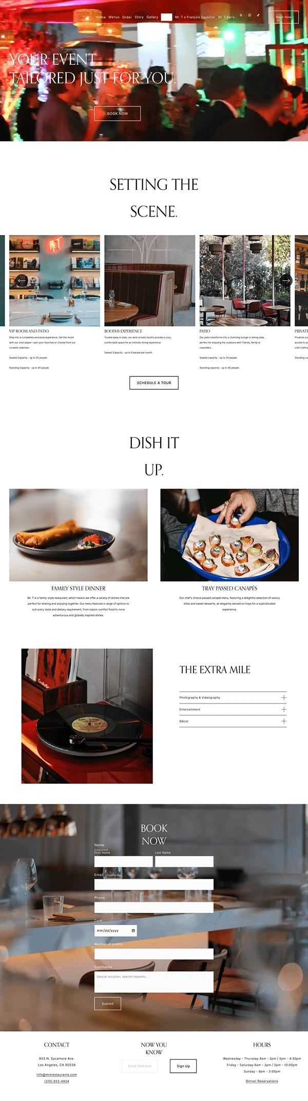
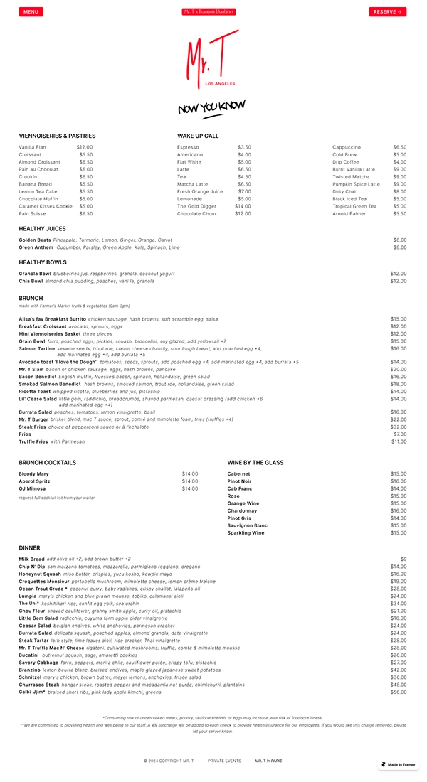
I recently redesigned the website for Mr. T’s, a unique dining destination in Los Angeles, with the goal of creating a more dynamic and user-friendly experience. The primary objective was to differentiate the café, lunch, and dinner menus while introducing a dedicated services section for takeout, delivery, private events, and catering. However, after a deep dive into the business needs and structure of the restaurant, it became clear that a single, consolidated menu was a more effective solution, as many items overlapped across services. To streamline this, I designed and implemented a CMS, enabling the owners and chef to easily update and revise menu items as needed.
The Original Site
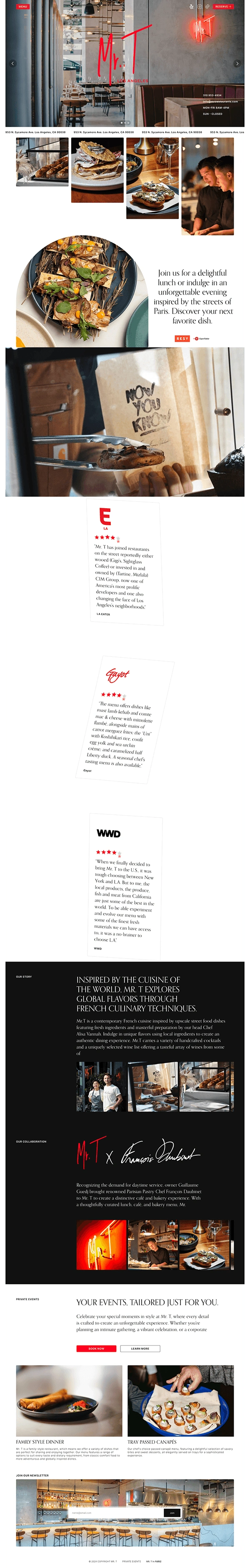
The original site, built on Wix, had several limitations. While the events hero video was a nice touch, its short loop and slow load times detracted from the user experience. Additionally, the site felt static, with most menu items and features linking to external sites or documents, such as the separate menus and ordering options (Uber Eats, DoorDash, catering, etc.). The crowded navigation bar further complicated usability, with unnecessary links like "Collaboration" and the Paris location leading to a separate restaurant, creating a disconnected experience.
To address these challenges,
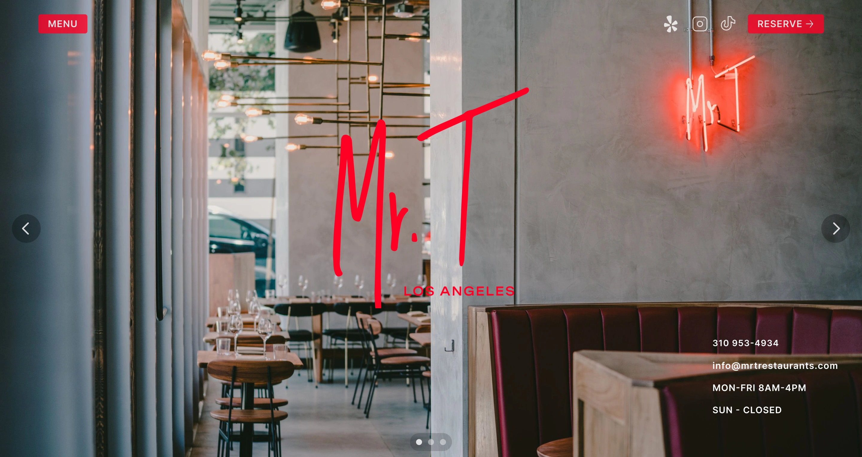
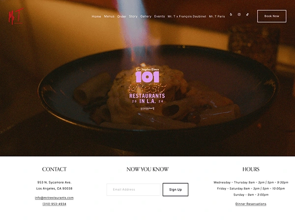
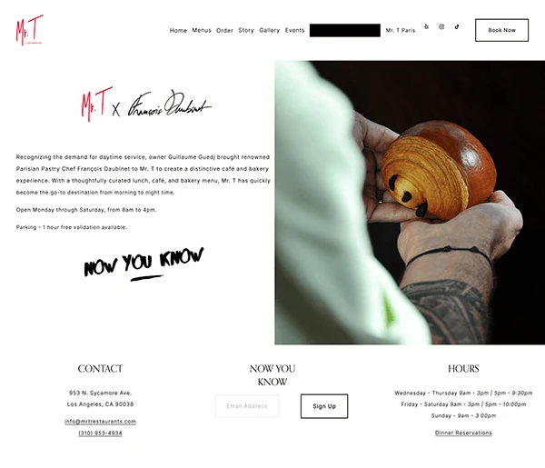
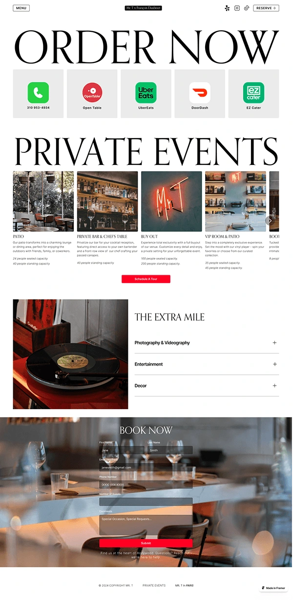
I designed the new website in Figma and developed it using Framer, ensuring a no-code solution for easy maintenance. I simplified the navigation for better usability and clarity. Interactive elements such as scroll transitions, subtle text animations, button hover states, tickers, and slide shows were added to improve engagement and conserve space. I also rebalanced the content by incorporating more food photography, reducing the overuse of ambiance imagery, and merging "Gallery" and "Story" into a unified section for a more cohesive experience.
The Results
The result is a visually striking, easy-to-navigate website with a consolidated menu and a 50% reduction in external links. Users can now seamlessly explore offerings and services without feeling overwhelmed. The updated site aligns the design and structure with the brand’s identity, enhances functionality, and equips the team with tools to manage their content effortlessly.
Thank you for taking the time to read this. Feel free to give me some feedback, Have a great day!
Have an Awesome Project?
Let's create something amazing together! 🚀
Contact Me @ 📩 kitsiu213@gmail.com
Portfolio: https://www.kitsiu.me
Check Out My LinkedIn: https://www.linkedin.com/in/kitsiu/
Disclaimer: This case study is a conceptual project created for illustrative purposes only.
Like this project
Posted Jul 16, 2025
Redesigned Mr. T’s restaurant website to reflect a more modern and upscale brand aesthetic.