L’AGENCE Account Page Redesign – UX/UI Case Study
UX/UI Design Challenge – L’AGENCE
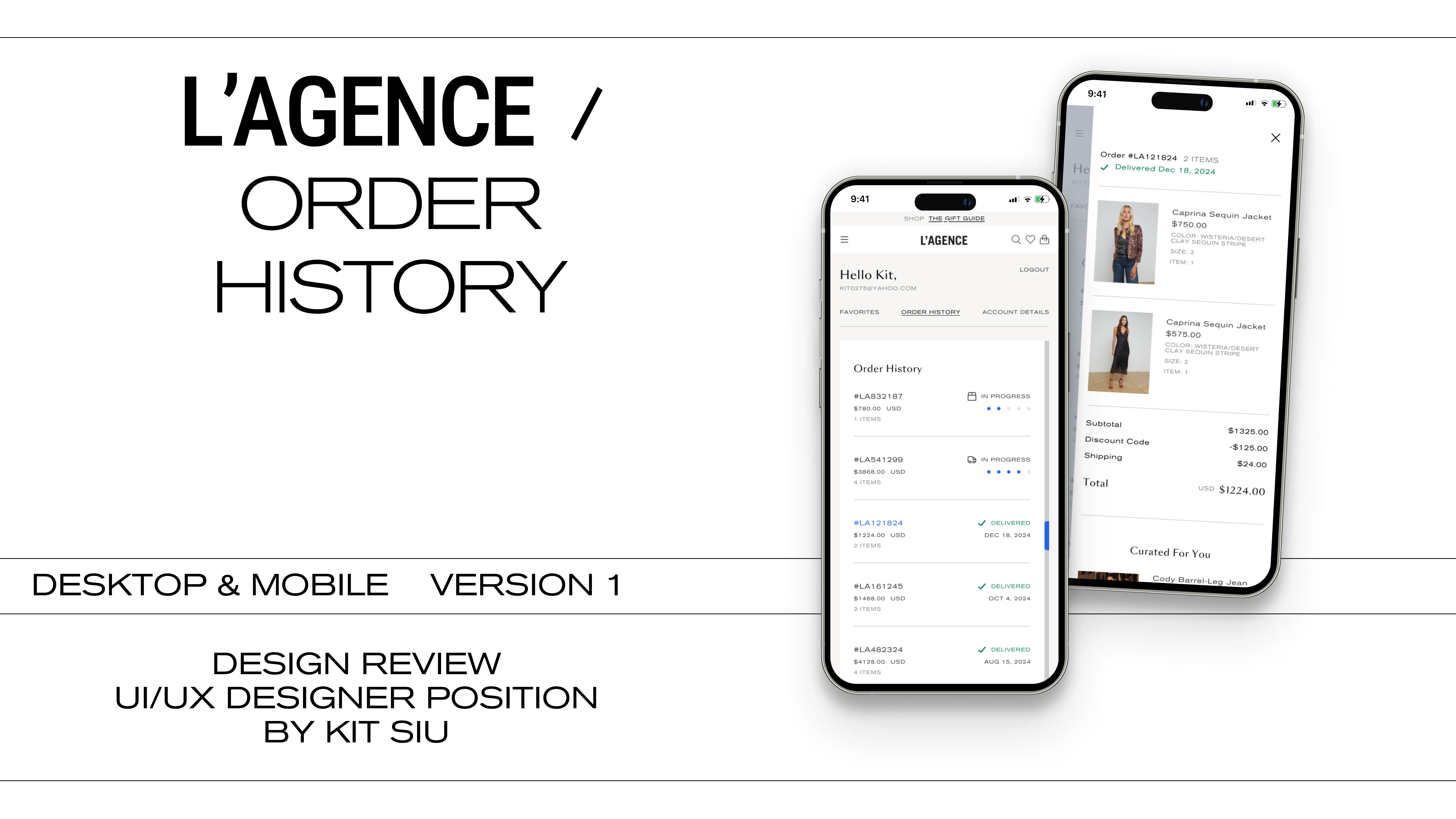
Role: UX/UI Designer | Finalist 2 Candidate
Timeline: 1 Week
Project: Account Page Redesign
Tools: Figma, Adobe Creative Suite
Brief & Objective
I was invited to interview for the UX/UI Designer role at L’AGENCE, a fashion brand known for its effortless elegance and timeless designs. After a warm and inspiring conversation with the hiring manager, I was tasked with designing a modern and intuitive Account Page UI that reflects the brand’s elevated aesthetic while improving the user experience across desktop and mobile.
The goals were to:
* Create a refined, fashion-forward layout
* Ensure intuitive navigation through Profile, Order History, Settings, etc.
* Balance creativity with practical functionality
* Build entirely in Figma
Discovery & Research
To ground my design in industry context and user expectations, I:
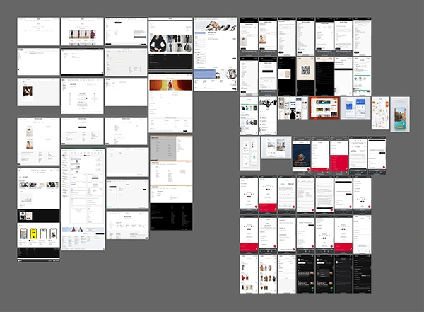
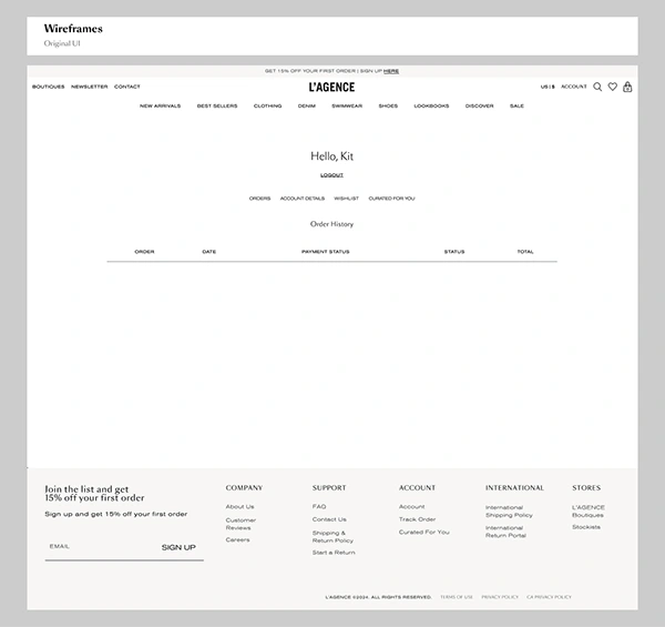
* Reviewed the existing L’AGENCE site to identify tone, layout opportunities, and gaps
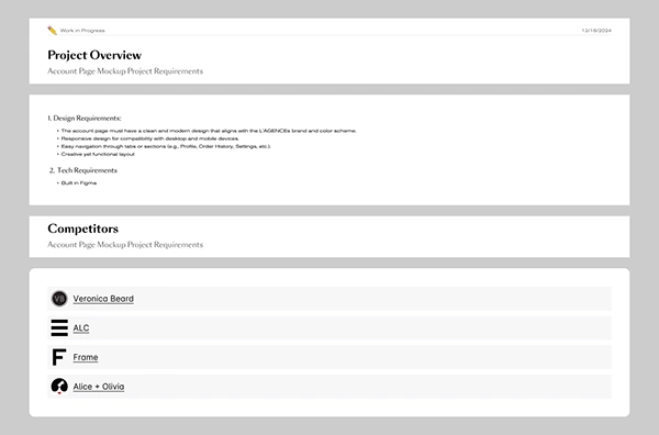
* Conducted a competitor audit (Veronica Beard, Frame, ALC, Alice + Olivia)
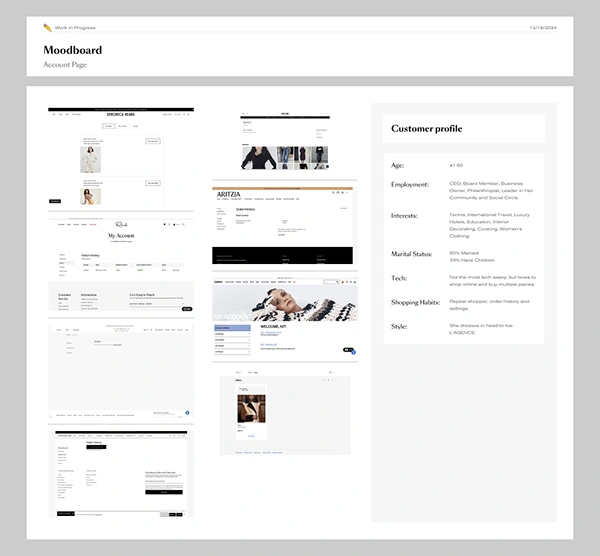
* Created a visual moodboard to establish the tone: minimal, editorial, confident femininity


Design Process
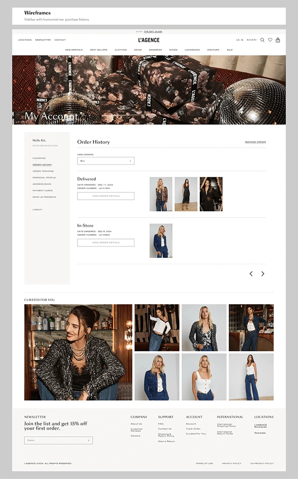
✦ Wireframes & Structure
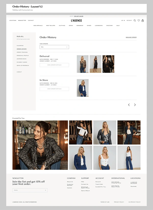
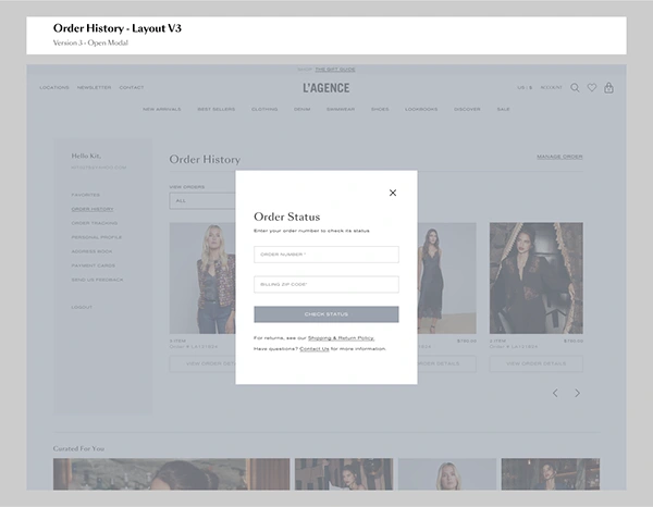
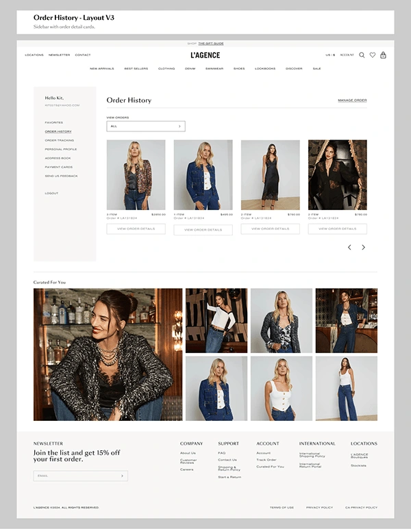
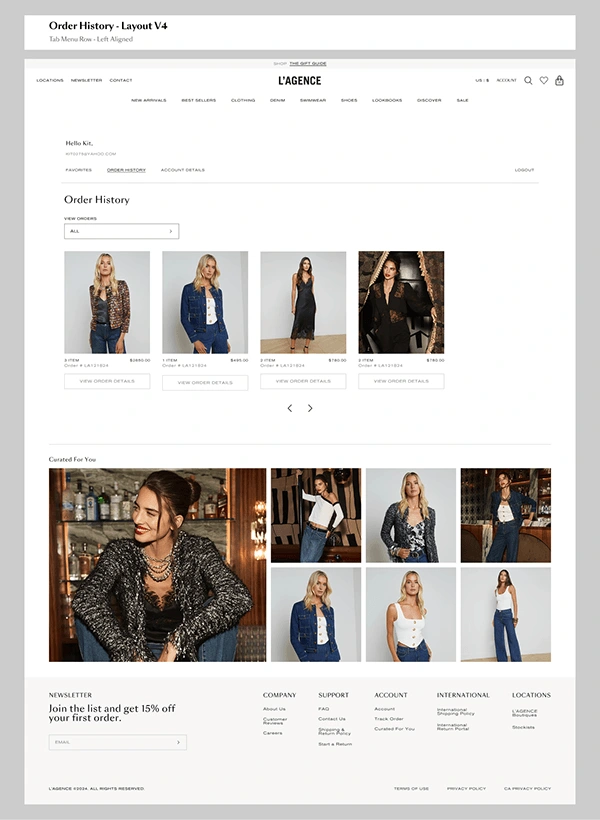
I sketched multiple layouts that organized the account experience into clear, modular tabs.
Focus: clean hierarchy, intuitive CTAs, elegant use of white space.
✦ Visual Design
* I identified the existing type families and audited the use of H1, H2, and body styles for consistency. I refined areas where hierarchy could be clearer—adjusting type size, weight, color, and spacing to meet WCAG AAA accessibility standards—while preserving a contemporary, fashion-forward aesthetic that aligns with the L’AGENCE brand tone.
* Each tab section was designed with subtle animations in mind for future implementation.
✦ Responsive Thinking
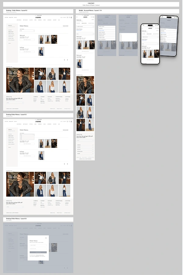
The mobile layout retained the same calm and considered feel, with collapsible menus and thumb-friendly touch zones for ease of use.
Final Designs
Option 1 – Side Navigation Layout
A clean, vertical side panel navigation that prioritizes easy category scanning and keeps the focus on content.
Key Features:
* Left Sidebar Navigation: Clearly labeled tabs (e.g., Profile, Order History, Settings) let the user quickly toggle between sections.
* Main Content Area: Each category opens a large, visual preview pane. In the Order History tab, items are grouped by status (Delivered / In-Return), with thumbnail previews for instant recognition.
* Dropdown Filters: Within each section, users can narrow their view via dropdowns (e.g., order type or timeframe).
* Curated For You: A smart product recommendation section sits just above the footer to encourage last-minute adds to cart.
* Footer Refresh: More breathing room, realigned columns, and clearer section headers improve scannability.
* Mobile View: Stackable layout maintains visual hierarchy with simplified dropdowns and thumb-friendly buttons.
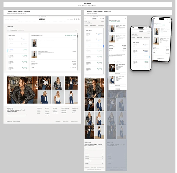
Option 2 – Top Tab Navigation Layout
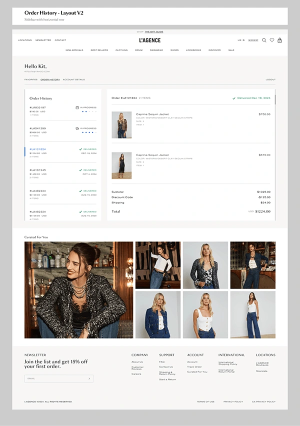
A more horizontal approach using a top tabbed navigation bar with a structured content grid for clarity and speed.
Key Features:
* Top Nav Tabs: Customers can quickly jump between main sections (e.g., Orders, Profile) using a clean, centered horizontal bar.
* Sidebar List (Left): When in Order History, the sidebar lists all recent orders—each with order #, total, and status for easy scanning.
* Detail Panel (Right): Clicking an order loads its full details, including images, delivery status, and pricing—laid out with strong visual alignment and dividers for quick reference.
* Curated For You: Similar to Option 1, personalized product suggestions are placed strategically before the footer.
* Mobile Optimization: Each section collapses into digestible blocks with clean spacing and interaction cues.
* Visual Consistency: Type, spacing, and card structure are polished for clarity across breakpoints.
Reflection & Gratitude
Although I wasn’t selected for the role, I was honored to be one of the final two candidates. This experience pushed me to think deeply about the intersection of luxury brand storytelling and functional UX design. It also gave me the chance to showcase not just technical skill, but sensitivity to detail, layout rhythm, and user emotion.
I'm sincerely thankful to the entire L’AGENCE team for the opportunity to connect and design for a brand I truly admire. Every interview was thoughtful and collaborative, and I walked away from this process inspired.
Thank you for taking the time to read this.
Feel free to give me some feedback!
Have a great day!
Have an Awesome Project?
Let's create something amazing together! 🚀
Like this project
Posted Jul 16, 2025
Reimagined the L’Agence customer account and order history pages with a more intuitive, user-centered flow—enhancing clarity, visual hierarchy, and ease of use.
Likes
1
Views
8
