Brushed- Logo & Packaging Design
Unnati Jain
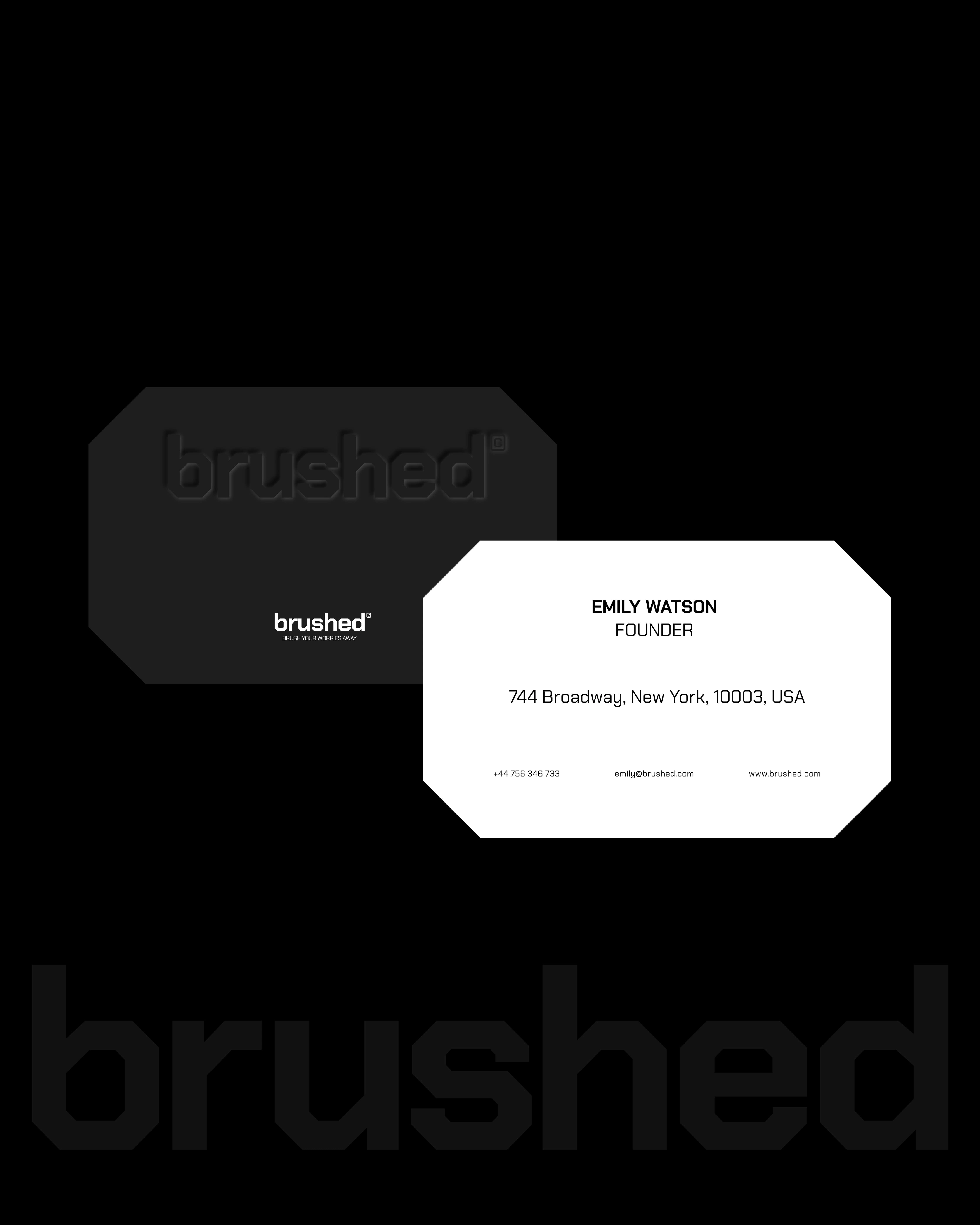
Brushed
Logo Design → Packaging → 2025
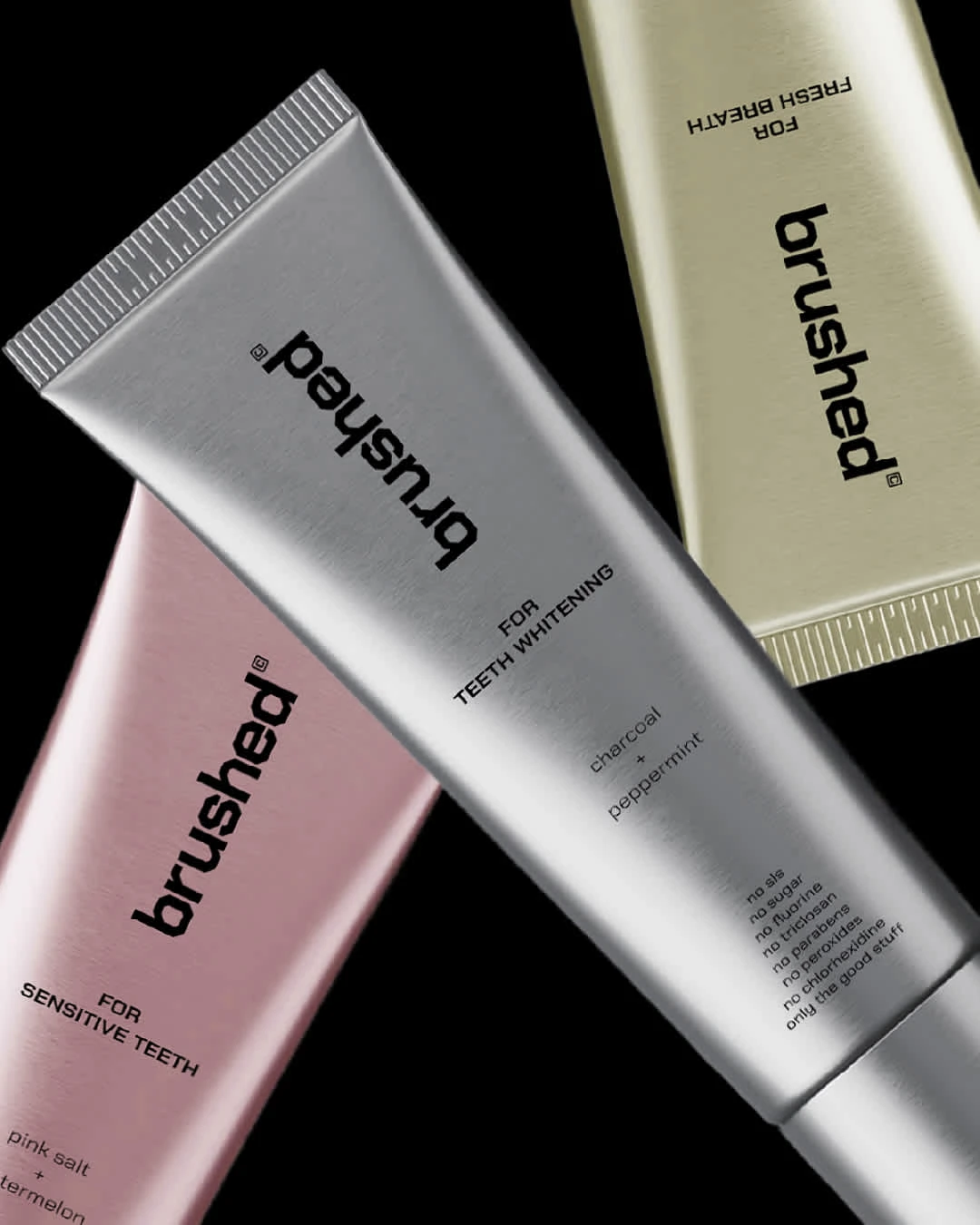
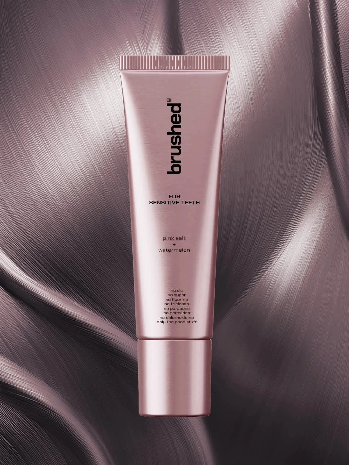
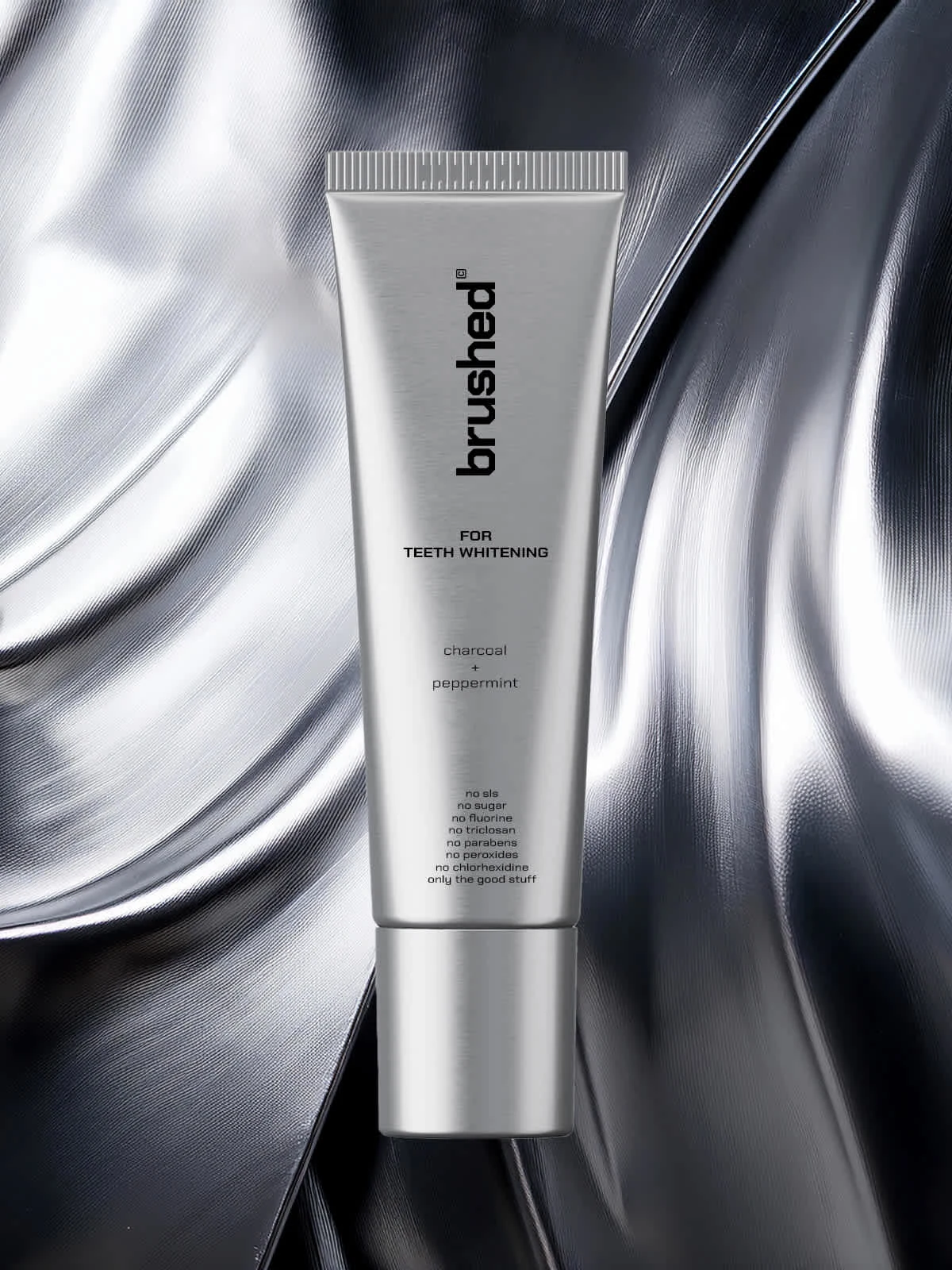
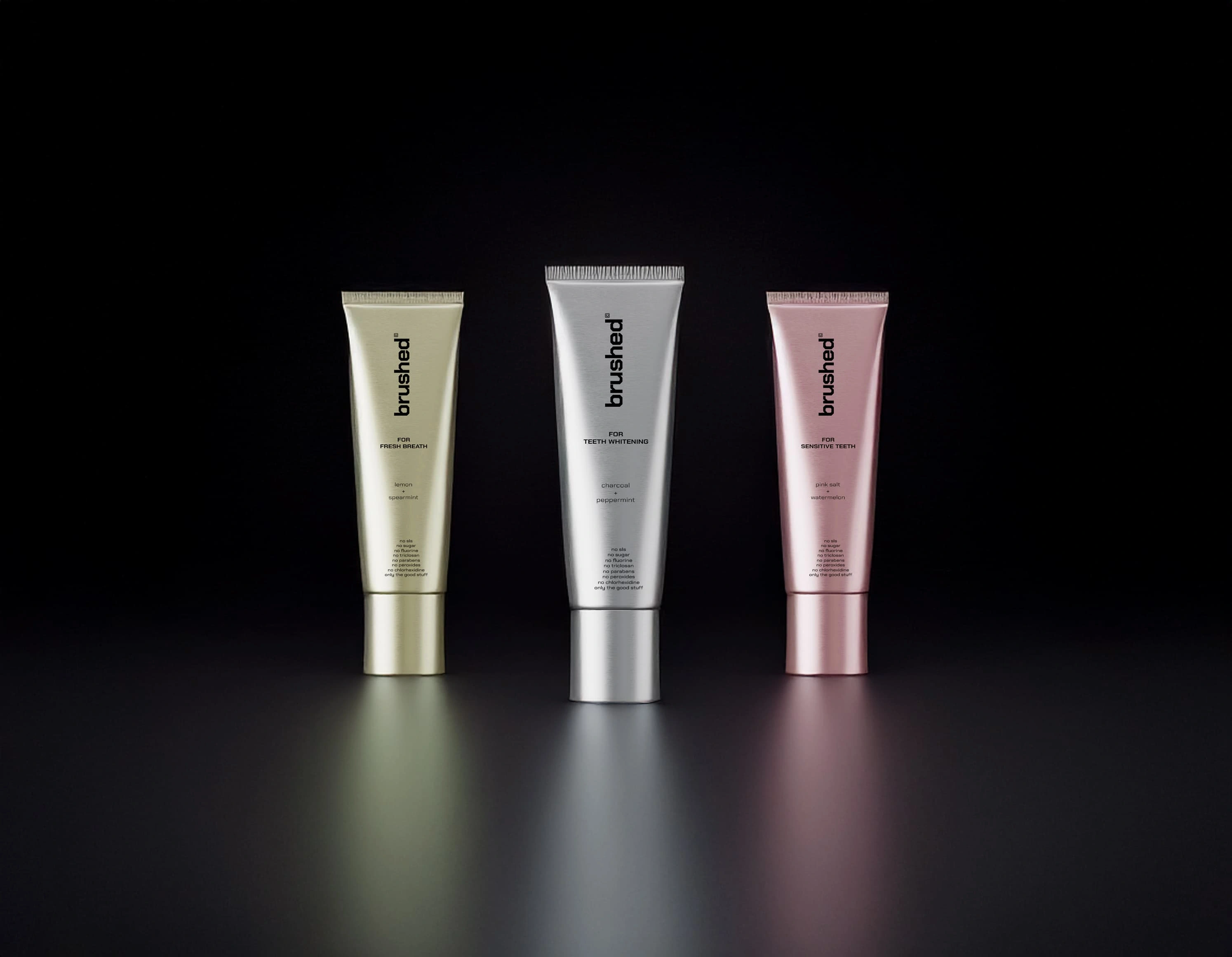
Brushed is a oral wellness brand merging minimalist design, clean ingredients, and elevated daily hygiene rituals. Target audience being wellness lovers (22-35) who value minimalism, clean rituals, sustainability and slow-living routines.
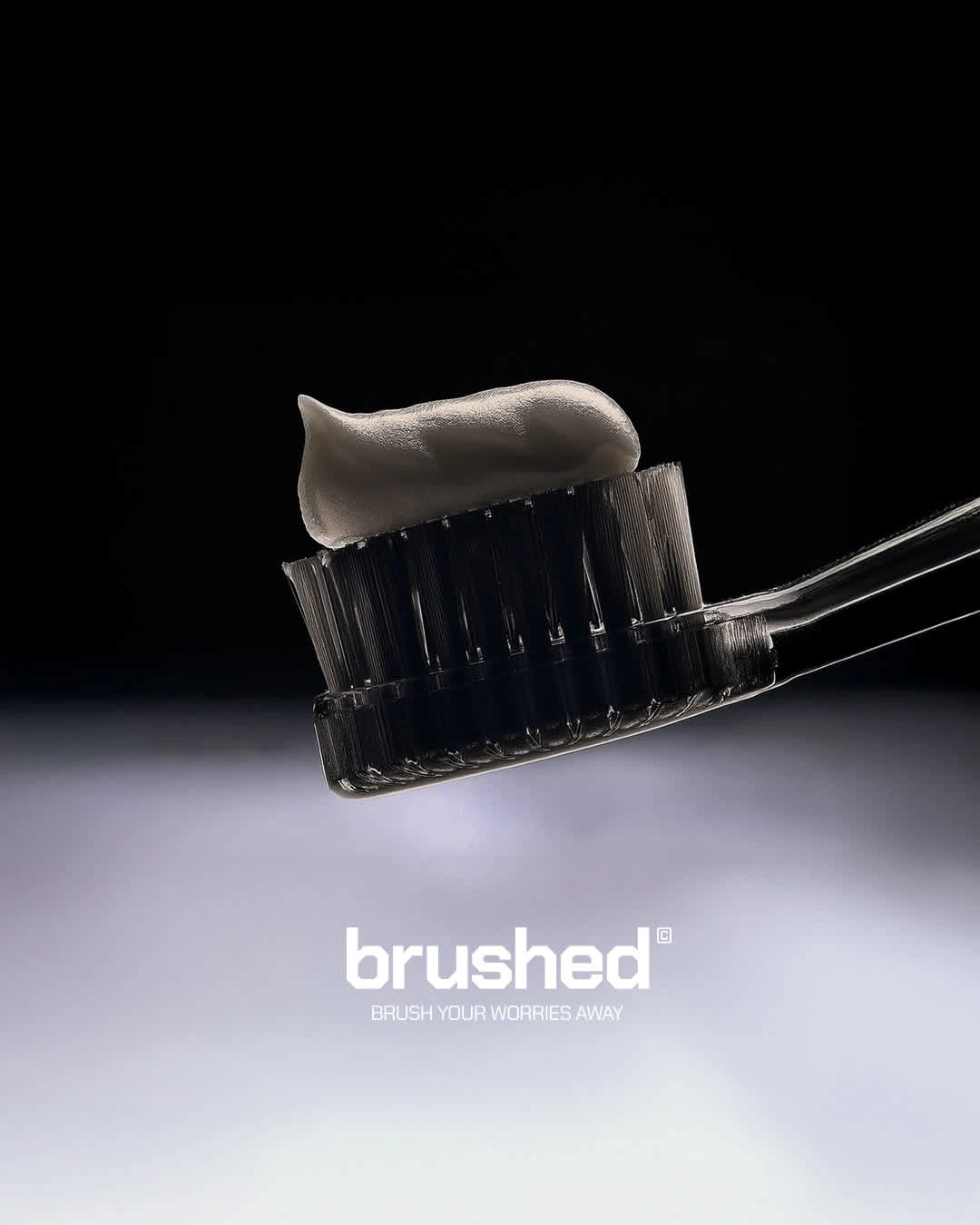
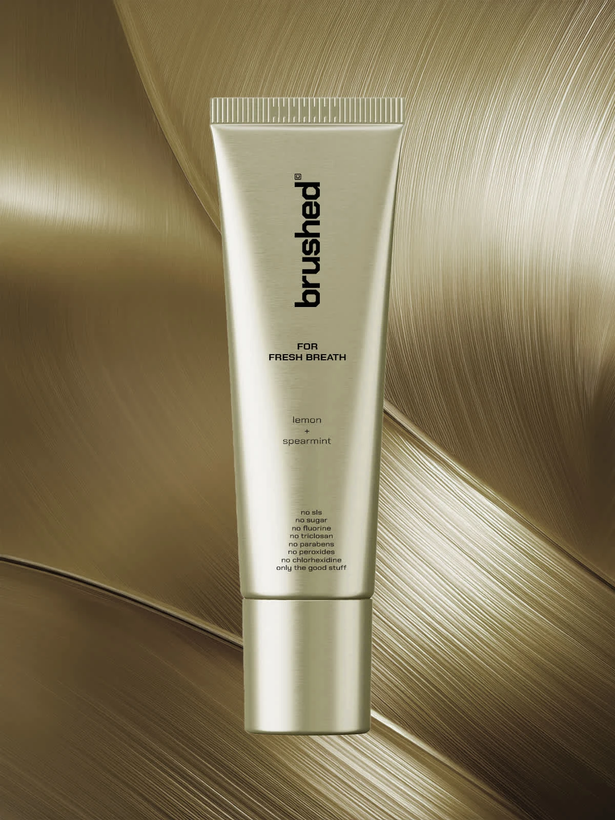
Creative Solution: For the logotype, I chose a typeface with lots of angles since brushing means reaching all the corners of the mouth from all the angles for a clean brush. Chose a chrome color scheme to make it look more high-end and unusual for a toothpaste brand to make it stand out on the shelves among other brands, evoking curiosity in shoppers while shopping.
Like this project
Posted Mar 31, 2025
Brushed is a oral wellness brand merging minimalist design, clean ingredients, and elevated daily hygiene rituals.