Olura Brand Identity Design
Alice Razumova
Olura - Brand Identity & Packaging
Deliverables: Brand Identity Design, Packaging Design
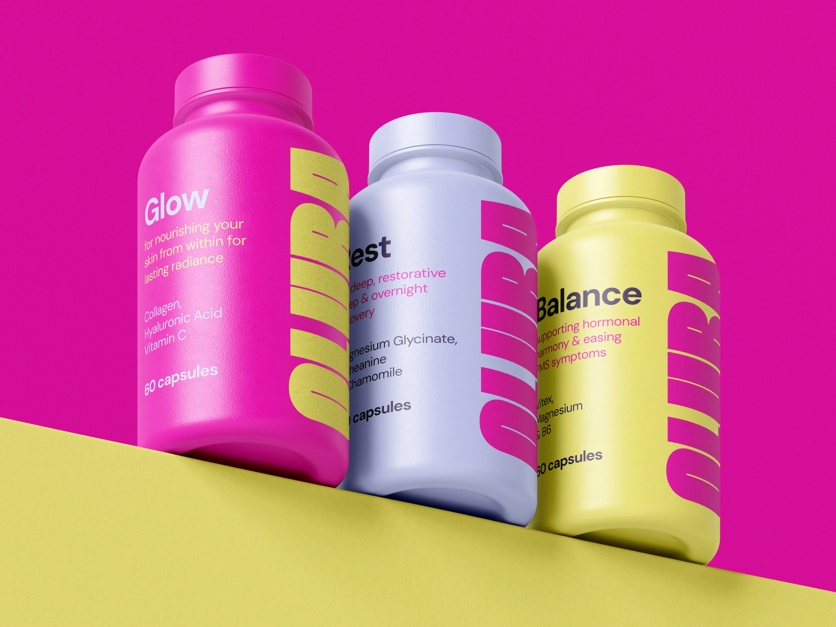
Olura is a supplement brand designed to grow with women through every change their bodies experience. Using simple, clean ingredients, it focuses on supporting skin, hormones, and overall balance, helping women feel their best, inside and out.
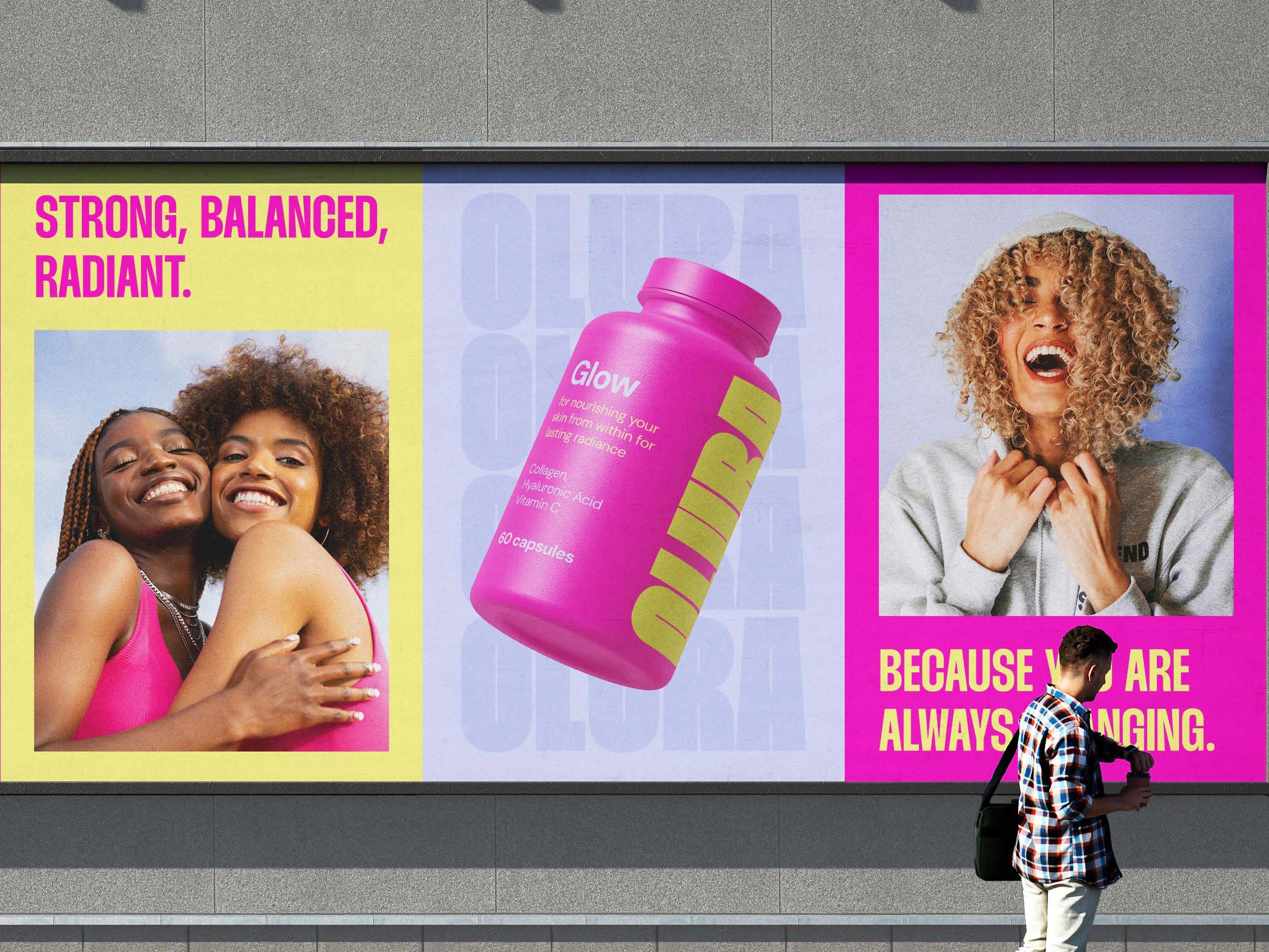
The Goal: The goal of this project was to create a confident, modern visual identity that feels strong, clear, and trustworthy. Instead of relying on the usual soft pastels and gentle aesthetics often used in women's wellness brands, Olura was designed to feel more empowered and radiant.
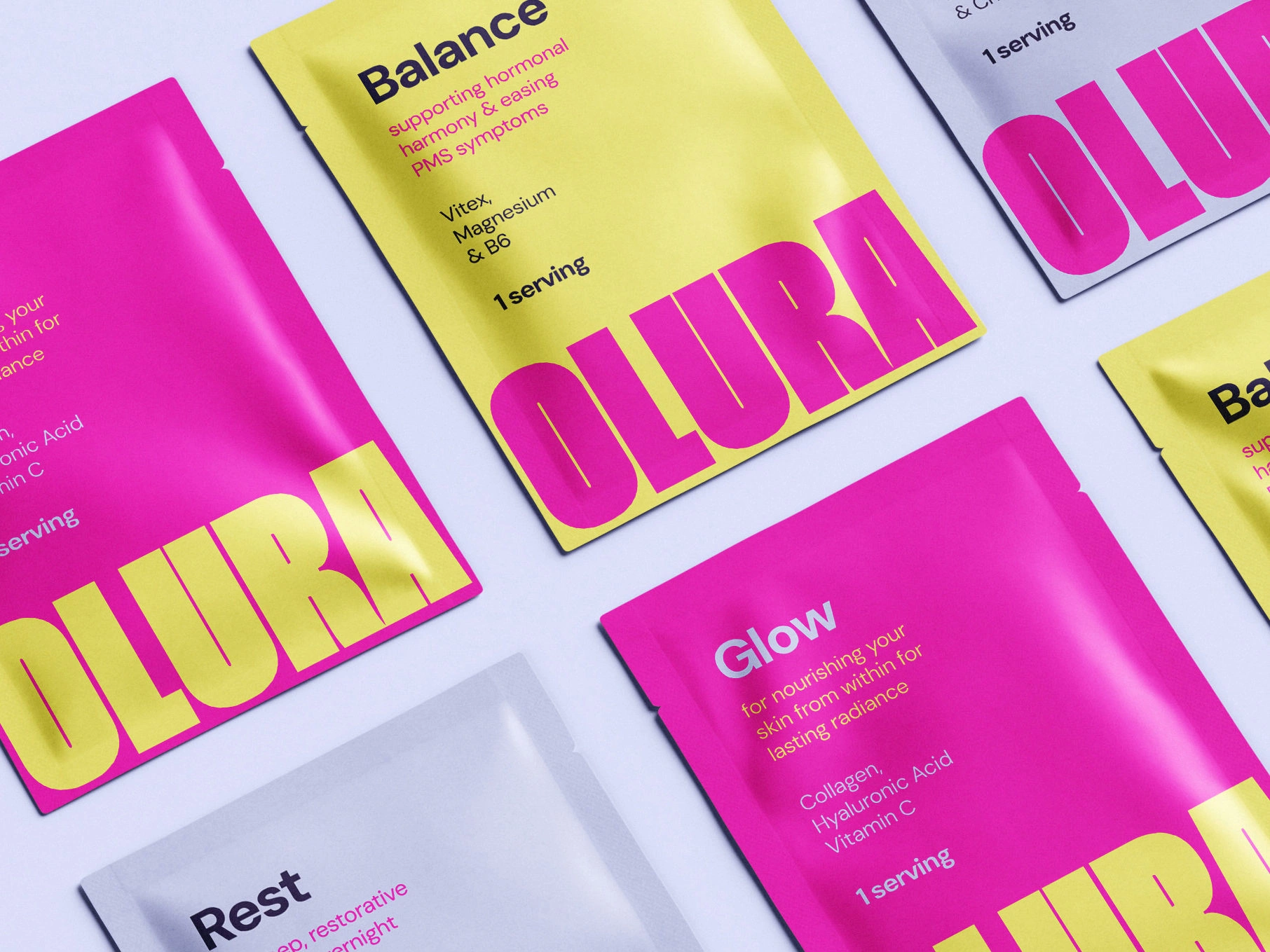
The Approach: The identity was built around the idea of modern femininity that feels strong rather than delicate. I chose a strong, sturdy typeface to represent the support Olura gives to young women and paired it with a bright colour palette of pink, yellow, and baby blue to celebrate femininity and reflect the radiant energy women feel when taking the supplements. This sense of radiance also comes through in the photography direction. To emphasise the clean and simple ingredients, I kept the packaging minimal and straightforward.
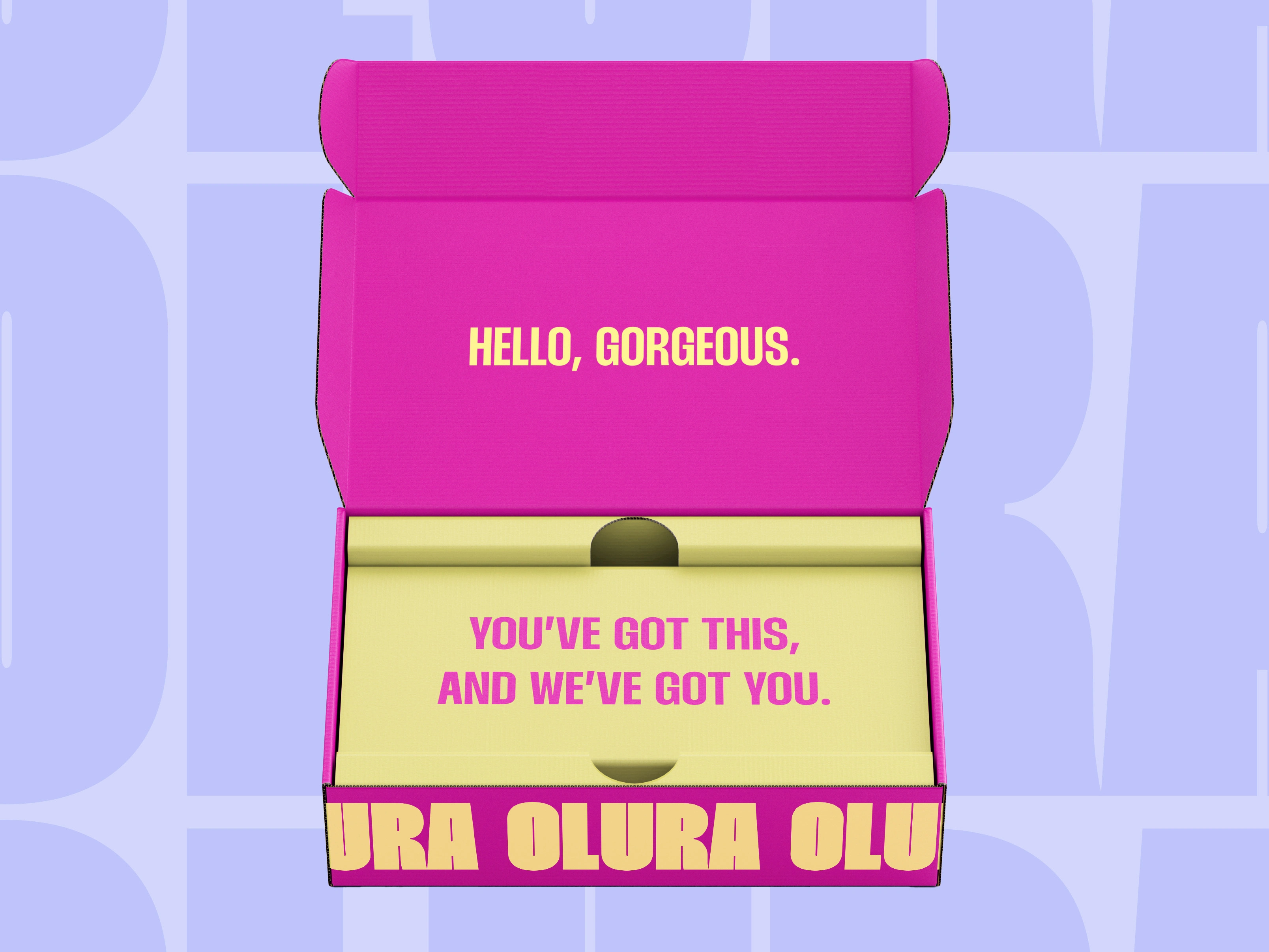

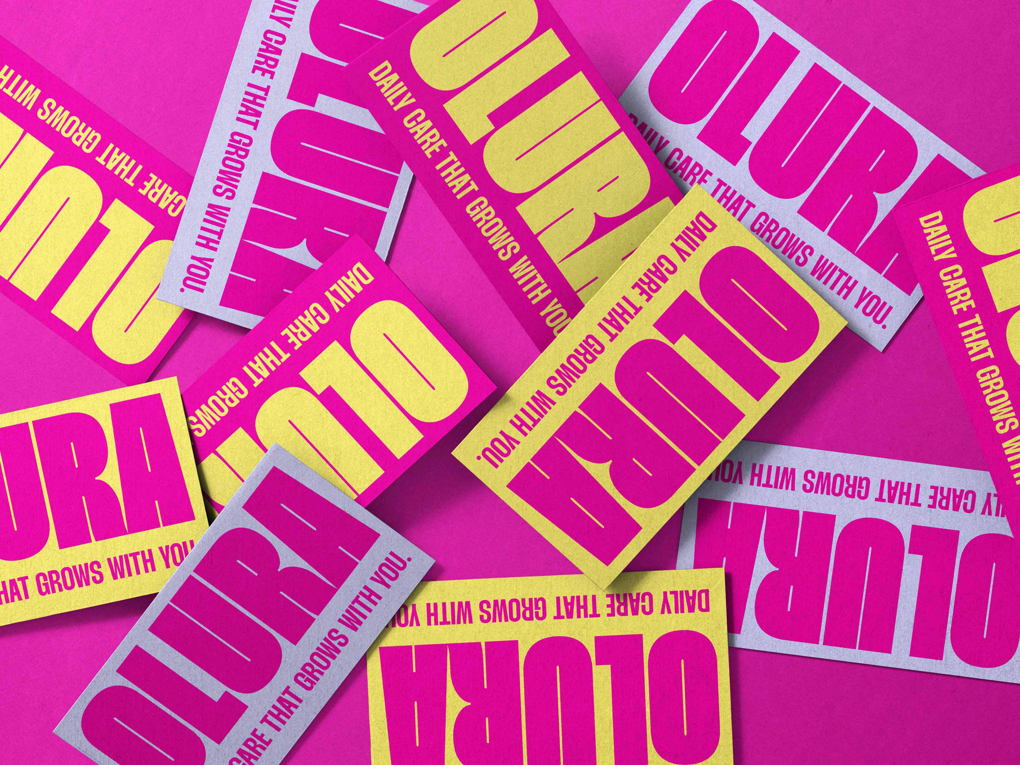
The Outcome: The final identity presents Olura as a modern, confident wellness brand that stands out in the women's supplement space, with a visual identity that balances clarity and boldness.
Like this project
Posted Jan 1, 2026
A brand identity for Olura, a women’s supplement brand, that celebrates women’s confidence and balance.
Likes
2
Views
31