Digital Marketing & Web Design for Non-Profit Organization
About the organization
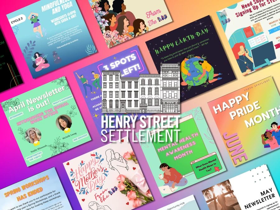
Henry Street Settlement, a nonprofit located in New York that offers opportunities in social services, art programs and health care services for its community in the Lower East Side and other New Yorkers. I particularly worked with one of their youth programs, the Youth Opportunity Hub, a program tailored for teens and young adults ages 12 to 24.
You can learn more about Henry Street below ⬇️
My Role.
Graphic Designer. Digital Marketer. UX/UI Designer.
Social Media
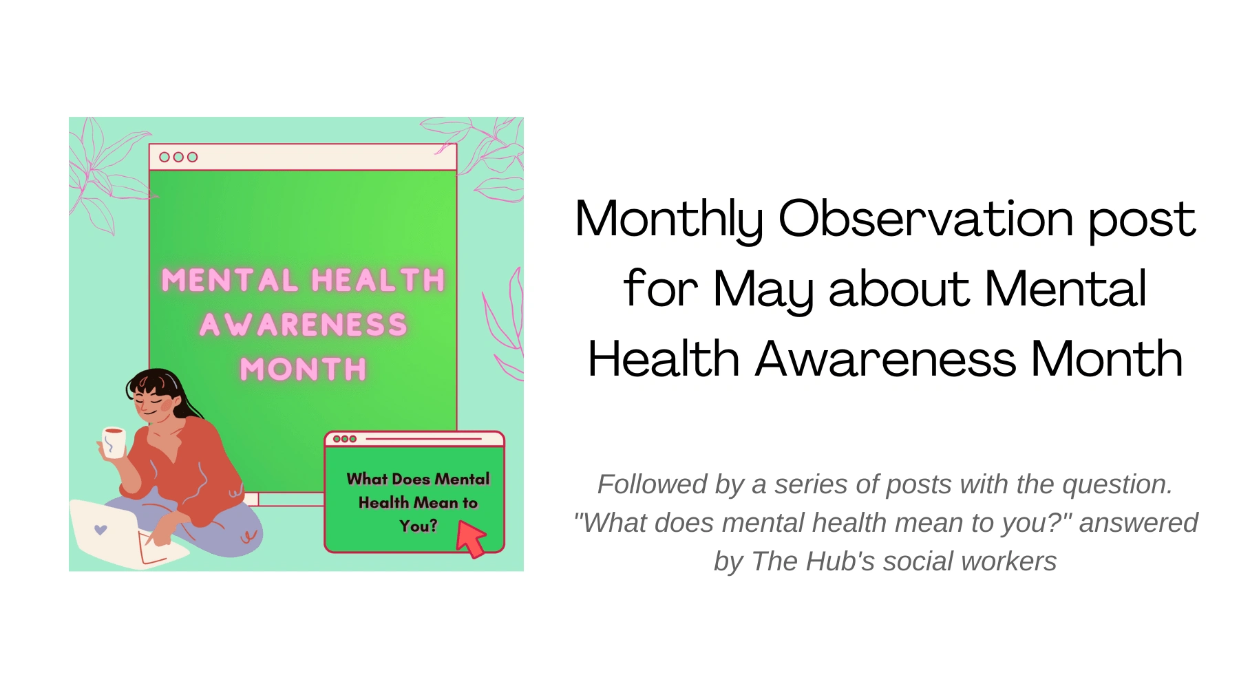
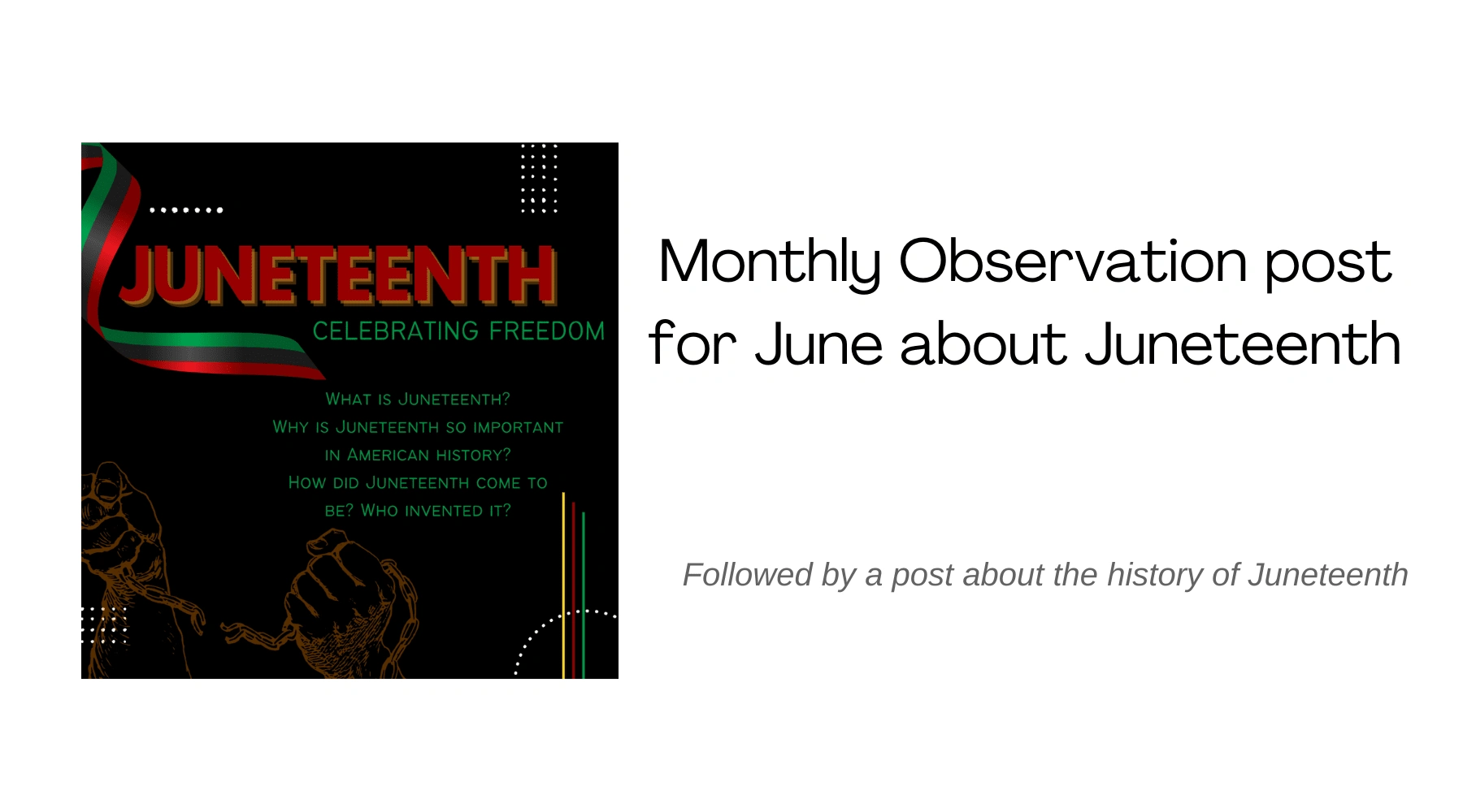
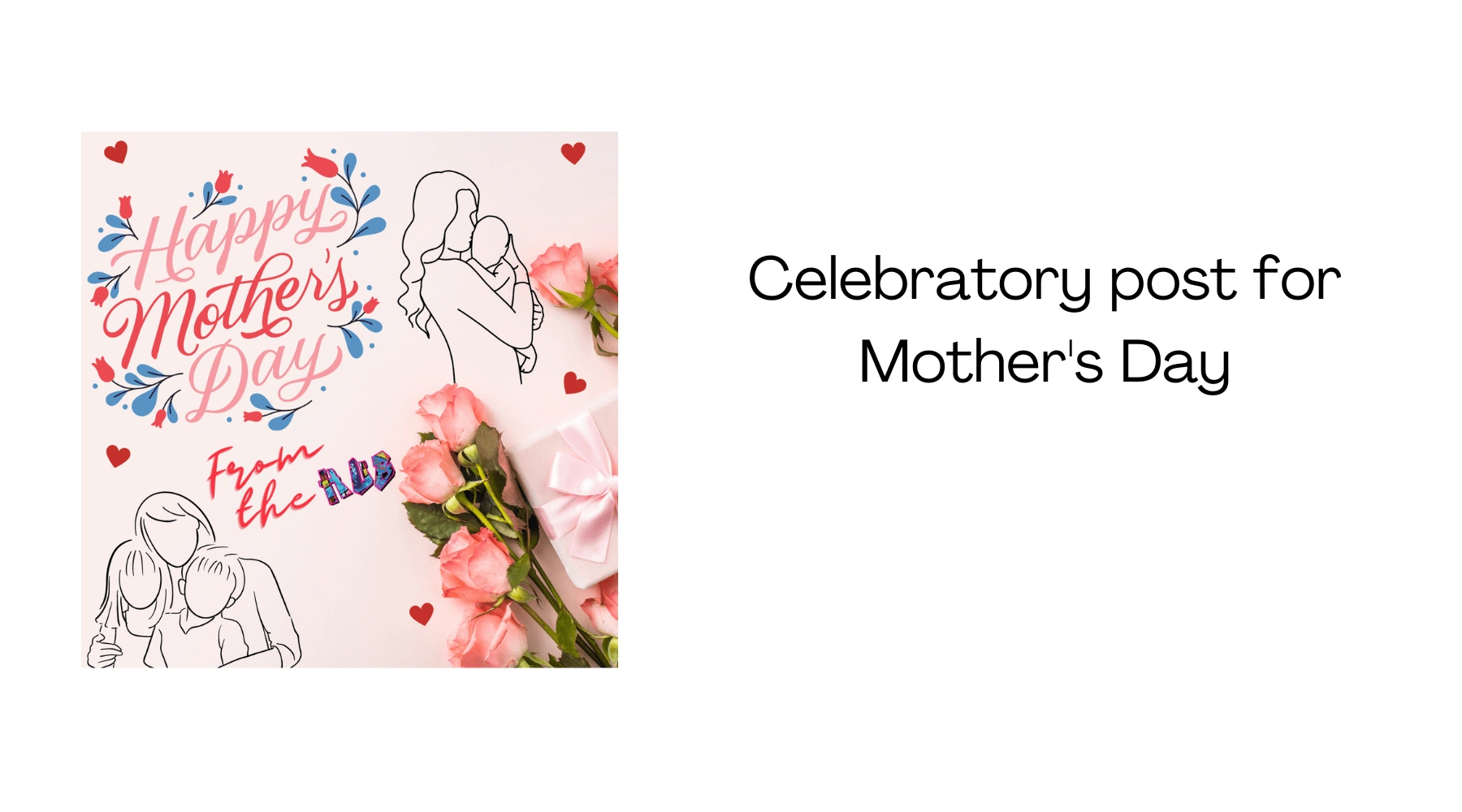
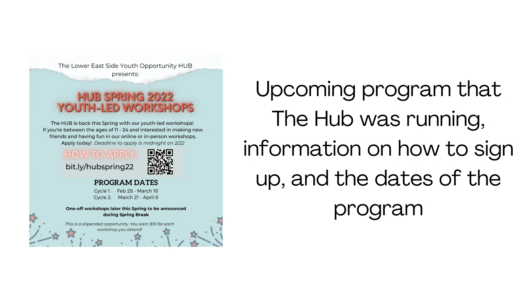
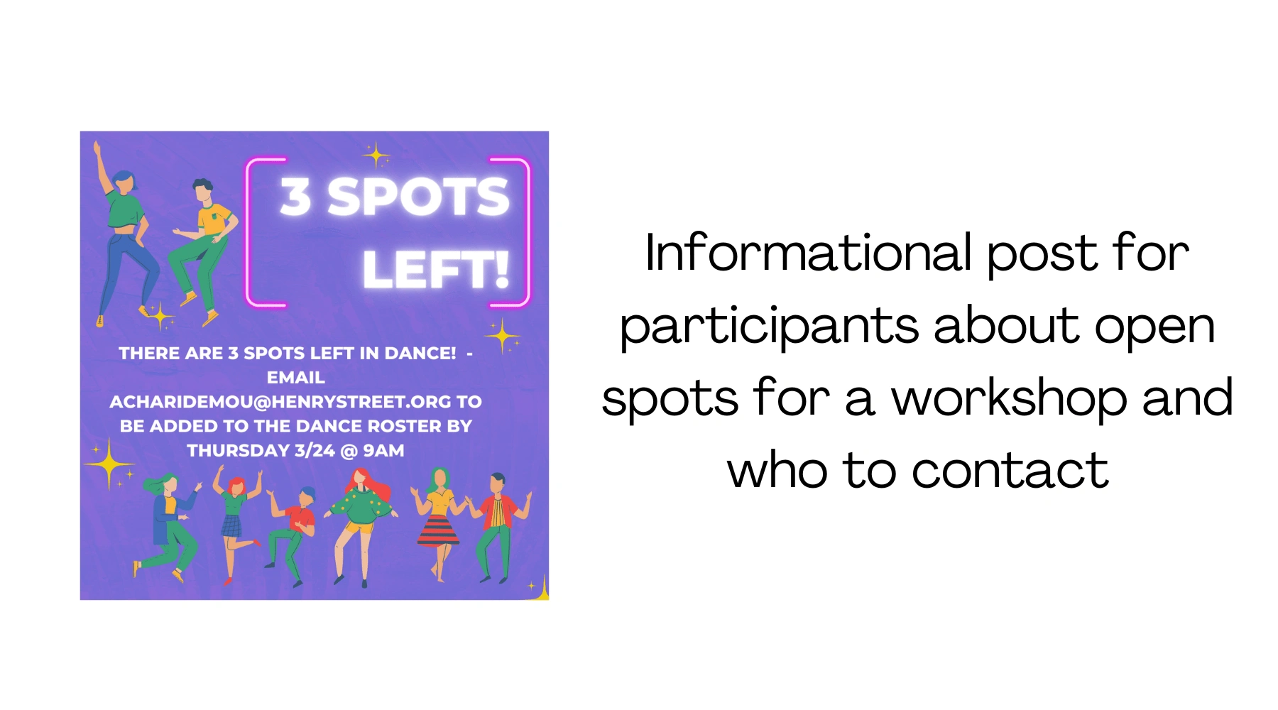
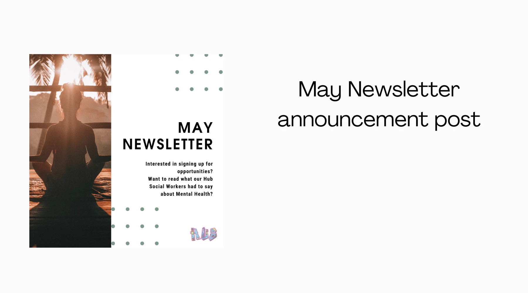
I was to create social media content for their Instagram and Facebook pages. These content ranged from: Upcoming events and workshops that the program was running, Informational posts regarding workshops, Announcement posts for the monthly newsletter, and Celebratory post for holidays.
Newsletter
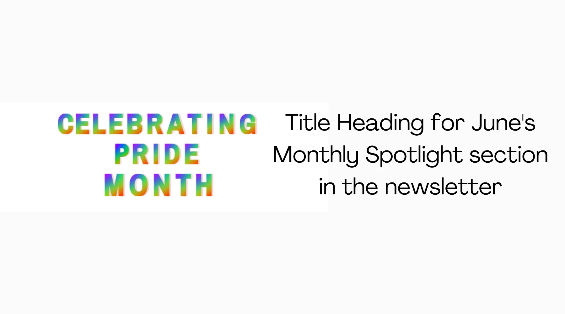
Aside from handling the social media, I was also in charge of the newsletter which I created graphics: Titles for the different sections, and Informational content regarding upcoming programs.
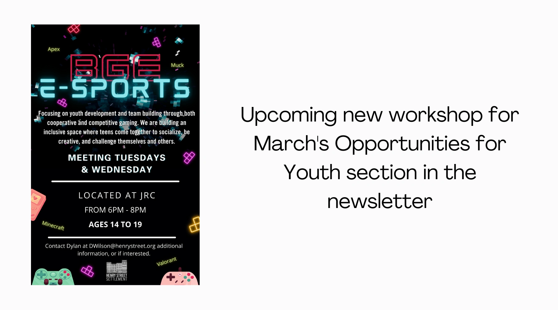
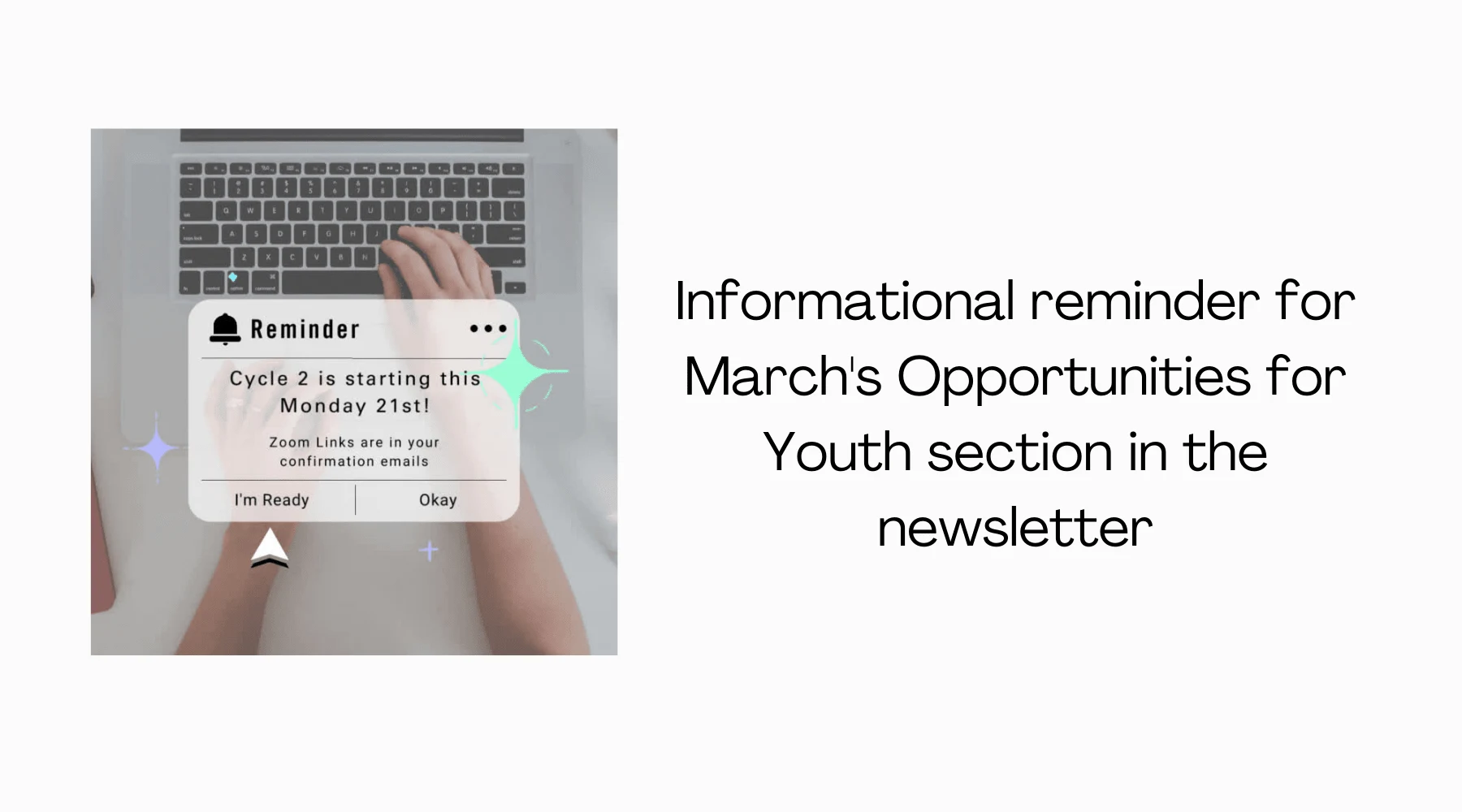
I also provided communication between the Hub Team and Henry Street's Marketing and Communications Team by providing updates from the Hub and relaying questions from Marketing.
Social Media Marketing Strategy
The Hub was interested in how could in additional content besides graphics. We looked at, explored and discussed: (1) Besides graphics, how can we incorporate reels with the program's brand? (2) How can we include program leaders, or program participants, in these reels that would be fun and engaging? (3) What kind of videos can we create for YouTube that would be interesting and engaging?
Results.
Despite the main goal being creating graphics for Instagram (and Facebook), updating it with upcoming events to increase participant engagement. There were other things that had also improved:
Instagram followers increased by 4.3% in the first three month period
Participants were looking at the page more and reaching out to the program director
More story engagements by viewers interacting with Insta story stickers
You can check out their Instagram page here.
Webpage Design
Challenge & Problem.
The Hub personal page hasn't been updated in so long. They were interested in seeing something that would reflect their Instagram page, contain links, updated and new information with pages, and more pictures and colors. The program director wanted something that they wouldn't be hesitant to refer people to the page.
At the same time there was a request to not modernize it and keep it consistent with the rest of the site.
Users.
Since the Youth Opportunity Hub program is catered towards teens and young adults, the main users and target audience would be anyone around the ages of 13 to 24.
Industry Research.
I did research in how other non-profits displayed their pages, particularly paying attention to layout, and what and how information was presented. As a result there were: (1) Pictures that made pages engaging, (2) Information/data that reflected what was happening or celebrating achievements, and (3) Colors that made pages vibrant.
UI Style Guide.
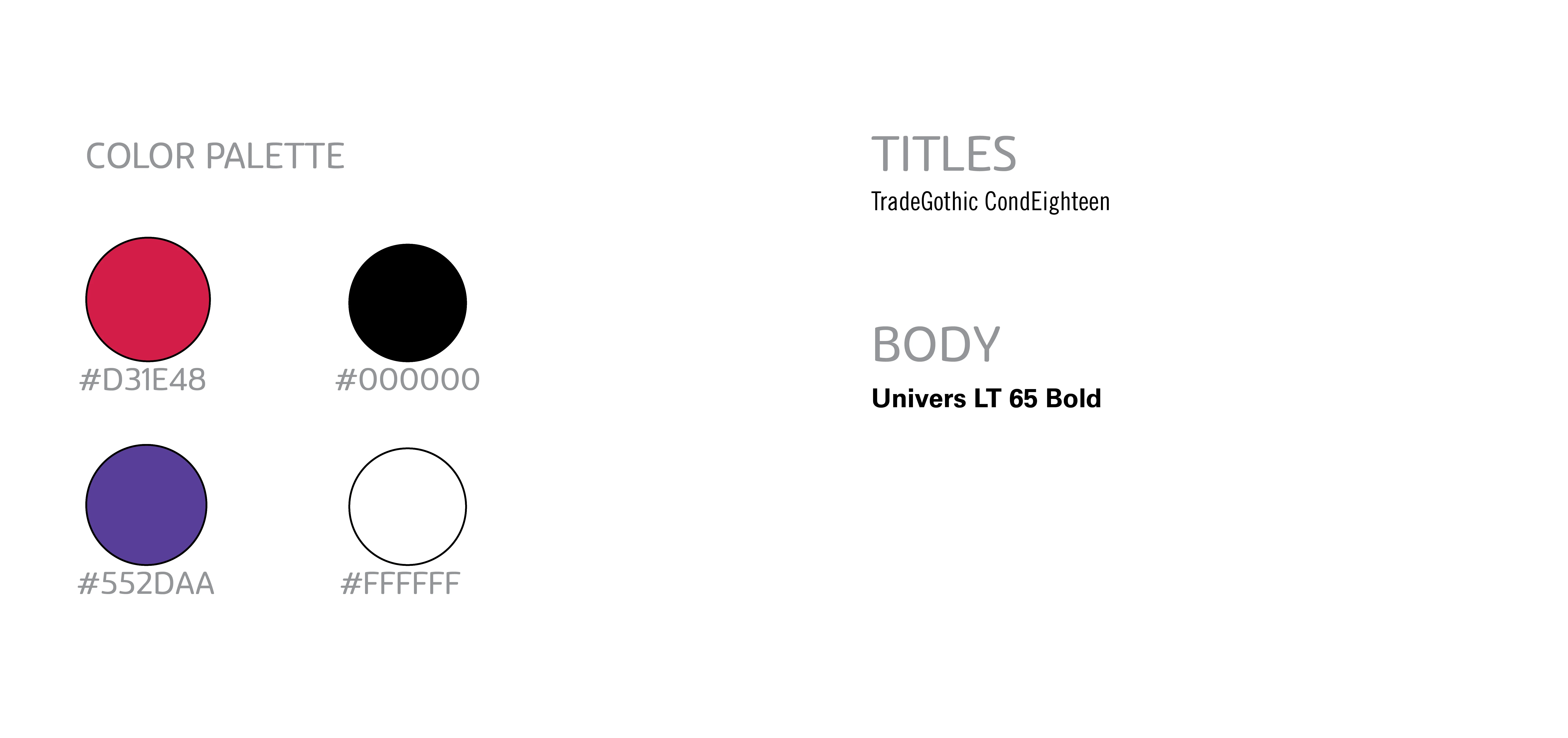
Colors #D31E48, #000000 and #FFFFFF were brands colors with Henry Street, while #553DAA was a color based on the Hub's logo. And it's the same color they've been using in their newsletters.
Wireframes.
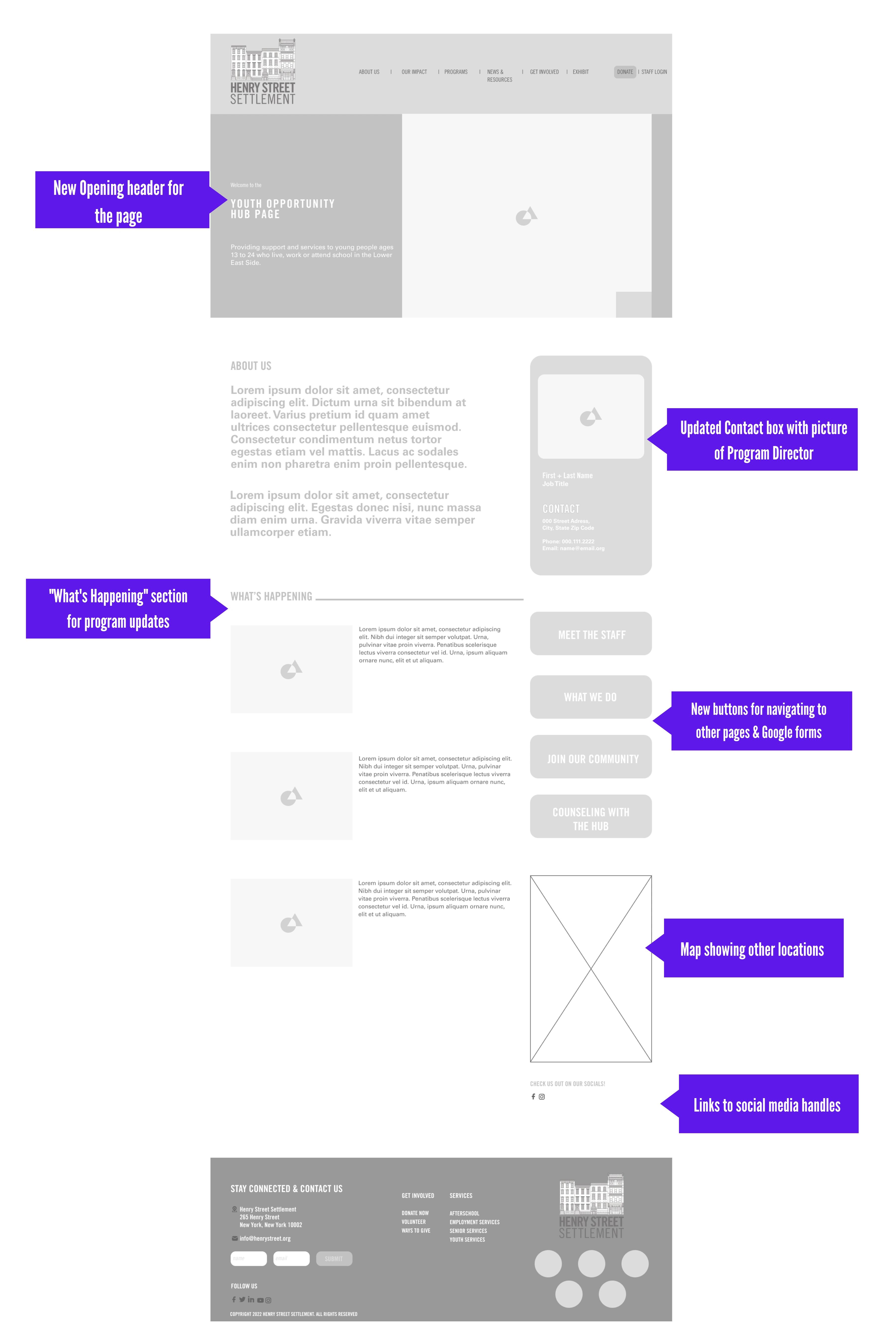
Main Page
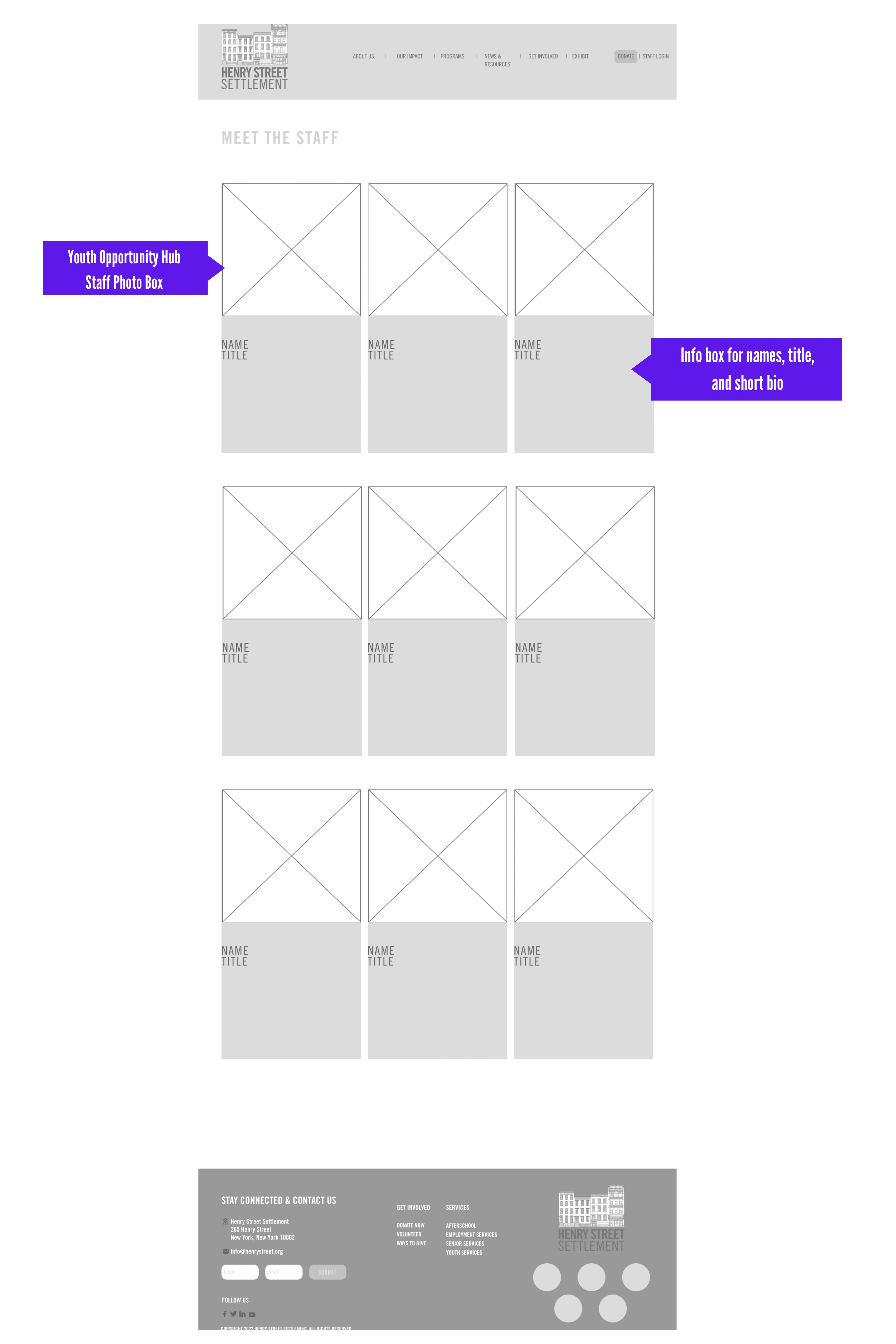
Hub Staff Page
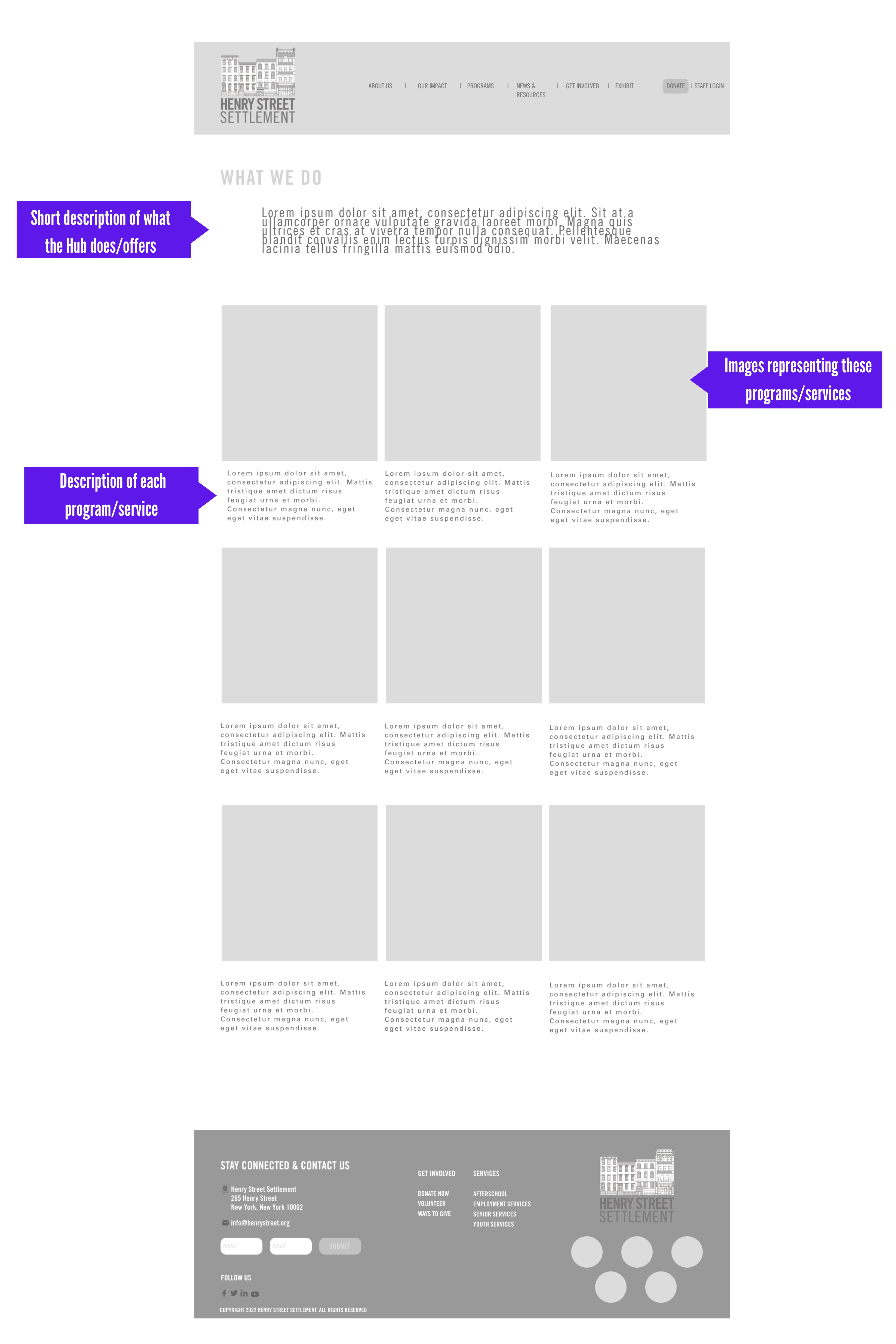
"What We Do" Page
Like this project
Posted Mar 20, 2023
Creating graphics, planning, and uploading program updates on Instagram and Facebook. Redesigning and updating the home page for the Youth Opportunity Hub.
Likes
0
Views
75
Clients
Henry Street Settlement


