Pizza Catering- Visual Identity
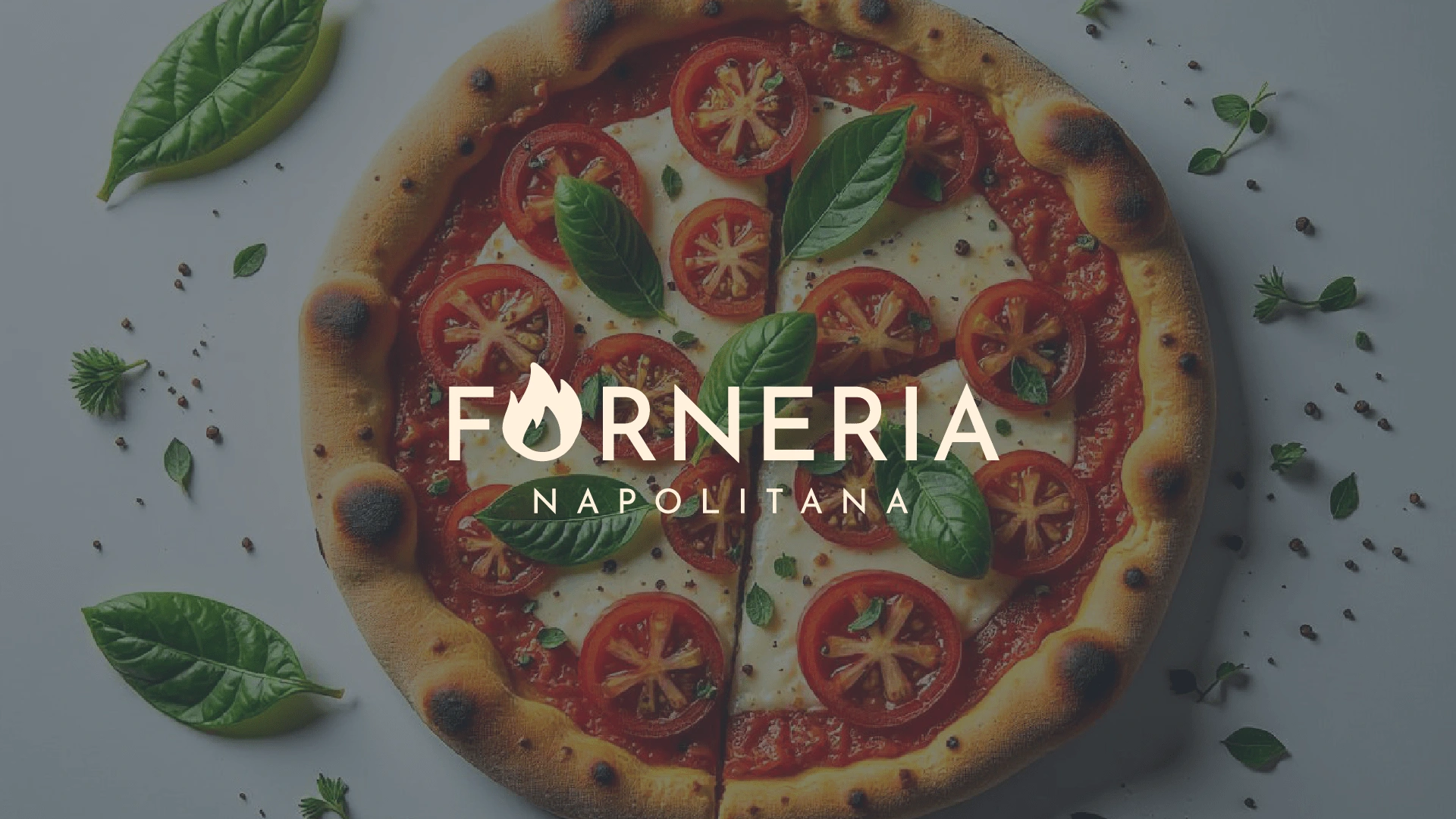
Forneria Napolitana is a premium pizza brand that combines the rich tradition of Napolitana pizza-making with a unique Brazilian twist.
Known for its handcrafted pizzas, the brand takes pride in using high-quality ingredients and offering an elevated dining experience, particularly for private events. With a focus on both authenticity and modernity, Forneria Napolitana serves flavours that reflect the warmth and passion of Italy, while adding distinct Brazilian influences to its menu.
The brand’s identity is built around providing a cozy, sophisticated, and versatile experience, making it the ideal choice for gatherings that require both exceptional food and a touch of elegance.

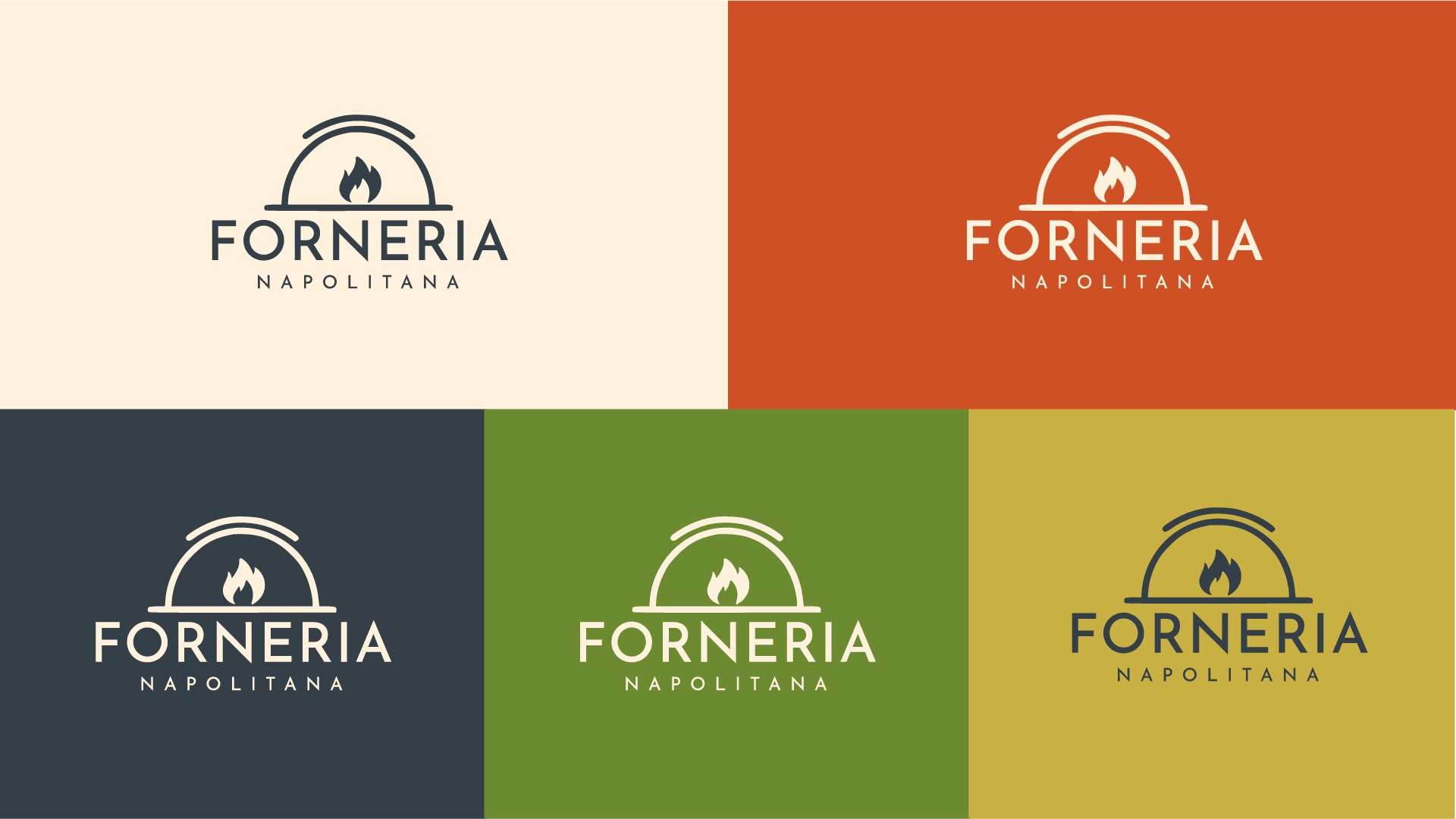
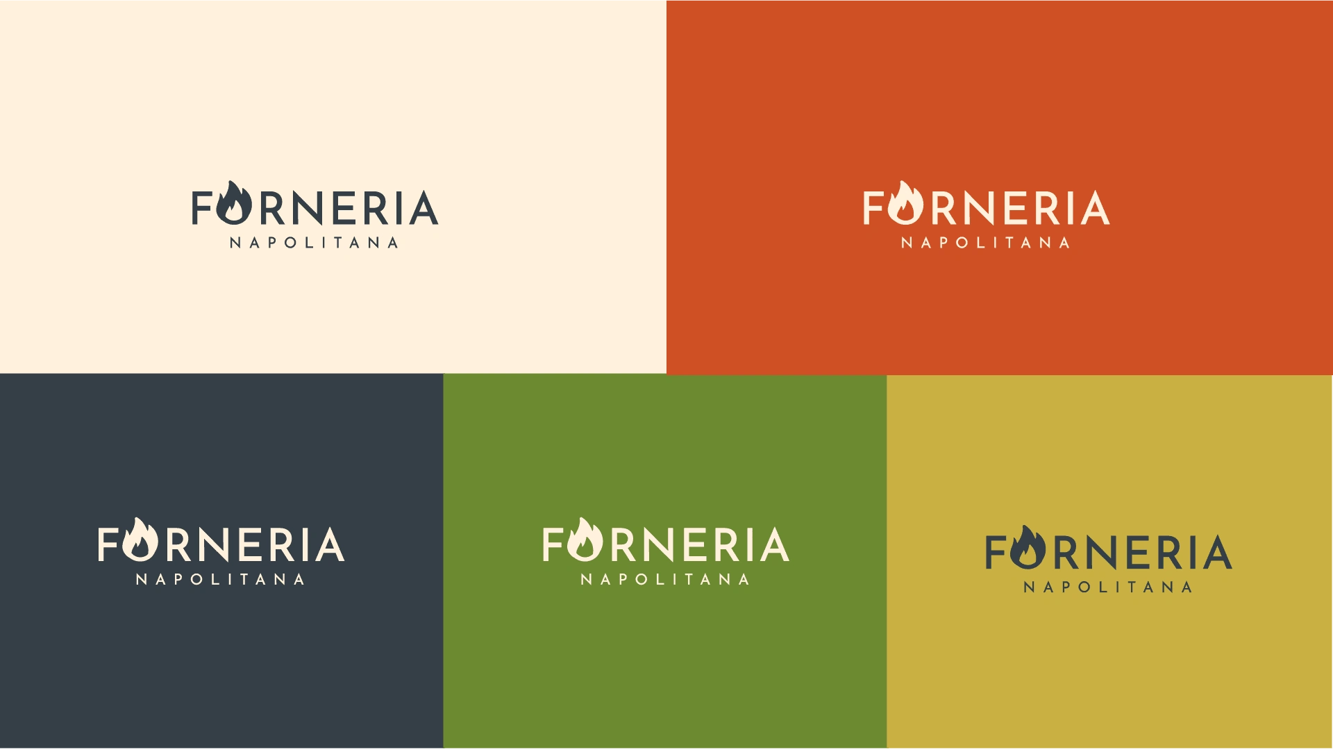
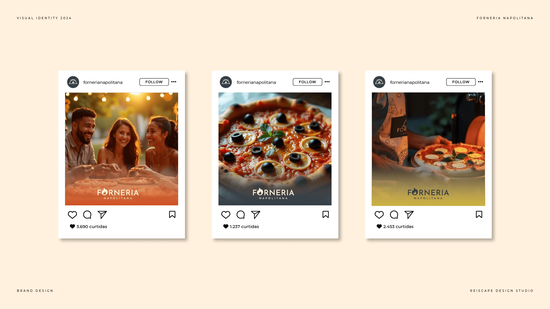
The color palette for Forneria Napolitana blends warmth, sophistication, and freshness to reflect the brand's modern and artisanal character. The vibrant orange conveys energy and passion, evoking the heat of a pizza oven and stimulating an appetite.
The light cream adds a cozy and inviting touch, balancing the boldness of the orange and creating a welcoming atmosphere. The slate blue brings a sense of refinement and professionalism, grounding the brand in elegance.
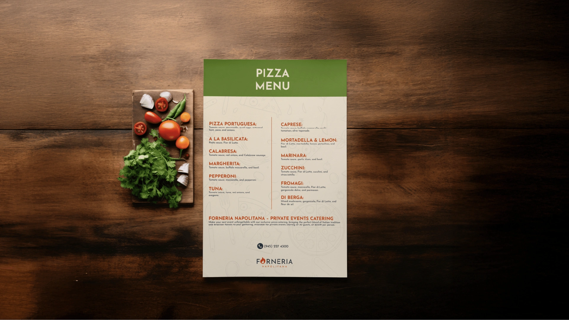
Secondary colours like gold symbolize luxury and craftsmanship, while the natural green highlights the use of fresh, high-quality ingredients. Together, these colours visually represent a brand that is both approachable and premium, perfect for a sophisticated yet relaxed dining experience.

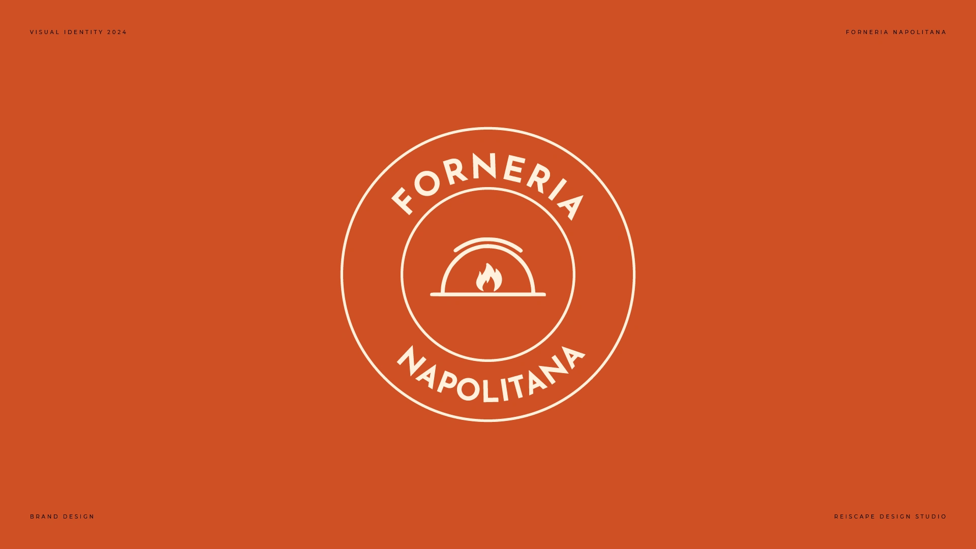
The Logo
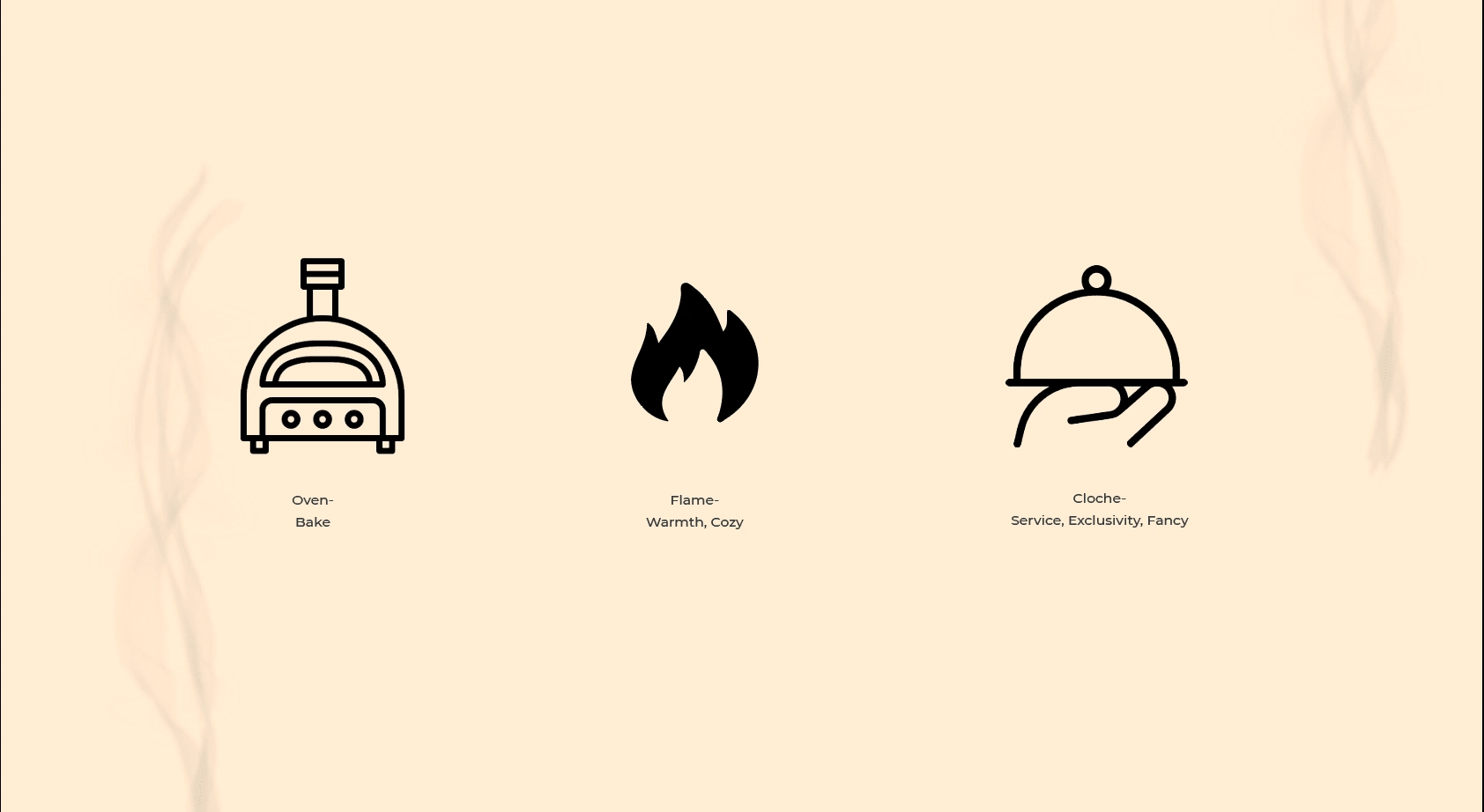
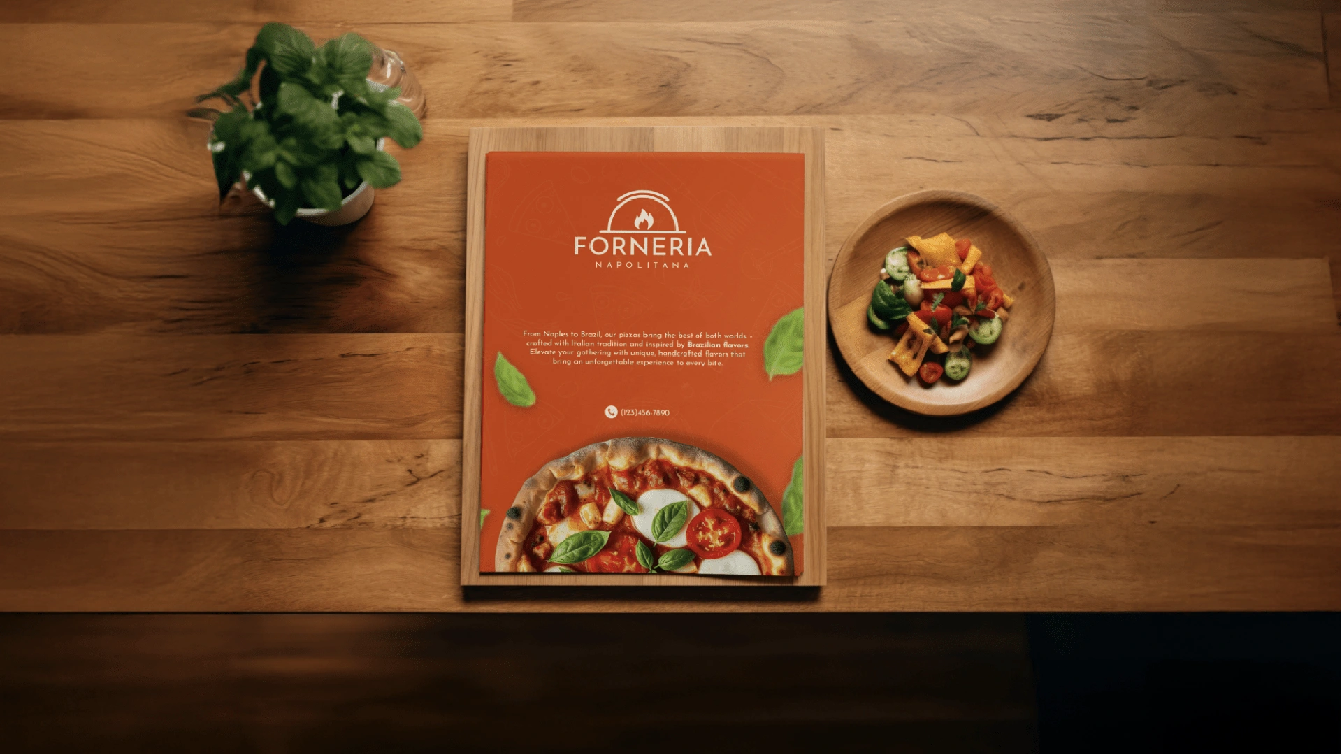
The logo for Forneria Napolitana combines elements of a pizza oven and a cloche, symbolizing both the artisanal pizza-making process and the elegant service offered at private events. The flame represents the warmth of the oven and the brasa (embers), reflecting the expert care behind each pizza.
The modern, bold typography enhances the sense of professionalism while staying true to the brand’s authentic roots.


Like this project
Posted Oct 9, 2024
Visual Identity Design for a Pizza Catering company in Orlando.
Likes
0
Views
12


