GI NUTRIVIDA- Website Design and Logo Redesign
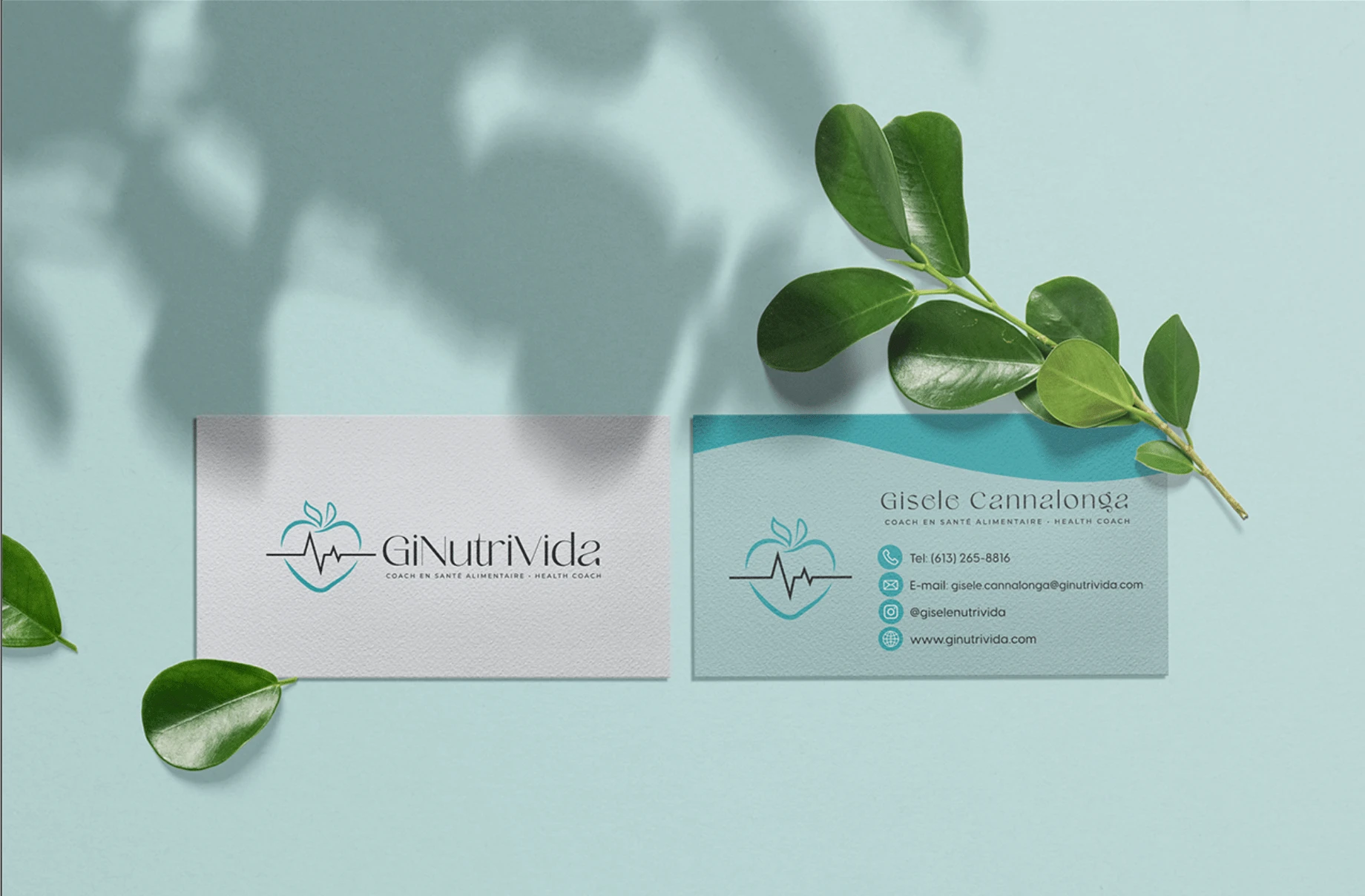
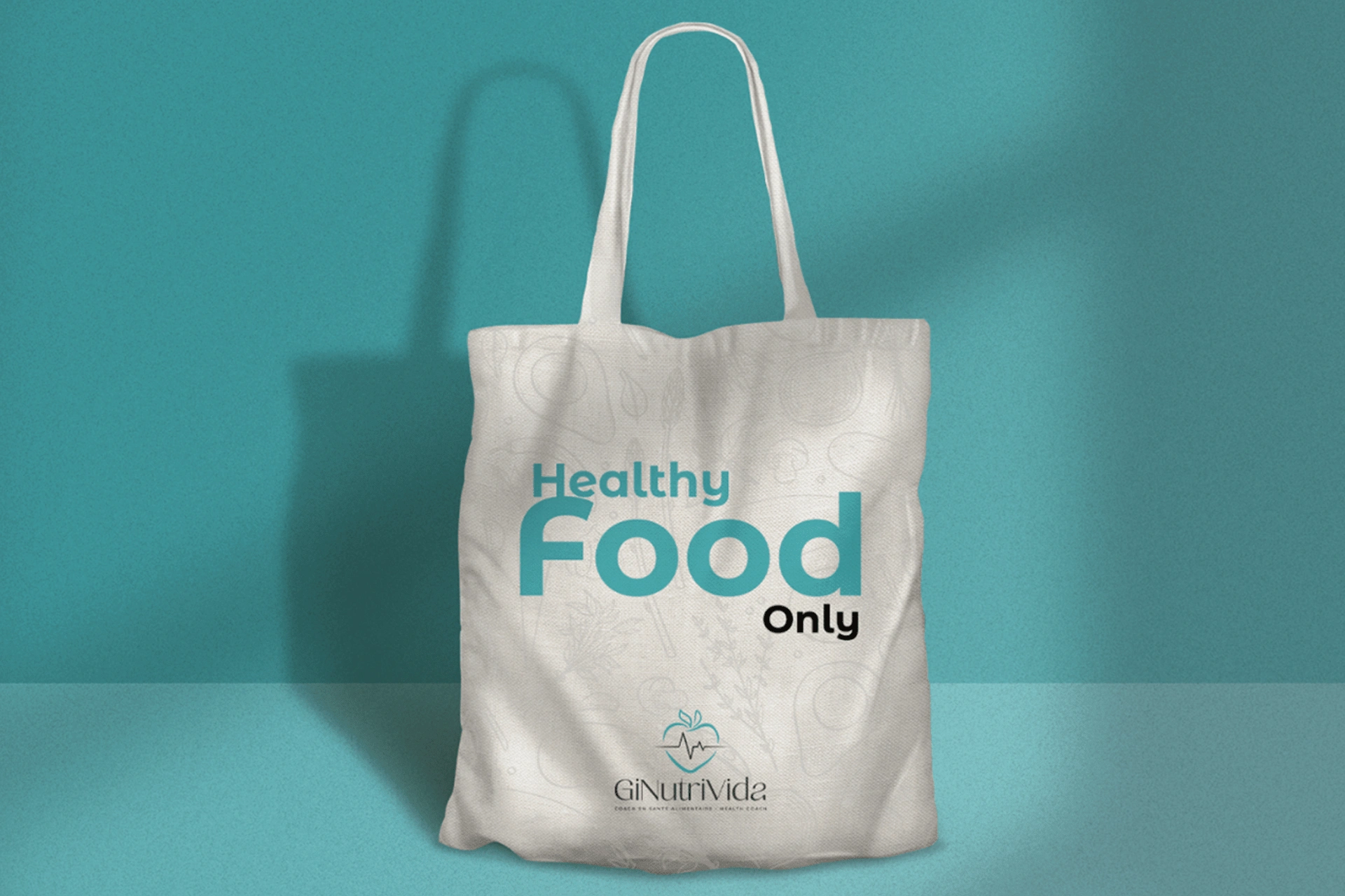
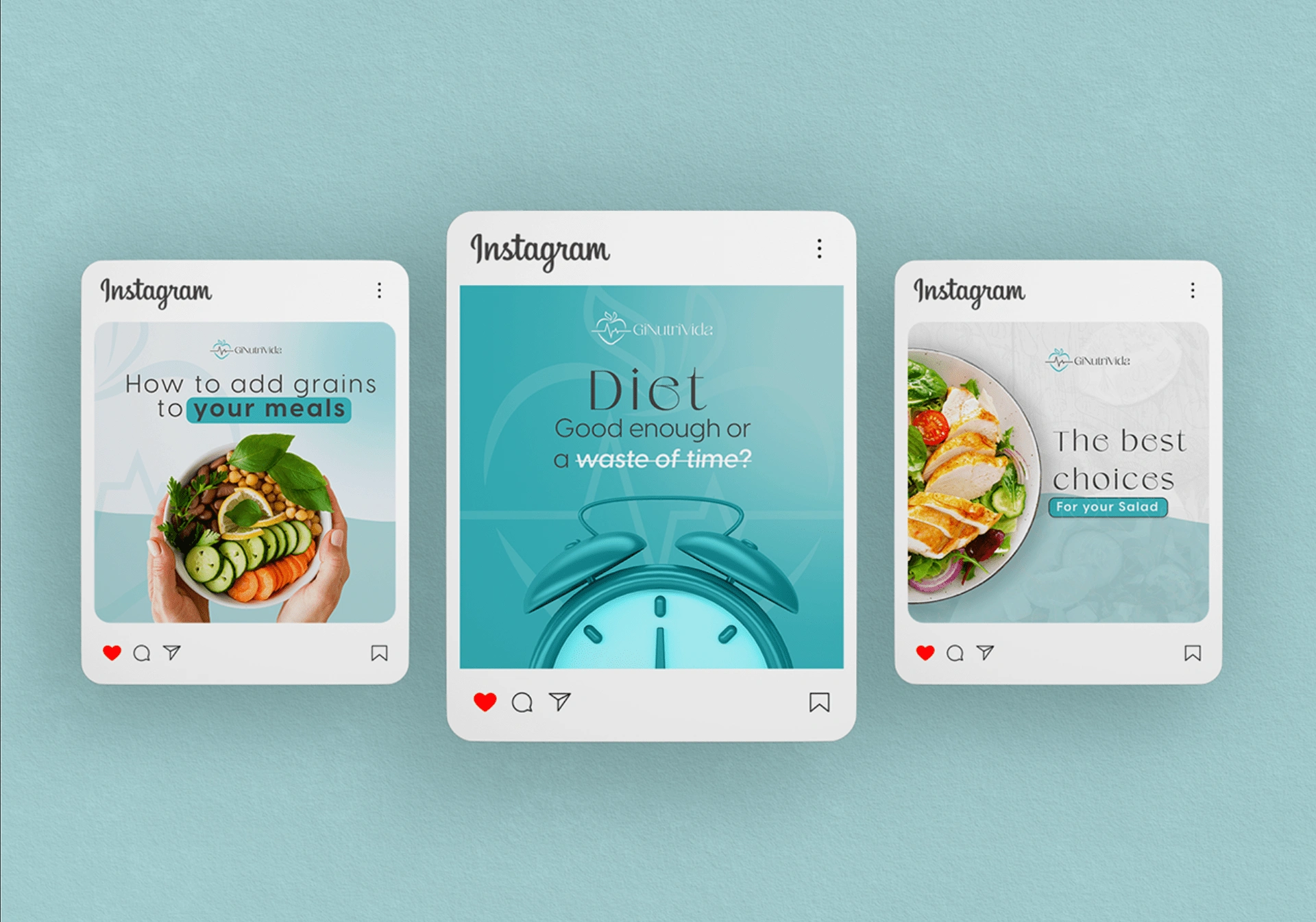
Gisele is a Health Coach from Gatineau, and she contacted us to rebrand her business, mainly her logo which was very busy with information and not very legible. Gisele needed to professionalize her brand and her website, which she had created herself. We identified that the main colours of Gisele's brand were consistent with the message she wanted to convey to her target audience. Gisele works with mature women (40+) to help them live a healthier lifestyle and develop healthier eating habits so they can live life to the fullest. She strongly associates water with the symbol of life. Therefore, we kept the main colours, only refining the shades to bring more professionalism and vibrancy. In the logo, we created a heart reminiscent of the shape of an apple, with a heartbeat at the centre, also symbolizing life.
Logo Redesign:
Website Redesign
Since Gisele's website had been created by herself, it was not visually appealing to visitors. Some pages were text-heavy, and the site had a performance score of only 40% with a low SEO score.
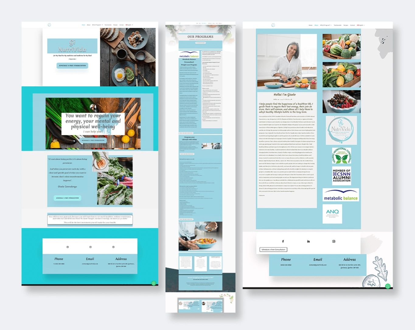
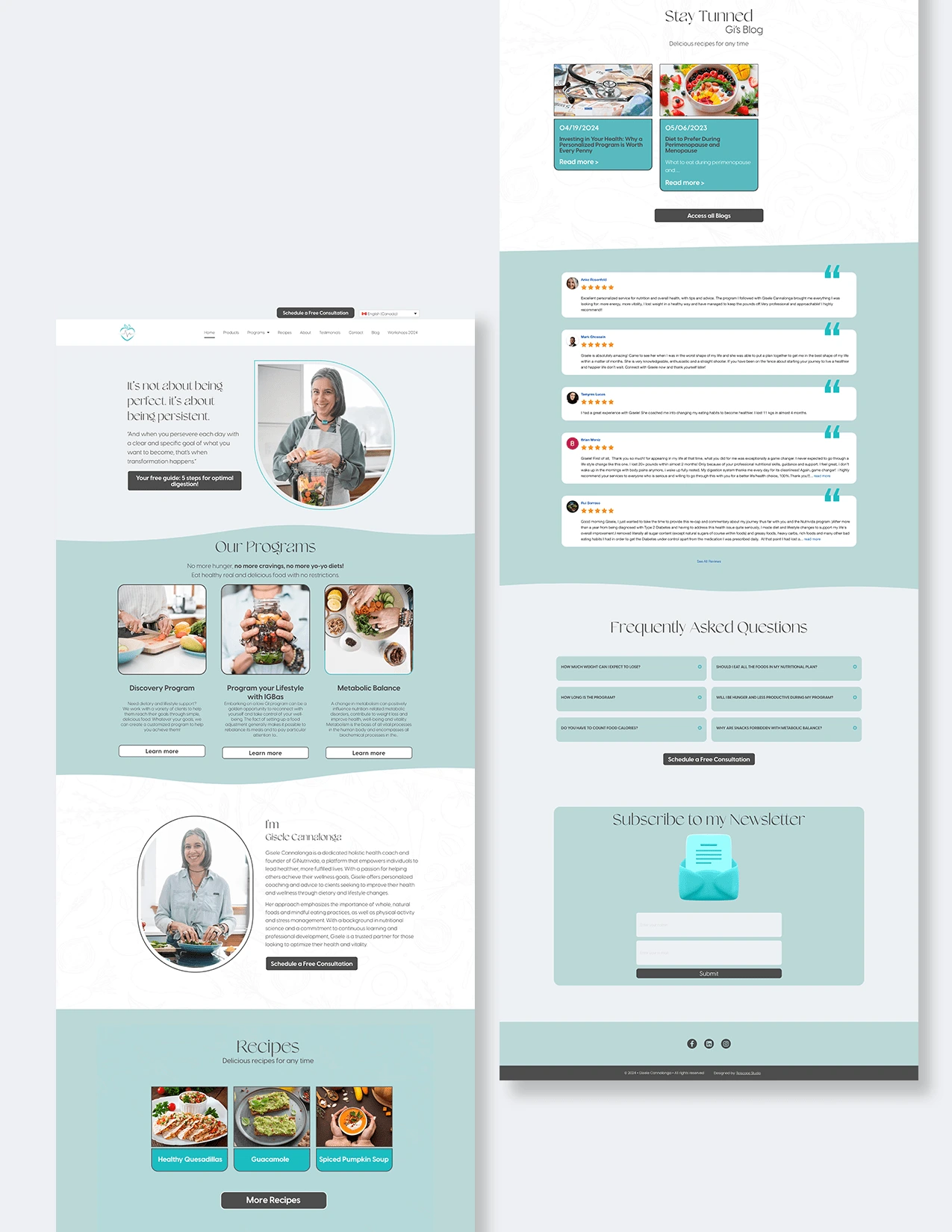
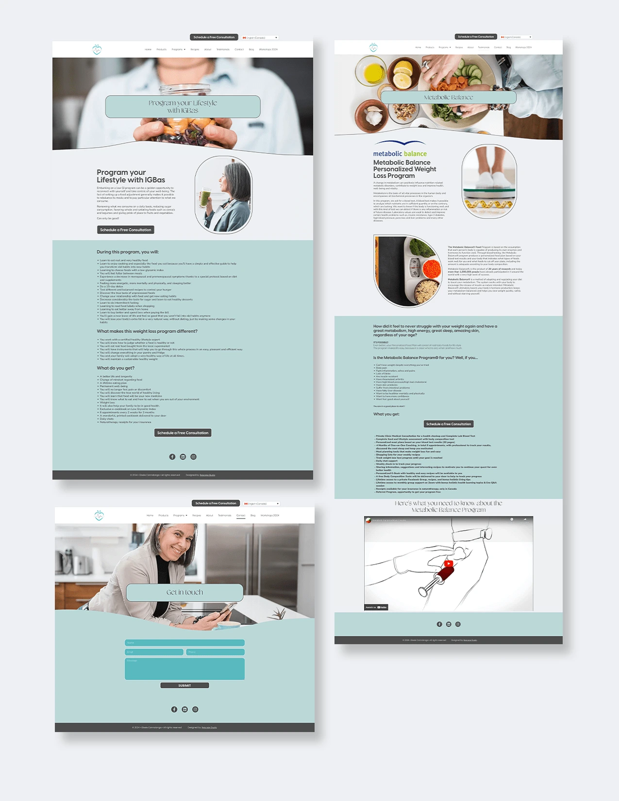
To improve the site's performance and increase visibility, we gave Gisele's website a lighter, more elegant, and professional look. We also created a blog page where she can write about topics that people frequently search for on Google related to nutrition, which will increase traffic to her site. In addition, we created a portal where Gisele's clients can access their meal plans and a recipe page that can also help increase site traffic when people are looking for recipes. This can lead people to see the programs that Gisele offers, and sales can be initiated from there.
Like this project
Posted Oct 6, 2024
Logo & Website Redesign, with web performance improvements.
Likes
0
Views
5

