Turning Tides Visual Identity
Renata Reis
Adriana is a psychotherapist based in Toronto who decided to start her own business. She approached us to create a visual identity that represents her company’s name and embodies her values as a professional, while also reflecting her target audience.

The strong meaning behind the name
“Turning tides” is a metaphorical expression often used to describe a significant change in circumstances, especially from one state to another, typically implying a shift in fortune or a reversal of conditions. It’s derived from the natural phenomenon of changing tides in the ocean, which can symbolically represent changes in life or a situation. This phrase is commonly used to indicate that things are starting to improve after a period of difficulty or that there is a major shift in how events are unfolding.
About the Brand
An Elegant brand that wishes their patients to fell comfortable in a safe space, where they can grow and evolve. Turning Tides is also representing Calmness, Warmth, Clarity, Confidence, Comfort, Courage, Relaxation, Hope, Happiness, Harmony, Peace, Reflection, Freshness, Respect, Optimism, Gentleness, Tenderness, Tranquility , Liveness and Health.
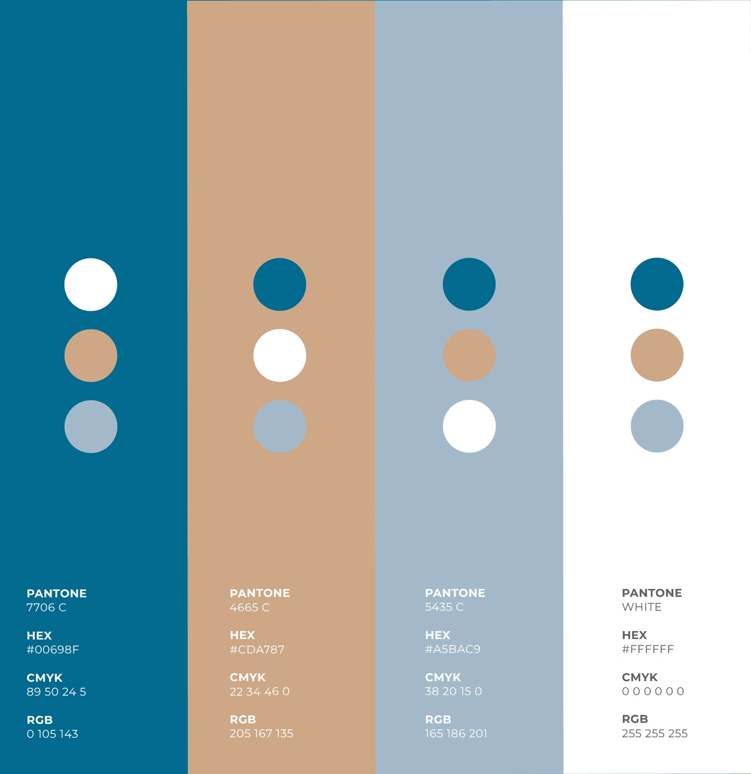
Colours
The main brand colour is a shade of blue with a hint of green that embodies trust, reflects emotional well-being, and symbolizes hope and growth, conveying the professionalism and elegance of Turning Tides. The lighter blue with a hint of grey suggests lightness, stability, tranquility, and harmony. The light brown evokes feelings of comfort and calmness. Together with white, it creates an atmosphere that feels light and comfortable, making it a primary colour of the brand. White symbolizes peace and clarity, offering a contrast that enhances the legibility and impact of the brand’s visual identity.
Typography Choices
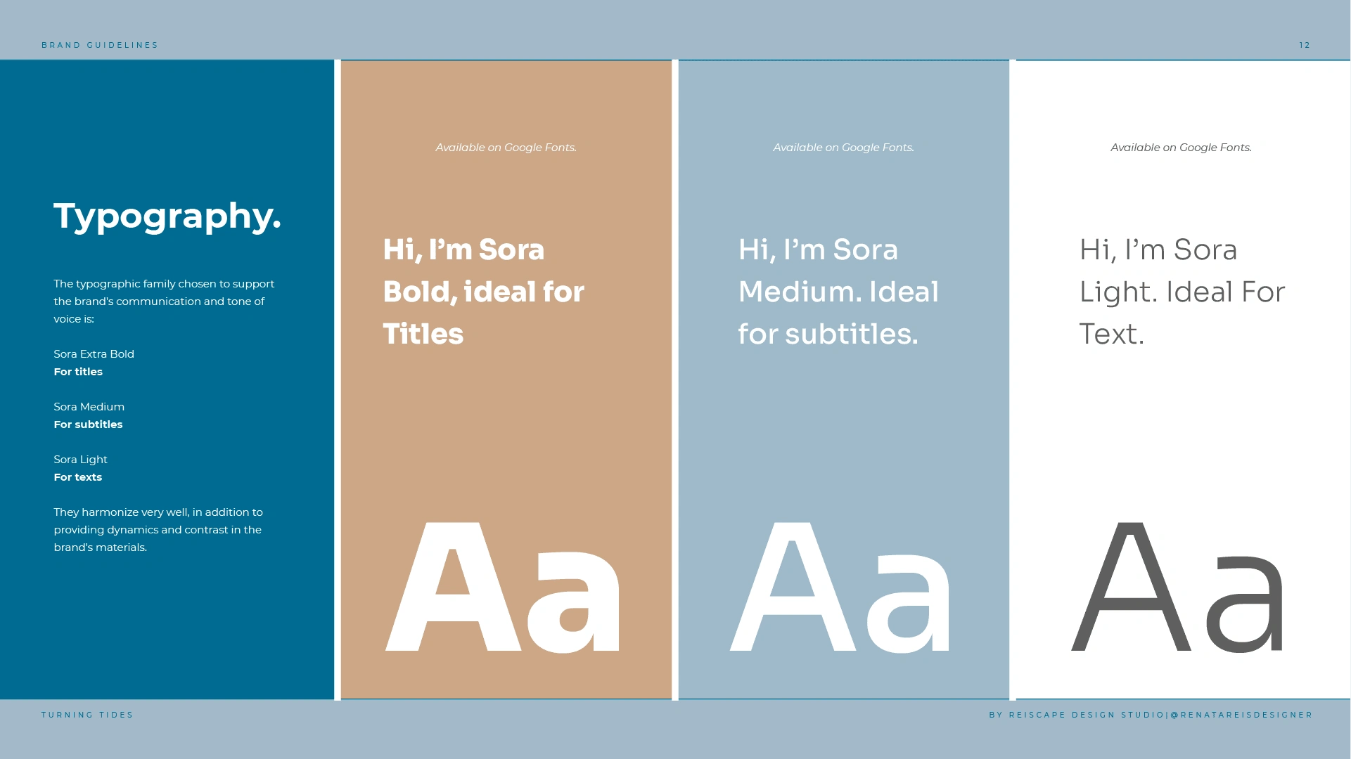
The typographic family chosen to support the brand's communication and tone of voice is:
Sora Extra Bold
For titles
Sora Medium
For subtitles
Sora Light
For texts
They harmonize very well, in addition to providing dynamics and contrast in the brand's materials.
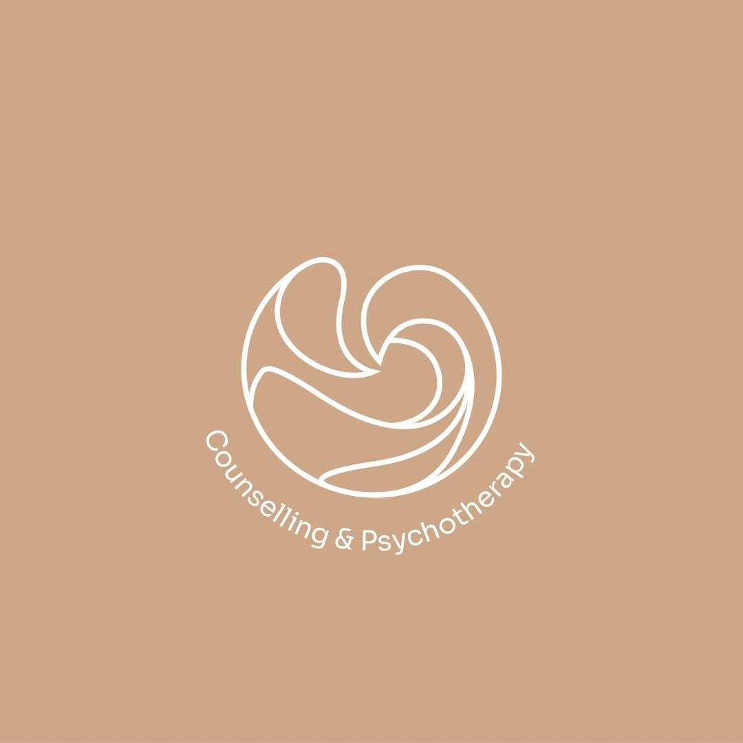
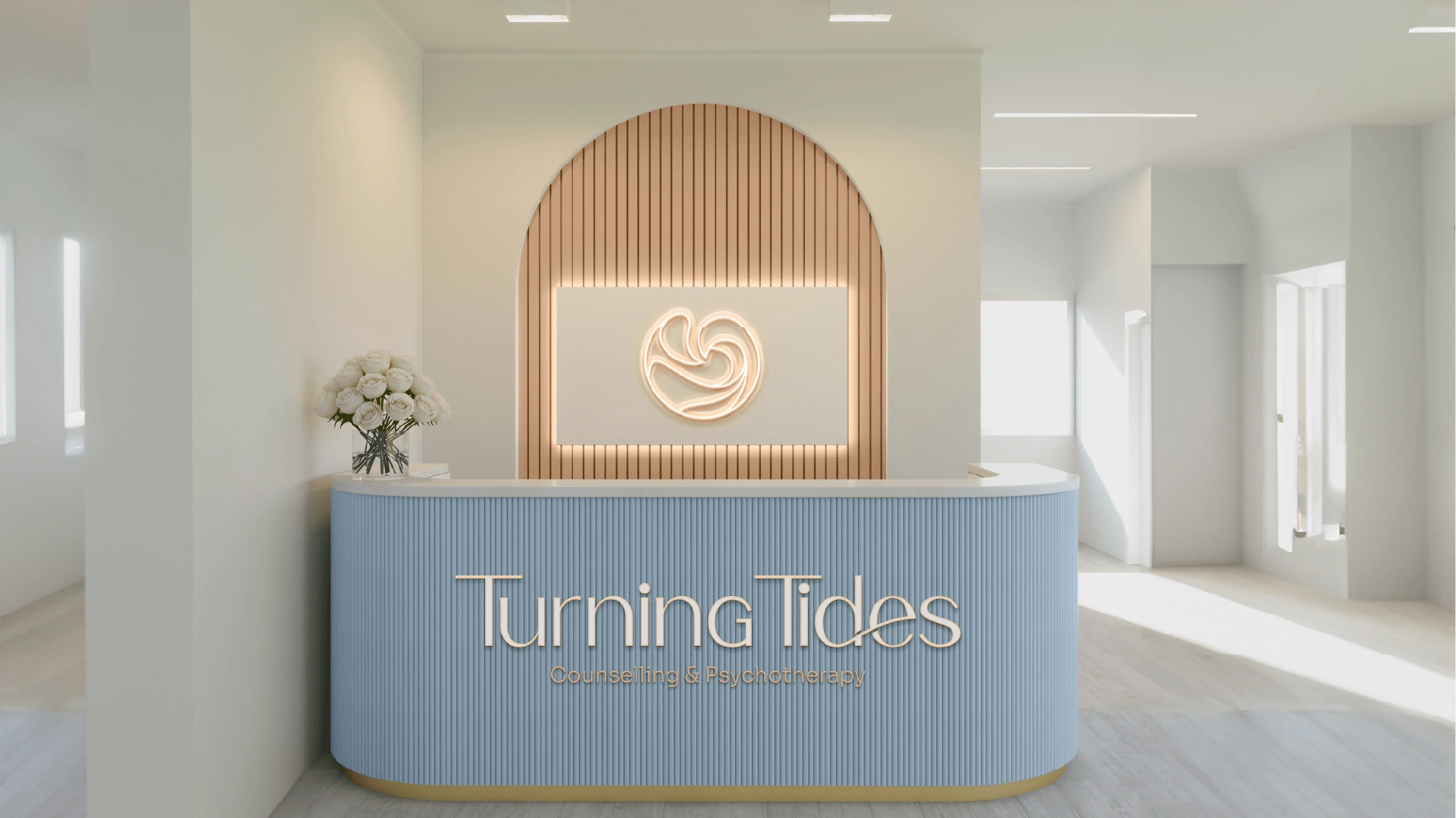
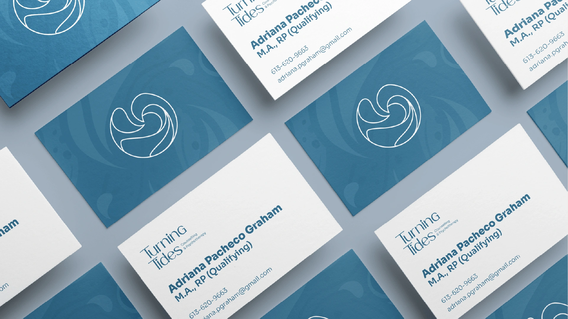
Logo Suite
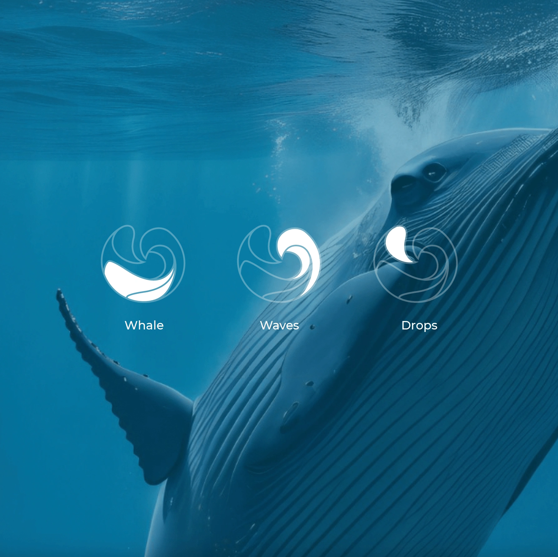
The creation of Turning Tides' symbol was inspired by the brand's philosophy of transformation and resilience. The symbol combines elements of a whale, waves, and water droplets to embody the journey of growth and renewal. The whale represents strength and emotional support, while the waves symbolize life's challenges and the natural flow of experiences. The water droplets represent clarity and purification, reflecting the brand's commitment to guiding clients through their personal transformations. Together, these elements form a cohesive symbol that encapsulates the essence of Turning Tides: navigating through life's challenges with grace and resilience.


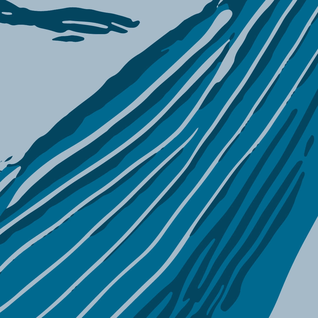
Patterns
The pattern is the signature of your visual identity. It's an exclusive print of your brand that should be used throughout marketing materials, stationery, packaging, and more.
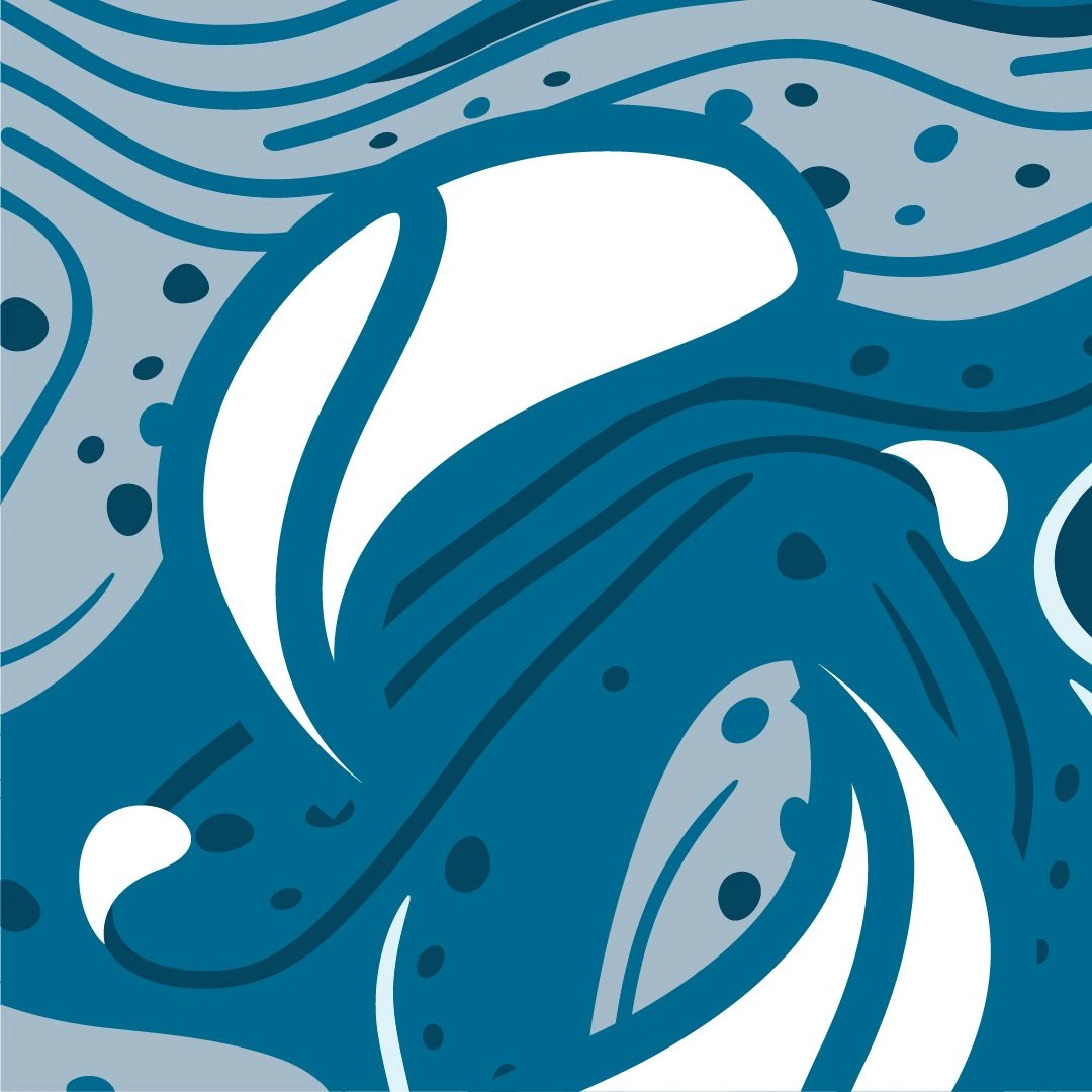
The rhythmic movements of the whales mirror the natural flow and rhythm of life's currents, offering a sense of calm and stability amidst change. By incorporating this pattern, we aim to evoke feelings of safety and emotional connection, fostering a welcoming atmosphere for therapy sessions.
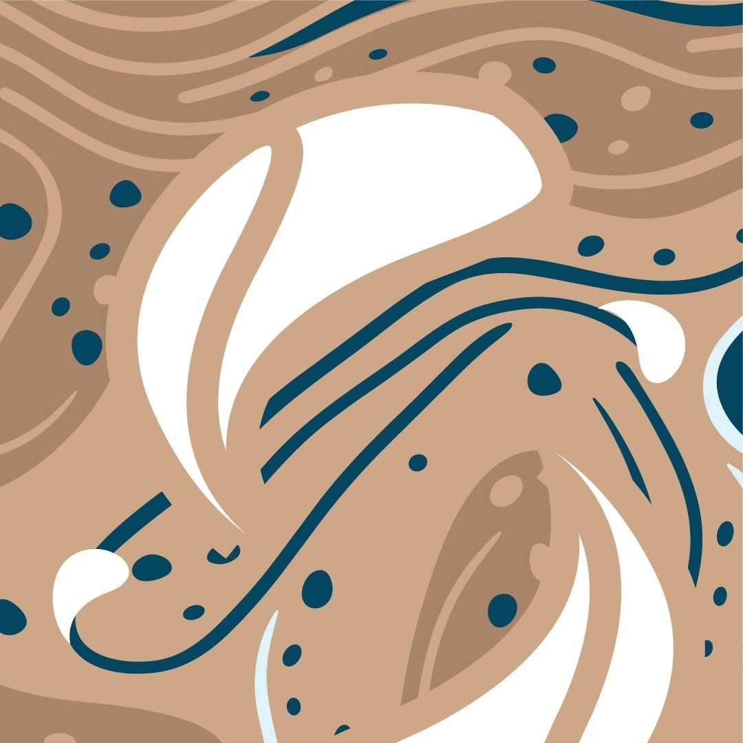
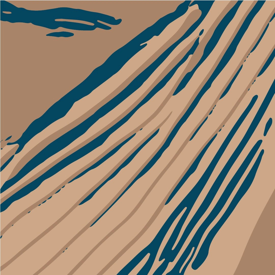
This pattern reflects the unique texture and markings of a whale's skin, symbolizing the beauty of individuality. By incorporating it, we aim to foster a serene and comforting environment for therapy, evoking a sense of closeness to the journey of self-discovery.
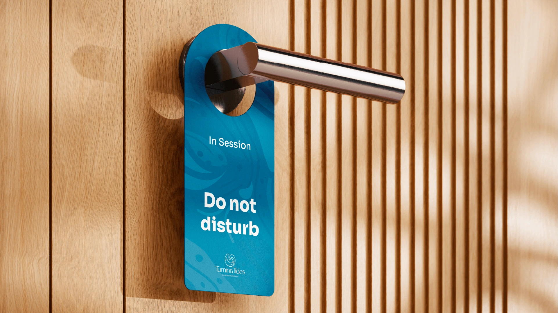
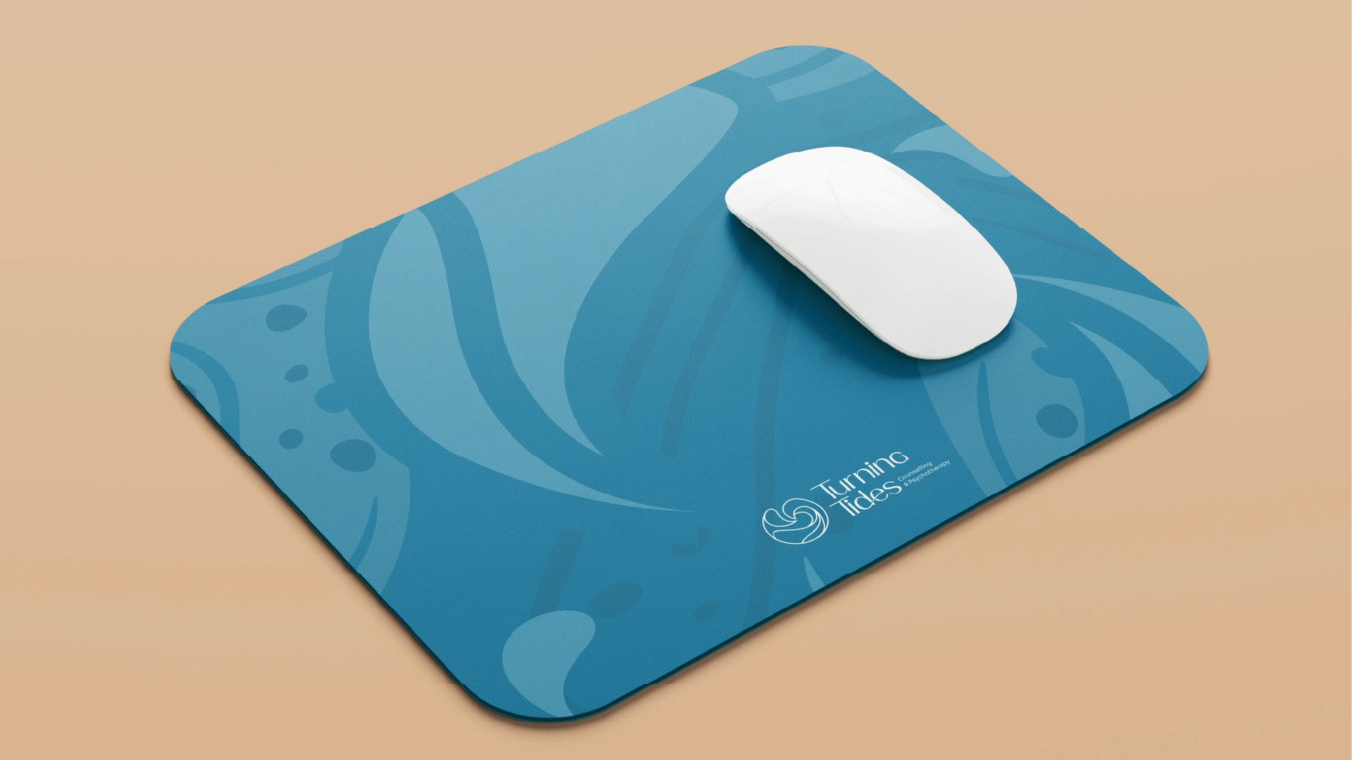
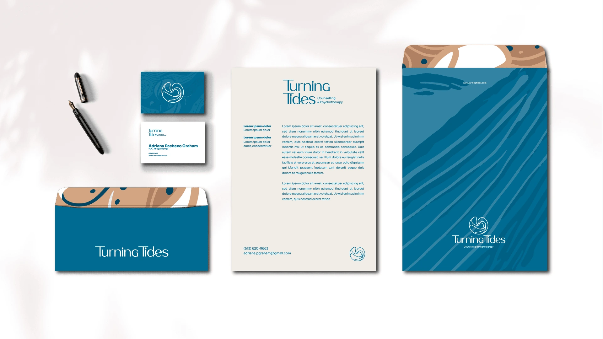
Brand Applications:

Like this project
Posted Oct 6, 2024
Created a comprehensive brand identity for Turning Tides with a unique logo, custom typography, and exclusive patterns, ensuring a welcoming, professional, and
Likes
0
Views
14