Collekt: From SaaS Tool to Enterprise AI
Diana Fabianczuk
PROJECT OVERVIEW
Repositioned Collekt.ai from a lightweight SaaS tool to an enterprise AI infrastructure, completed a full website redesign approved by stakeholders, and handed off to the dev team in 4 weeks.
Role: UX/UI Designer
Note: Worked closely with the client's vision; final implementation is handled by their internal front-end team.
Client challenge
Despite operating at scale, Collekt was perceived as a lightweight SaaS tool. That perception created a trust gap at the enterprise level — limiting credibility with two very different audiences who needed to feel confident for completely different reasons.
The redesign had to serve both simultaneously:
Banks — required trust, compliance signals, and operational clarity
Investors — needed to see scalability, technical depth, and defensibility
Core design challenges:
Reframing the category moving beyond SaaS conventions toward infrastructure-level thinking;
Avoiding generic AI and SaaS visual patterns that would blend in rather than stand out;
Making a multi-layered system feel structured and understandable;
Building a complete visual system from zero, without legacy constraints.
My approach
I built the information architecture from the ground up, defining structure, narrative flow, and content hierarchy. In parallel, I worked closely with the founder on messaging to ensure each section speaks clearly to its intended audience.
For banks, every section was designed to signal trust — compliance clarity, operational structure, and system reliability.
For investors, the focus shifted to depth — communicating the AI-human execution model, orchestration logic, and long-term defensibility.
Instead of relying on standard SaaS or AI visuals, I established a strict visual direction: no dashboards, no stock imagery, no generic AI motifs.
The system is communicated through abstract data flows, motion that reflects real-time orchestration, and restrained typography.
I developed the full visual language from scratch, including the design system, animation logic, and handoff documentation, ensuring precise implementation without ambiguity.
Process & decisions
Every visual element was defined not only by how it looks, but by what it communicates about the system.
Animation and layout decisions were used to express:
system behavior
orchestration logic
real-time activity
Early concepts validated the narrative direction, but several iterations exposed inconsistencies in color and layout.
These explorations were intentionally used to stress-test the system and refine it into a more cohesive and scalable solution.
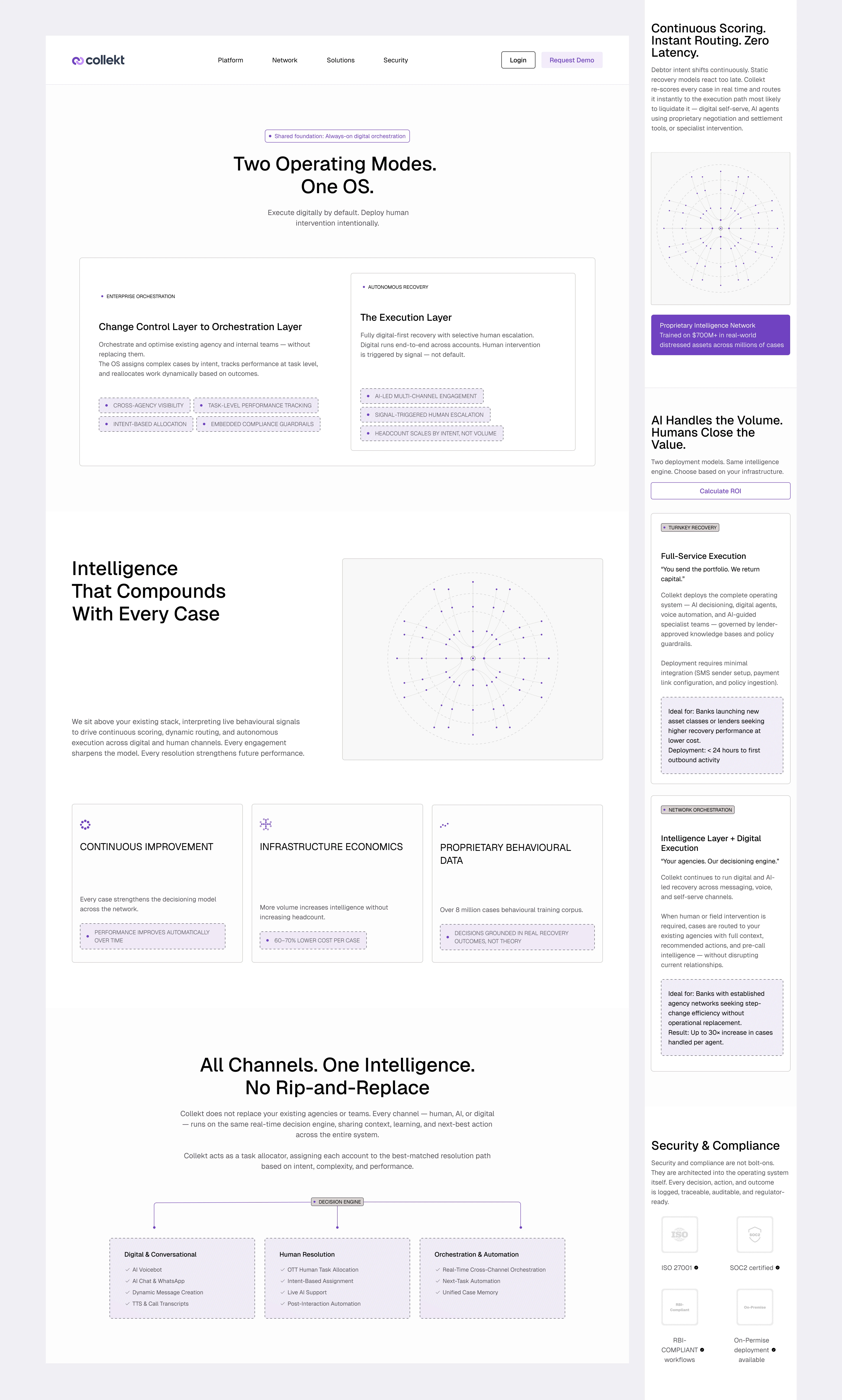
Presentation and explanation of the main graphic for the client:
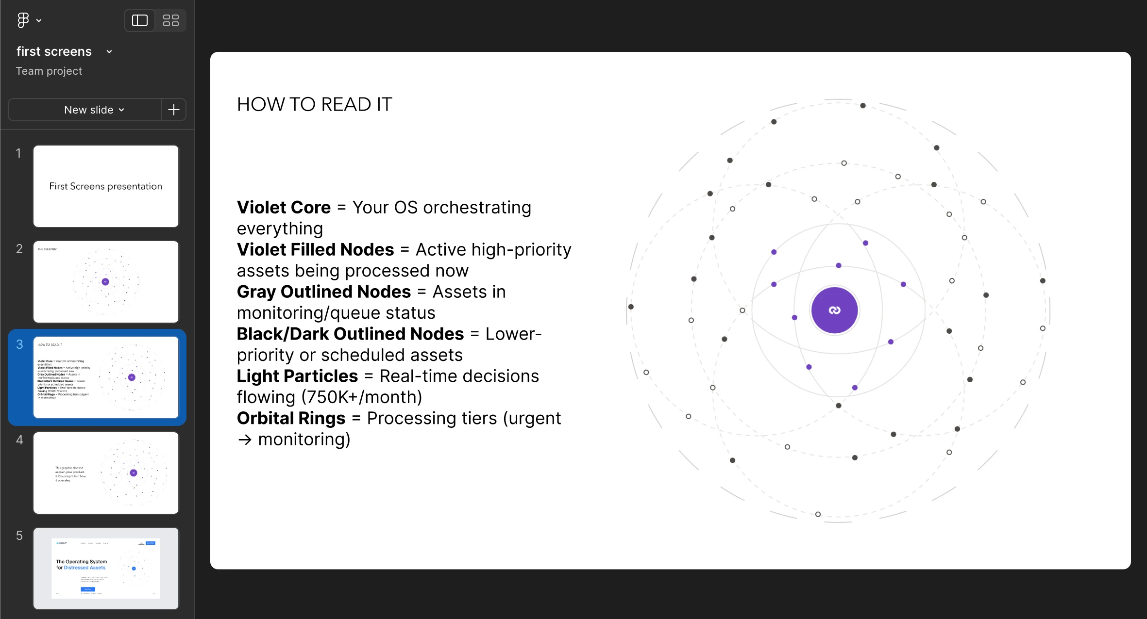
presentation of main graphic
presentation of main graphic
Example of one documented animation flow:
example of one documented animation flows
Although the concept was validated early, clearly conveying the product’s value and ecosystem, several iterations missed the mark due to inconsistent color use and subpar layout choices. These explorations, though not selected, were crucial in stress-testing the visual system and informing a more unified final design.
example of first screens
Realization of the live first screen and main graphic:
Result:
The redesign was approved by the founders and delivered within 4 weeks.
The final output included:
a 10-section narrative-driven website
a complete design system with 20+ reusable components
detailed animation specifications
developer-ready documentation
This enabled a faster internal rollout and reduced implementation ambiguity.
From a strategic perspective, the redesign:
clarified the product’s value at first glance
strengthened its positioning in investor conversations
established a clearer narrative for both banks and investors
Before and after
Strategic Direction
To reinforce the shift from software to infrastructure, all standard SaaS visual conventions were removed.
The final system is built around:
abstract representations of data flow
motion as a core storytelling tool
a dual-layer narrative structure prioritizing enterprise trust while supporting investment evaluation
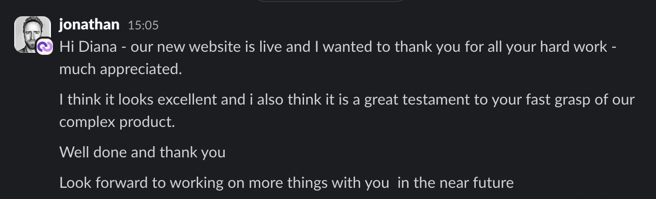
Testimonials
Figma file
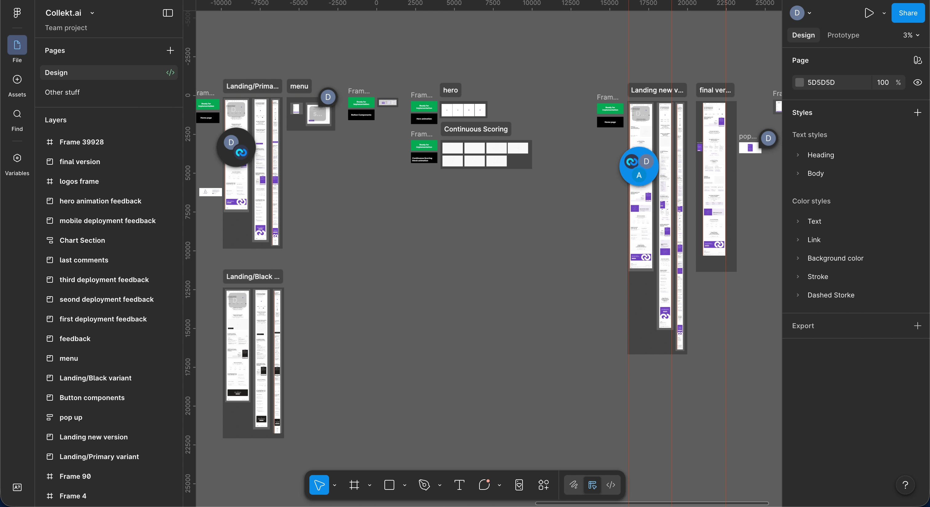
figma file
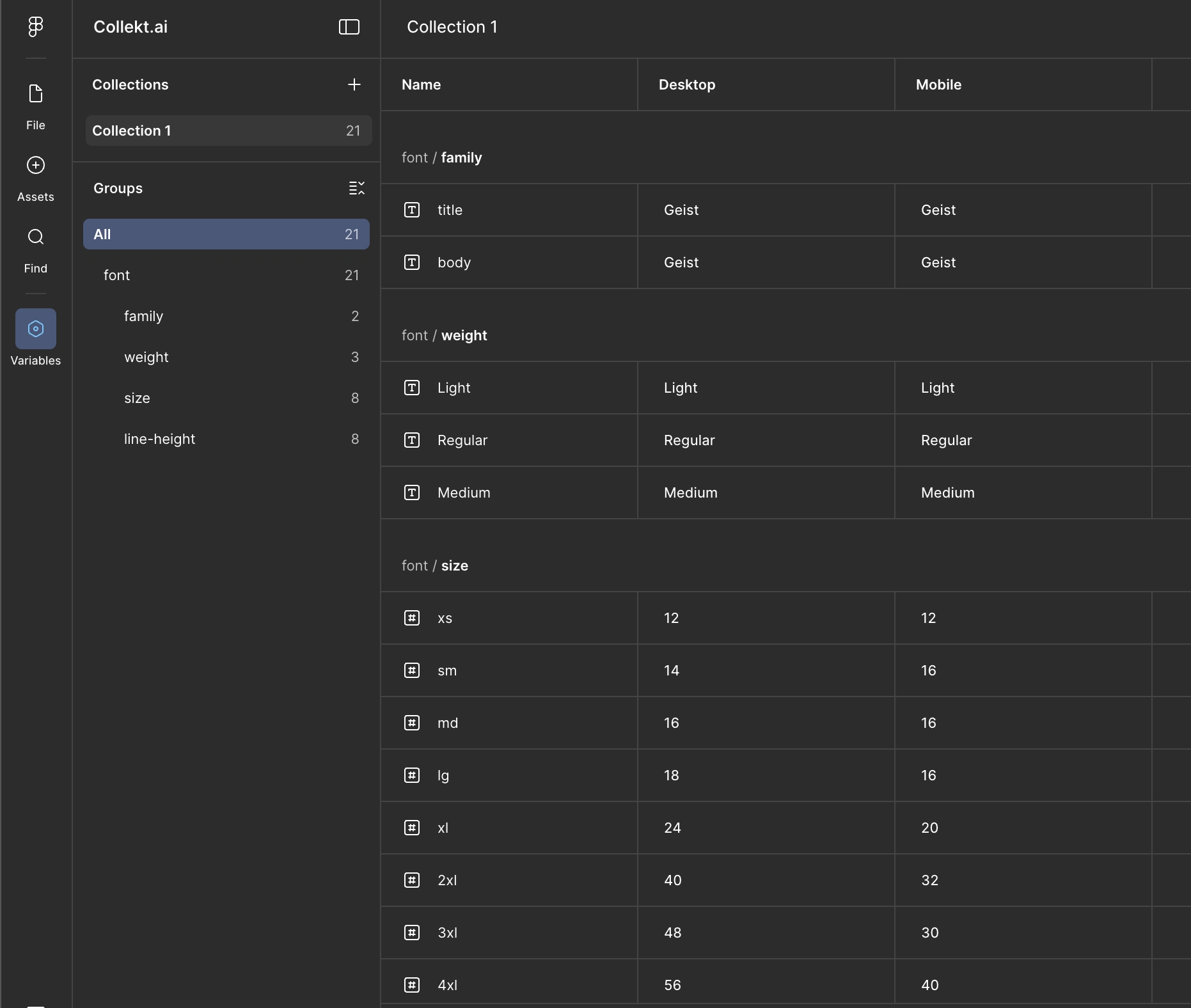
variables

Like this project
Posted Apr 1, 2026
Repositioned a SaaS product into enterprise-grade AI infrastructure through strategic UX, messaging hierarchy, and visual systems.
Likes
1
Views
20
Timeline
Dec 22, 2025 - Jan 26, 2026