Collekt: From SaaS Tool to Enterprise AI

Diana Fabianczuk


PROJECT OVERVIEW
Repositioned Collekt.ai from a SaaS tool into an enterprise AI platform through strategy, UX/UI design, information architecture, and a complete website redesign. Delivered a developer-ready design system in 4 weeks.
Strategy · UX/UI Design · Website · Design SystemTools: Figma, Claude
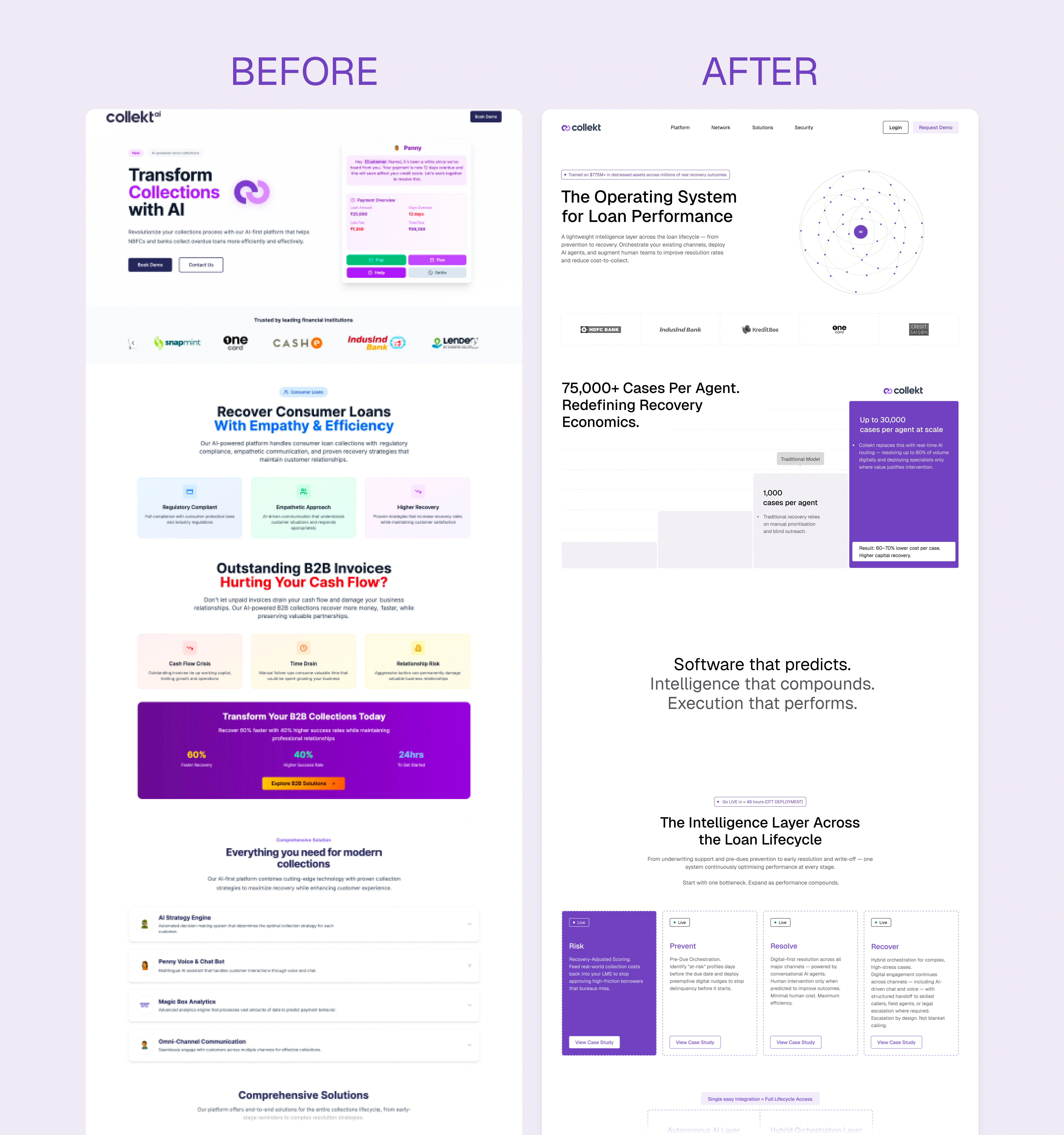
Before and After
The Problem
Collekt had enterprise-grade AI infrastructure, but its website communicated it as a lightweight SaaS product — creating a trust gap with two very different audiences:
Banks needed confidence in reliability, compliance, and operational maturity.
Investors needed clarity on scalability, technical depth, and defensibility.
The challenge wasn't a visual redesign. It was changing how the company was perceived.
Design Process
When I read the brief, studied competitors, and got deep into the company, I immediately knew what I wanted to show on the first screen — a graph. My goal wasn't to explain the product right away on the hero screen. My goal was to give people a feeling of how it operates.
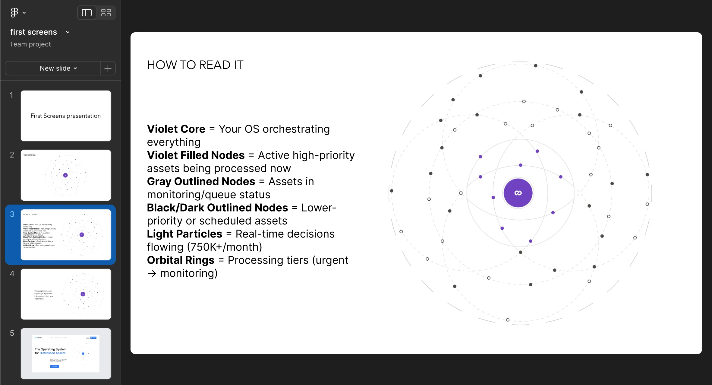
presentation of main graphic
Exploration
The client also wanted to experiment with color and layout to explore possible options. After testing several directions, the original brand colors proved to be the stronger choice. They carried the new layout and hierarchy more clearly than the alternatives, and the client agreed.
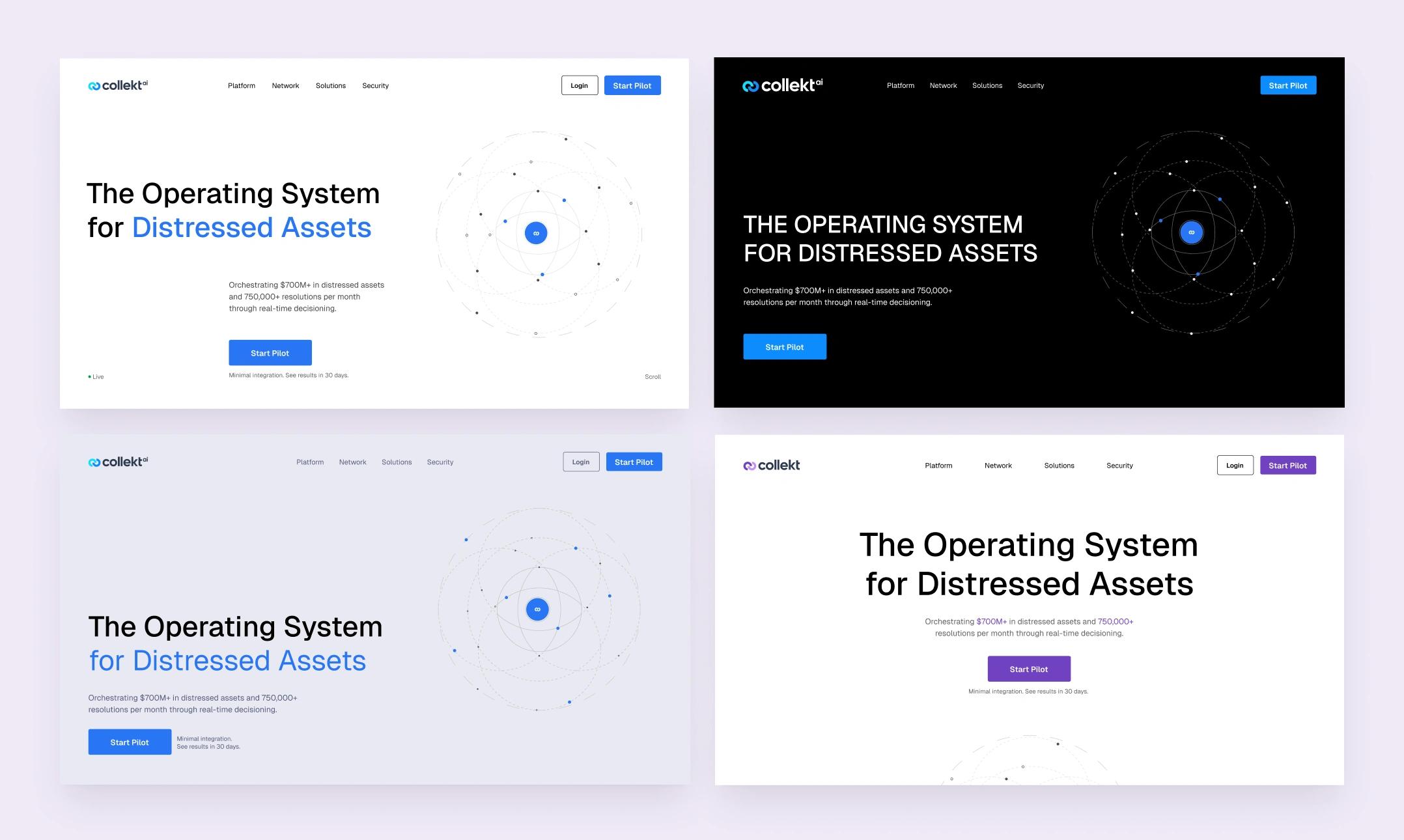
example of first screens
Accepted final hero screen result
hero block
Solution
Instead of redesigning the visuals, I repositioned the product. I rebuilt the information architecture, created a new narrative, collaborated on messaging with the founder, and designed a visual language that intentionally avoided common clichés in SaaS and AI.
The system communicates infrastructure through abstract data flows, motion, typography, and content hierarchy — rather than dashboards or stock AI imagery.
To reinforce the shift from software to infrastructure, all standard SaaS visual conventions were removed.
The final system is built around:
abstract representations of data flow
motion as a core storytelling tool
a dual-layer narrative structure prioritizing enterprise trust while supporting investment evaluation
economics proof point
Documented System
Developer handoff — animation states documented frame-by-frame
Final result — live on site
Micro-interactions
Beyond the core animation logic, smaller interaction patterns reinforced the system's depth. Motion used to signal information, not decorate it.
micro-animation — Infrastructure Economics cards
Hover and click interaction — cards expand into case studies, reinforcing the system's layered depth.
Process & Key Insights
Reframed the challenge as a positioning problem, not a UI problem.
Built the information architecture before designing screens.
Designed every animation to explain system behavior rather than decorate the interface.
Explored multiple visual directions before defining the final design language.
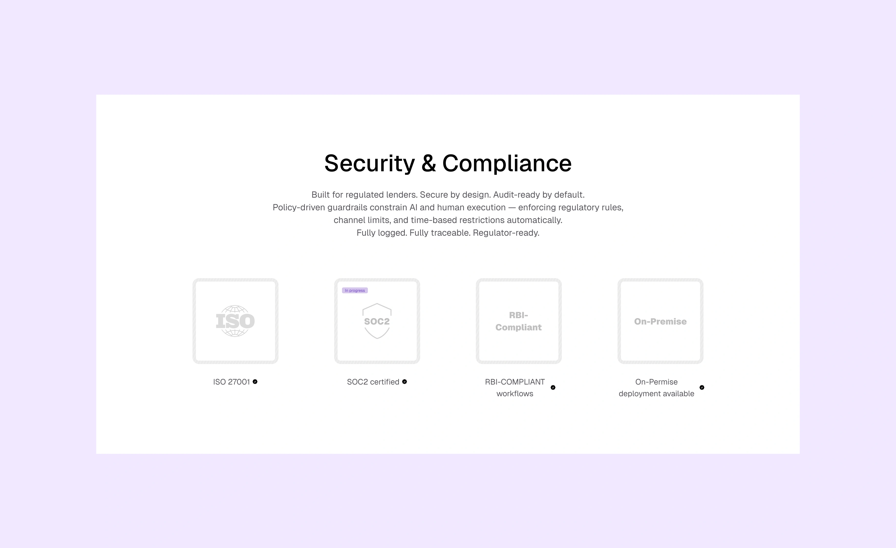
Security & Compliance block
Impact
Complete website redesign approved by stakeholders, delivered in 4 weeks
10-page narrative-driven website, 20+ reusable design components, developer-ready documentation, animation specifications
Reported improvement in trust during enterprise conversations (per founder)
Engagement extended to redesign the investor pitch deck, using the same system
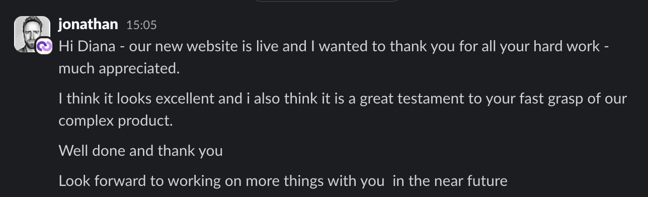
Reflection
The strongest decision wasn't visual — it was changing how the product was perceived. By focusing on positioning first, the interface became a tool for communicating enterprise credibility rather than simply showcasing features.
What I'd Do Next
Test alternative homepage narratives.
Validate messaging through usability testing with enterprise buyers.
Measure how positioning affects conversion across investor and banking audiences.

Like this project
Posted Apr 1, 2026
Repositioned a SaaS product into enterprise-grade AI infrastructure through strategic UX, messaging hierarchy, and visual systems.
Likes
2
Views
44
Timeline
Dec 22, 2025 - Jan 26, 2026