Voxa — Testing an AI-Native Design Workflow, End to End

Diana Fabianczuk


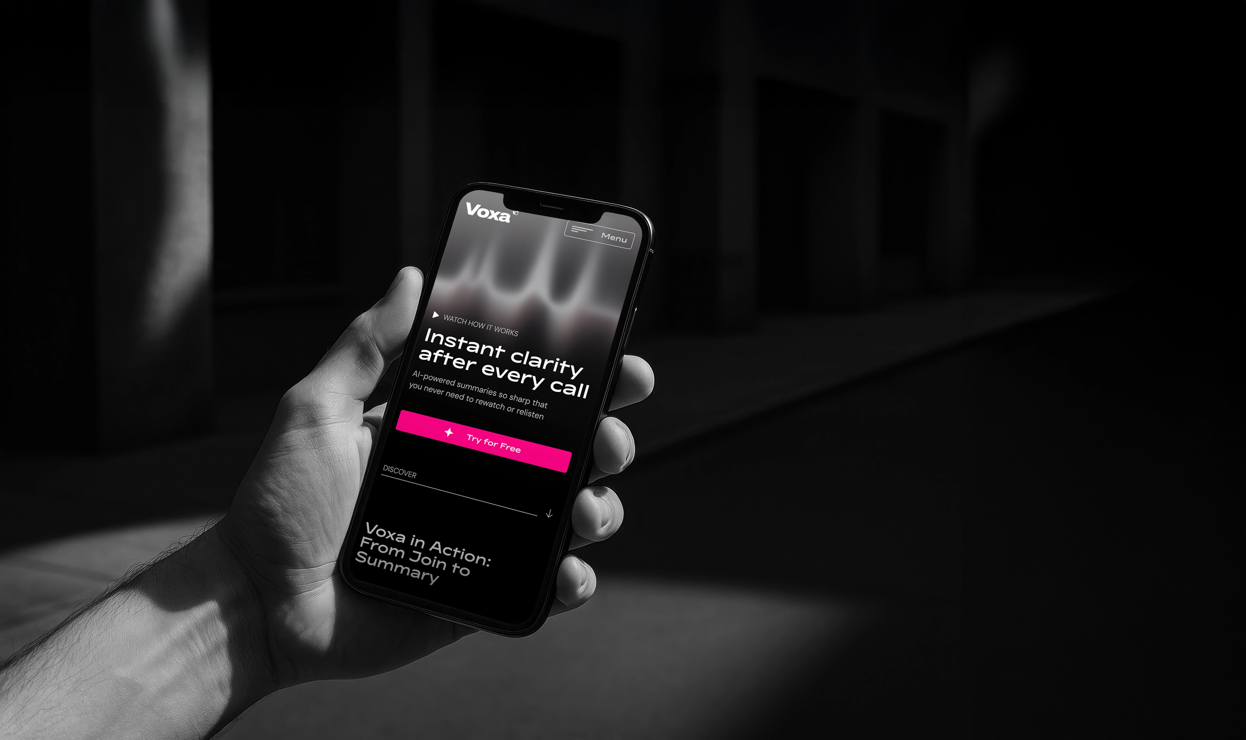
Self-initiated project built to stress-test an AI-integrated design process from research to final screens. The goal was to see how far AI tools could carry a product design workflow, and where human judgment still had to take over.
Problem
Teams waste hours rewatching meetings to capture key information. Tasks get forgotten, insights are missed, and productivity suffers. Voxa needed a landing page that instantly demonstrates its value and builds trust in a category where people are often uneasy about AI recording and analyzing their conversations.
AI-workflow: Research & Positioning
Used ChatGPT to map the AI meeting-assistant landscape: Otter, Fireflies, and Fathom as the three leading players, and identify feature gaps rather than guess at differentiation.
The research showed that sentiment tracking, fast summarization, and automated task creation are already standard across the category: Fireflies and Read AI both offer sentiment analysis, Fathom markets summaries in under 30 seconds, and CRM/task automation (Notion, Trello, Salesforce) is table-stakes among the major tools. Building on any of these alone wouldn't differentiate Voxa.
That research shaped positioning at every level of the site. One genuine functional gap surfaced: none of the three direct competitors offered an audio-first recap, and that became the site's anchor hook, Voice Recall. But the bigger takeaway was that in a category where every player already ships the same core capabilities, differentiation has to come from trust and clarity as much as features: transparent pricing, visible privacy controls (Invisible Join Mode, local data storage), and explicit use-case framing for the specific professionals who rely on conversations most — sales, recruiting, consulting. The competitor research informed all of it, from the headline feature down to how pricing and trust signals were presented.
AI-workflow: Visual assets
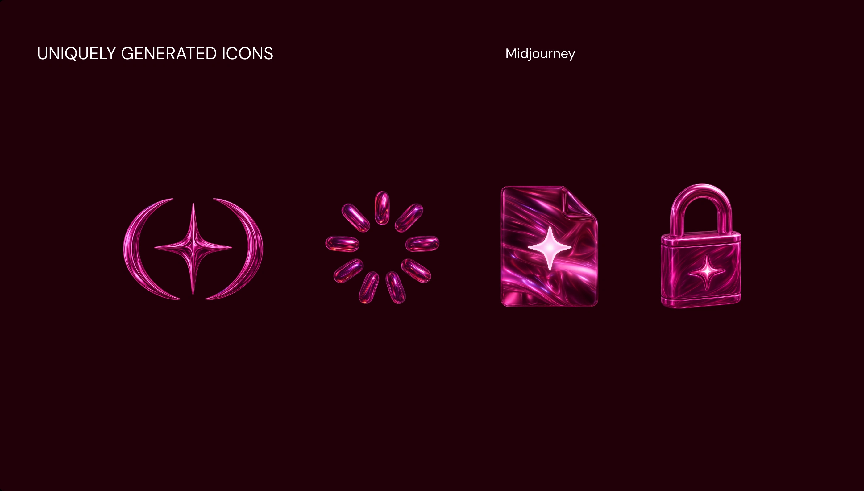
Icons and supporting graphics across the landing page were generated in Midjourney, then refined and integrated into the Figma design system, testing how far AI-generated visuals could carry production-ready UI work without looking generated.
Process & decisions: Hero exploration
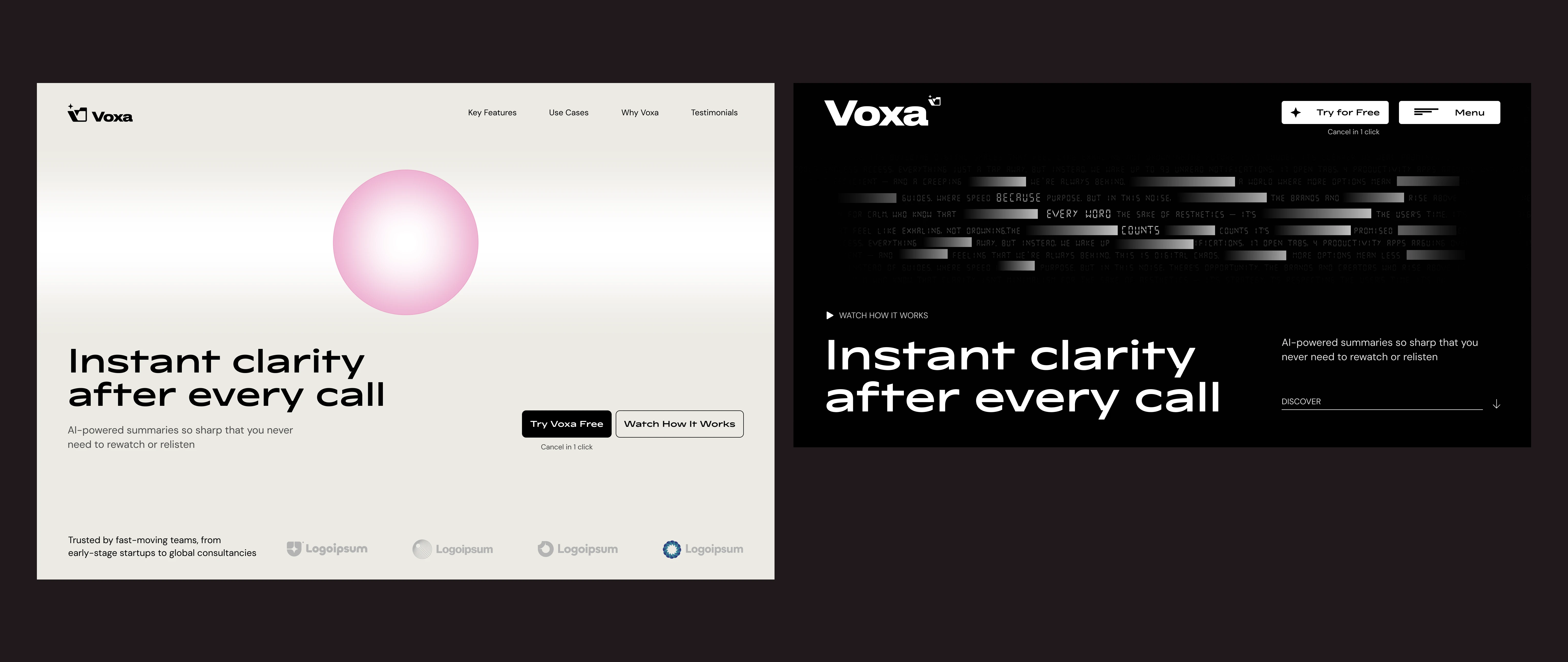
Two early hero directions were built and rejected before landing on the final one.
Rejected — Glitch/noise direction: The headline promised "instant clarity," but the fragmented, glitch-style background text read as chaos, not calm. The visual language directly undercut the core message, so it was dropped.
Rejected — Soft orb/bubble direction: Technically clean, but the bubble metaphor didn't sit right once built out, and the hero layout felt off-balance rather than confident. Both the metaphor and the composition were reconsidered.
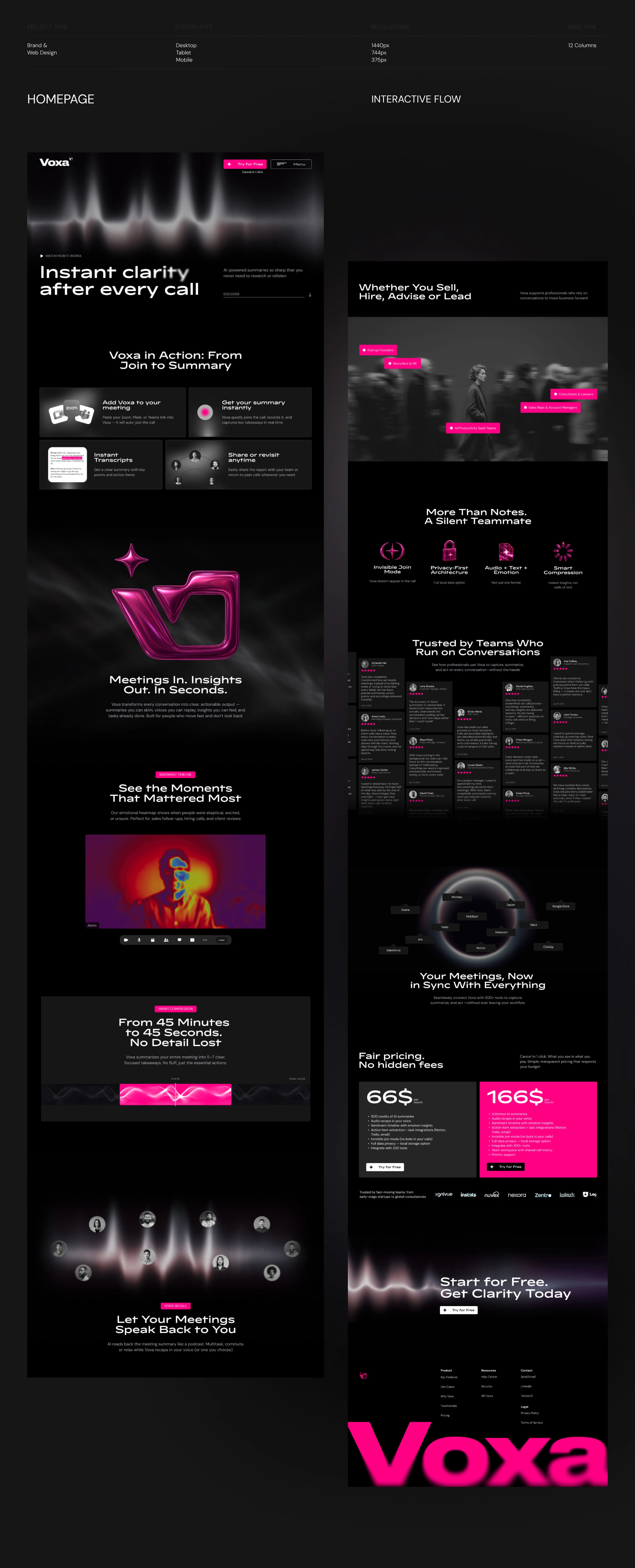
Selected — Waveform direction: The final hero replaced literal noise and abstract metaphor with a soft, glowing soundwave directly tied to what Voxa actually does: listen to and process audio. Where the glitch version created visual chaos, and the bubble felt like a generic AI placeholder, the waveform reads as calm, focused, and legible. It reinforces "instant clarity" instead of contradicting it, and grounds the abstract "AI-powered" promise in something concrete: structured sound, exactly like the summaries the product delivers. The choice also foreshadows Voice Recall; the hero visually sets up the idea of meetings speaking back to you, before the user ever reaches that feature further down the page.
Solution
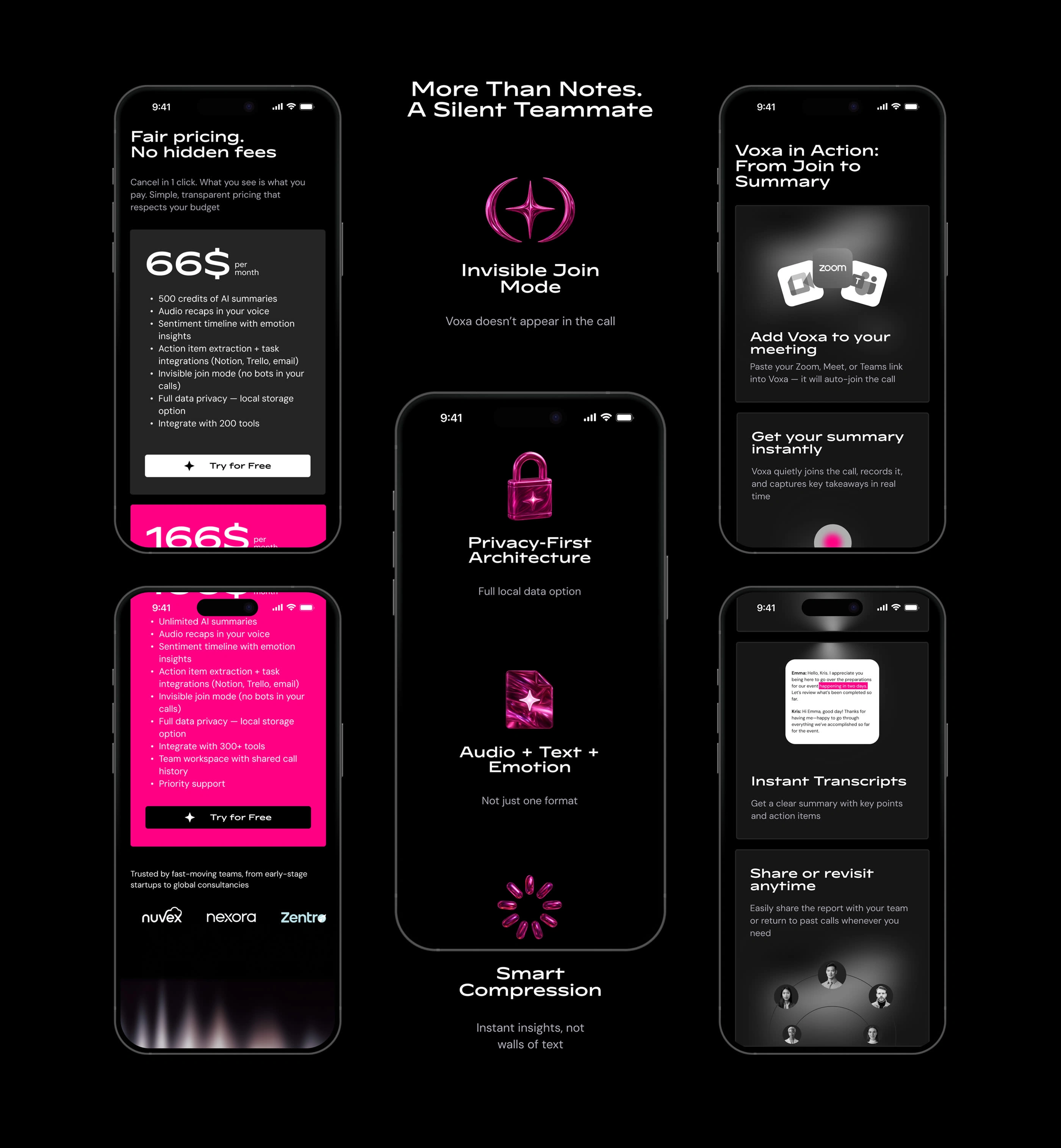
Focusing on clarity, hierarchy, and strategic CTAs, the final design blends a premium visual language with a mobile-first experience. Every element supports Voxa's identity as a trustworthy AI partner — not just another productivity tool — while guiding visitors from understanding the product to trying it.
Reflection
AI tools meaningfully accelerated the research phase, cutting down the time spent mapping competitors and identifying category gaps. But visual and structural decisions still required manual iteration and rejection: the hero direction went through two full discarded concepts before the right one emerged, and the site structure was built by hand once the research pointed to a clear angle. AI could generate options and surface information fast, but couldn't tell which one was actually right; that judgment call stayed entirely human.
Features Section

Like this project
Posted Oct 20, 2025
Self-initiated project testing an AI-integrated design workflow. From competitor research to hero exploration and final UI, using ChatGPT and Figma.