Conneqt Visual Identity Design
Mateja Mitrovic
The Challenge
Conneqt needed more than a logo, they needed a visual identity that could authentically represent their mission of fostering meaningful professional connections and transformative mentorship relationships.
Foundation First, Aesthetics Second
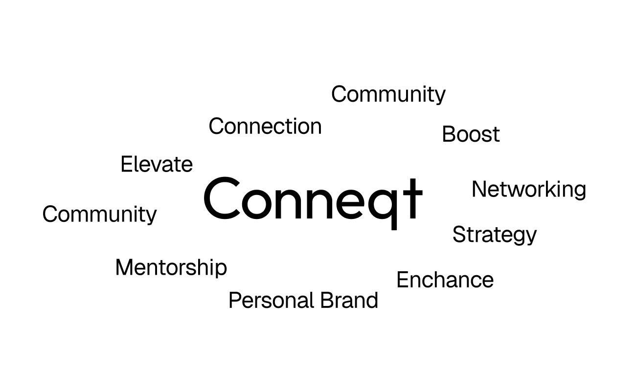
Anyone who's worked with me knows I don't rush into Figma. I spent nearly a full day mapping the core message and brand essence before touching any design tools. This isn't about making things look pretty, it's about building the foundation that informs every visual decision that follows.
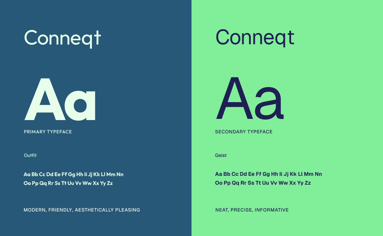
Strategic Typography
With the core message defined, I selected typefaces that could carry the brand's voice:
Outfit for headlines - fresh and approachable, perfect for making bold statements
Geist for body copy - clean and precise, ideal for data and detailed information
The typography communicates before the words even register.
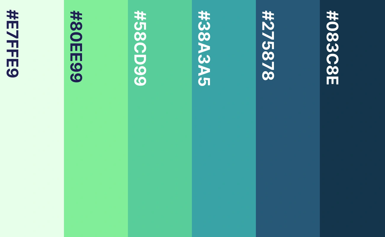
Purposeful Color System
I developed a six-stage color progression that mirrors the community member journey:
#E7FEE9 Fresh start (new member energy)#80EE99 Early engagement (first connections forming)#58CDC99 Active participation (regular interactions)#38A3A5 Meaningful bonds (relationships deepening)#27587B Trusted community (strong network built)#083C3E Deep impact (transformative mentorship)Every shade serves a specific purpose in the brand narrative.
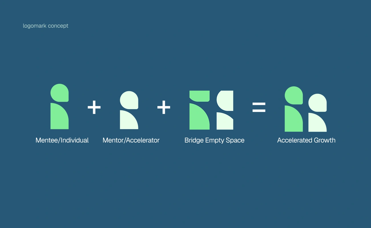
Logomark Development
With strategic clarity in place, the logomark practically designed itself. I explored multiple illustration concepts, refining until I found the solution that best expressed Conneqt's story, one that represents connection, growth, and community.
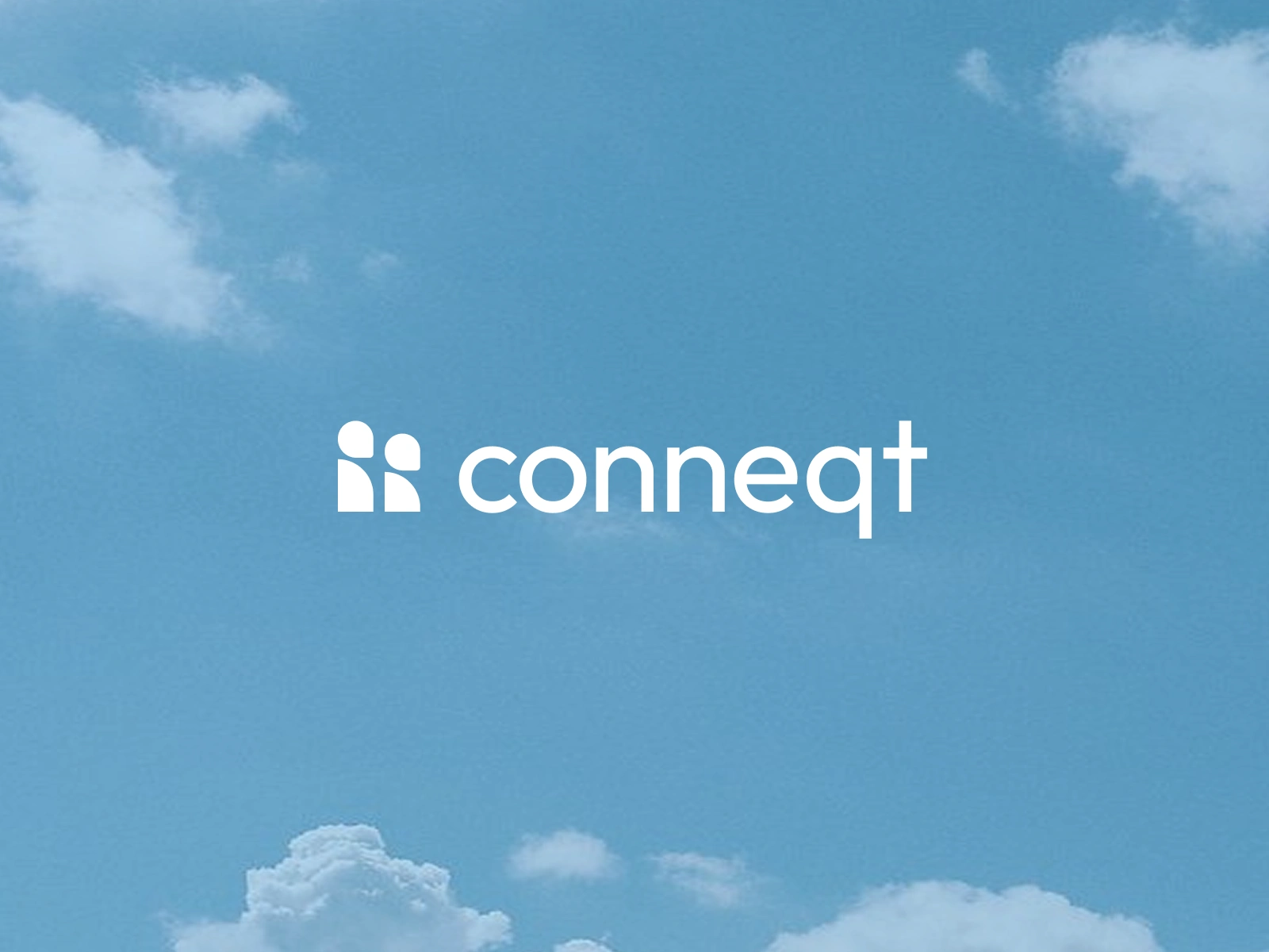
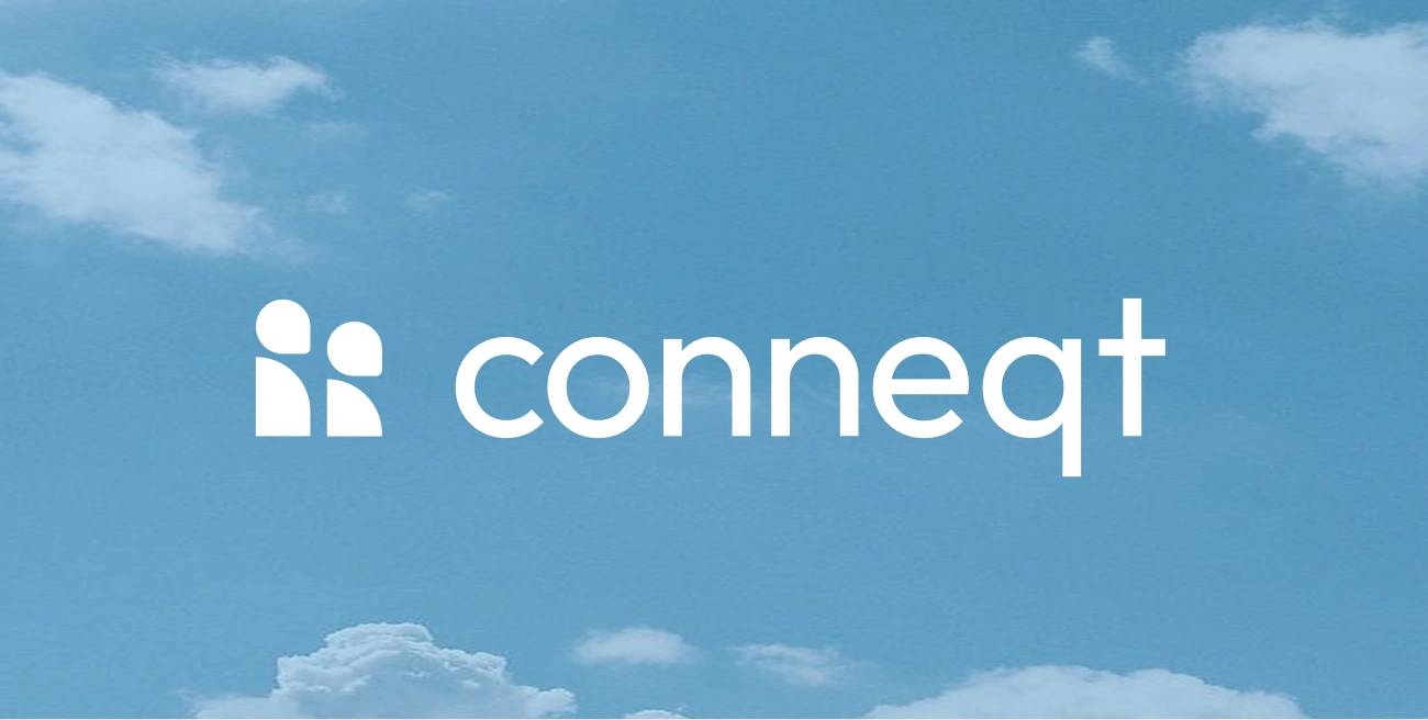
Real-World Versatility
A logo that only works on white backgrounds isn't really working. I tested the identity against skies, clouds, and aspirational imagery - the contexts where this brand would actually live. If it doesn't perform in real-world applications, it fails the test.
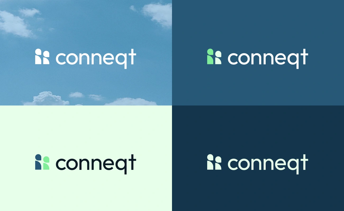
Flexible Brand Expression
I created four distinct mood applications:
White on sky blue (aspirational, dreamy)
Green on dark (tech-forward, energetic)
Dark on mint (approachable, fresh)
White on navy (premium, professional)
Same brand, infinite adaptability. This is how you scale across touchpoints without losing coherence.
The Results
Delivered in 10 days from kickoff to completion.
While many agencies send three logo options and call it branding, my approach at Marso goes deeper. Real branding is honest storytelling wrapped in pixels - it's strategic narrative brought to life through intentional design decisions.
That's the difference clients value.
Like this project
Posted Jan 5, 2026
Developed Conneqt's visual identity focusing on meaningful connections and mentorship.
Likes
1
Views
11