Bastion: Building Fortresses in Code
Mateja Mitrovic
Bastion: Building Fortresses in Code
When a security startup approached us to brand their AI-powered code review platform, they had a problem that many technical products face: how do you make security feel human? DevOps teams and security engineers are drowning in alerts, false positives, and tools that feel like they're working against them rather than with them. They needed a brand that could stand shoulder to shoulder with enterprise security giants while feeling approachable enough to become part of a developer's daily workflow.
The Concept
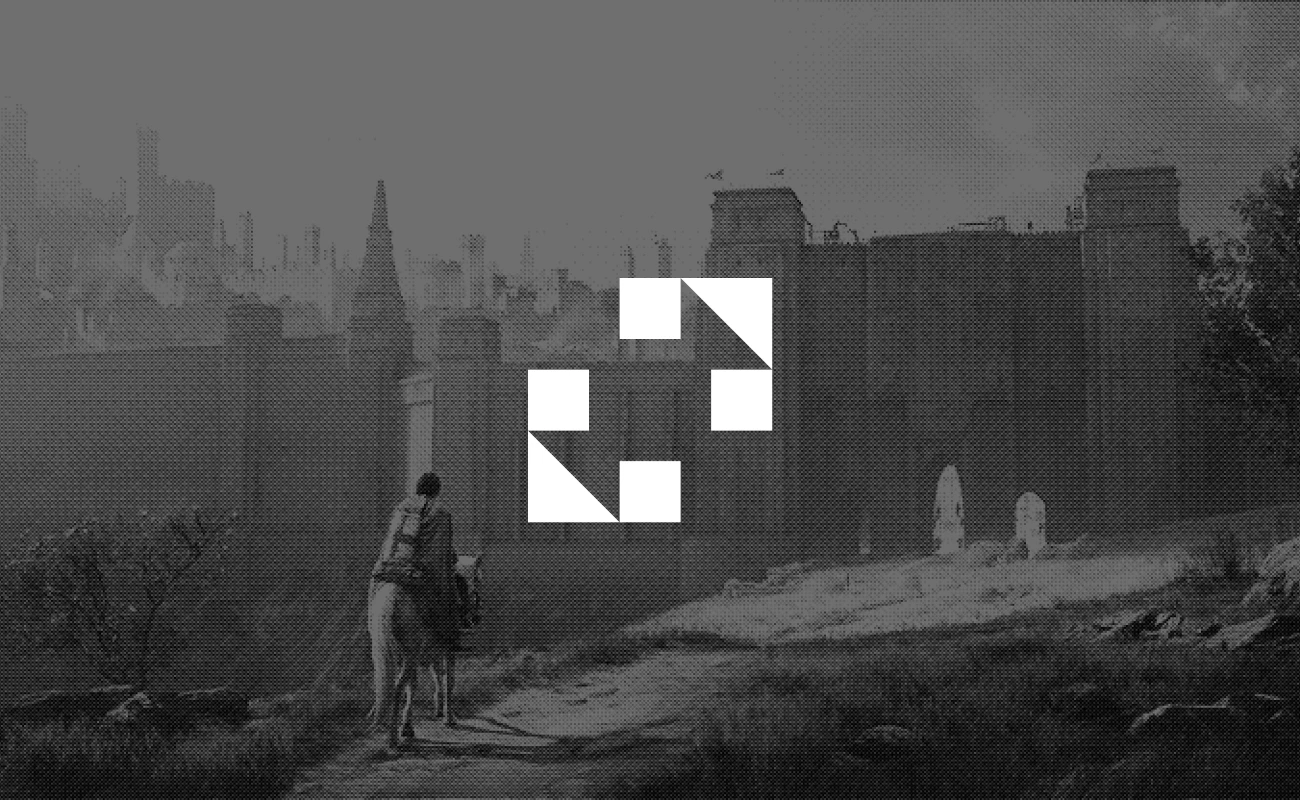
The name gave us our direction: bastion. Not boring corporate security, but the kind of fortress you'd see in a Ghibli film - imposing yet inviting, technically precise yet wonderfully human.
The Mark
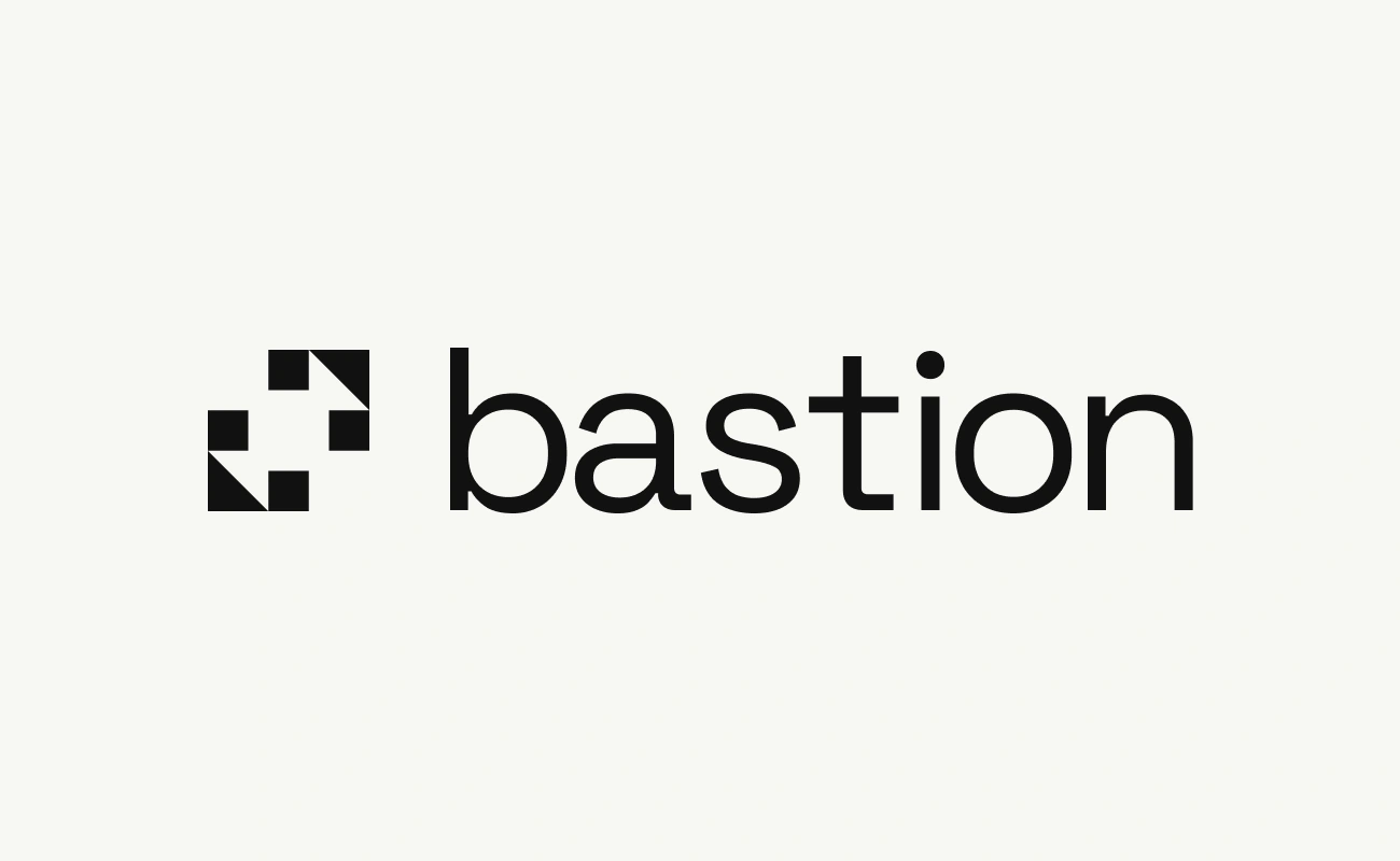
Four squares and four triangles lock together like the corner bastions of a star fort. But unlike typical security branding, the triangular corners fold inward, creating protection rather than aggression. It's a fortress that welcomes you in.
No shields, no locks, no security clichés.
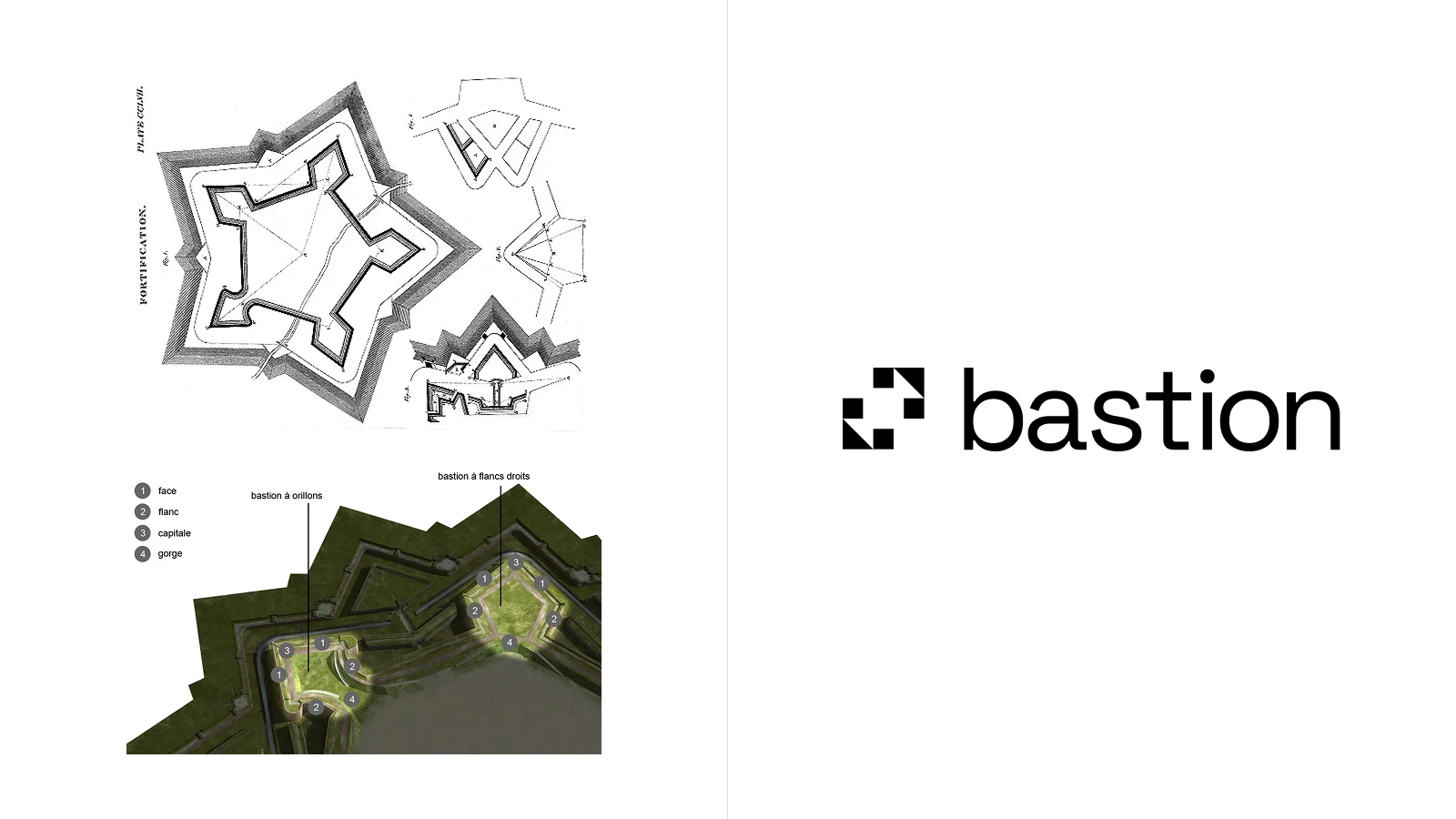
*credits go to the original creators of these bastion pictures, which were the main source of inspiration.
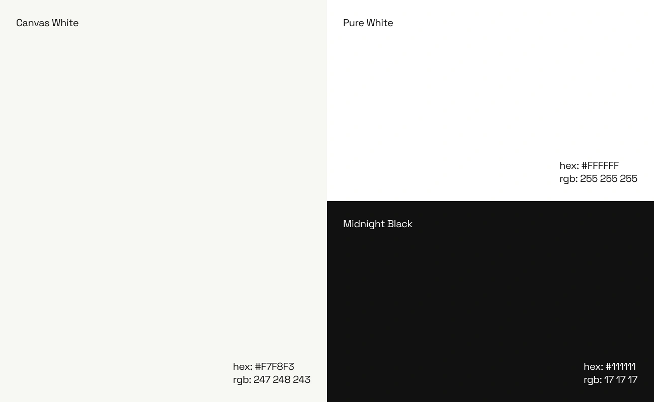
The Palette
Canvas White, Pure White, Midnight Black. While competitors drown in dark blues and electric cybers, we chose restraint. When you're hunting vulnerabilities in thousands of lines of code, you need clarity, not visual noise.
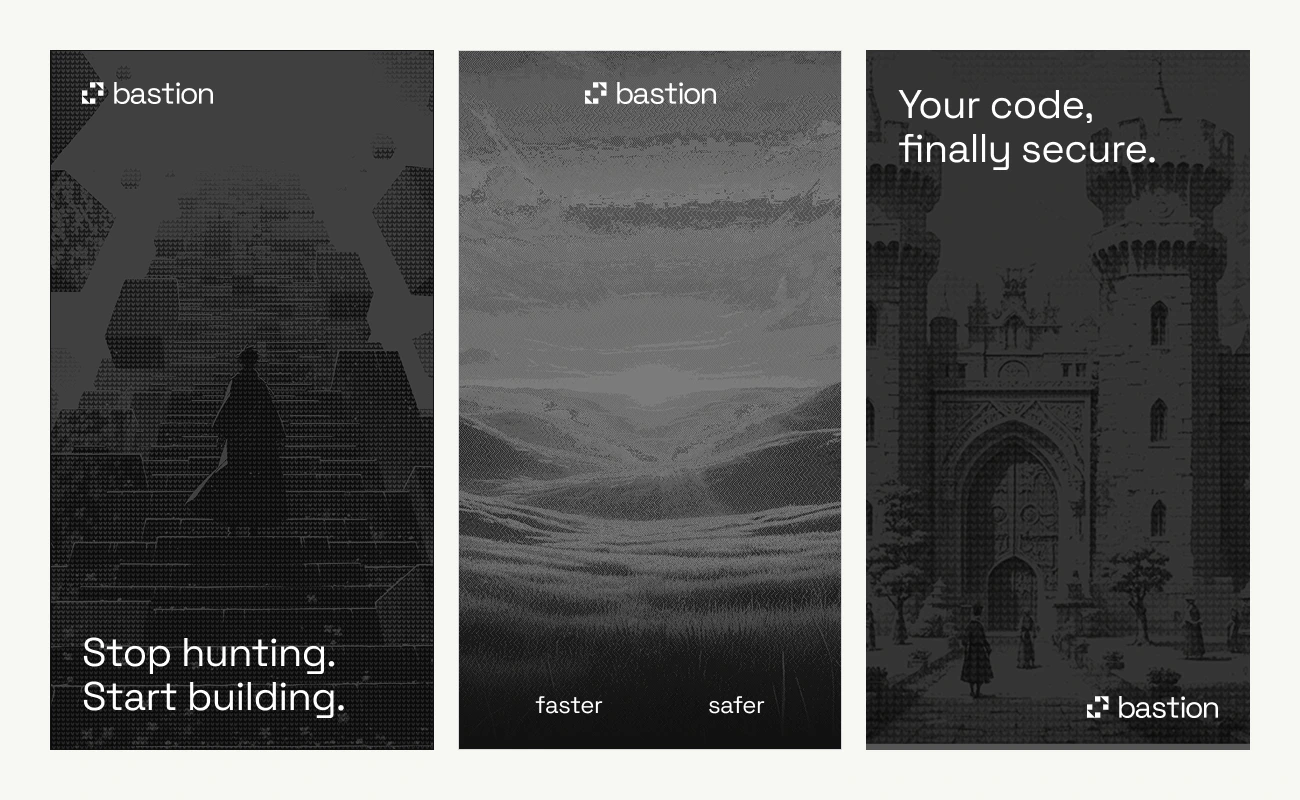
The Visual Language
We developed an illustration style that merges anime-inspired aesthetics with architectural drama, all filtered through a grainy dither effect that feels like 1987 technical manuals meet film photography.
The cartoon-like quality keeps things human - no stock photos of hooded figures in dark rooms. Hand-crafted scenes that evoke the feeling of having a powerfulally watching your back. Partnership and protection, cutting-edge and timeless allat once.
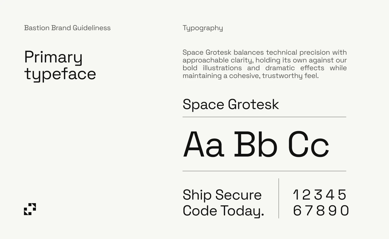
The Typography
Space Grotesk strikes the perfect balance - technical without being cold, modern without being trendy. It holds its own next to code snippets while remaining perfectly readable.
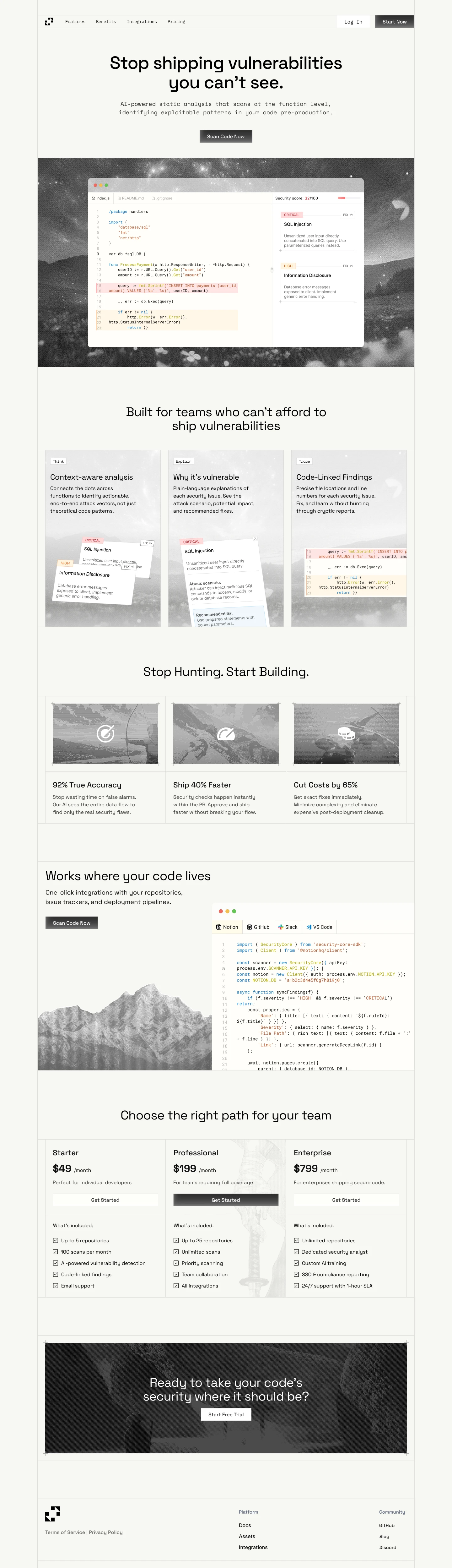
The Website
The landing page carries the brand's cinematic quality into every scroll. Hero sections blend dithered illustrations with clean code snippets, showing rather than telling. "Stop shipping vulnerabilities you can't see" isn't buried in paragraph text - it's a statement backed by visual proof.
We organized the experience around clarity: context-aware analysis, vulnerability explanations, and code-linked findings each get their moment with supporting visuals. The three-tier pricing sits against mountain landscapes, making enterprise software selection feel less like a spreadsheet decision and more like choosing the right path forward.
Throughout, the dither effect unifies photography, illustrations, and UI elements into something that feels crafted rather than templated. It's a security product that doesn't look like every other security product.
The Result
Bastion stands out in a sea of identical security products. Where competitors scream about threats, Bastion confidently offers protection. Where others overwhelm with features, Bastion invites partnership.
DevOps teams don't just use Bastion. They trust it. Because it looks like it was made by people who understand that behind every line of code is a human who just wants to ship something great.
Sometimes the strongest fortress is the one that doesn't need to prove how strong it is.
Like this project
Posted Nov 29, 2025
Developed a unique brand and website for Bastion's AI-powered code review platform, blending security with human approachability.
Likes
3
Views
30