The Anatomy of a Powerful Logo: Covenant Case Study
Mateja Mitrovic
Covenant: When Your Logo Does the Pitching For You
Most startups treat their logo as an afterthought. A quick Fiverr job. A weekend DIY project. Then they wonder why investors scroll past their deck or why their brand feels forgettable.
Covenant took a different approach. We started with strategy, moved through intentional design decisions, and delivered a brand identity that positions them as a serious player from day one. This case study breaks down exactly how we did it and why it matters.
Your Logo Is Your First Impression
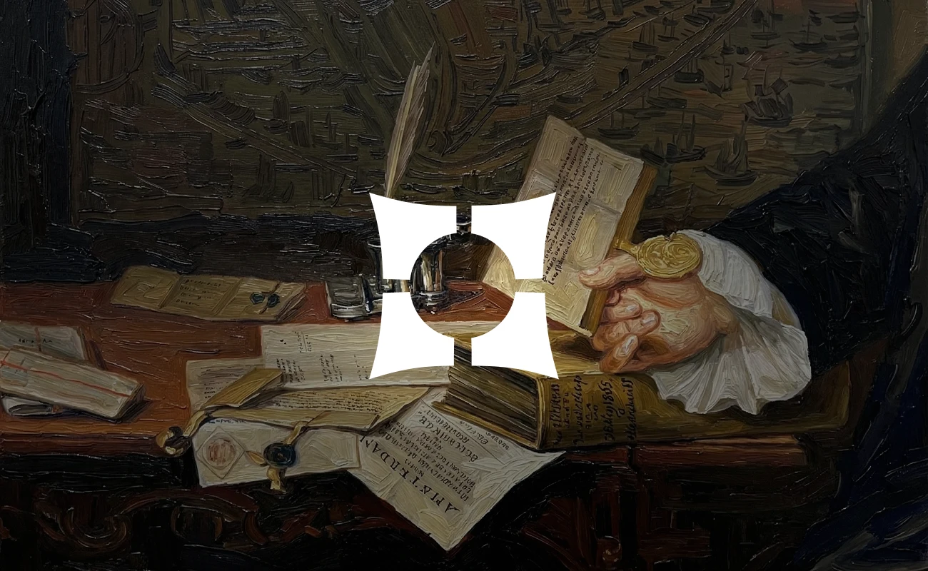
Your logo is the face of your company in every investor deck, landing page, and LinkedIn post. It's the silent ambassador that shows up in email signatures, product demos, and conference badges - often before you get the chance to explain what you do.

Starting with Strategy: Understanding the Brand Before Designing
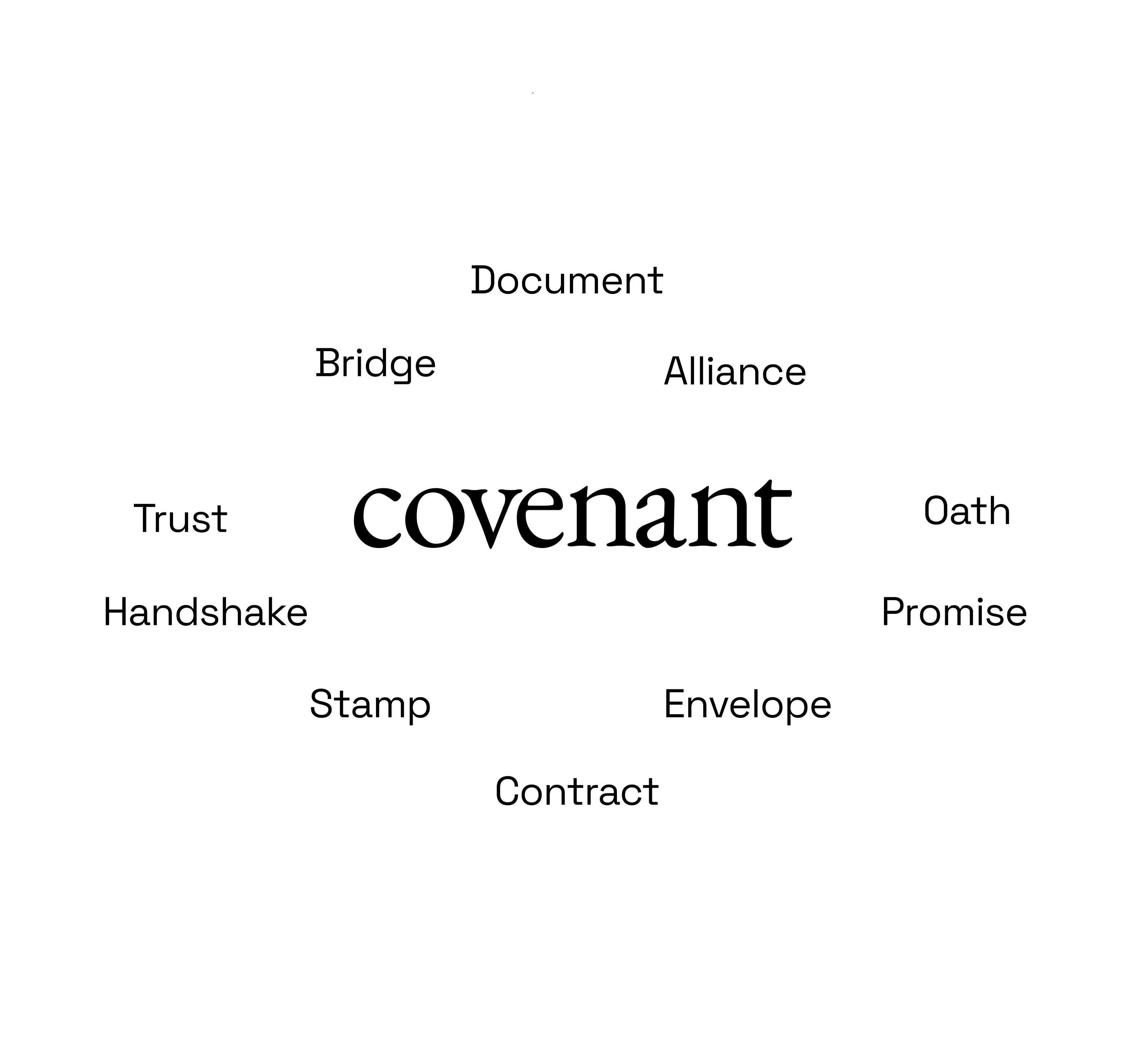
Before touching any design software, we mapped out what "covenant" really means:
In order to visualize it, we had to understand the deeper meaning behind it’s name and origin.
Every powerful brand should start here - with clarity on what you actually stand for.
Breaking Away from the Generic
We have to set the design tone before a single logo sketch is done. In the sea of identical AI and security websites, we wanted to stand out and do something different (as we always do at Marso).
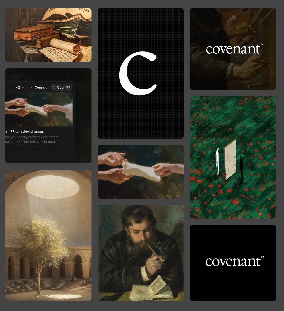
We decided that we don’t want to use the purple and blue tones with casual mockups, but instead we wanted to use vintage oil paintings that symbolize alliance, contracts, and partnerships. Here’s the moodboard we created in order to achieve this vibe:
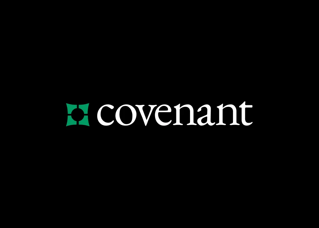
Defining the Visual Identity
From those references, the visual language clicked: Teal green - because your brand deserves better than another corporate blue. Clean serif type - credibility without the stuffy boardroom energy. Geometric symbol - looks fresh today, still works in 5 years. We've got the blueprint. Now let's build it.
Defining the Visual Identity
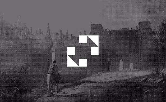
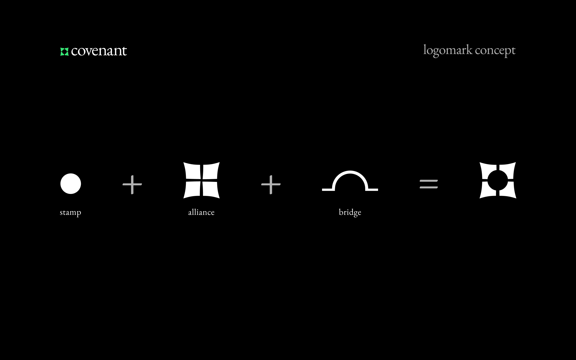
The logomark comes from three core concepts:
- Stamp (authority)
- Alliance (partnership)
- Bridge (connection)
The Logomark Concept: Three Symbols, One Cohesive Story
A great logo doesn't just look good.
It tells a story. It scales everywhere. It makes your brand recognizable in a crowded market.
This is what separates startups that look amateur from those that look like they belong.
Your Brand Works 24/7 - Make Sure It's Working For You
The final result: a mark that works on everything from pitch decks to product packaging. Clean. Confident. Memorable. This is what professional branding looks like - and why it matters when you're trying to close deals or raise capital.
Your brand is pitching for you when you're not in the room.In investor inboxes. On demo calls. At conferences. On social media.
A weak logo? It makes people question everything else. A strong one? It opens doors before you even speak.
Like this project
Posted Dec 3, 2025
How we designed Covenant's brand identity to stand out in a crowded market. This case study reveals the strategy and thinking behind a logo that actually works.
Likes
1
Views
9