Boosting The Doctor App Landing Page to Empower Doctors
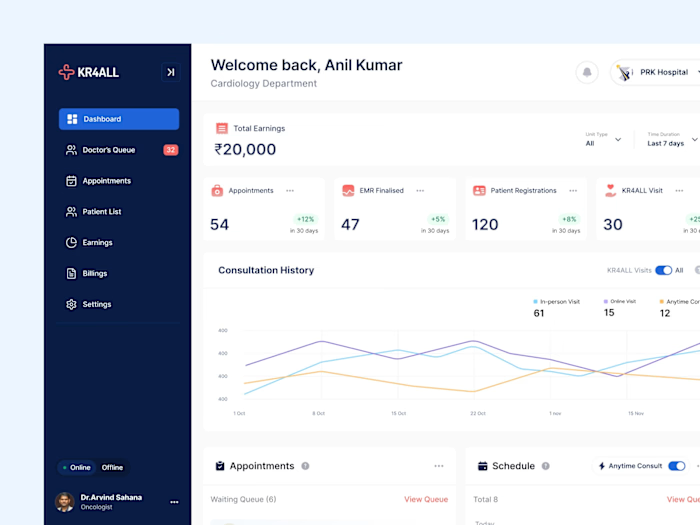
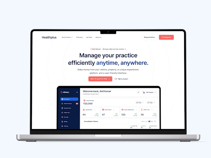
Your schedule has been simplified. Seamlessly manage appointments without hassle
Industry: Healthcare
Target Audience: Doctors
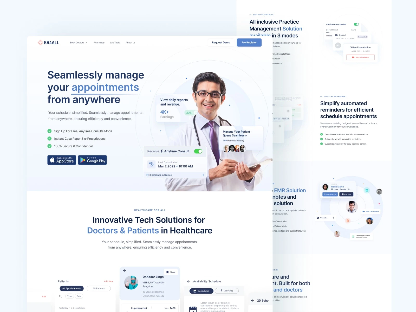
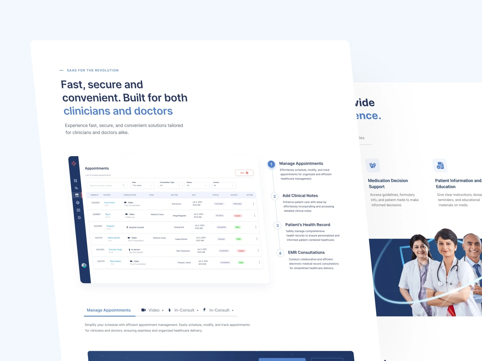
This project aimed to create a landing page for KR4ALL Doctor app. The app basically helps the doctors manage their appointments, with the ability to set a custom schedule, record patients, or even write prescriptions.
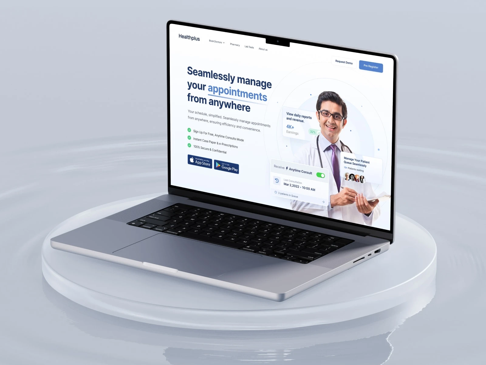
The idea was to create eye-catching visuals with subtle colors and no edgy, sharp elements on the page. The project began in July 2022. What you see here is a slightly polished version of published version on the web
Idea Validation
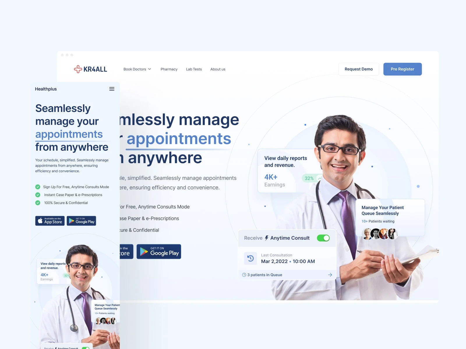
While refining, I decided to use white and light, shady blue as the theme colors. My introduction began with an image of a doctor in the hero section, emphasizing his role in the story. Mobile screens would provide them with a better understanding of what we do and how we can help you.
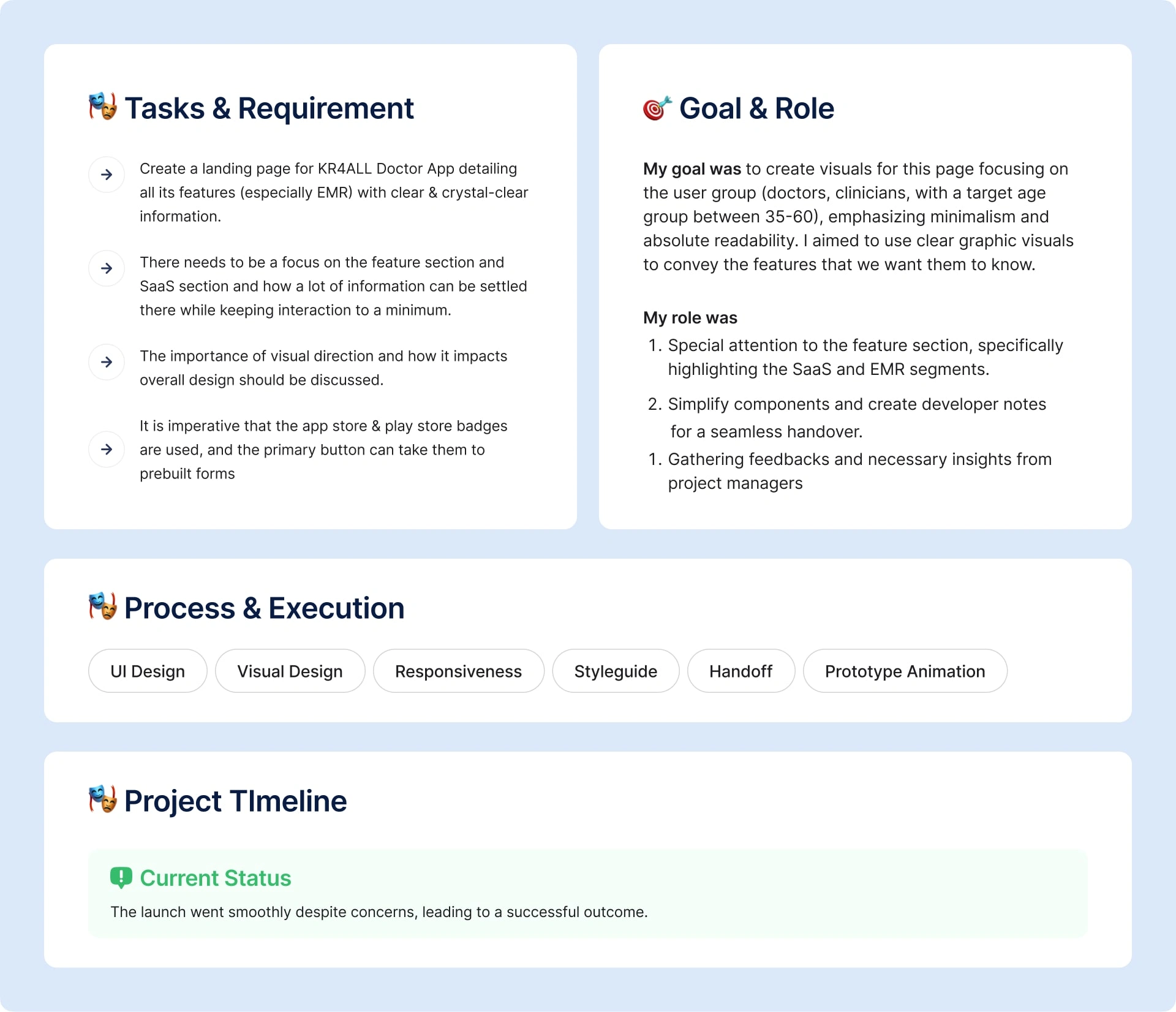
team gave it some thought and once more left notes for my visual guidance. Although they thought the hero section was a great idea, they asked me to concentrate on the feature section, specifically the SaaS and EMR feature sections that we had previously planned during the first wireframe's review phase.
Design decision
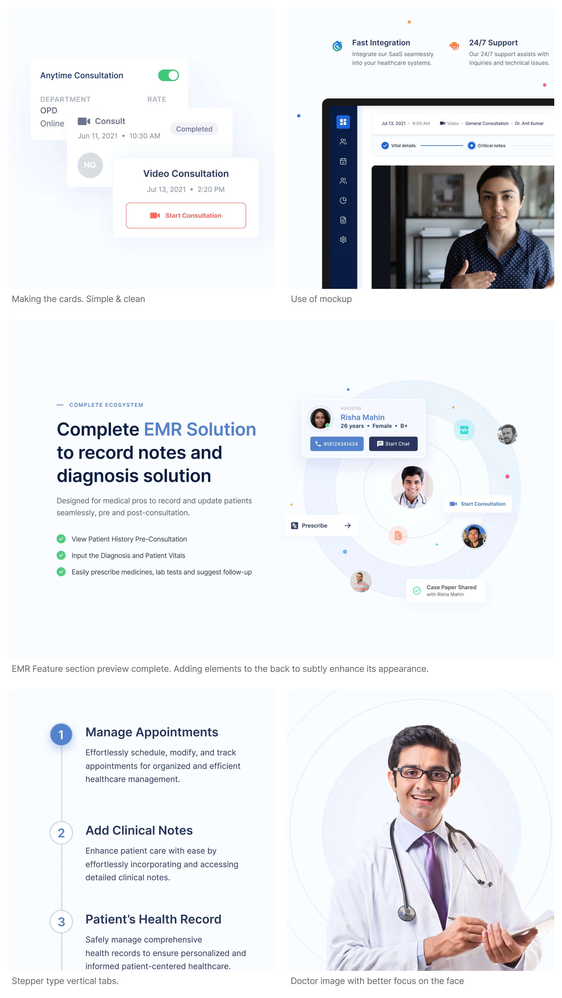
I think for me leveraging soft shadows and soft corners and putting elements all together with less fancy effect but the use of good interaction UX may help me to structure the large set of information on the page.
Clear and concise display of cards
Readability on check without any clutter
No complex interaction
How the redesign went on
I began by designing the hero section, then came to the EMR section as it was pretty hard thing to figure out. I just wanted to show some patient while doctor is the center. Some actions which are available to doctor.
When it went live, primary button clicks increased from 0% to 24%. Following form leads was around 12% appstore badge clicks 34% and playstore badge clicks hit at 24%.
Final preview
Like this project
Posted Apr 7, 2024
Enhancing Healthcare: A Case Study on Transforming Doctor App Landing Page with Visuals & User Experience
