KR4ALL: SaaS Application Landing Page
The All-in-One Solution for managing your Health care facilities Online
Say hello to India’s Unified Patient Experience Healthcare Platform Tailored As Per Your Needs.
Industry: Healthcare
Target Audience: Clinics, Hospitals & Doctors
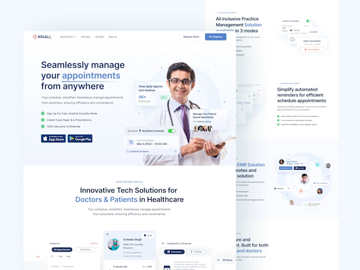
This project aimed to create a landing page for KR4ALL SaaS Tara 3.0 targeted at doctors, clinics, and hospitals, with a slightly different outlook. Aesthetically, it was designed to prioritize readability and present features clearly with nice, clear visuals without cluttering it up with an abundance of information that will be discarded by the users.
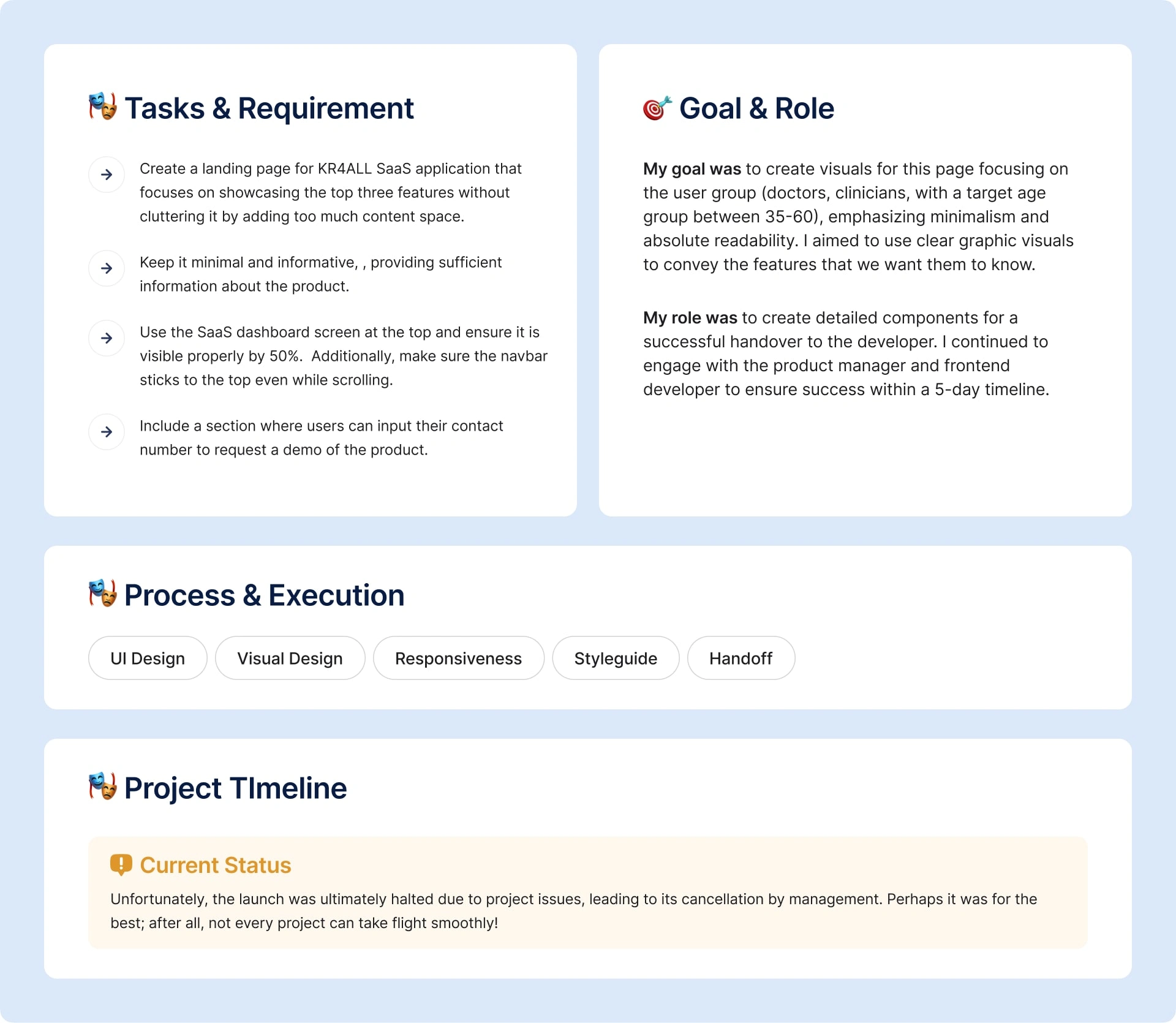
Tools I have used on this project
Notion & Whimsical
Plugins: Breakpoints & Measure
Wireframe
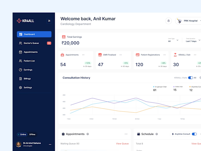
After going through couple of wireframes, the project manager and UX researcher in my team chose this particular wireframe and gave notes for specific areas. During this process, I stumbled upon some interesting mockups on Behance and decided to incorporating iPad or iPhone mockups into certain sections. After taking the main SaaS screen, cropping out some cards, and doing some iteration with minimal effort, I determined what needed to be done next.
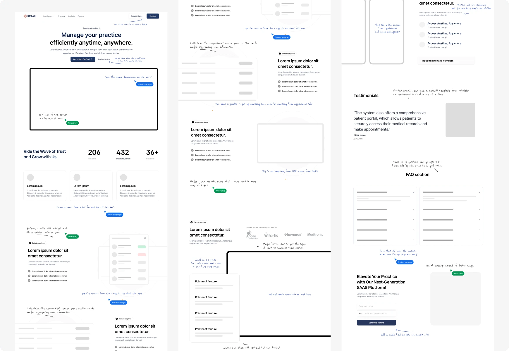
Includes the comment of mine and project manager. That was more of medium fidelity wireframe.
Moodboard
Unfortunately, I have some bad news—I've lost the page where we stored some of our actual inspiration. Even checking the version history wasn't helpful, which is a terrible mistake. Nevertheless, there is no need to be concerned since it was only three to four screens taken primarily from Landing Folio and SaaS inspiration websites.
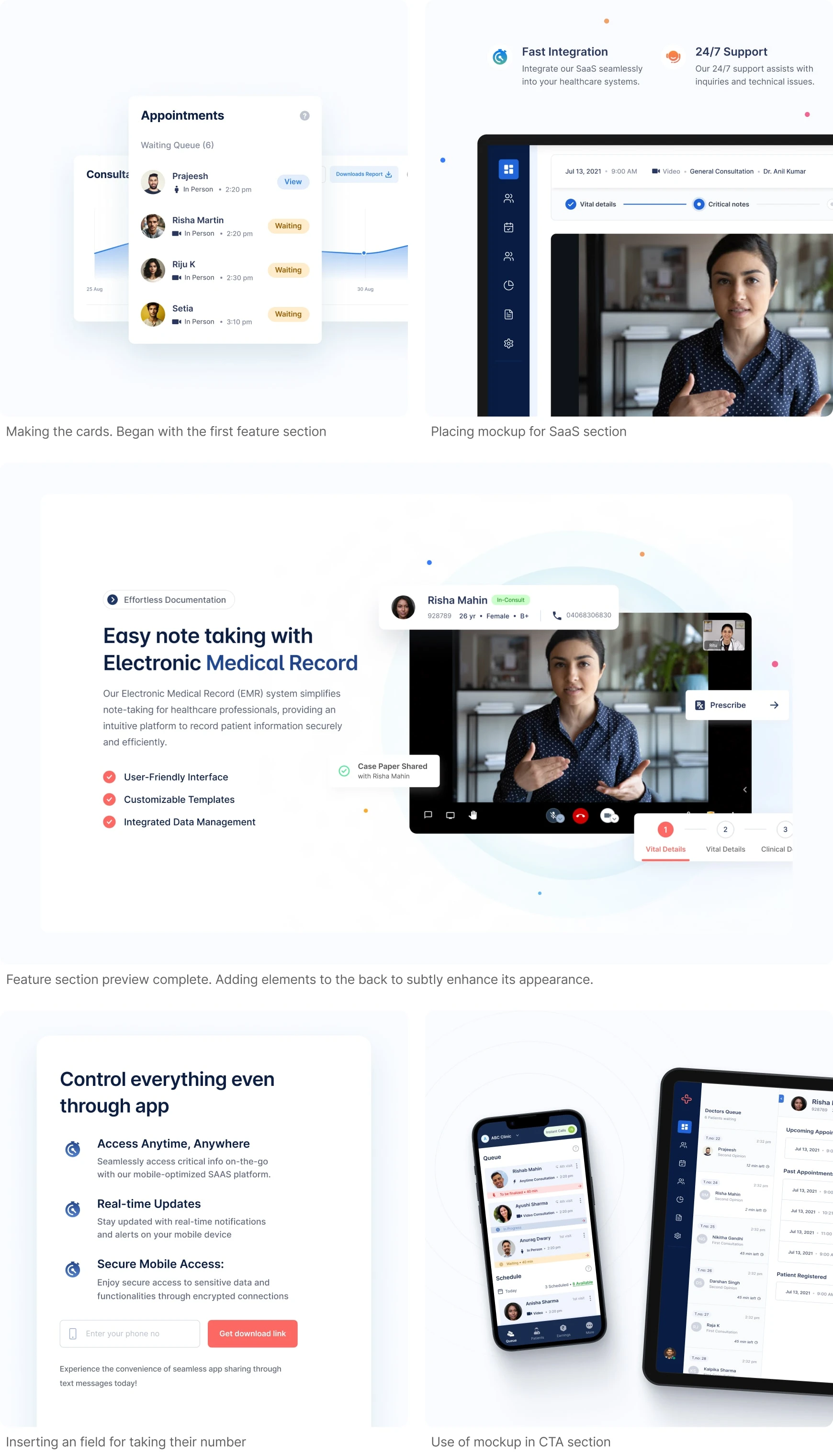
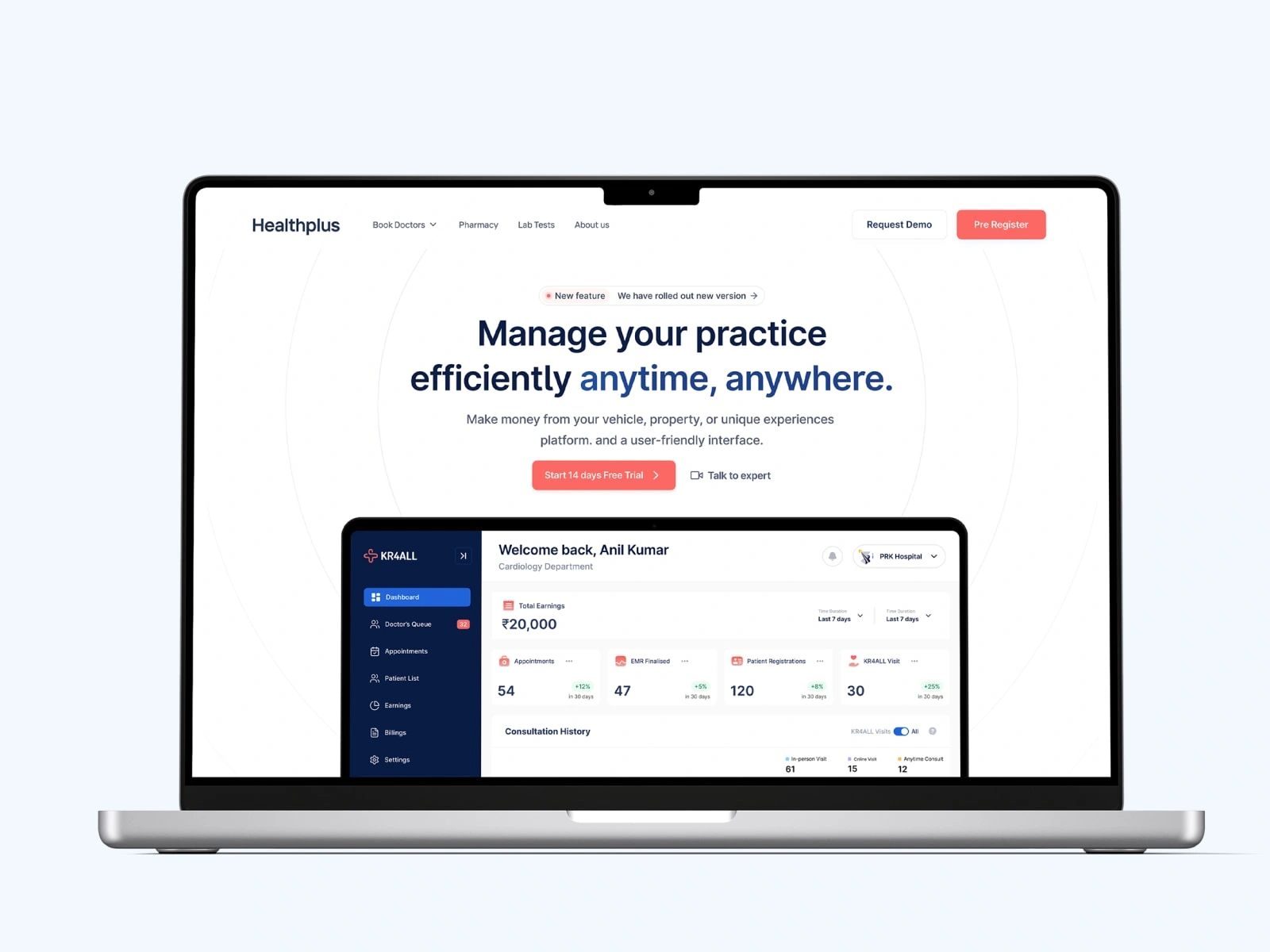
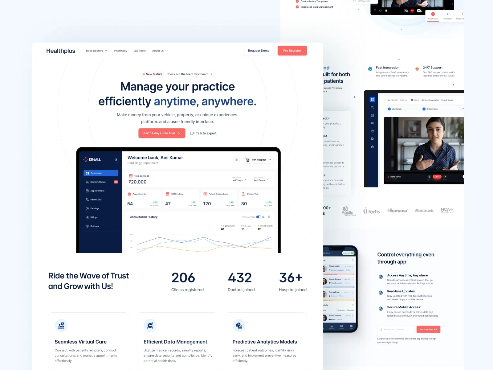
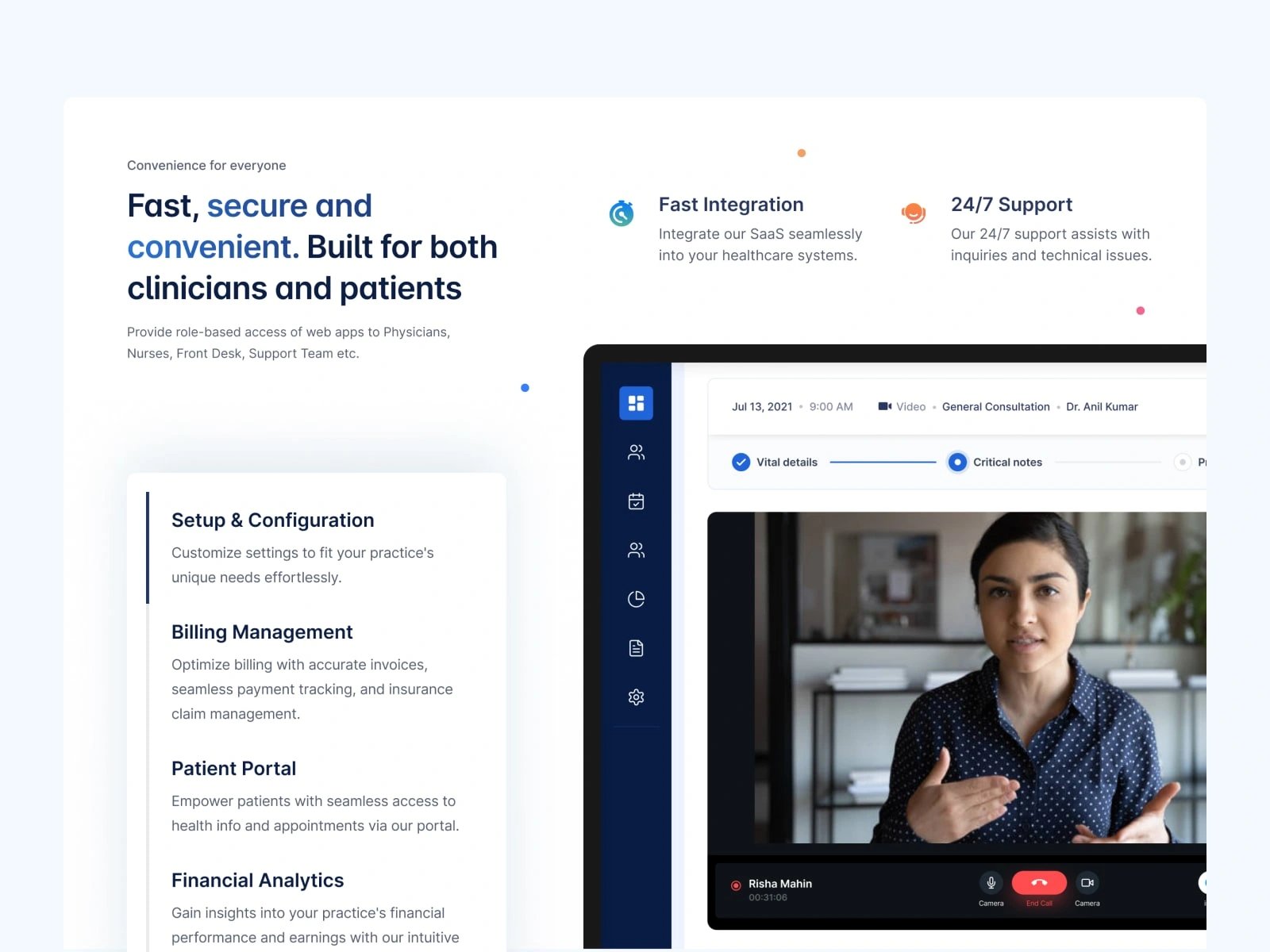
I began by designing the hero section, centering the SaaS image, and then moved on to creating the first feature section for visual representation. At the end i put the circles behind the cards under feature sections
Final Preview
I began by designing the hero section, centering the SaaS image, and then moved on to creating the first feature section for visual representation. At the end, i put the circles behind the cards under feature sections
View1
View2
Like this project
Posted Apr 1, 2024
This project aimed to create a landing page for KR4ALL SaaS Tara 3.0 targeted at doctors, clinics, and hospitals, with a slightly different outlook. Aesthetical
