Birth Cards for San Antonio Regional Hospital (SARH)

Full Line Up
I was tasked with creating updated versions of Birth Cards for San Antonio Regional Hospital located in Upland, California. They wanted a more modern-looking design that allows parents to post the card online without releasing any personal information. They preferred the basic blue and pink color palette but also wanted the option of green for parents who have gender-fluid children.
With this in mind, I began to design concepts focusing on readability and modern style fonts, icons, and colors. For the brand packaging, it's important to ensure that the designs are visually cohesive and aligned with the hospital's brand identity. Consistent use of colors, fonts, and icons across all materials will help reinforce the hospital's brand and create a professional and polished look.

Old Birth Cards
The older version of the cards had outdated fonts that didn't match the hospital's guidelines and didn't convey the feel the hospital wanted for their patients. I wanted to show excitement and readability, so I kept the idea of using a cursive style font with a thick outline and solid color to separate it from the background. I also wanted to showcase the hospital and not rely solely on the logo at the bottom of the card. Because of this, I took the bug of the original logo and resized it so that it was part of the background for both the front and back of the card, while using the same information layout as the old version.
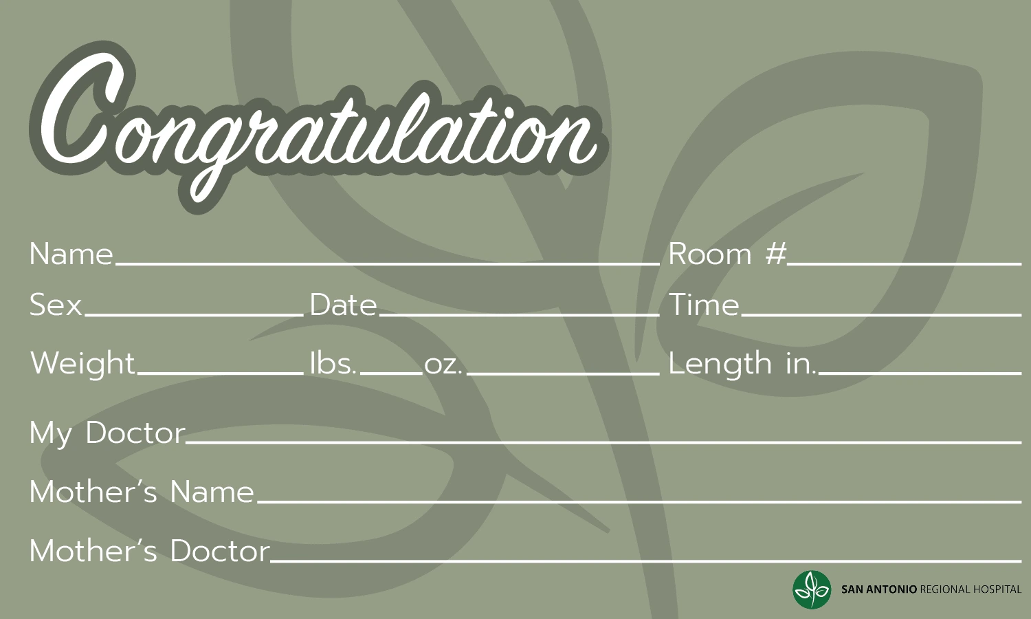
First Draft of Card
The client liked the first card design but felt that the font of the header text didn't align with their brand guidelines. They expressed that they wanted a more serif style font and wanted the header text to be centered and cover more of the top portion of the card. They liked the bug in the middle of the card but felt that there was too much happening in the front.
After receiving that feedback, I came up with this design, which the client decided was exactly what they wanted. For the front of the card, I found a serif font that me and the client felt matched their guidelines, as well as gave off that modern feel. I laid it over a banner style header that didn't distract from the information portion below. I still wanted to incorporate the hospital's bug on both sides, so I resized the bug and centered it so that you can see the whole logo. For the back, I used the design from the first round of revisions but added icons so that parents can put the details they wish to share online. I also placed the hospital's logo in the lower right corner and used the same font for the header as the front
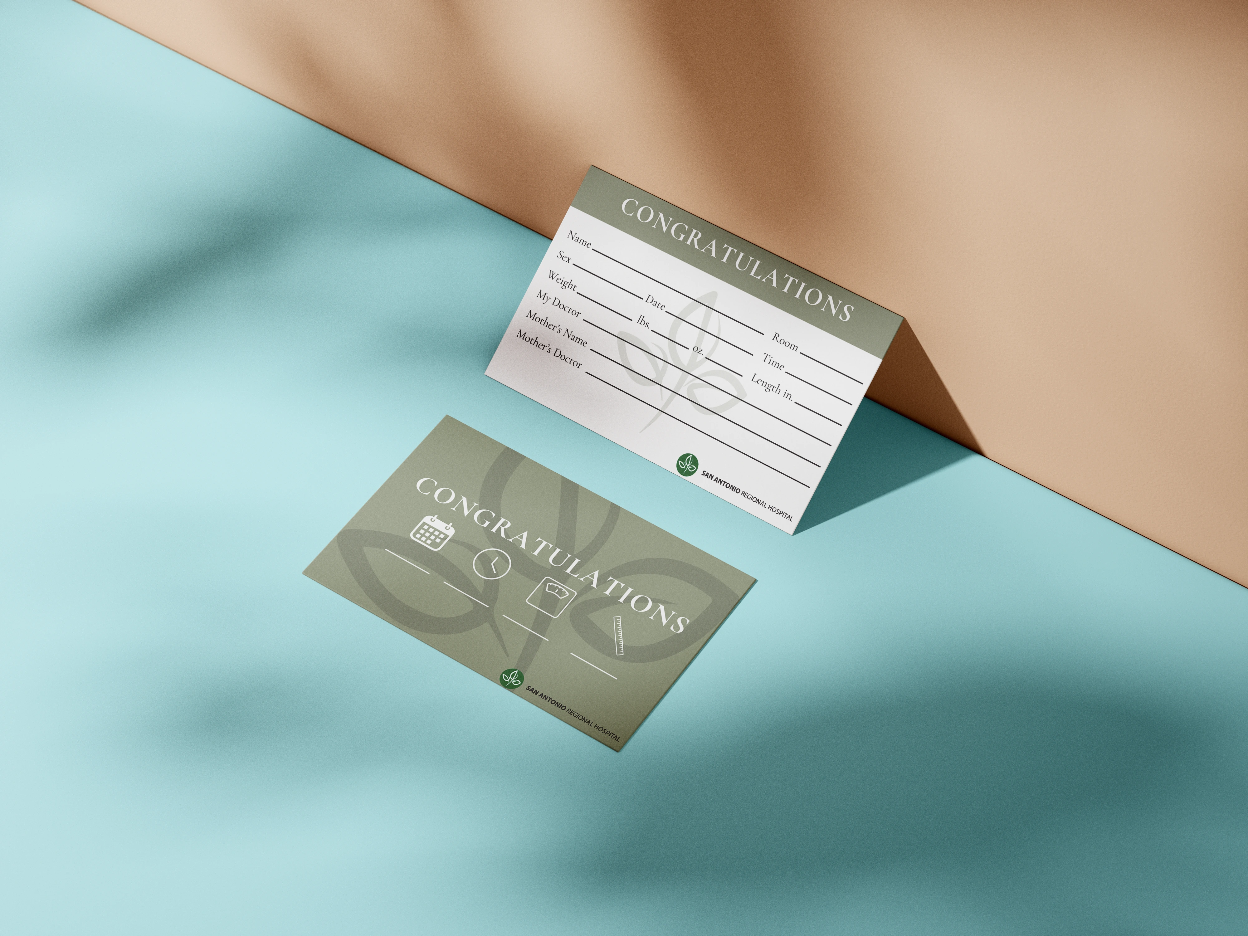
Finished Design
Like this project
Posted Nov 12, 2024
I was tasked with creating updated versions of Birth Cards for San Antonio Regional Hospital. The goal of the project was readability and modernism.
Likes
0
Views
18
Clients
San Antonio Regional Hospital

