Atlas Surfaces Brand Identity Redesign

Gabriel Polido


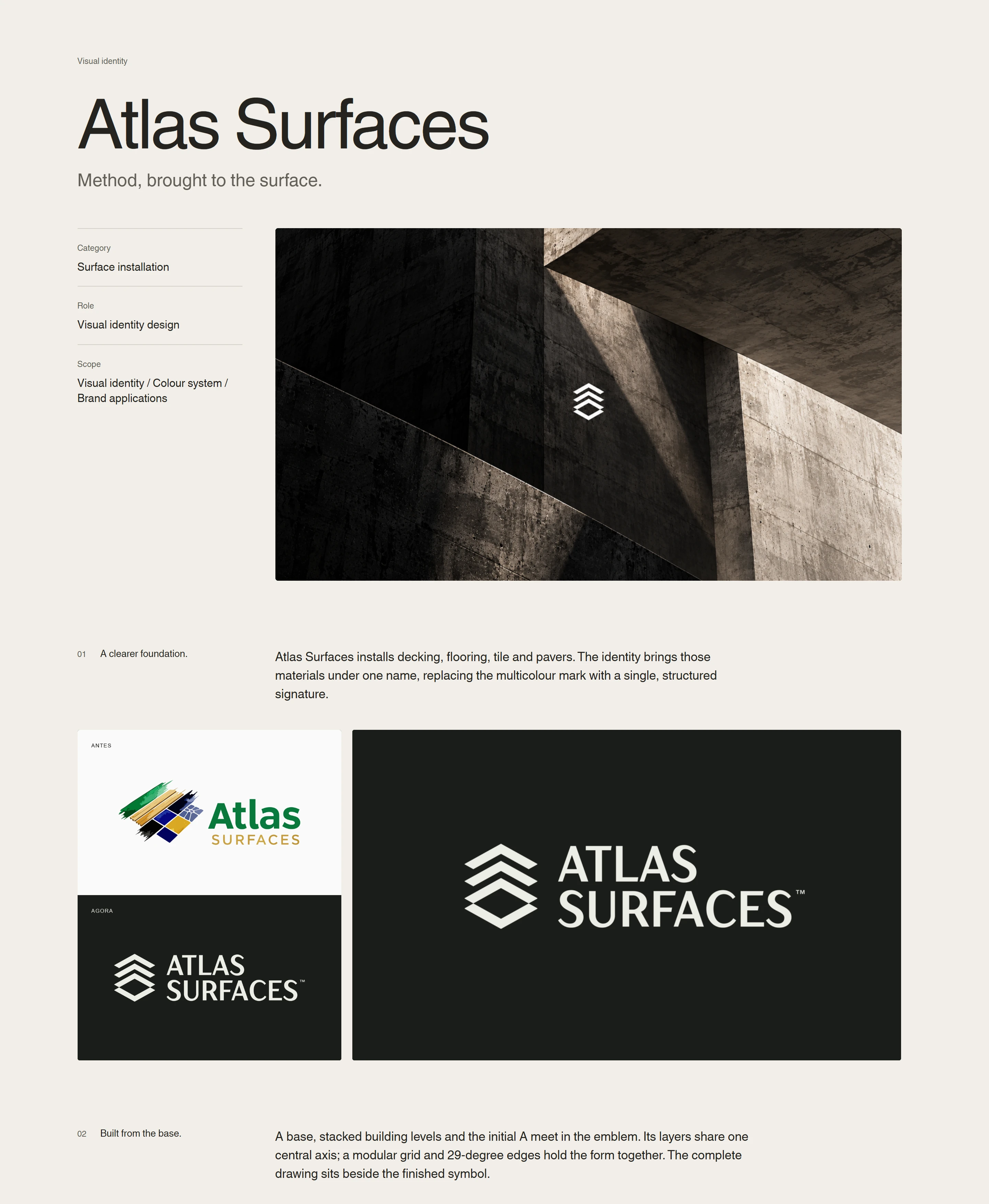
Atlas Surfaces’ identity translates the precision of surface installation into a visual system built around structure. With decking, flooring, tile and pavers under one name, the challenge was to represent the full scope of the business through a unified signature. The redesign replaces the previous multicolour mark with a more focused identity, grounded in the method shared across its services.
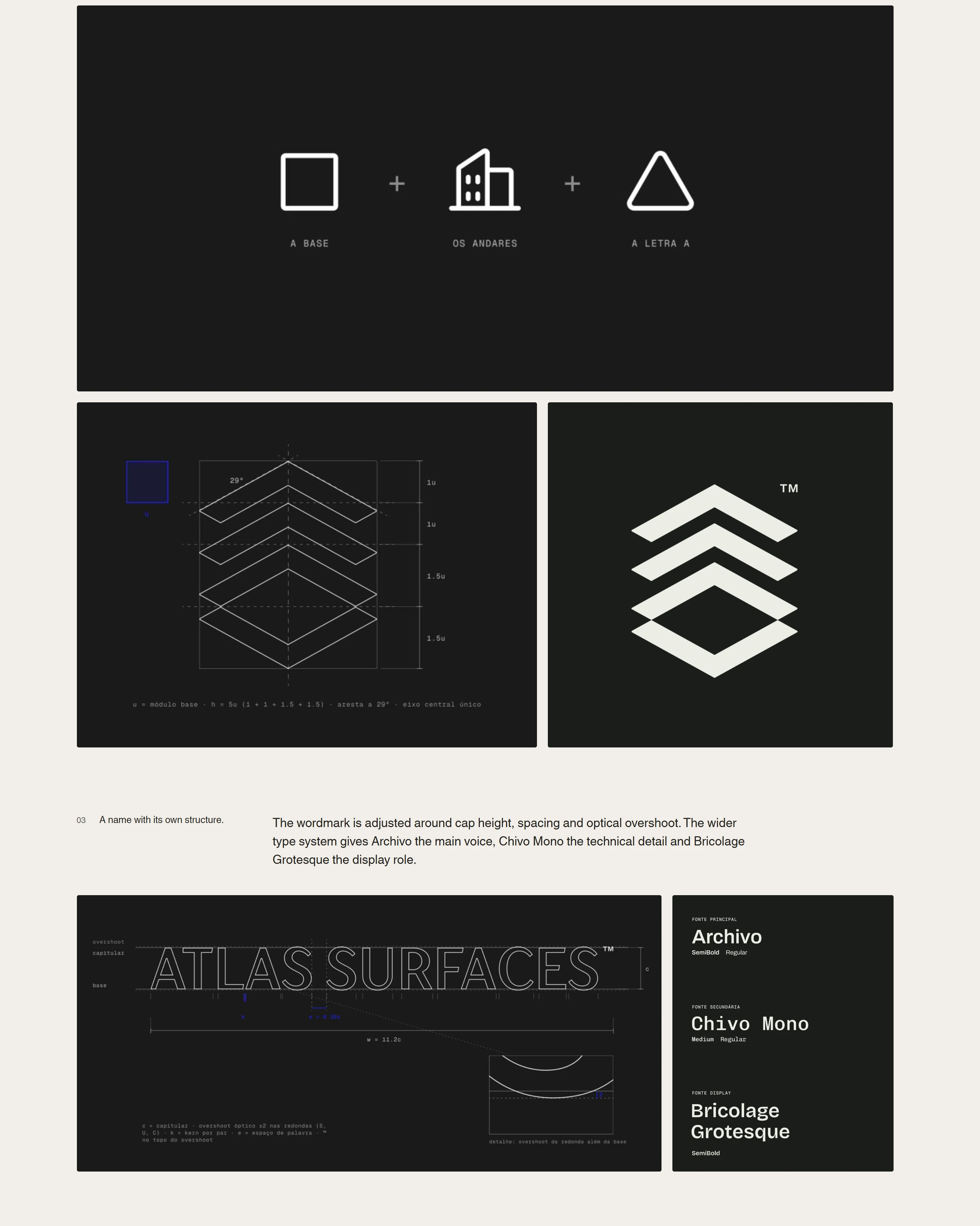
The symbol brings together a foundation, stacked building levels and the initial A. Its layers follow a central axis, with consistent angles and measured spacing giving the form its rhythm. This construction connects the mark to the work itself: each level depends on the alignment and support of the one below.
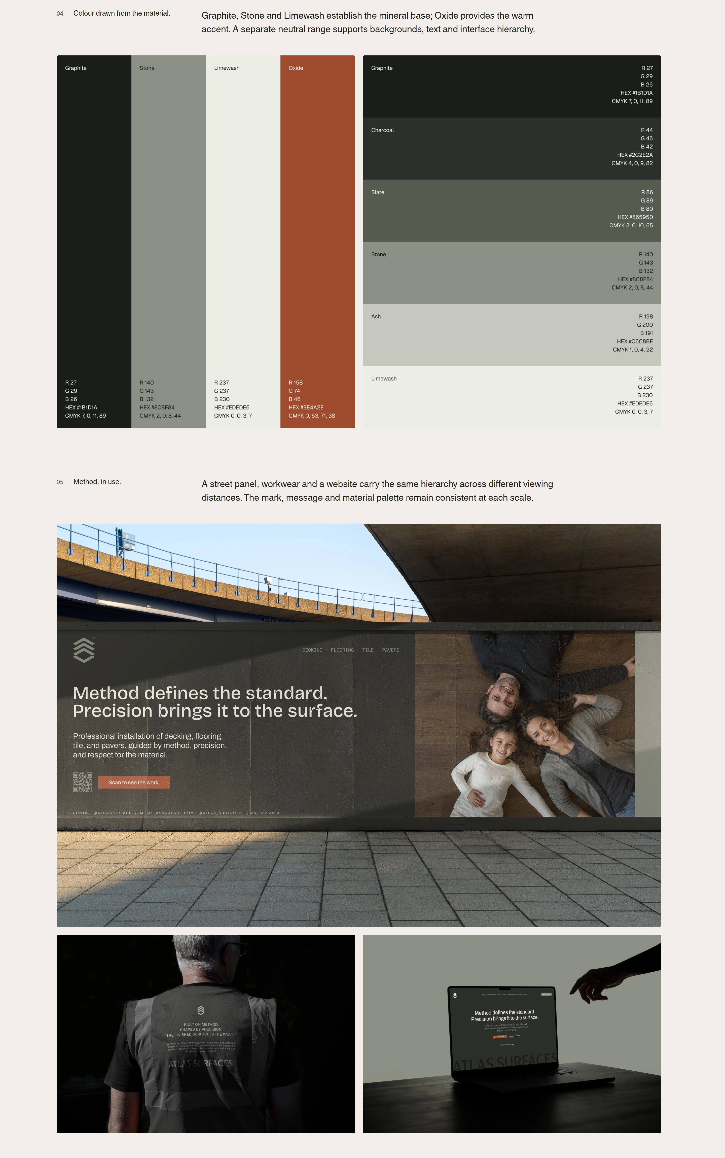
The same discipline carries into typography and colour. A carefully spaced wordmark establishes a clear signature, supported by distinct roles for headlines, everyday communication and technical details. Graphite, stone and limewash draw the palette toward the materials Atlas works with, while oxide introduces warmth and emphasis.
Across workwear, street signage and digital applications, a consistent hierarchy keeps the name, services and message easy to identify. The result gives Atlas a coherent presence across its different specialities, making the care and precision behind the installation visible before the work begins.
POLIDO.PAGES.DEV
Like this project
Posted Oct 23, 2026
An identity redesign for surface installation, expressing method and precision through a structural symbol, typography and a mineral colour palette.