Ilhó Brand Identity Design

Gabriel Polido


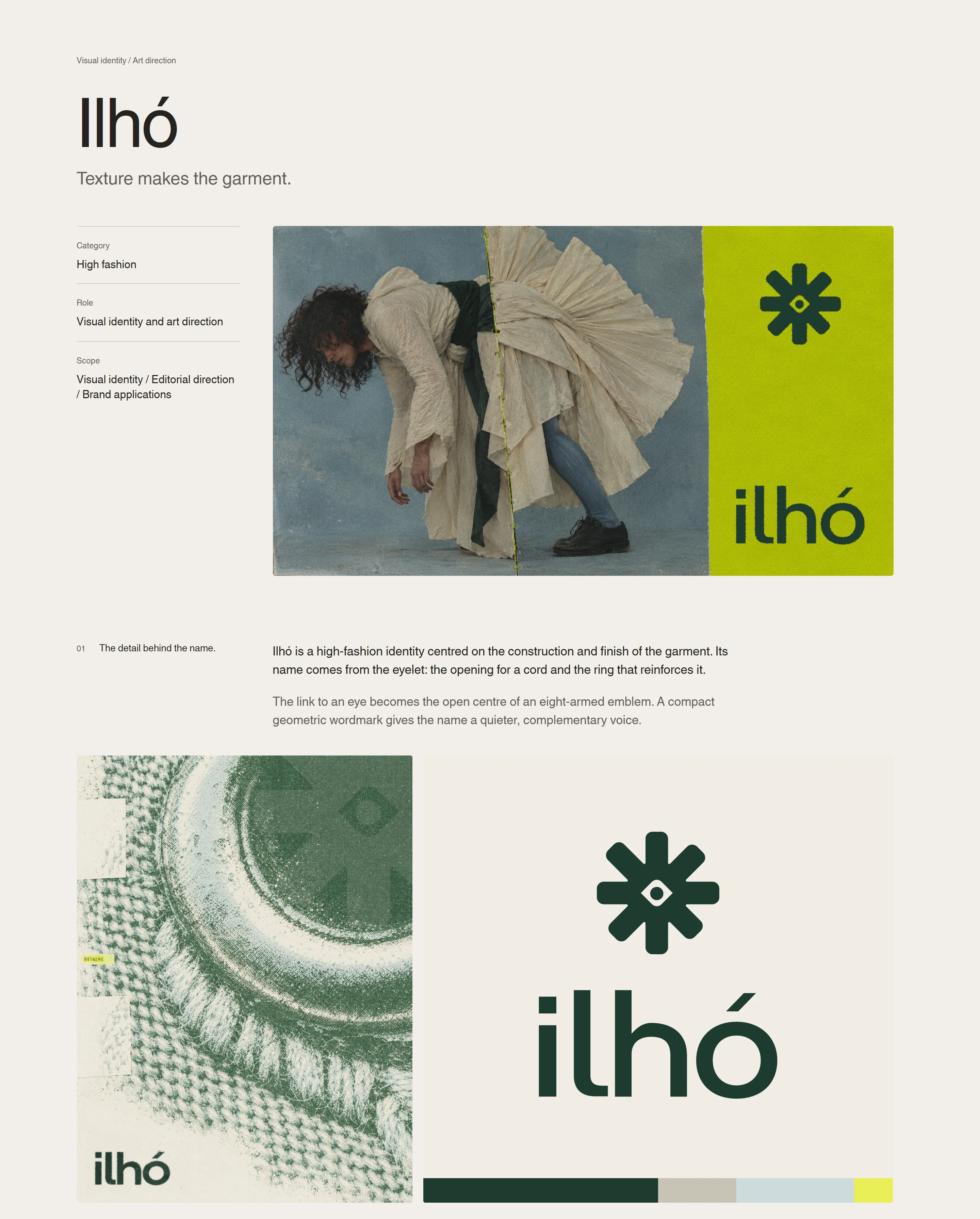
Ilhó’s identity begins with the construction of a garment: the seam, the fold and the small details that give a piece its character. Named after the Portuguese word for eyelet, the brand connects its visual language to the materials and processes of clothing, giving the identity a role within the garments themselves.
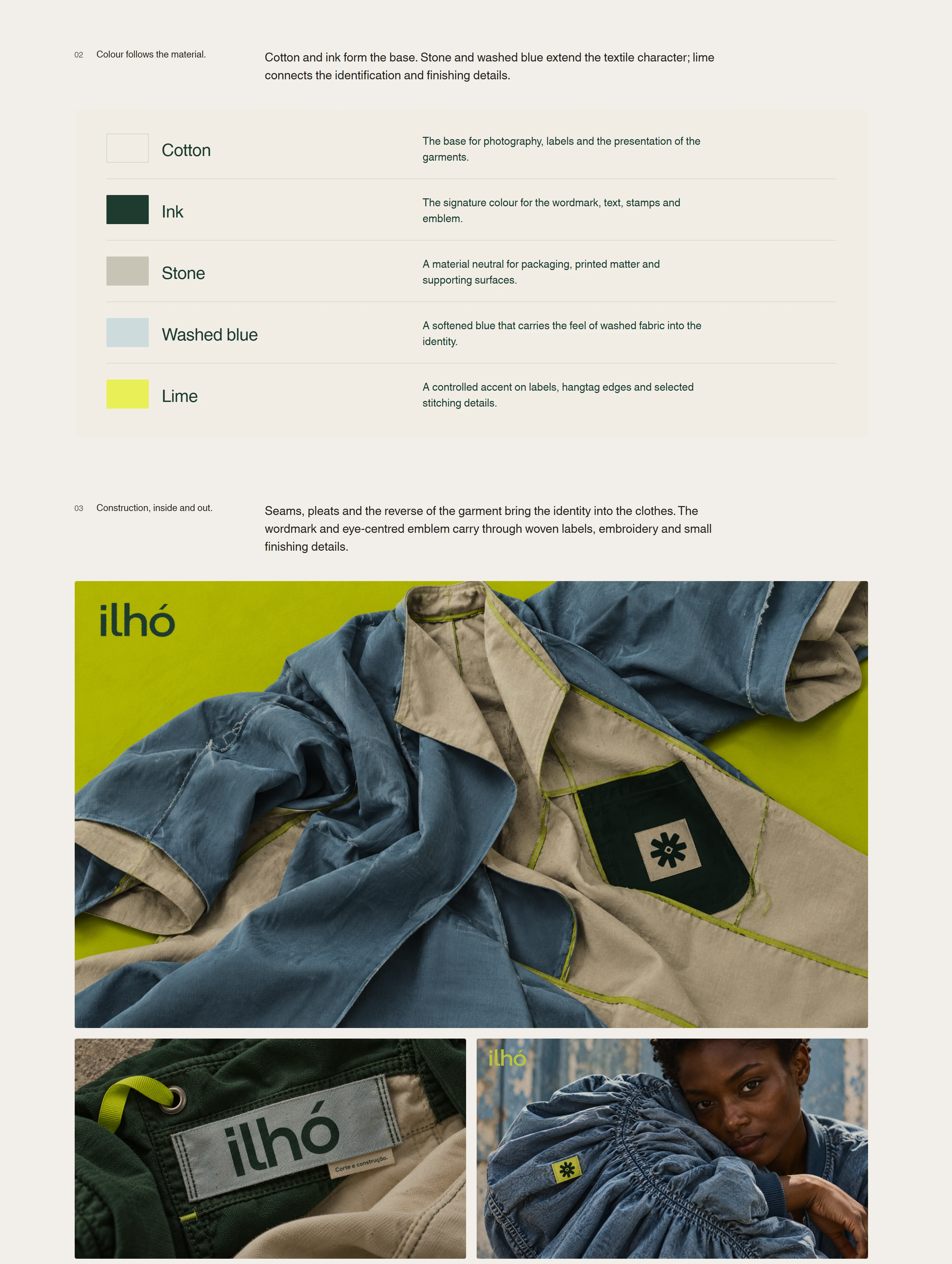
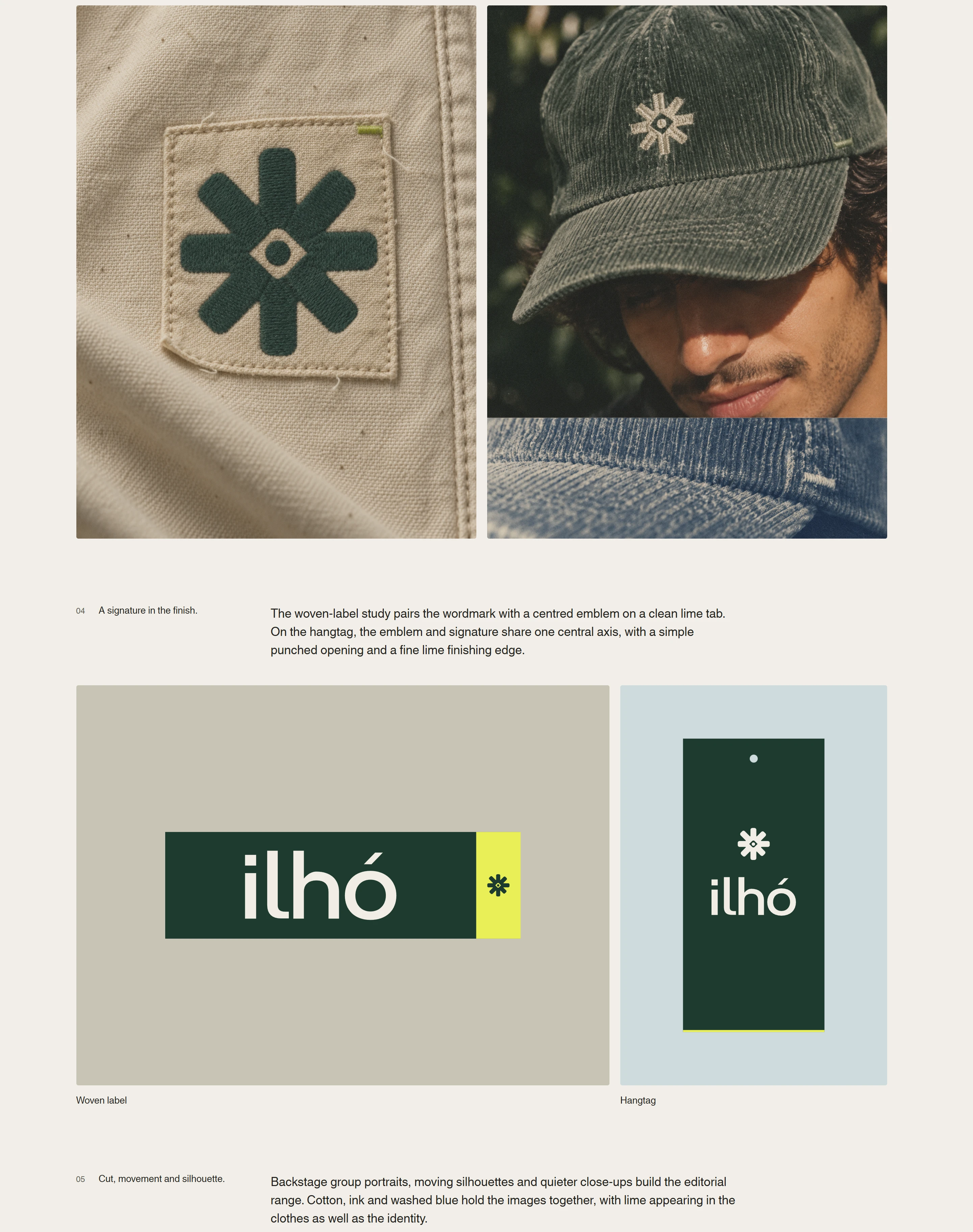
The emblem carries an eye-shaped opening at its centre, connecting the name to the act of looking closer. Alongside the wordmark, it moves through woven labels, embroidery and hangtags, making the finishing details part of how the brand is recognized.
Colour extends this relationship with fabric. Cotton, stone and washed blue establish a tactile base, while deep green anchors the signatures and typography. Lime brings a recurring point of recognition to stitches, label tabs and printed edges, linking garment construction to graphic application.
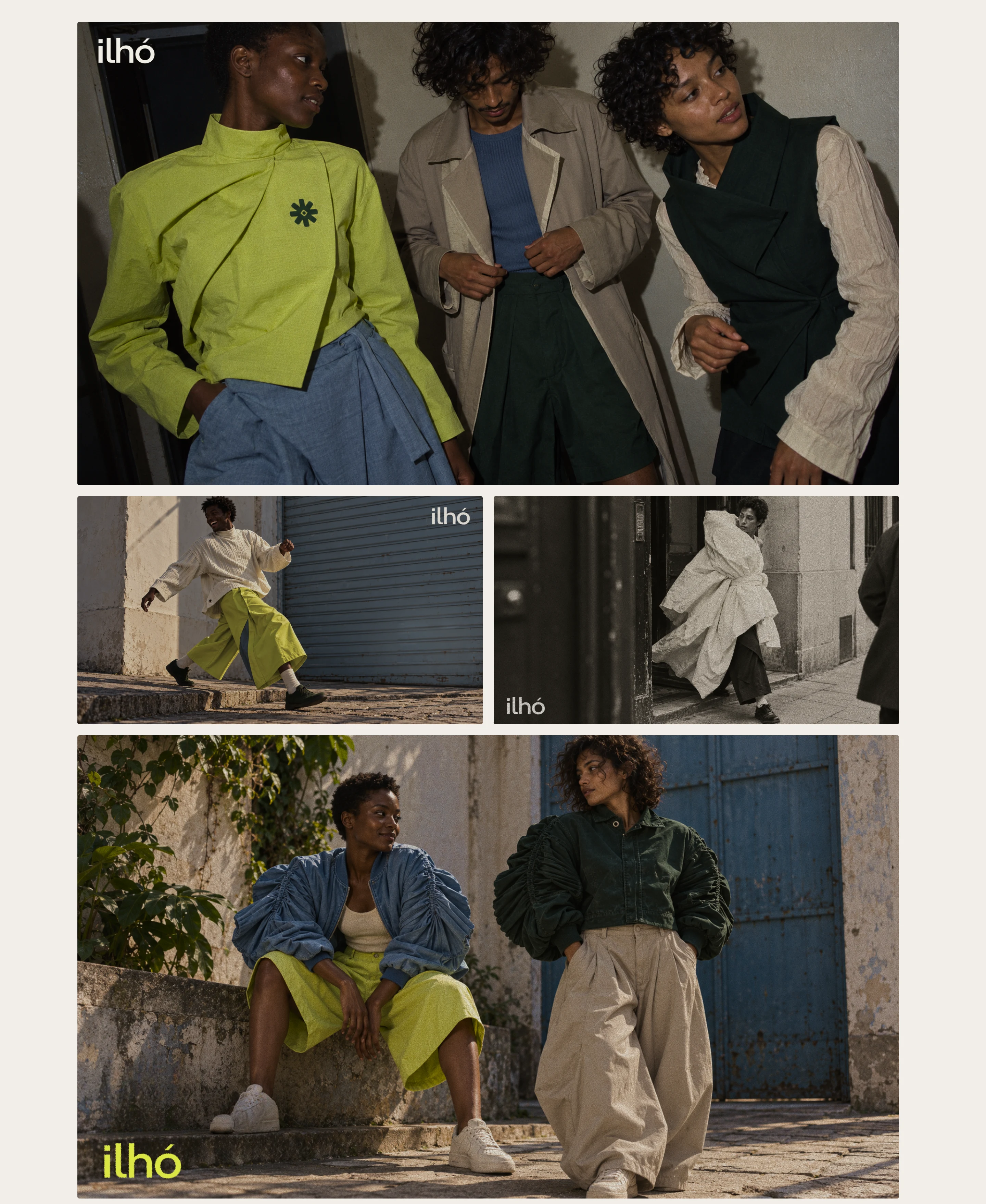
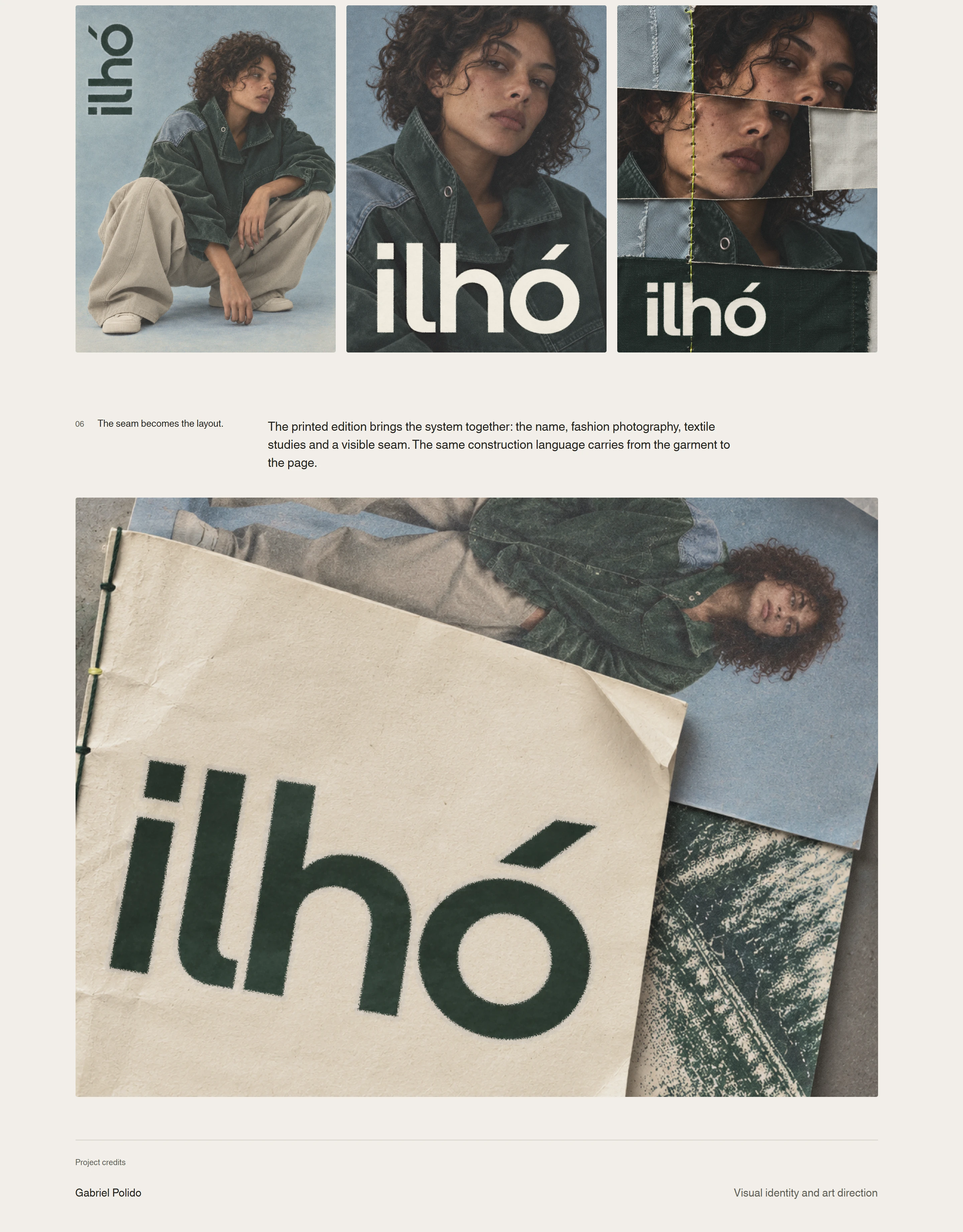
The art direction follows the same attention to detail. Backstage portraits, moving silhouettes and close views of fabric reveal how the pieces are made and worn. In print, seams become compositional elements, joining photographs and textile studies across the page. Together, these decisions give Ilhó a consistent presence from a small woven label to a full editorial, while leaving room for the cut, texture and individuality of each garment.
Like this project
Posted Oct 23, 2026
A fashion identity built around the eyelet, translating garment construction into an emblem, textile details and a cohesive editorial language.