Logo Design and Brand Guidelines for Imunixx
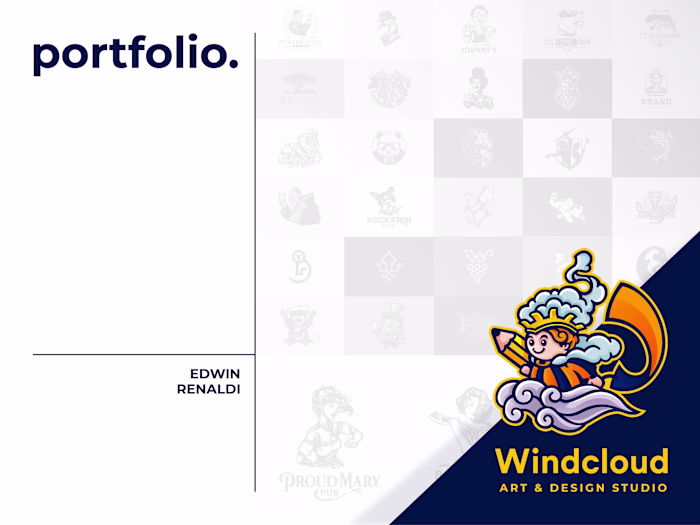
Edwin Renaldi
Logo Design and Brand Guidelines
About
Imunixx IT Solution
Sachse, Germany
Client's Problem:
Imunixx, an IT solutions company, struggled with inconsistent brand representation due to a lack of a professional and versatile logo. Their previous branding lacked modern appeal, was not optimized for various formats, and failed to reflect the innovative and secure nature of their tech services. This affected their visual credibility, especially across digital platforms and corporate communications.
Design Solution:
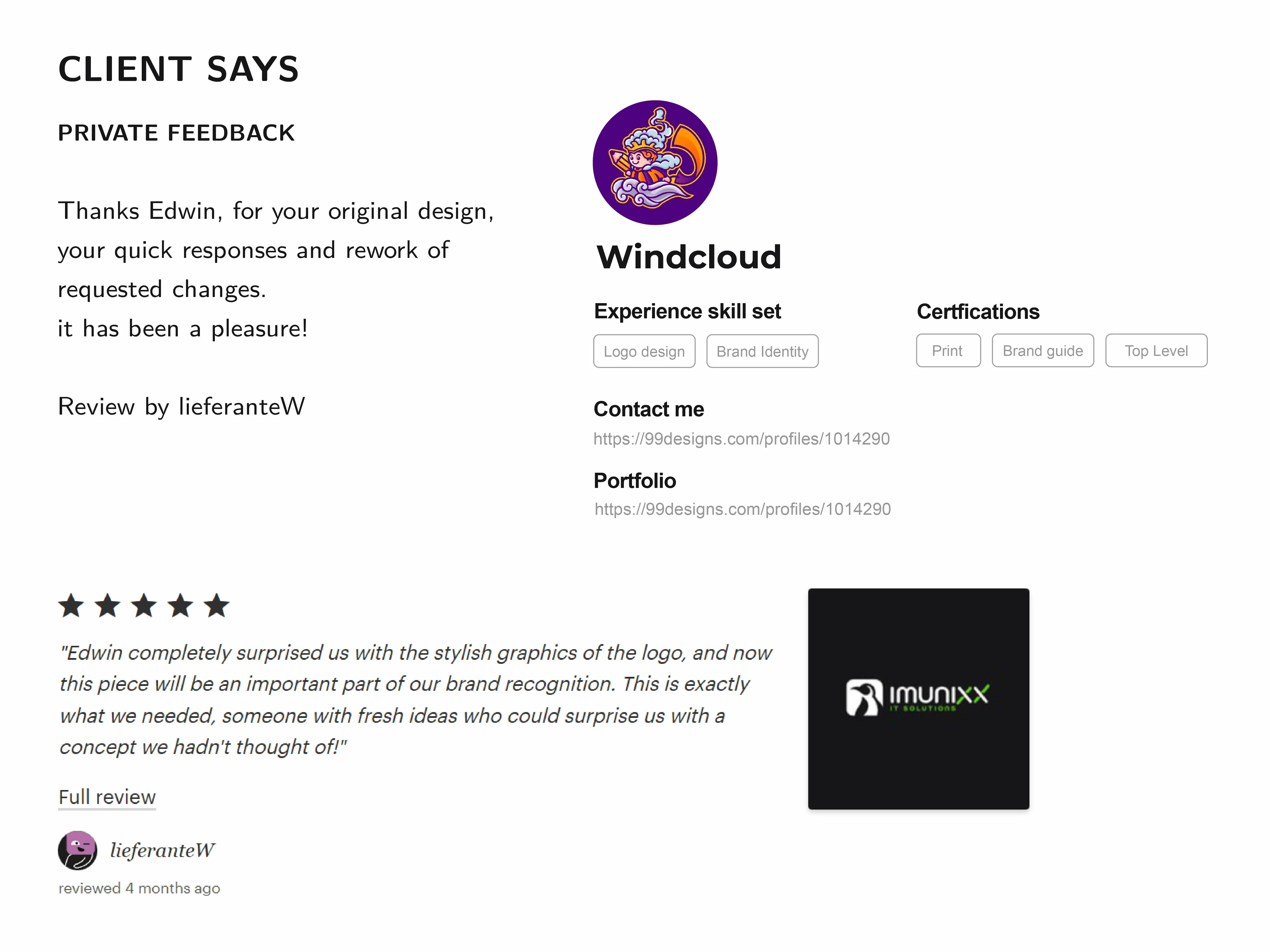
The new horizontal logo design for Imunixx provides a strong and balanced visual identity that enhances readability in wide-format applications. The minimalist penguin icon symbolizes intelligence, adaptability, and digital security values aligned with the brand. The clean typography and modern color palette ensure maximum versatility, making the logo work seamlessly across digital and print media. This branding solution reinforces Imunixx's presence as a reliable, cutting-edge IT solution provider.

Strategy & Concept
The design process began with understanding Imunixx’s core mission: delivering intelligent IT solutions with a human centric approach. The brand needed to reflect security, agility, and clarity without feeling cold or corporate.
The biggest challenge?
Crafting a visual identity that evokes trust and innovation, while staying adaptable across platforms from websites to pitch decks to mobile apps.
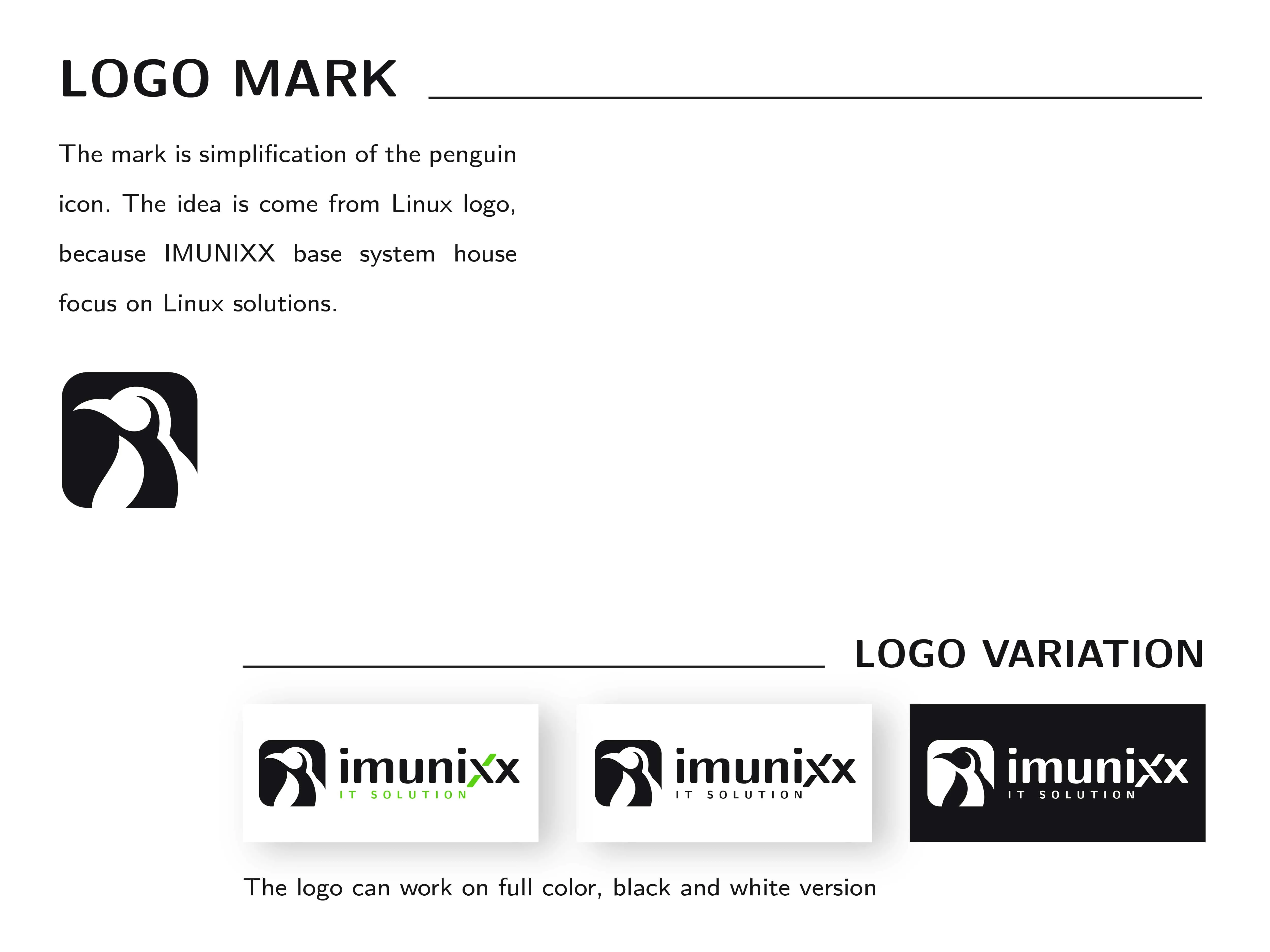
The penguin icon was chosen intentionally. In nature, penguins thrive in harsh environments through collaboration and instinctive strategy paralleling how Imunixx tackles complex tech challenges. The bold silhouette ensures recognition, and the smooth linework adds a sense of warmth and reliability.
Logo Design
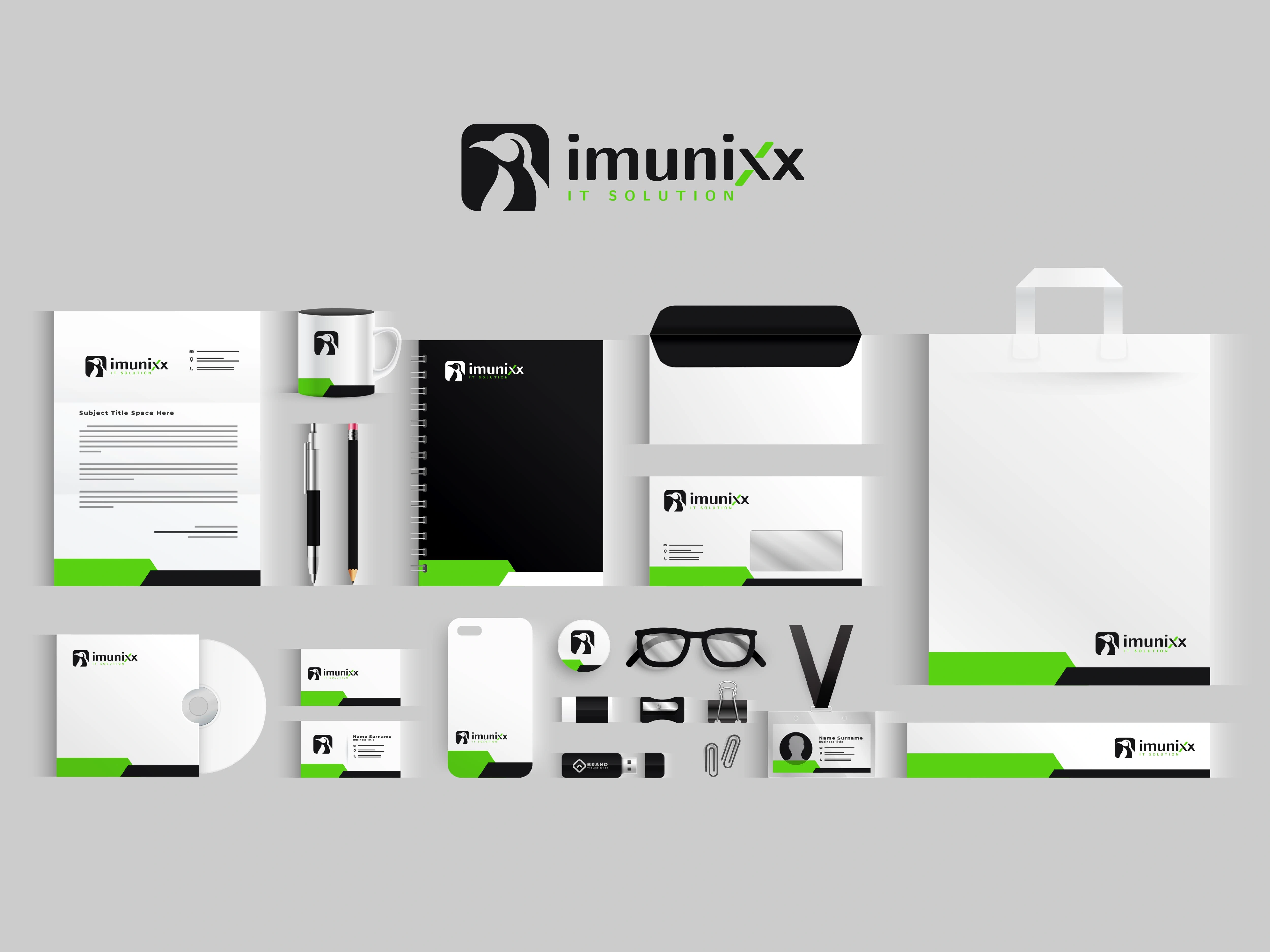
The logo suite includes:
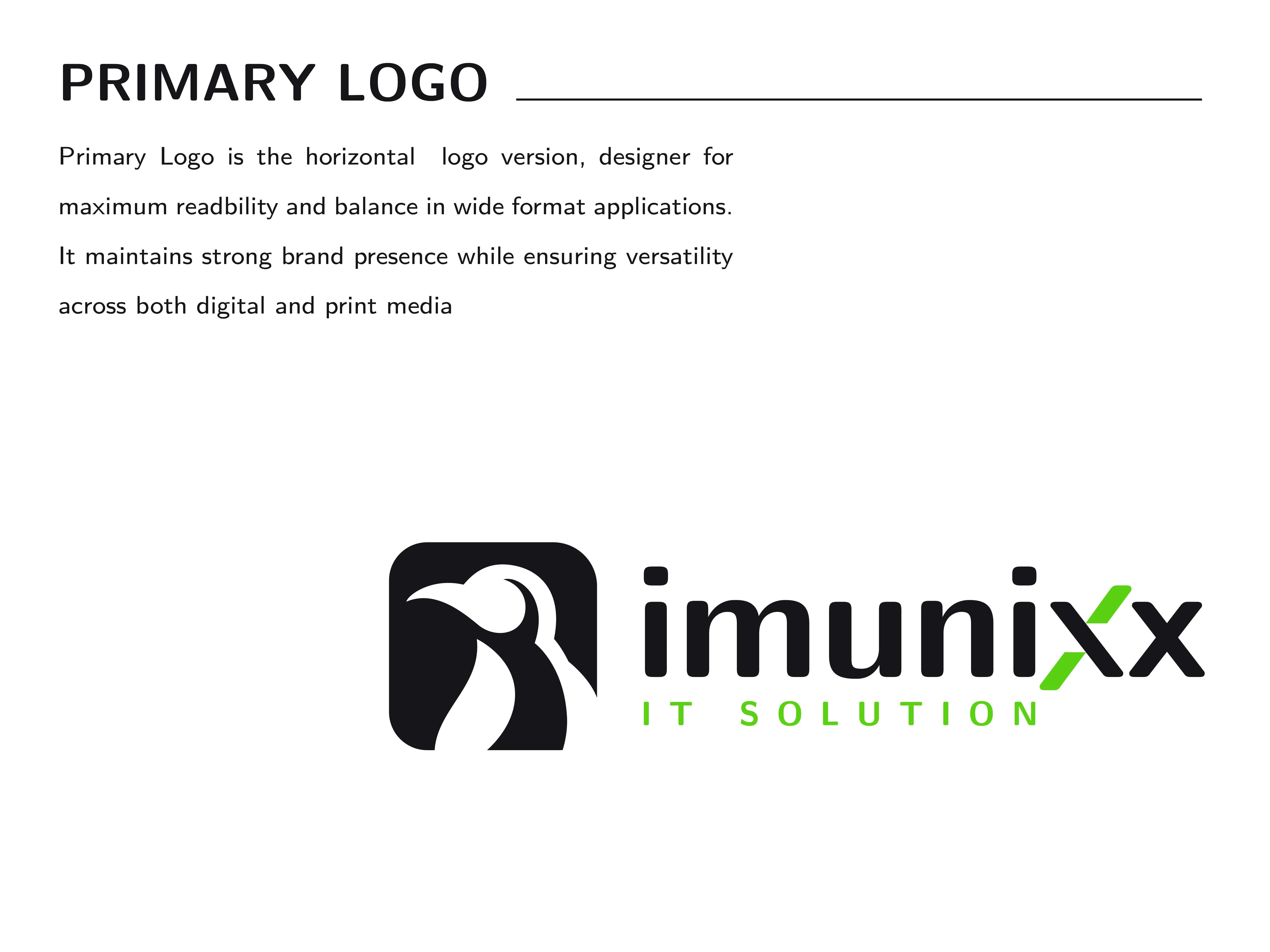
Primary Logo: A horizontal lockup combining a stylized penguin icon with clean, modern typography. The design balances tech forward to clarity with a friendly, trustworthy presence.
Brand Icon: The penguin mark represents adaptability and resilience qualities that mirror the cybersecurity landscape. Designed with simplicity and bold contrast, it functions well at small sizes and across a range of digital applications.
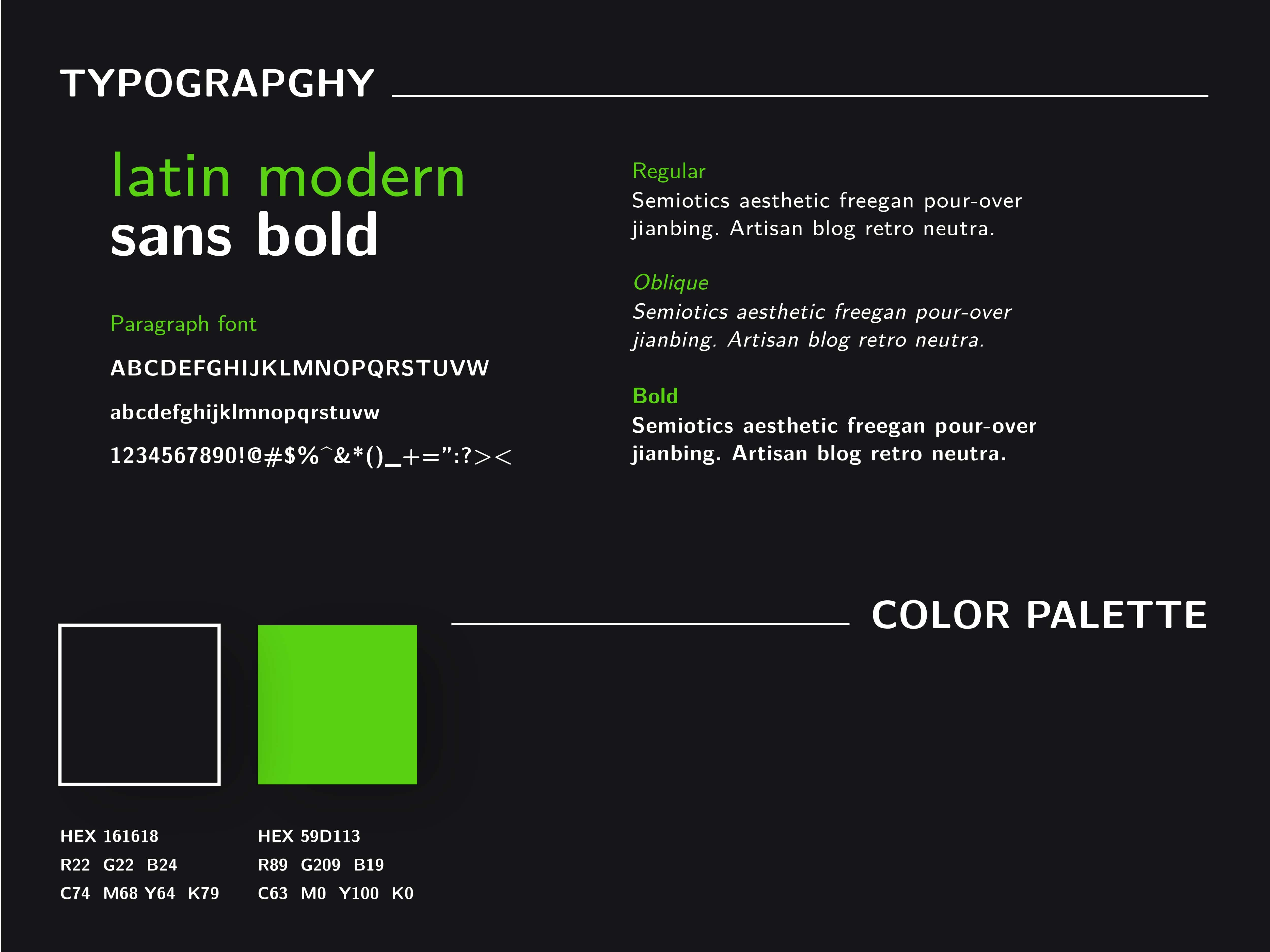
Color & Fonts
The imunixx color palette is built around clarity and confidence. A deep, near absolute black provides a strong foundation, evoking reliability, precision, and a no nonsense attitude. In contrast, the sharp electric green accent injects life into the brand, symbolizing agility, innovation, and forward motion. Together, they strike a deliberate balance: bold but clean, energetic yet grounded.
Typography follows suit. With Latin Modern Sans Bold as the lead, the type system communicates efficiency and clarity. Its geometric structure reinforces imunixx’s focus on streamlined digital solutions, while its modern curves keep the tone human and accessible.
The combination ensures legibility across platforms from codeheavy interfaces to clean editorial layouts reinforcing imunixx’s mission as a smart, adaptive IT solution partner.
Brand Application
We designed ready to use social media templates, merch mockups, YouTube banners, and promotional materials. All crafted to reflect a fast, agile, and connected tech vibe.
This brand was built to be effortlessly adaptable across platforms, while staying consistent and strong. From Instagram feeds to hoodies, Imunixx always looks solid and modern.
Outcome
The final brand identity gives Imunixx a bold and reliable presence that built for tech, speed, and smart communication. Its clean, modern system works seamlessly across platforms, from apps to print.
Now, the brand speaks with confidence and clarity, making it stand out in the fast moving digital world while staying adaptable and future-ready.

Like this project
Posted Apr 23, 2025
Designed a modern logo and brand identity for Imunixx, enhancing their digital presence and credibility.
Likes
0
Views
6
Timeline
Nov 2, 2004 - Nov 18, 2004