UI Landing Page & Banner Design for Confiction Labs
UI Landing Page & Banner Design
About
Riftstorm & Confiction Labs
Assessment Test Project :
Layout Design Showcase with Clean Grids, Visual Hierarchy, and Modern Flow. This portfolio project was created as part of a design assessment test, and not for commercial purposes. All visual assets (illustrations, photos, and icons) were provided externally and are used solely to demonstrate layouting skills.
Design Solution :
My responsibility in this project was focused entirely on layout design. All illustrations, icons, and visual elements were provided by the client. I worked with these existing assets to create a cohesive landing page and promotional poster, establishing a clean visual hierarchy, consistent color palette, and responsive grid system.
The goal was to highlight my ability to work within predefined asset libraries while maintaining modern aesthetics, usability, and brand coherence. This work is strictly for portfolio purposes and was not created for commercial use.
The Client
This project was created as part of a recruitment test for Confiction Labs, a game development company behind the title Riftstorm. The company opened a design position and provided visual assets as part of the assessment brief. I applied for the role and completed this test task to demonstrate my layout and visual design skills.
Confiction Labs Concept Design (Non-commercial Job Application Test)
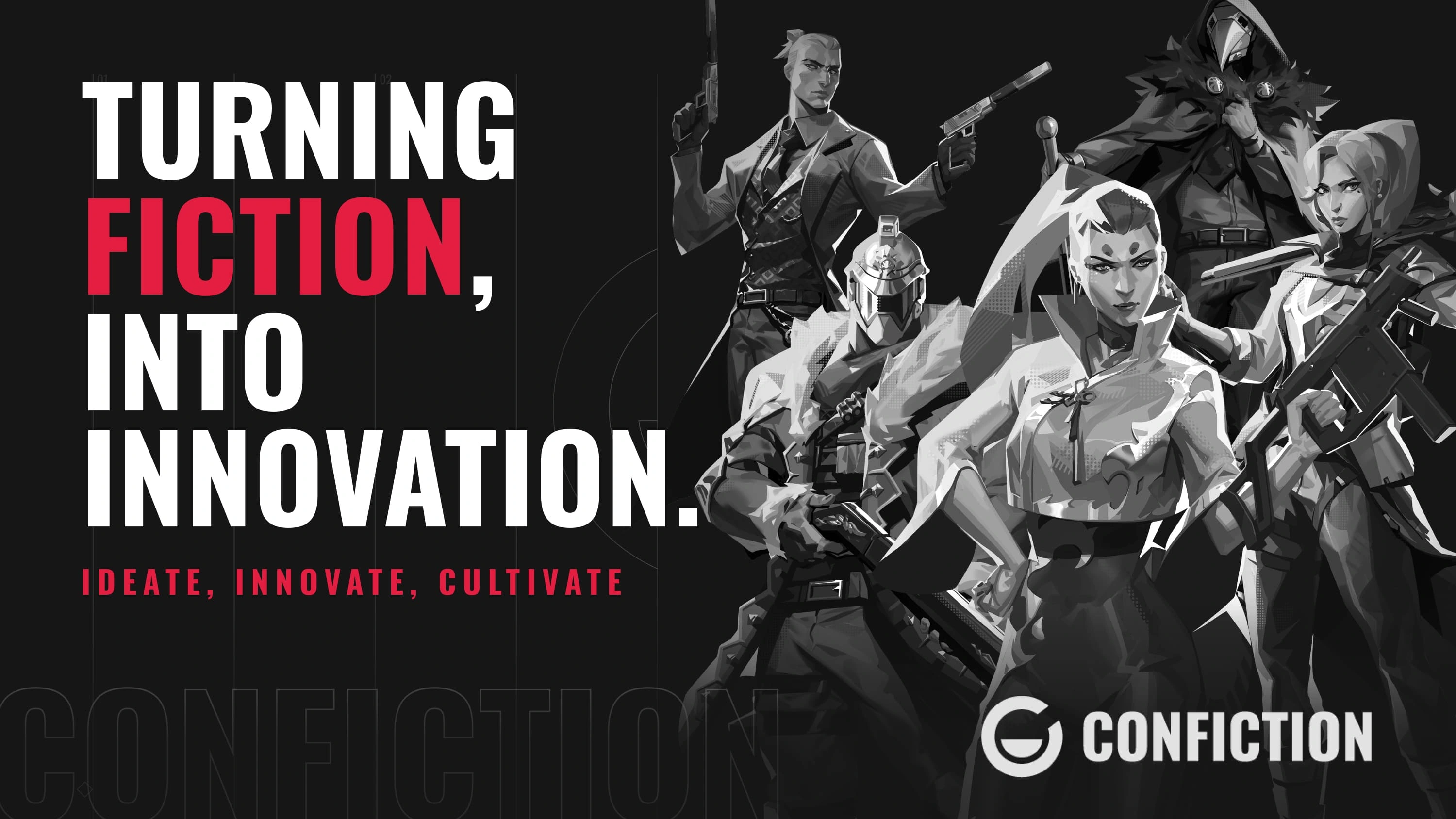
This Ui Landing Page and Banner Design was created as part of a job application design test for Confiction Labs, a game development studio currently developing "Riftstorm". The purpose of the test was to assess my ability to work within brand constraints, manage layout using provided assets, and communicate strong visual hierarchy in a clean, modern user interface.
Design Strategy and Concept
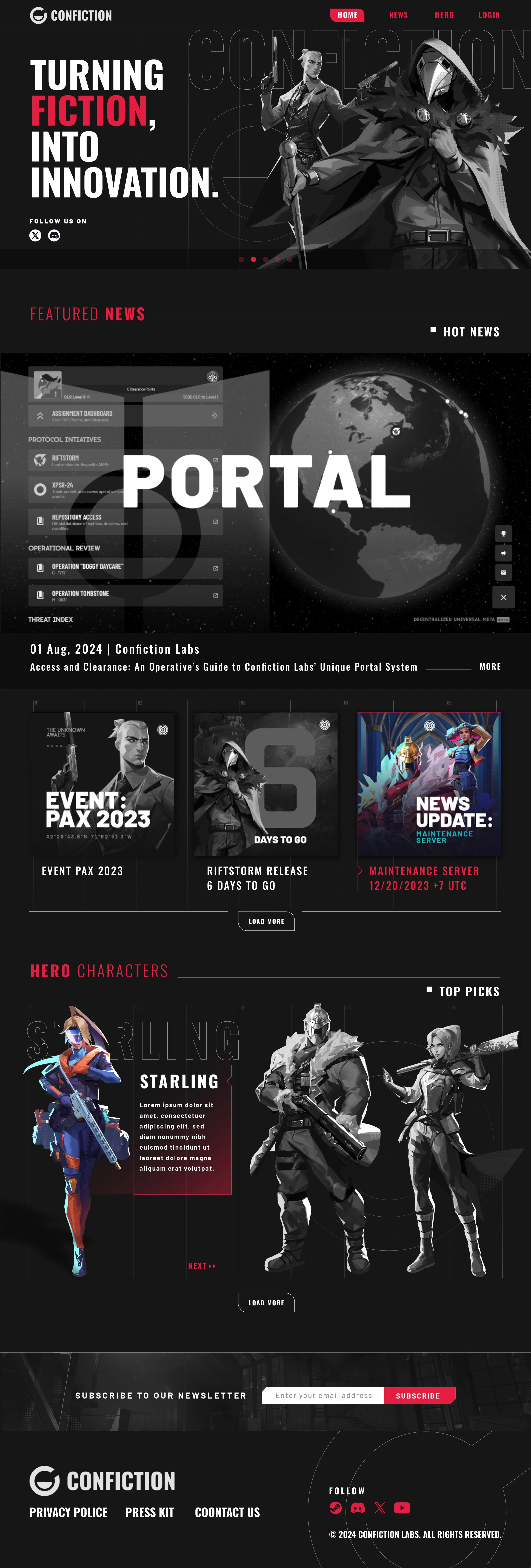
The core direction was to maintain a minimalist and tech oriented tone, aligning with the futuristic nature of Confiction Labs as a studio focused on cutting edge game development. The entire layout was designed around clarity and controlled tension, letting black and white dominate to allow future game visuals to stand out when applied. The structure is grid-based, designed responsively with flexible scaling and clean divisions to accommodate future modularity. The visual flow guides the eye top down with intentional breathing space and visual rhythm.
Typography
The primary font used is a bold, modern sansserif to express clarity and strength, reflecting the brand’s forward and tech savvy identity. Strong capitalizations and consistent kerning give the brand authority without feeling overbearing.
Color Palette
The palette was strictly monochrome black and white, with accent of vibrant red to establishing a clean canvas that acts as a visual ‘base camp’. It lets vibrant game content pop if applied later. Monochrome also evokes sophistication and high tech minimalism, in contrast to the more colorful visual language of Riftstorm.
Tools Used
All assets were provided by the client. Layouting and UI structuring were done primarily in Adobe Photoshop. No commercial assets were created or modified beyond layout structuring.
Focus Points
Precision in margin spacing, alignment, and padding to create a calm and readable visual environment
Contrast and whitespace used intentionally for information emphasis and readability
Clean visual rhythm with consistent vertical flow
Future scalability for adding interactive components or animations
Note
This design is non-commercial and was made specifically for application purposes only. All graphical assets, logos, and brand marks belong to Confiction Labs. My contribution focused solely on layout, structure, and visual presentation.
Riftstorm Concept Design (Non-commercial Job Application Test)
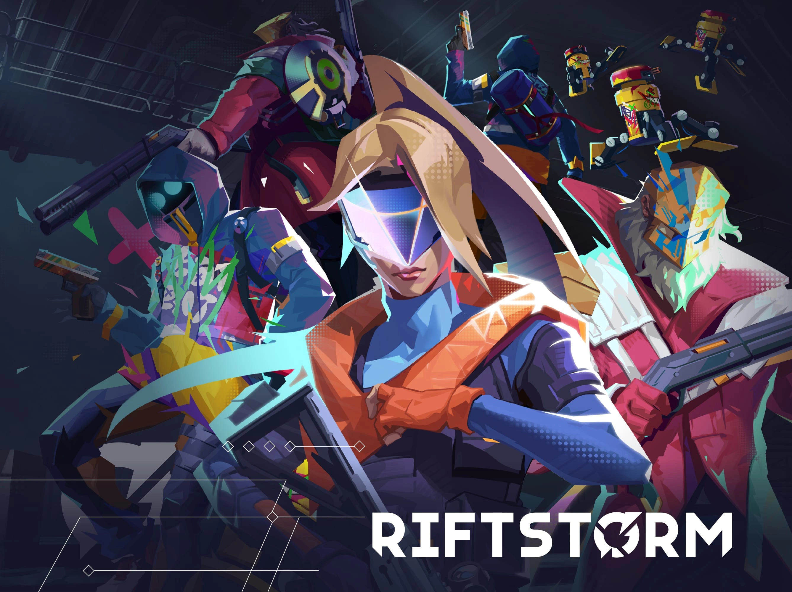
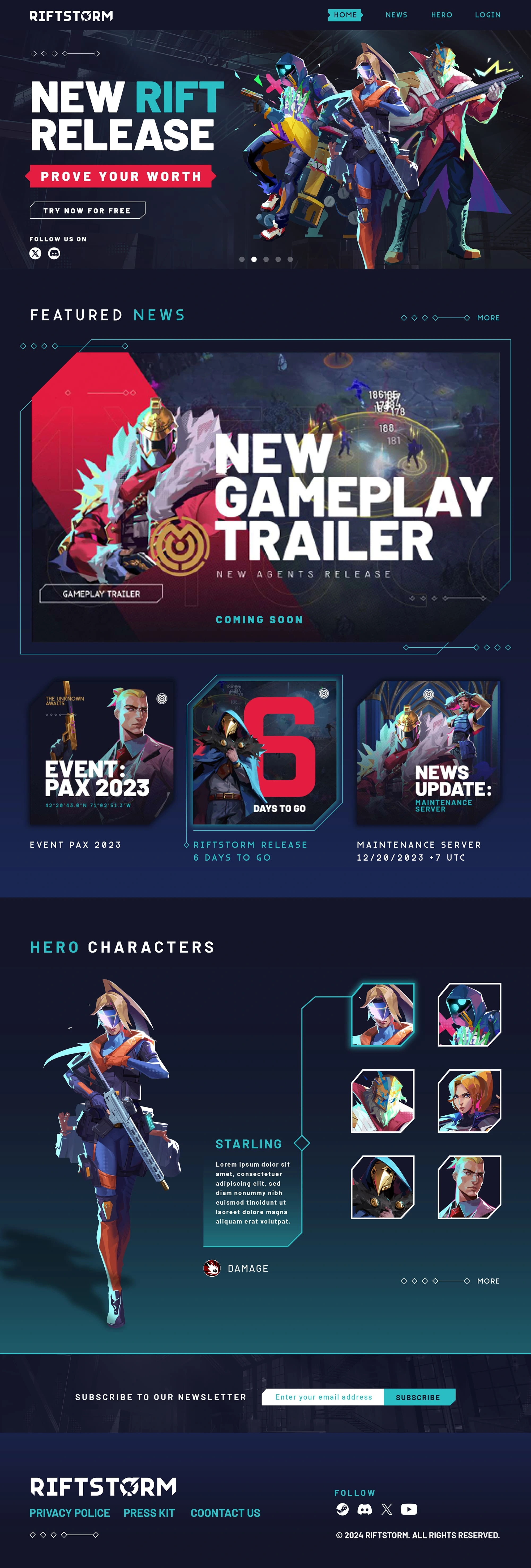
The core concept of this Ui Landing and Banner Design was to convey urgency and hype around the Riftstorm game, while staying true to the game’s energetic, sci-fi aesthetic. The goal was to immediately grab attention and guide the viewer’s eye through a clean visual hierarchy and the characters and brand name.
Visually, I approached the layout as a blend between esports aesthetic and modern gaming UI, aiming to match the tone of competitive, fast-paced shooters while giving space for each character to shine. The layout allows for strong focal points, while supporting elements enhance the futuristic tech vibe.
Typography
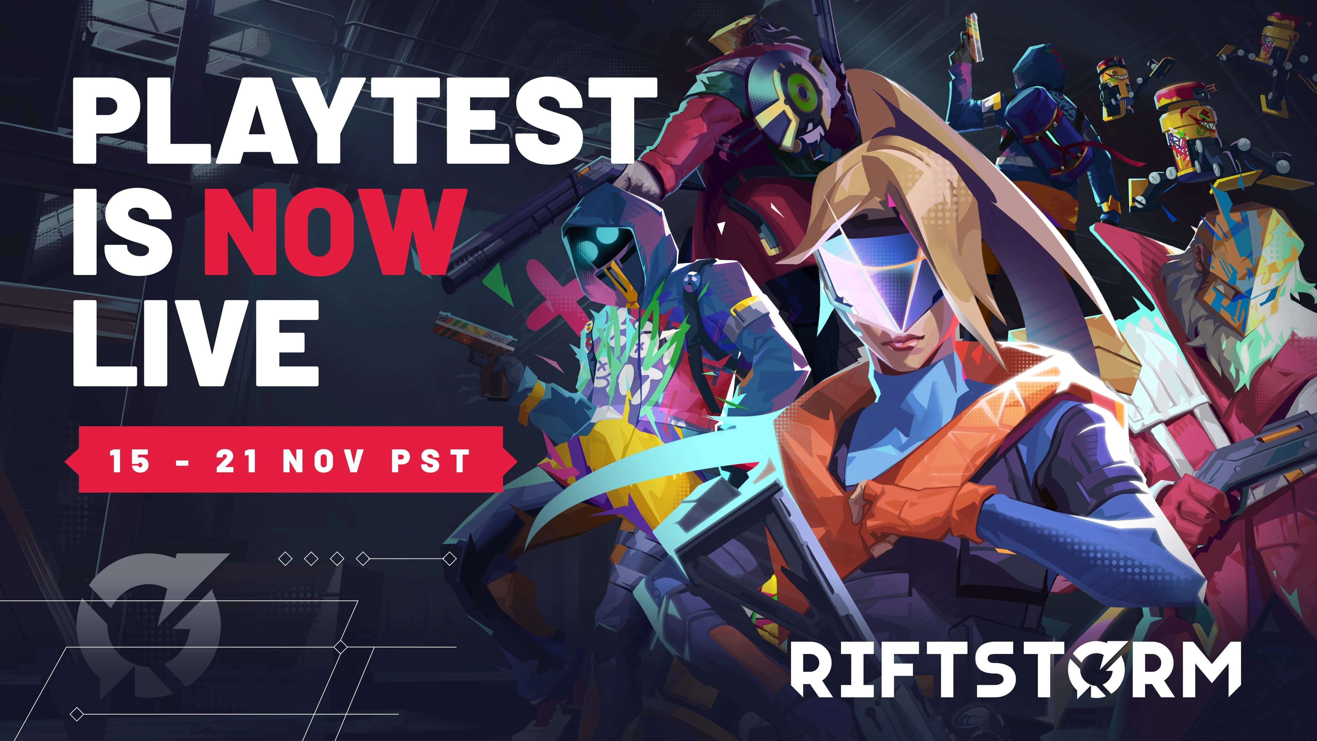
The headline uses a bold, heavy sans serif font to create instant impact. All caps treatment reinforces the intensity and urgency of the message. The contrast red and the rest in white provides a clear call to action without overwhelming the composition.
Secondary text like the date bar follows a more condensed sans-serif for space efficiency, maintaining readability while supporting the primary message.
Color Palette
The palette draws from the game’s visual identity:
Electric red for urgency and action cues
Crisp white for clarity and visual break
Deep navy in the background to add depth and make the characters pop
Teals suits to create harmony between type and image
Color use was optimized for contrast, legibility, and mood alignment with the game's neon-tech environment.
Layout & Composition
The composition follows a rule-of-thirds approach, balancing the headline on the left with the character cluster on the right. Grid-based alignment ensures visual stability, while overlapping elements add dynamism.
I applied depth layering techniques using characters’ foreground positions, glow effects, and angular motion lines to give the poster a sense of kinetic energy.
The game’s logo is placed bottom-right to anchor the entire layout, serving as a strong brand recall point after the user digests the main message.
Role and Limitations
All visual assets, including character renders and icons, were provided by Confiction Labs. My role was focused entirely on layout design, visual hierarchy, and composition strategy. No original illustration was made for this poster.
Layouting and UI structuring were done primarily in Adobe Photoshop,No commercial assets were created or modified beyond layout structuring.
Outcome
The final outcomes across all four design tasks reflect a cohesive approach to visual storytelling, brand consistency, and modern layout structure. From the high-impact Riftstorm banner to the clean UI landing pages for both Riftstorm and Confiction Labs, the goal was to balance strong visual presence with functional clarity.
Each layout was built using provided assets, focusing on hierarchy, grid alignment, and typographic control. The use of bold sans serif fonts, dark to light palette contrast, and subtle digital motifs helped communicate both energy and precision. Photoshop and AI-assisted tools were used for layout refinement and mockup presentation. Every design was tailored to fit the test brief, ensuring it would showcase design sensibility, adaptability, and the ability to translate gameplay into visually engaging interfaces without compromising usability or branding integrity.
Like this project
Posted Apr 24, 2025
Designed UI landing page and banner for Confiction Labs' recruitment test. This design is non-commercial and was made specifically for application purposes only
Likes
0
Views
0
Timeline
Sep 23, 2024 - Sep 25, 2024
