Jazz Rhythms in Type


Animated Conceptual Typography
Rhythm and Staff (Jazz Inspiration)
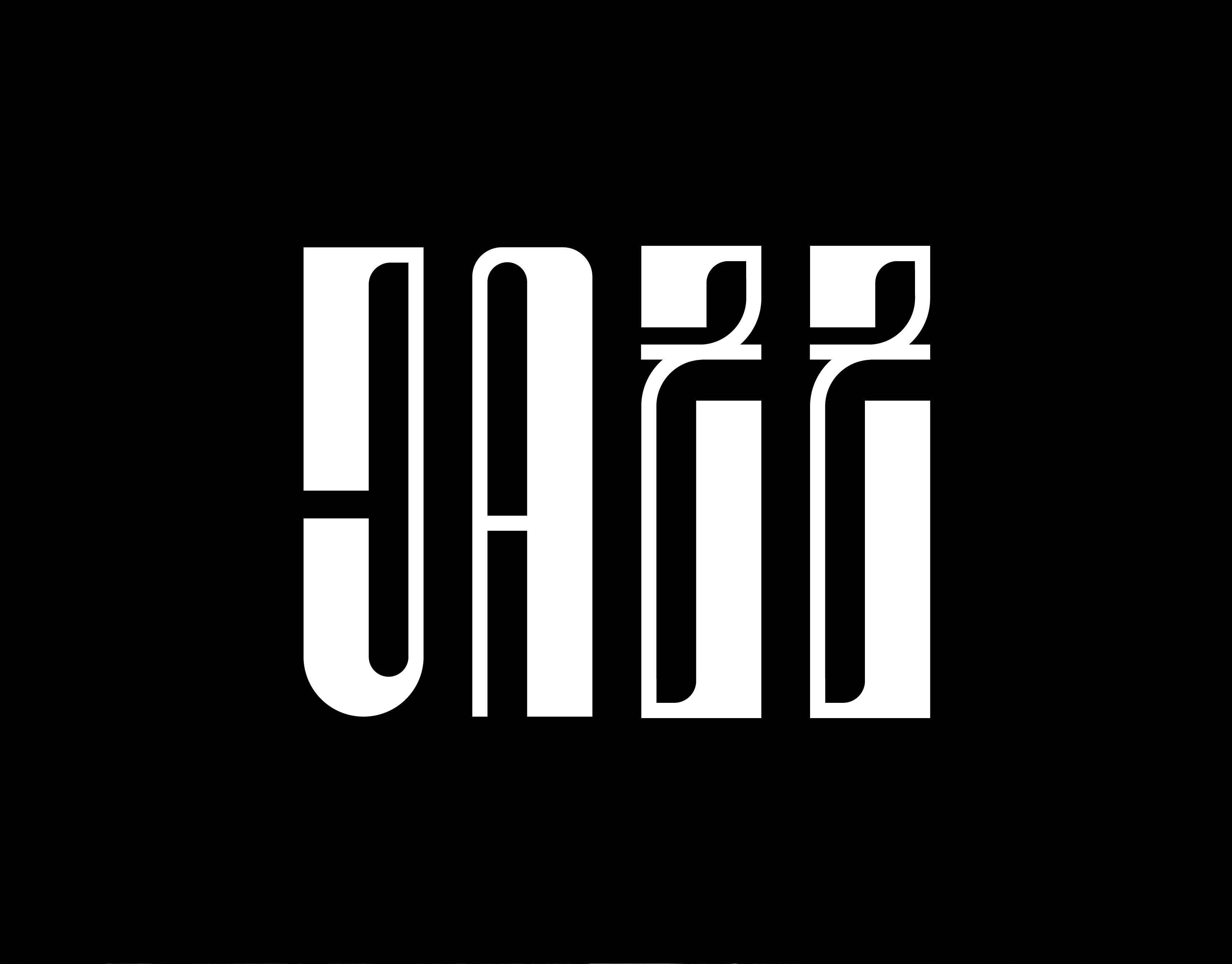
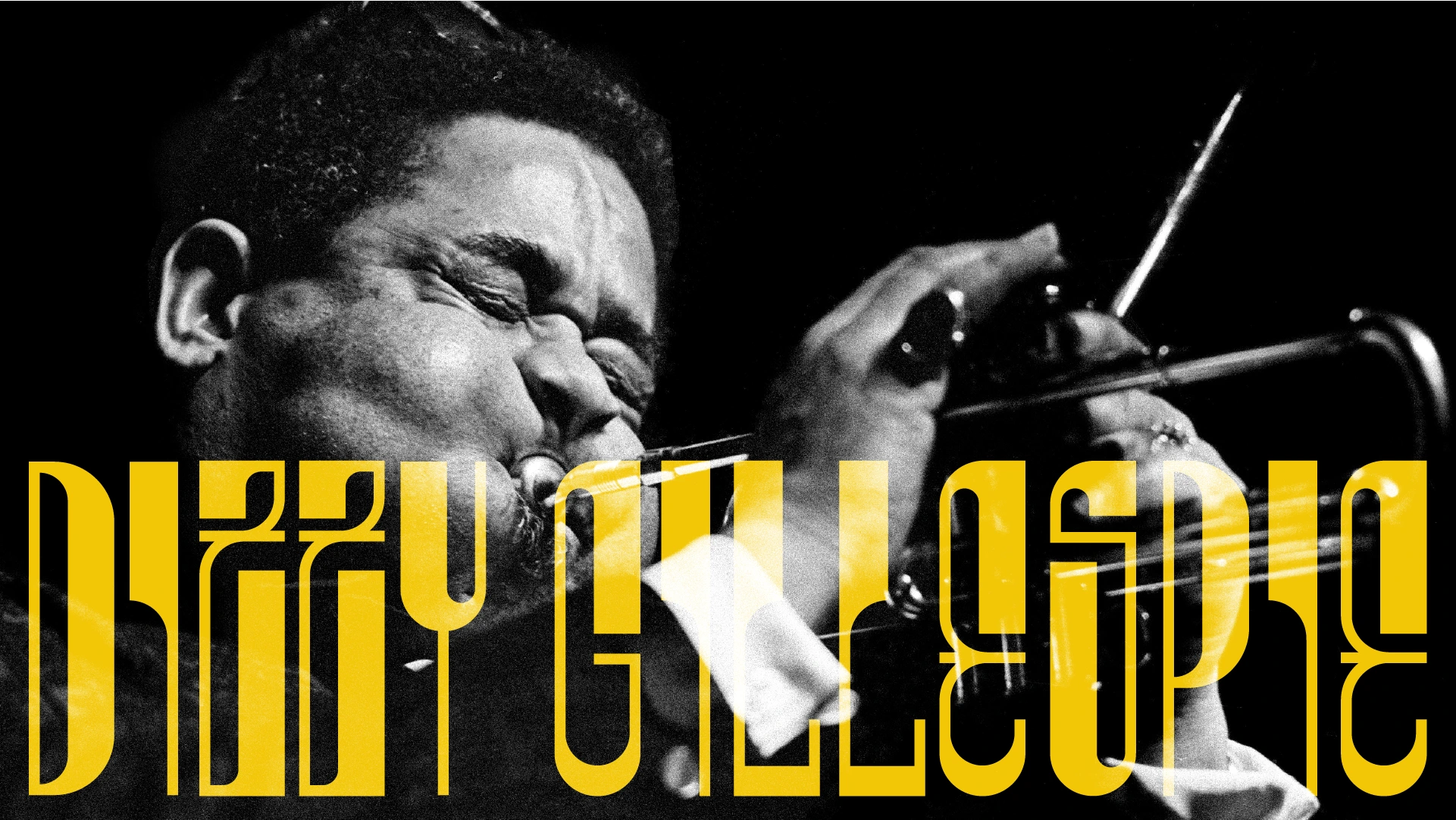
This project is a deep dive into the convergence between typographic design and musical composition. I designed this typeface, named 'Jazz,' based on the question: How can a font be composed as if it were a piece of music?
The central concept was developed from two key analogies that dictated the design structure:
The Staff Structure (Pentagram): The weight and position of musical notes on a staff were studied, where each character's stroke and thickness were designed to evoke the placement of chords and notes on the score. The typography is built with a hierarchy of weights and spacing that reflects rhythm.
Modular Analogy (The Drum Kit): Each glyph was conceived as an instrument—a sum of parts that are assembled rhythmically, similar to a drum kit composed of drums and cymbals.
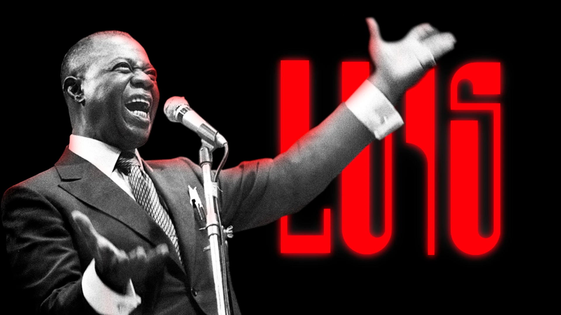
The resulting design is a font with inherent visual rhythm. Finally, Motion Graphics was used to bring it to life, translating the improvisation and swing of jazz into fluid movement, creating an entirely original, dynamic, and conceptual typographic system.
Like this project
Posted Nov 4, 2025
Custom animated typeface, inspired by Jazz. Capturing the music's rhythm, improvisation, and movement, brought to life by motion.


