Web design and no code development for architect Utsav Shah
After having the pleasure of designing the website for the architecture agency White Noise Design Studio, one of its members, Utsav Shah, decided to update his personal website.
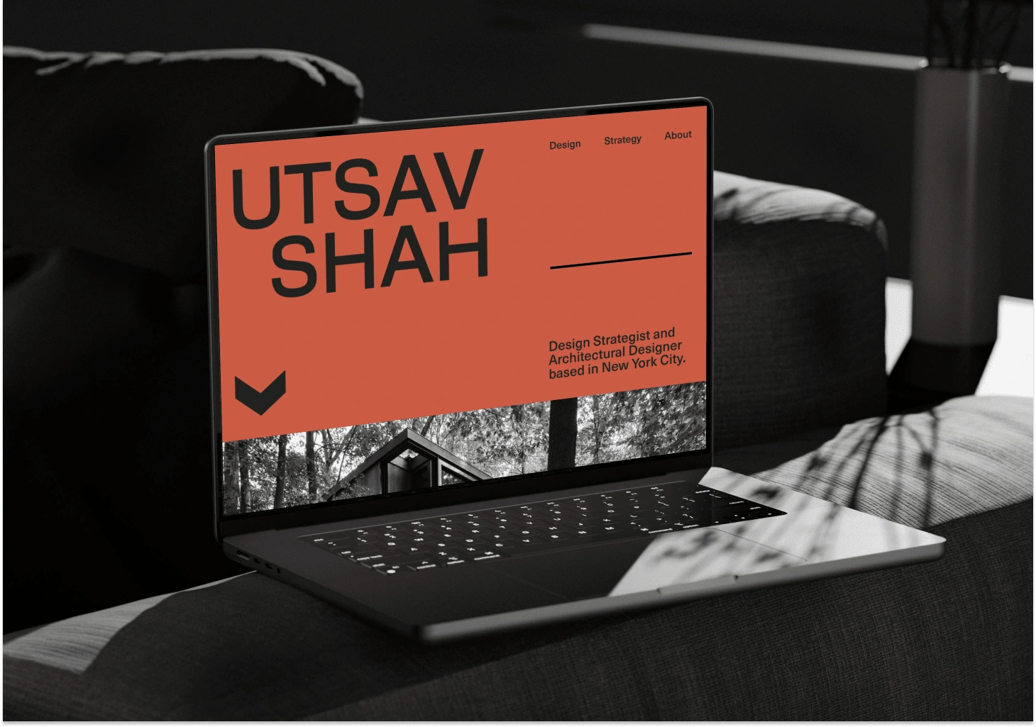
As he was looking for more freelance clients, Utsav Shah needed a captivating website that could work as a magnet for new clients and partners alike. He needed something clearly showcasing the scope of his work, that was starting to shift more towards workplace strategy rather than interior design only.
Utsav wanted his website to represent a personal brand, rather than just showcase his work. I focused on creating a visual language that would elevate his status.
I used muted yet eye-catching colors, ensuring that the palette complemented his designs. I used a clean grid system to give the website a solid, structured feel, allowing for easy navigation. To add a touch of personality without overshadowing the content, I incorporated minimal animation effects. These subtle animations enhanced the user experience by providing interactive elements that engaged visitors while maintaining the focus on Utsav's work.
The deliverables
3 distinct design directions for the website
Design refinement of the chosen design direction
Design implementation and no code development.
Website animation
Landing page scroll-through
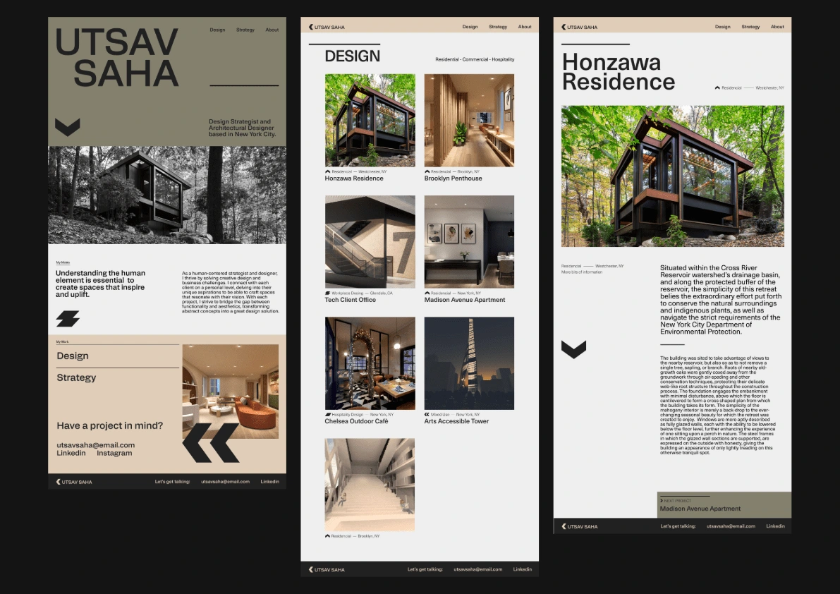
Website Layout
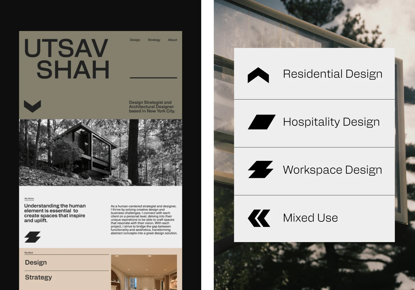
Graphic Language
Website scroll through - project page
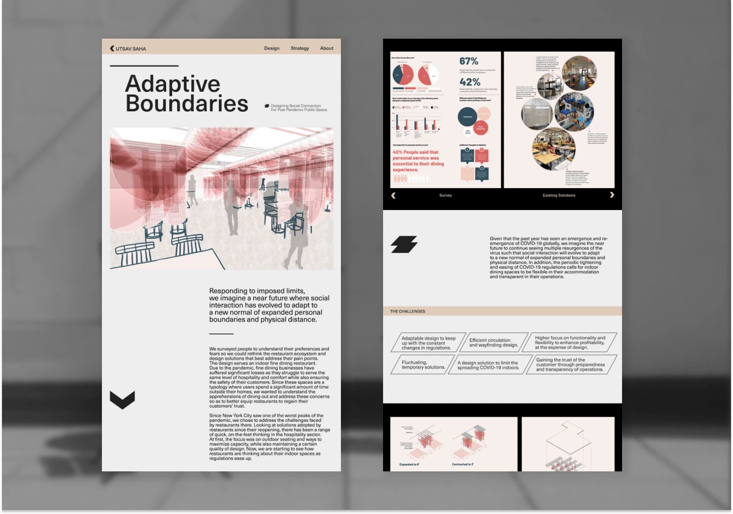
Project page design
Like this project
Posted Jul 30, 2024
GRAPHIC DESIGN – WEB DESIGN – NO CODE DEVELOPMENT – CONCEPTUALISATION
Likes
0
Views
12
