Iris Design System
Bryan King
The Problem
NaviStone's product UI was a Frankenstein monster—a chaotic mix of three different CSS frameworks (Bulma, Buefy, and Oruga) bolted together over time. The result was an inconsistent, buggy, and frankly ugly user interface.
What "Frankenstein UI" meant in practice:
CSS chaos: Values all over the place—no spacing system, no color tokens, no consistency
Contrast issues everywhere: Text on backgrounds failed accessibility standards
Broken on tablets: Responsive design didn't work (product doesn't support mobile, but tablets matter)
Misaligned elements: Buttons, inputs, and cards never lined up properly
Random font sizes: No typographic hierarchy
Why this happened:
The team had 6 backend engineers and zero front-end expertise. They were building UI from screenshots and a messy Figma file created by a low-rate contractor before I joined. There was no design system, no component library, no source of truth.
I was spending 10 hours a month troubleshooting UI issues: "Why doesn't this button match that button?" "How do I make this modal work?" "The spacing is wrong—what should it be?"
The PM was fed up. The product looked unprofessional, and every feature took too long to ship because of endless design-to-engineering feedback cycles.
The Challenge
When I started as a contractor in 2022, the team had no design system—not even in Figma. I was working from screenshots, and engineers were building from a messy Figma file created by a low-rate contractor. There was no source of truth.
By fall 2023, I had built a proper Figma component library. The team decided to try an off-the-shelf solution: PrimeVue, a pre-built Vue component library. The migration failed. PrimeVue was all-or-nothing—too complex for a living application—and it didn't have everything we needed.
When I was converted from part-time contractor to full-time employee in early 2024, I finally had capacity to solve the problem properly: build a custom Vue component library that worked within our constraints.
What made this hard:
Not greenfield: I had to work within an existing Vue codebase that was actively being developed—couldn't break production
Extracting from chaos: Had to identify patterns in the Frankenstein UI (Bulma + Buefy + Oruga mix) and build components that could replace them
Complex state management: Components like ComboBox required custom architecture—no style-agnostic Vue libraries existed at the time
Solo front-end expert: Team of 6 backend engineers had no FE experience—I was building the infrastructure they'd rely on
Tight timeline: PM carved out 8 weeks—had to ship fast while maintaining quality
I had succeeded where PrimeVue failed. The team needed a custom solution that fit their existing codebase, not an all-or-nothing framework replacement.
What I Built
A complete production-grade design system in 8 weeks:
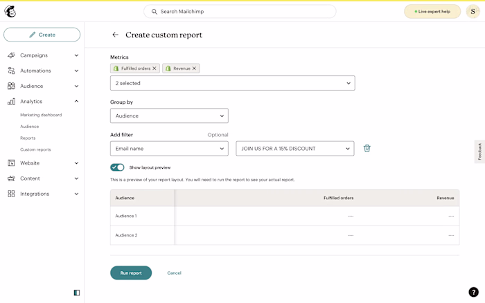
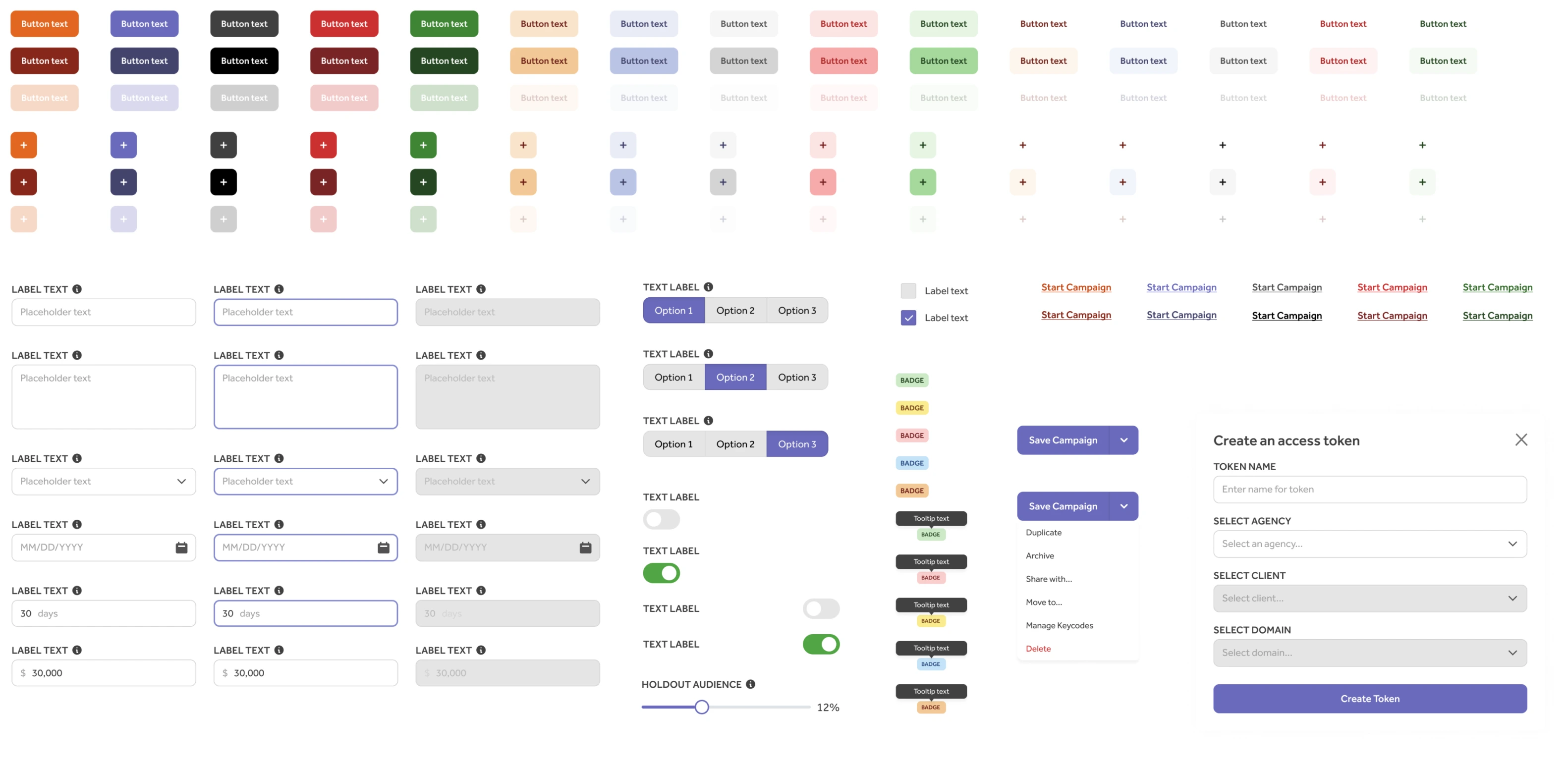
15 Vue.js Components
ActionList, Button, ButtonGroup, ComboBox, Input, Loading, Modal, MultiInput, RangeSlider, Select, Skeleton, Switch, Table
Plus shared utilities: InputLabel, HelperText (reusable across form components)
Figma Component Library
Built in fall 2023, refined during Vue implementation. Organized with variants, properties, and clear naming conventions that matched the Vue component props.
Storybook Documentation
Every component documented with props, states, and usage examples. Engineers could see exactly how to implement each component without asking me.
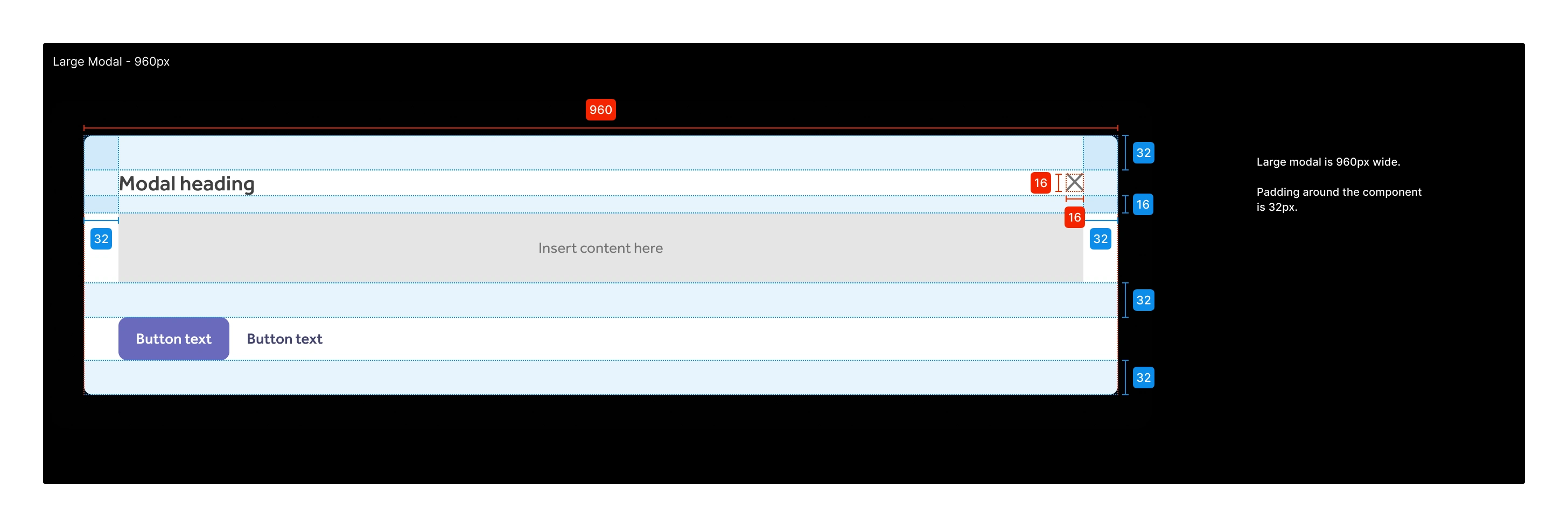
Design Tokens & Shared Styles
Spacing scale, color palette, typography system, border radii—all centralized and reusable across components.
The Complexity: Building ComboBox
Some components required significant architectural complexity. The ComboBox component is a good example of what "building from scratch" meant.
ComboBox manages:
13 configurable props: options, modelValue, labelText, helperText, required, tooltip, placeholder, maxitems, allowAddingOptions, pattern, validationMessage, error, errorMessage
Multi-select with visual chips: Selected items appear as removable chips, each with individual delete actions
Real-time search filtering: As user types, options filter to matching results
Full keyboard navigation: ArrowUp/Down to highlight options, Enter to select, Backspace on empty input removes last chip
Pattern validation: Custom regex patterns with error messages for "add new option" functionality
Edge case handling: Max items reached states, focus management with blur delays, mouse hover + keyboard navigation sync
I used ChatGPT to scaffold boilerplate code and help with Storybook documentation, but the architecture, state management, and interaction logic were mine. The AI couldn't design this—it required understanding Vue's reactivity model, accessibility patterns, and user mental models.
The RangeSlider component was similarly complex, requiring math calculations for drag interactions and value mapping.
The Process
Week 1: Catalog and Audit
I went through every page of the product and cataloged component instances—identifying patterns, variations, and props needed. This gave me a clear inventory of what to build.
Weeks 2-8: Build Iteratively
Using ChatGPT's desktop app (before Cursor and AI IDEs were mainstream), I built components one at a time. The workflow was: copy-paste code from ChatGPT, refine implementation, debug edge cases, write Storybook documentation, push to codebase.
ChatGPT accelerated my output, but I directed the architecture. For complex components like ComboBox and RangeSlider, I wrote the state management and interaction logic myself.
I pushed components to the codebase as I built them—no big-bang launch. This let engineers start using the design system immediately and give feedback.
Months 3-6: Engineer Implementation & Code Review
Over 4 months (May-September 2024), the backend engineers refactored existing code to use the new components. They replaced Bulma/Buefy/Oruga implementations with design system components.
I code-reviewed every implementation to ensure proper usage and maintain quality standards. This was critical—the design system only works if it's implemented correctly.
The Impact
Immediate Results (First 6 Months):
My troubleshooting time: 10 hours/month → near-zero
UI bugs: Constant misalignments, broken responsive behavior, contrast issues → near-zero
Engineer questions: "How do I build this?" → Storybook has the answer
Handoff clarity: Common system to communicate—designers and engineers speaking the same language
Leadership satisfaction: PM, CTO, and VP Product all pleased with progress
The Intern Success Story:
Six months after launch, the design system's value became undeniable. In summer 2024, a front-end intern (between freshman and sophomore year at Johns Hopkins) redesigned our main dashboard and built a new campaign index page in just 3 months—two of the product's most critical overhauls.
This would have been impossible without the component library. The intern had all the building blocks and could focus on layout and user experience, not reinventing buttons and inputs.
Continued Impact (12 Months Later):
New campaign type shipped in 12 weeks (Fall 2024): Engineering team stood up a new feature type because they had all the UI pieces—just needed to focus on business logic and data. Would have taken significantly longer without the design system.
Product became salable: The UI cleanup helped transform NaviStone's product from an unsalable mess to something valuable enough to sell to a partner. Sale in progress as of late 2024.
Team velocity increased: Engineers stopped reinventing the wheel every feature. They had tested, documented, reusable components.
The design system didn't just make the product prettier—it made the product shippable, scalable, and ultimately salable.
What I Learned
Design systems aren't just Figma libraries—they're infrastructure.
A Figma component library is a starting point, not a solution. The real value comes from production-ready code that engineers can drop into their work. I wasn't building mockups—I was building the foundation for everything the team would ship.
Being the solo front-end expert means owning quality end-to-end.
I wasn't just designing components—I was architecting state management, writing accessibility patterns, handling edge cases, documenting usage, and code-reviewing implementations. When you're the FE expert on a team of backend engineers, quality is your responsibility.
AI tools multiply output when you direct them well.
ChatGPT helped me build faster, but it couldn't architect the ComboBox or design the component API. I used AI as an accelerant, not a replacement for expertise. The key is knowing what to ask for and what to build yourself.
The ROI of design systems shows up in team velocity.
The intern shipping 2 major redesigns in 3 months proved the design system worked. The new campaign type shipping in 12 weeks (instead of months) proved it scaled. The product becoming salable proved it mattered to the business.
Design systems are invisible until they're obvious.
Reflection
This project taught me that design systems are as much about leadership as they are about code. I wasn't just building components—I was building the infrastructure that would determine how fast the team could ship, how consistent the product would look, and ultimately whether the product would be valuable enough to sell.
I'm proud that I succeeded where PrimeVue failed. Off-the-shelf solutions work for some teams, but NaviStone needed a custom system that fit their existing codebase and constraints. Building it myself—as both designer and front-end developer—meant I could control quality from Figma mockup to production code.
The fact that an intern could ship major features in 3 months, and that the product became salable to a partner, validates the investment. Design systems aren't decoration—they're competitive advantage.
Like this project
Posted Dec 20, 2025
How I Built a Production Design System in 8 Weeks (Solo) and Enabled 12+ Months of Product Development