AI-Health Wellness Mobile App
Habiba Abdullahi 😎
AI-Powered Hair Wellness
Project Info
Role: Lead Product Designer (UX/UI)
Deliverables: Mobile App Design, AI User Flows, Visual Identity
Focus: HealthTech, Artificial Intelligence
Traditional symptom checkers are stressful, and medical reports are confusing. This project aimed to utilize advanced AI (specifically for Hair analysis) to provide users with instant, personalized wellness insights.
The main design challenge was overcoming the "black box" problem: How do we design an interface that makes users feel comfortable taking a scan of their body, and then present complex AI findings in a way that is reassuring rather than alarming?
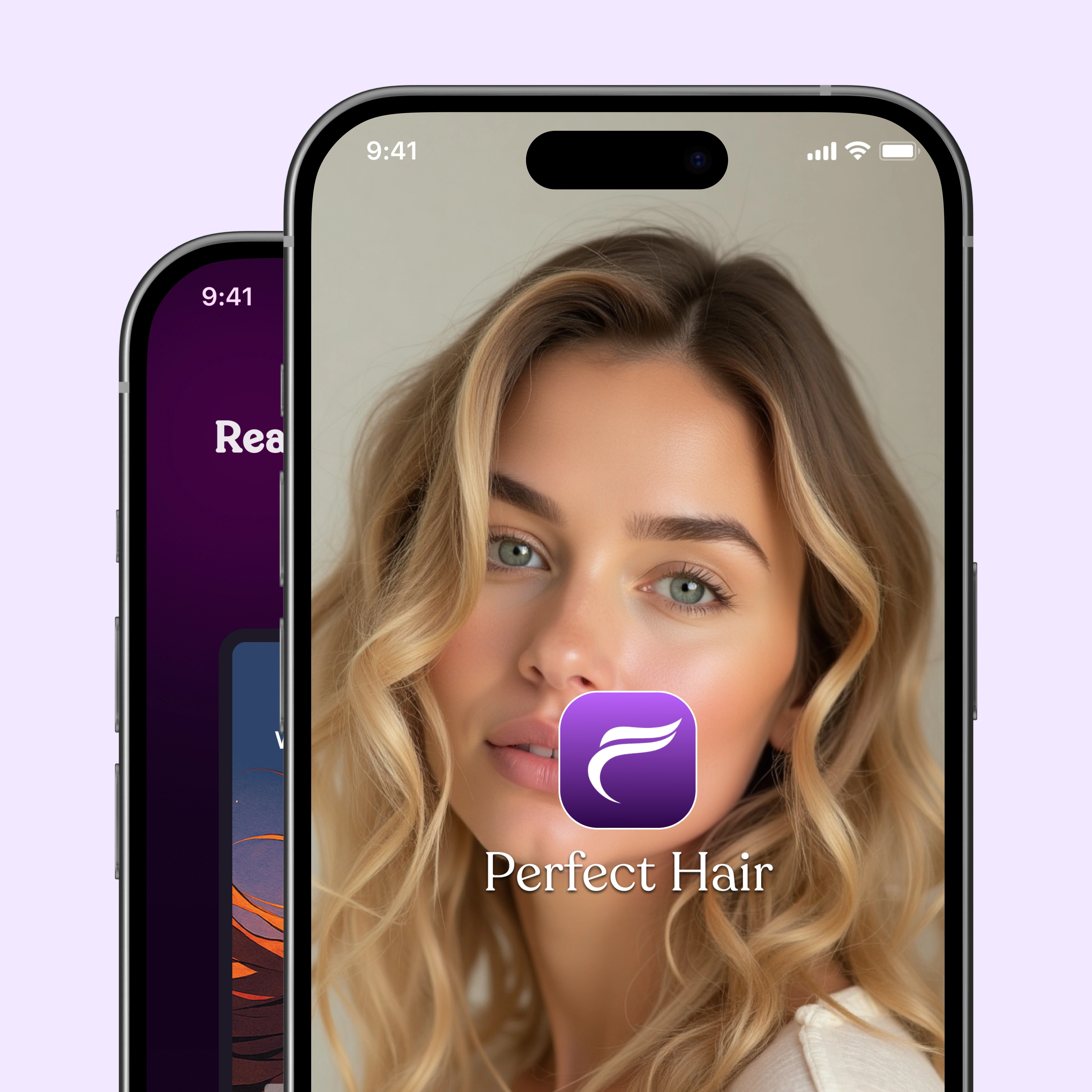
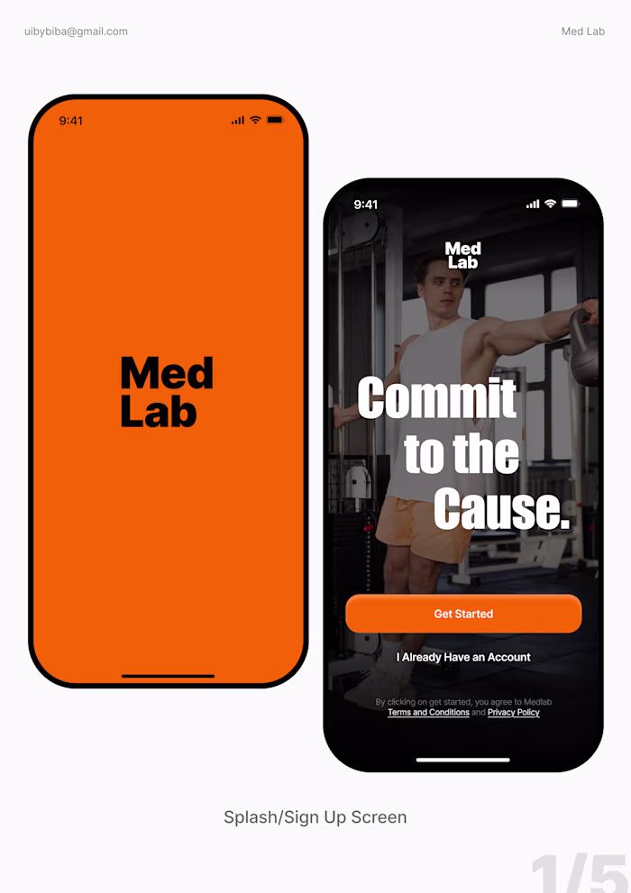
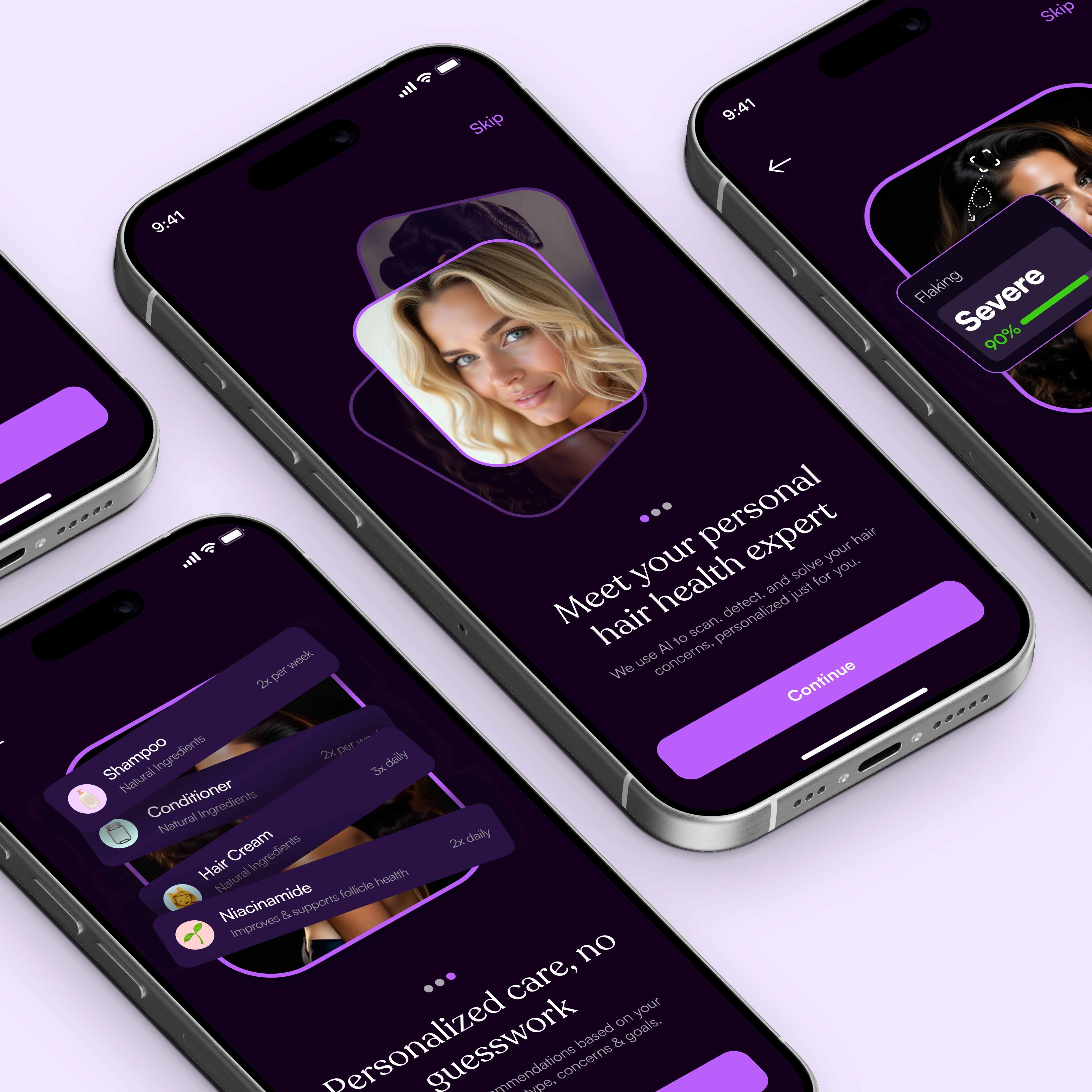
Splash Screen
Building Trust from Step One
In health apps, onboarding is high-stakes. We are asking for sensitive data immediately. If the UI feels clinical or invasive, users bounce.
The Design Solution: I designed a progressive onboarding flow. Instead of a giant form, we ask one question at a time, accompanied by warm use of emojis. The visual design uses ample white space and soft typography to lower cognitive load during the setup phase.
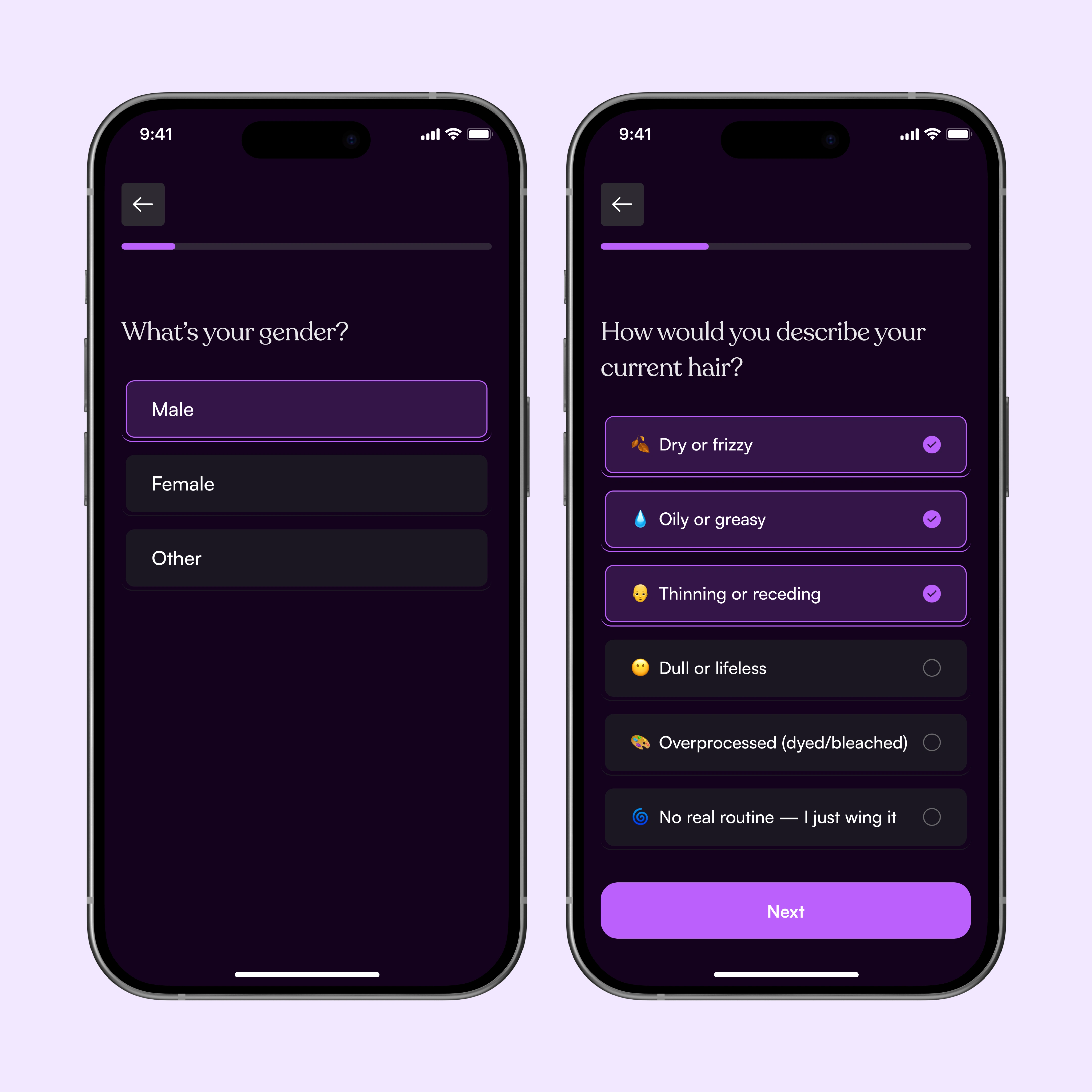
Onboarding Screens
Designing the AI Interaction
The core feature is the AI scanner. The quality of the AI's results depends entirely on the quality of the photo the user takes. The UX had to guide the user perfectly.
The Design Solution: We couldn't just open the camera and hope for the best. I designed a structured Guided Capture Experience.
Overlays: Clear UI overlays on the camera screen show the user exactly where to position their hair/scalp.
Real-time Feedback: The UI uses haptic feedback and visual cues (turning green) to confirm when lighting and focus are sufficient before the shot is taken.
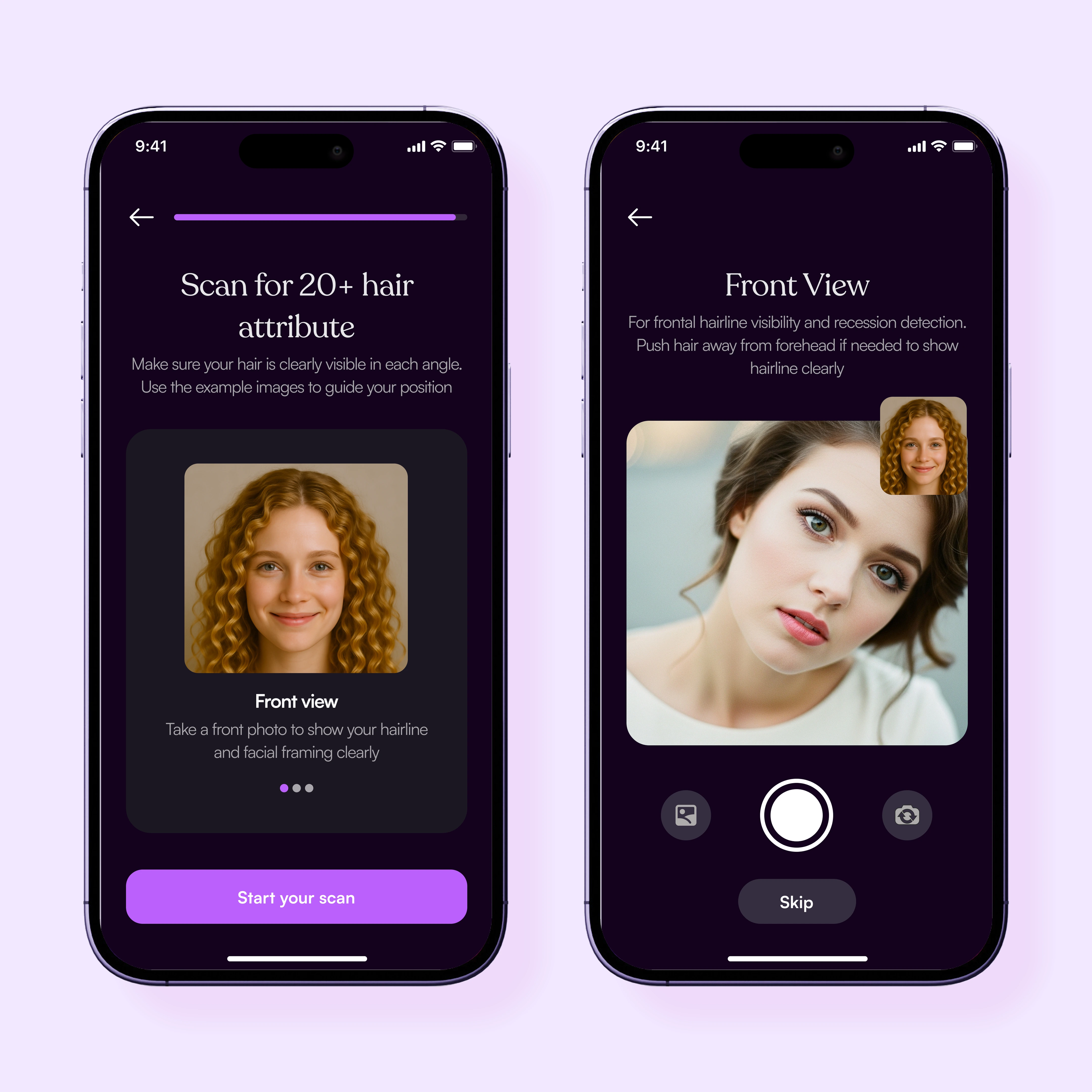
Scan Hair
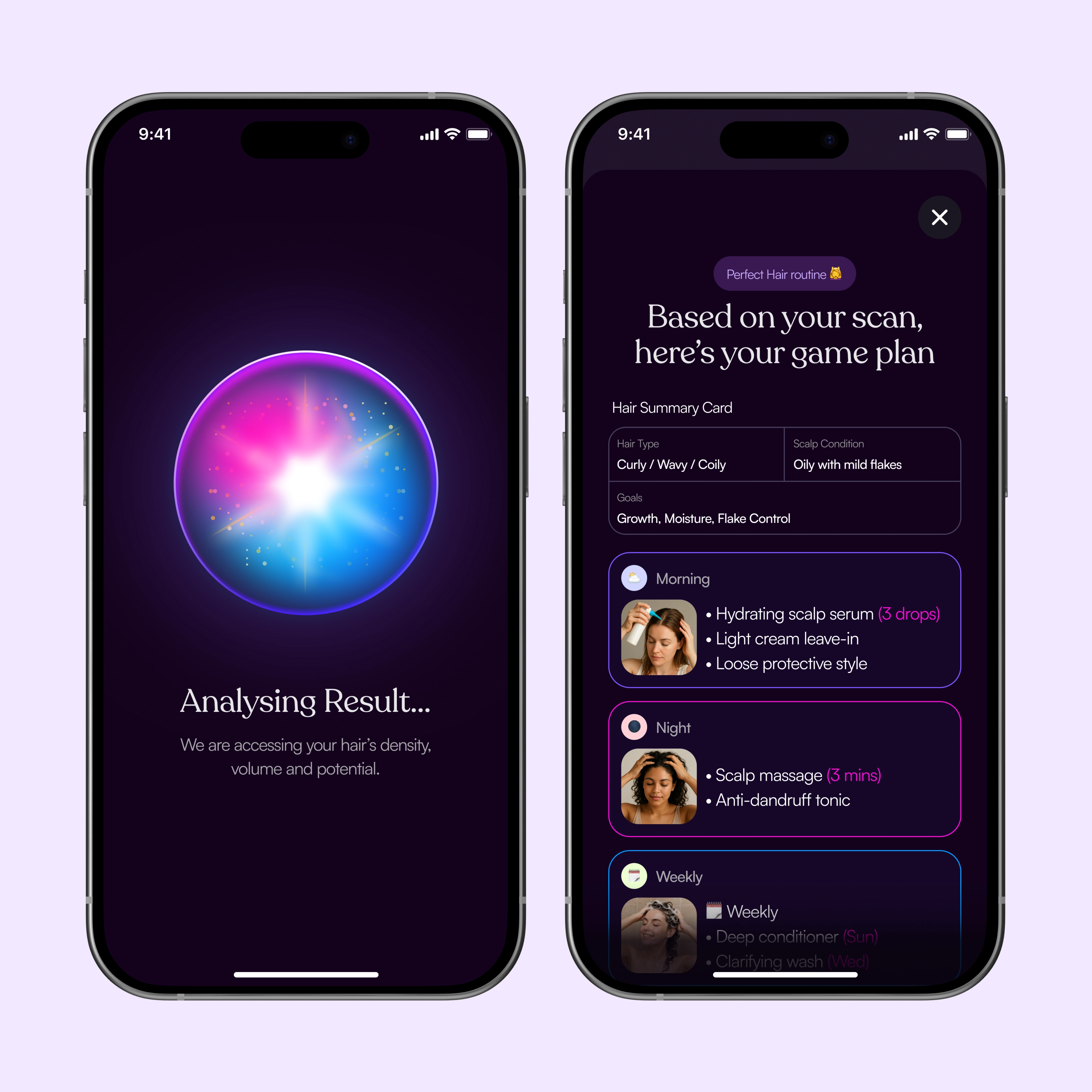
Hair Analysis and Result
Visualizing the Diagnosis
Raw health data is overwhelming. The results screen needs to translate algorithmic output into actionable human language.
The Design Solution: I utilized a strict Visual Hierarchy to parse the results:
The Score: A high-level "Wellness Score" provides immediate context at a glance.
The Breakdown: Clear data visualization (progress bars and simple charts) breaks down the contributing factors (e.g., hydration, breakage, scalp health).
The Game Plan: Crucially, every result is paired with a "Next Step" recommendation, moving the user from passive consumption to active wellness.
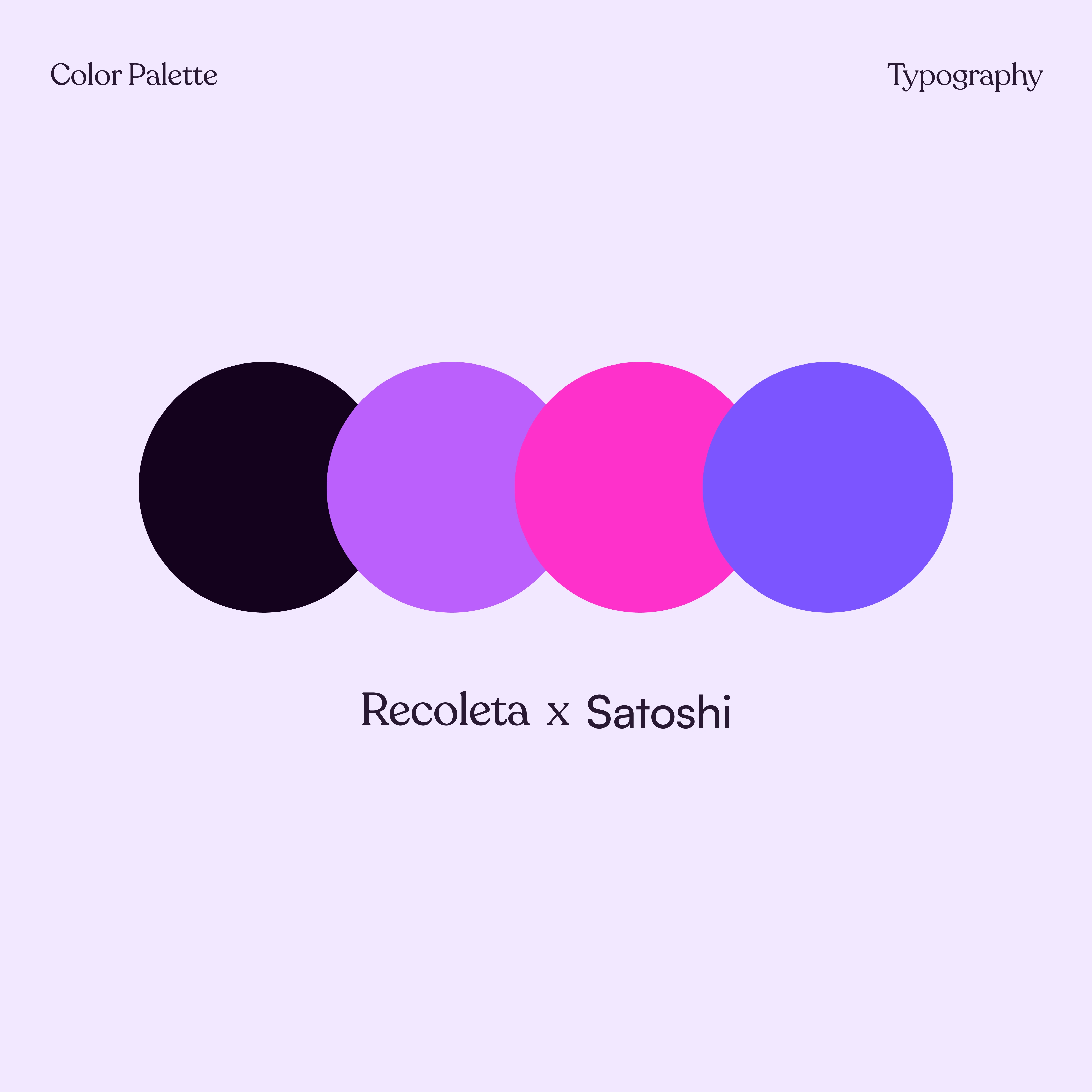
Color Palette and Typography
The Aesthetic of Care
Color psychology is vital in healthcare. We needed to avoid the cold, sterile blues typical of clinical environments, but also avoid overly aggressive colors (like stark reds) that cause anxiety when looking at health results.
The Solution: We developed a "Wellness Warmth" palette.
Primary: A calming, purple designed to evoke stability and trust.
Secondary: Soft pink and violet used for scoring and progress indicators. These feel organic and optimistic rather than clinical.
Neutrals: A creamy off-white for text reduces eye strain compared to a stark
By focusing on guided interactions and a calming visual identity, we turned an intimidating AI technology into an approachable daily wellness companion. The design successfully navigates the tension between advanced technology and human vulnerability.
👉 If you’re looking to bring a health, beauty, or AI-driven app idea to life, let’s collaborate!
Like this project
Posted Aug 19, 2025
Designed a Hair wellness companion. The design successfully navigates the tension between advanced technology and human vulnerability.
Likes
2
Views
122